Raìse & Beatrice Display
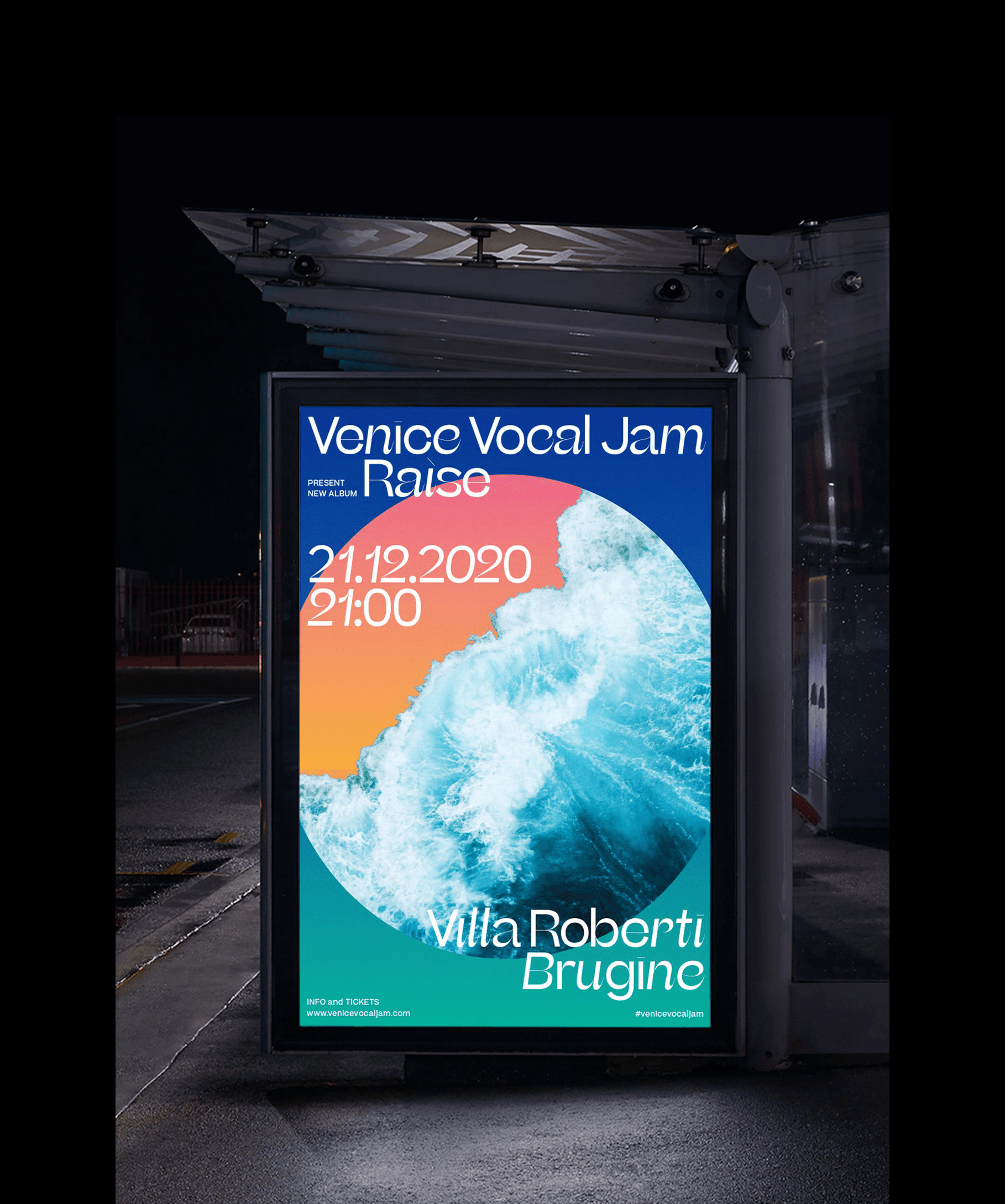
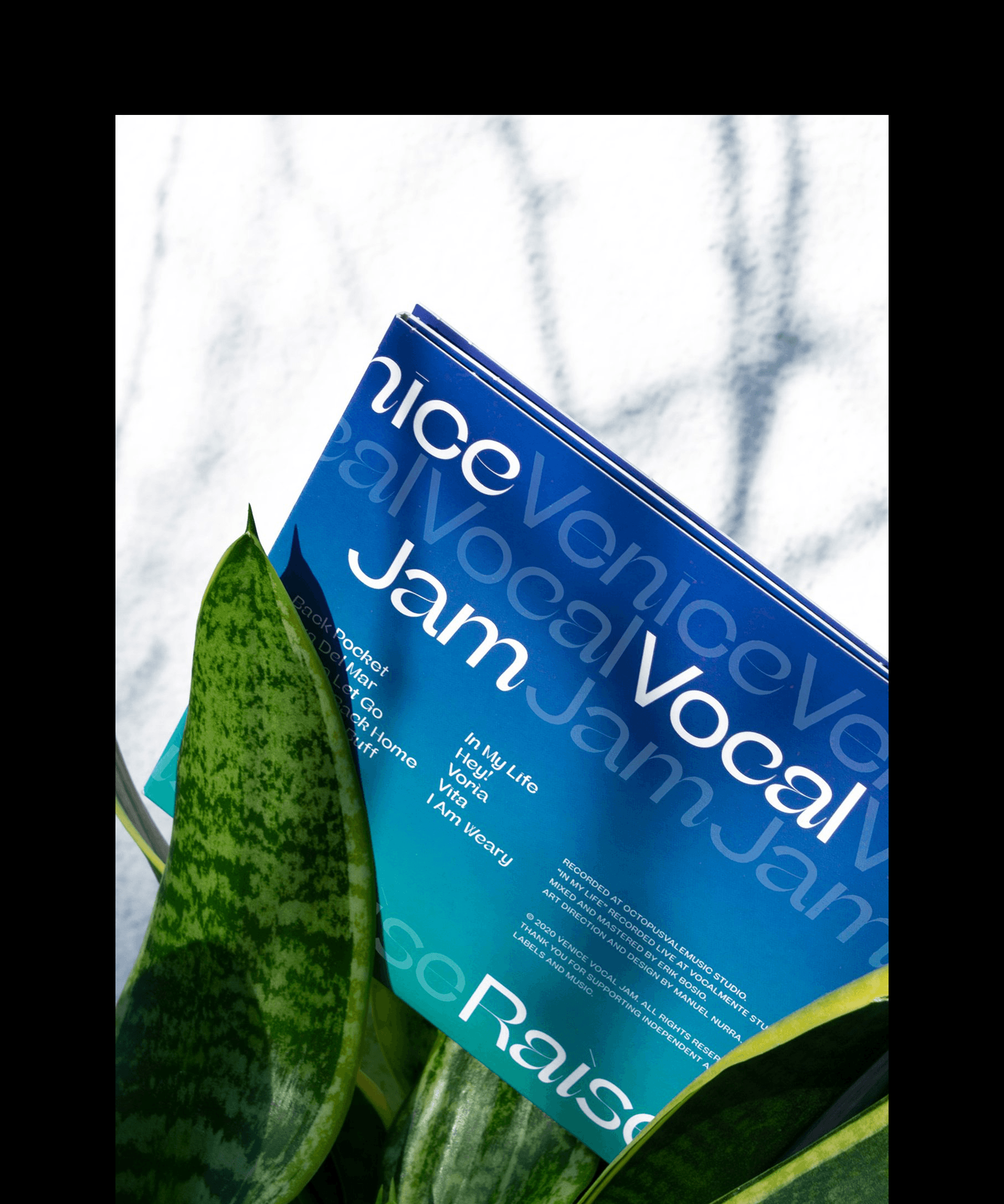
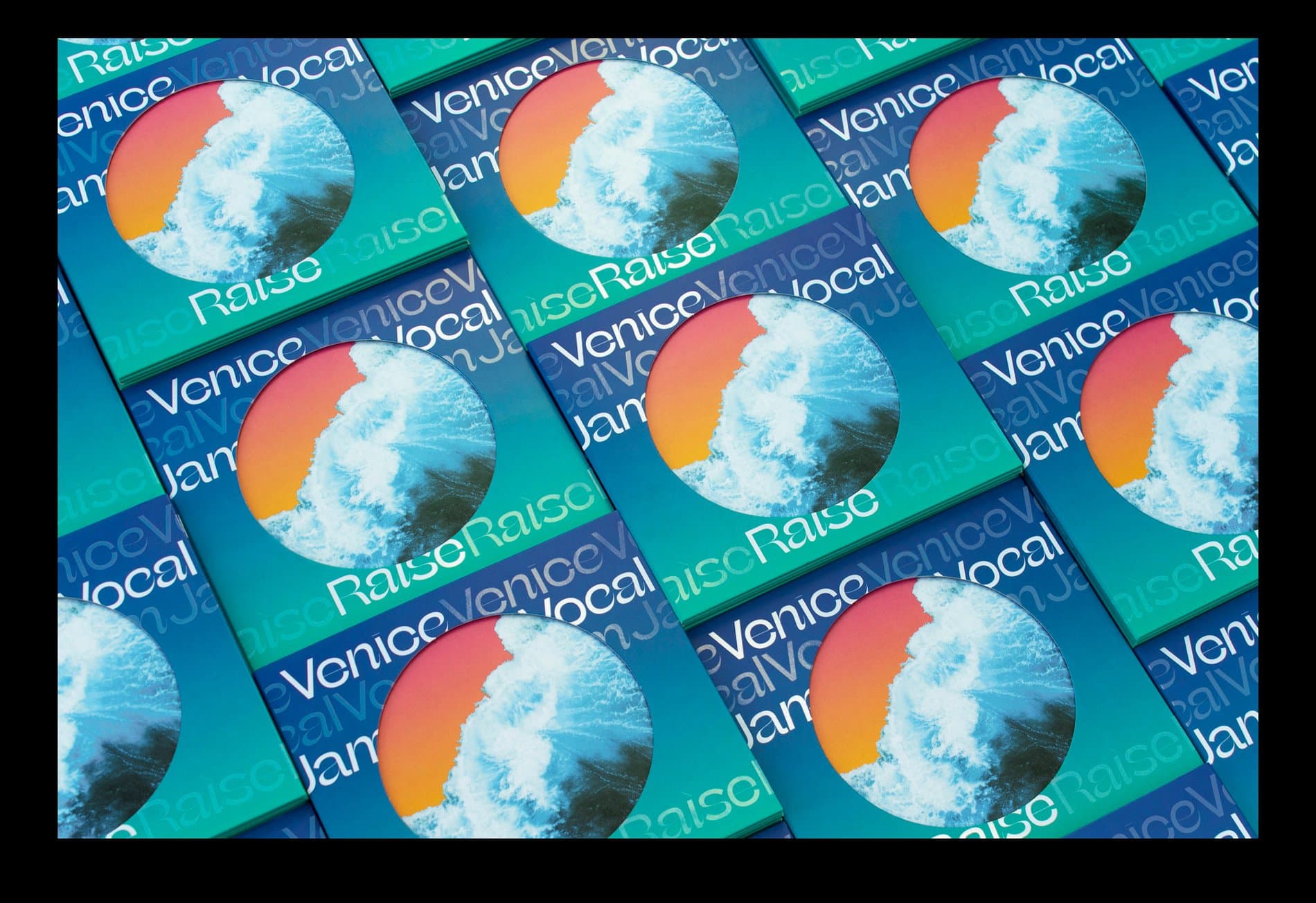
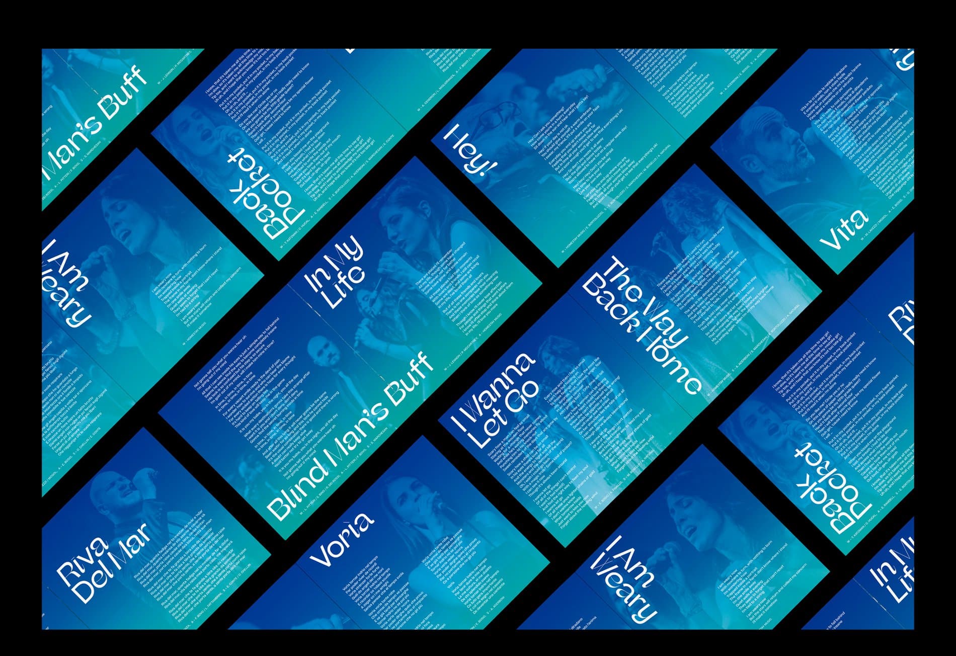
Venice Vocal Jam is a seven-member Italian a cappella group. Their debut album Raìse is named after a Venetian word meaning “origin” or “heritage.” In response to the concept of one's roots, designer Manuel Nurra chose the Venice lagoon as the main graphic element. Nurra also shared with us how the album’s typography, driven by Beatrice and Beatrice Display, echoes the album’s visuals of flowing water.
“Beatrice Display’s high-contrast shapes evoke the fluid dynamism of water,” Nurra says. “This dynamism is highlighted by mixing Italic and Regular styles and the repetition of words simulates the movement of flowing water, altogether characterizing Venice.”
Client: Venice Vocal Jam
Designer:Manuel Nurra
Typefaces:Beatrice Display & Beatrice
Show us your latest project using our typefaces by getting in touch or tagging us on social media.
IG: @sharp_type TW: @SharpTypeCo
Featured Fonts
Featured Fonts