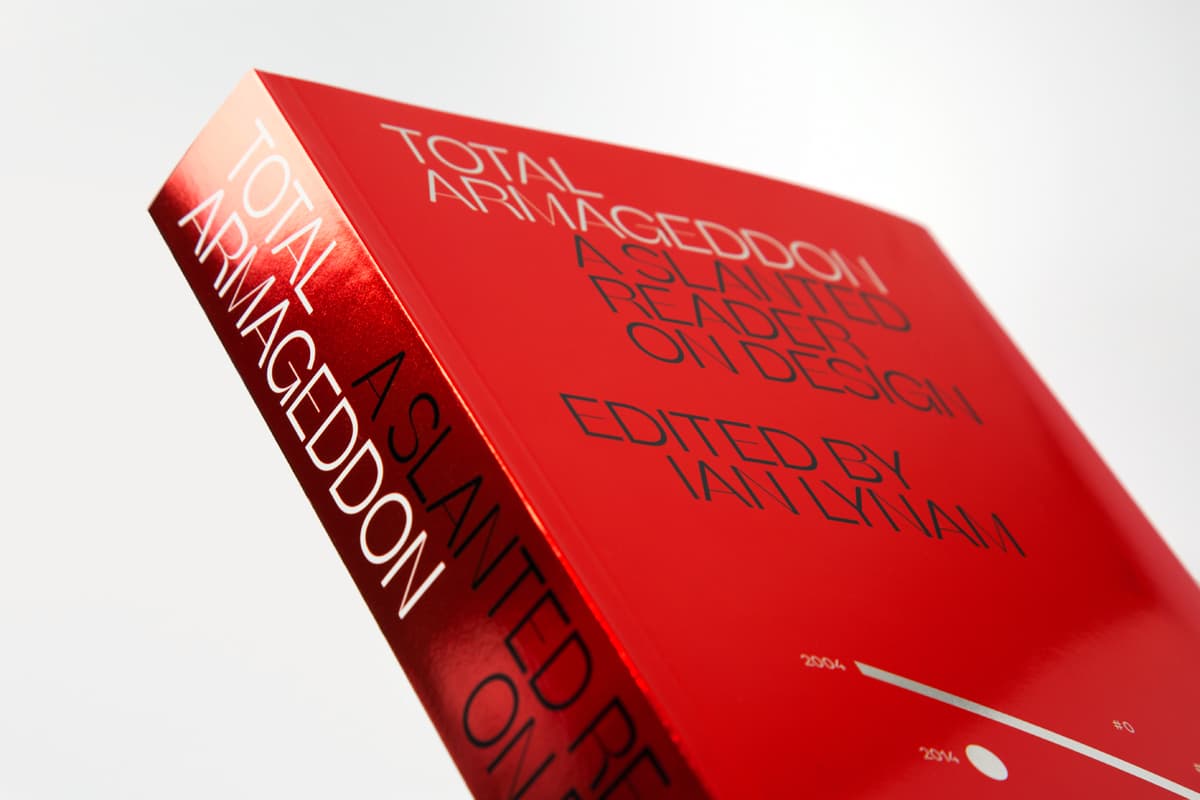
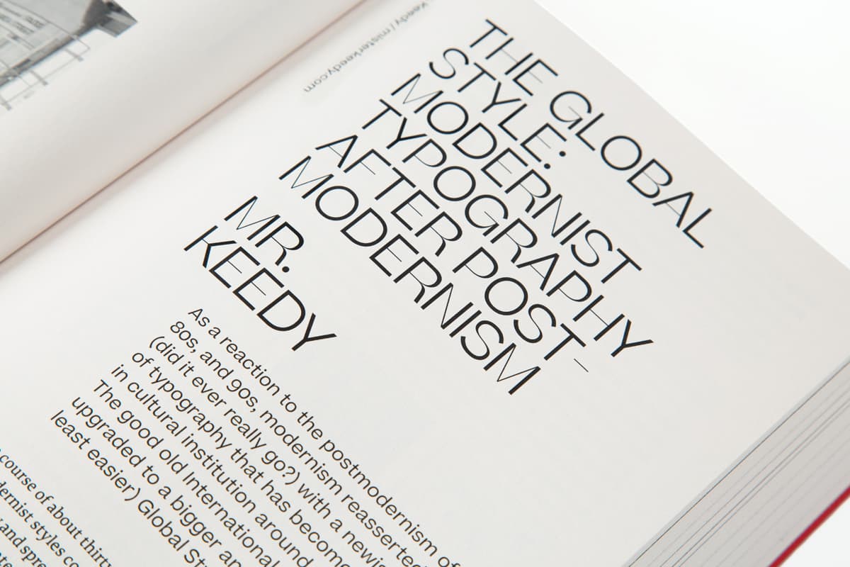
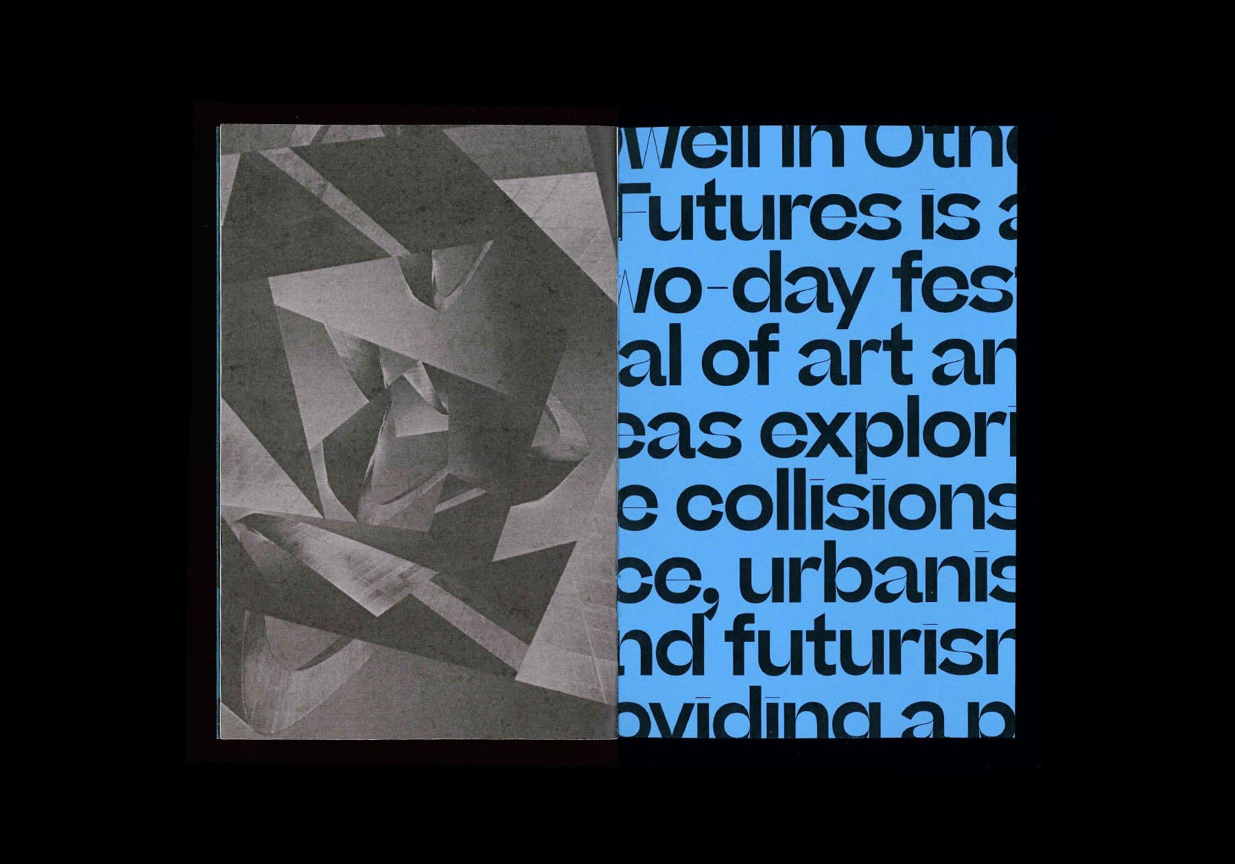
Beatrice Display
Beatrice Display is the family flagship. It's a visual oddity, instantly indelible, and a striking example of the Internal Contrast methodology. In addition to its notably high contrast, the extremely cozy spacing, finely wrought apertures, and dramatic hairlines lend the Display an exuberance that almost lifts it off the page. Because the details demand to be seen, we don’t recommend using Beatrice Display at point sizes below 60pt.
AAAAAAA BBBBBBB CCCCCCC DDDDDDD EEEEEEE FFFFFFF GGGGGGG HHHHHHH IIIIIII JJJJJJJ KKKKKKK LLLLLLL MMMMMMM NNNNNNN OOOOOOO PPPPPPP QQQQQQQ RRRRRRR SSSSSSS TTTTTTT UUUUUUU VVVVVVV WWWWWWW XXXXXXX YYYYYYY ZZZZZZZ
An Italian film and television actress who appears in more than 70 films between 1960 and 1998.
In Roman times, modern Friuli Venezia Giulia was located within Regio X Venetia et Histria of Roman Italy. The traces of its Roman origin are visible all over the area. In fact, the city of Aquileia, founded in 181 BC, served as regional capital and rose to prominence in the Augustan era. Following the Lombard settlements in the 6th century, the historical paths of Friuli and Venezia Giulia began to diverge. In 568, Cividale del Friuli (the Roman Forum Iulii (from which the name Friuli is derived)) became the capital of the first Lombard dukedom in Italy. In 774, the Franks, favored the growth of the church of Aquileia and established Cividale as a march.
GGGGGGGG
THE FLORENTINE REPUBLIC 59 B.C.
The Marche region is bordered by Emilia-Romagna and the republic of San Marino to the north, Tuscany to the west, Umbria to the southwest, Abruzzo and Lazio to the south and the Adriatic Sea to the east. Except for river valleys and the often very narrow coastal strip, the land is hilly. A railway from Bologna to Brindisi, built in the 19th century, runs along the coast of the entire territory. Inland, the mountainous nature of the region, even today, allows relatively little travel north and south, except by twisting roads over the passes.

1111111 2222222 3333333 4444444 5555555 6666666 7777777 8888888 9999999 0000000 &&&&&&&
Versace, Prada, Armani, Dolce & Gabbana, Missoni, Valentino, Trussardi, Moschino, Zegna
The Italian fashion, textile and accessories sector is one of the most important in the world for revenue generated, number of people employed, and the number of companies involved. Surrounded and crossed by major mountain chains and with few (but fertile) plains, the region has a relief that is dominated by hilly country used for agriculture.


EEEEEEE
Calabria is a region in Southern Italy bordered by Basilicata to the north, the Ionian Sea to the east, the Strait of Messina to the southwest,
The great names in Italian art through the centuries make a long list that includes, among many others, Giotto, Donatello, Filippo Brunelleschi, Michelangelo, Leonardo da Vinci, Titian, Bernini, and Tiepolo.
Emilia-Romagna one of the wealthiest and most developed regions in Europe, with the third highest gross domestic product per capita in Italy
The region is bordered by East and North Tyrol to the north-east and north respectively, by Graubünden to the north-west, and by the Italian regions of Lombardy to the west and Veneto to the south and southeast. It covers 13,607 km2. It is extremely mountainous, covering a large part of the Dolomites and the southern Alps.
SSSSSSSS
Taken as a whole, the Beatrice superfamily makes full use of the wide spectrum of optical sizes defined by the extrema of Display and Standard. All four styles share a common framework and contrast logic, with point sizes broadly determining each subfamily’s application.

Tuscany borders the regions of Liguria to the northwest, Emilia-Romagna to
Tuscany has a western coastline on the Ligurian Sea and the Tyrrhenian Sea, among which is the Tuscan Archipelago, of which the most significant island is Elba. Tuscany has an area of approximately 22,993 square kilometres (8,878 sq mi).
During the Republic's history, Florence was an important cultural, economic, political and artistic force in Europe. Its coin, the florin, was the dominant trade coin of Western Europe for large scale transactions and became widely imitated throughout the continent. During the Republican period, Florence was also the birthplace of the Renaissance, which is considered a fervent period of European cultural, artistic, political and economic "rebirth". Battles first began between the Cerchi and Giugni at their houses in the Via del Garbo; they fought day and night, and with the aid of the Cavalcanti and Antellesi the former subdued all that quarter: a thousand rural adherents strengthened their bands, and that day might have seen the Neri's destruction if an unforeseen disaster had not turned the scale. The Ghibellines were supporters of the noble rulers of Florence, whereas the Guelphs were populists. The Ghibellines, who had ruled the city under Frederick of Antioch since 1244, were deposed in 1250 by the Guelphs. The Guelphs led Florence to prosper further. Their primarily mercantile orientation soon became evident in one of their earliest achievements: the introduction of a new coin, the florin, in 1252. It was widely used beyond Florence's borders due to its reliable, fixed gold content and soon became one of the common currencies of Europe and the Near East. The same year saw the creation of the Palazzo del Popolo.
Florence's population continued to grow into the 13th century, reaching 30,000 inhabitants. As has been said, the extra inhabitants supported the city's trade and vice versa. Several new bridges and churches were built, most prominently the cathedral of Santa Maria del Fiore, begun in 1294. The buildings from this era serve as Florence's best examples of Gothic Architecture. Politically, Florence was barely able to maintain peace between its competing factions. The precarious peace that existed at the beginning of the century was destroyed in 1216 when two factions, known as the Guelphs and the Ghibellines, began to war. The Ghibellines were supporters of the noble rulers of Florence, whereas the Guelphs were populists. The Ghibellines, who had ruled the city under Frederick of Antioch since 1244, were deposed in 1250 by the Guelphs. The Guelphs led Florence to prosper further. Their primarily mercantile orientation soon became evident in one of their earliest achievements: the introduction of a new coin, the florin, in 1252. It was widely used beyond Florence's borders due to its reliable, fixed gold content and soon became one of the common currencies of Europe and the Near East. The same year saw the creation of the Palazzo del Popolo. During World War II the city experienced a year-long German occupation (1943–1944) being part of the Italian Social Republic. Hitler declared it an open city on 3 July 1944 as troops of the British 8th Army closed in.[33] In early August, the retreating Germans decided to demolish all the bridges along the Arno linking the district of Oltrarno to the rest of the city, making it difficult for troops of the 8th Army to cross. However, at the last moment Charles Steinhauslin, at the time consul of 26 countries in Florence, convinced the German general in Italy that the Ponte Vecchio was not to be destroyed due to its historical value. Instead, an equally historic area of streets directly to the south of the bridge, including part of the Corridoio Vasariano, was destroyed using mines. Since then the bridges have been restored to their original forms using as many of the remaining materials as possible, but the buildings surrounding the Ponte Vecchio have been rebuilt in a style combining the old with modern design. Shortly before leaving Florence, as they knew that they would soon have to retreat, the Germans executed many freedom fighters and political opponents publicly, in streets and squares including the Piazza Santo Spirito.