Crocs X MCM
Brand collaborations are a sign of the times. From global conglomerates to niche artisans, it seems that everyone has been co-creating limited capsule collections and experiences across the bandwidth of industry.
Brand collaborations are a sign of the times. From global conglomerates to niche artisans, it seems that everyone has been co-creating limited capsule collections and experiences across the bandwidth of industry.
In New York City, it’s impossible to keep track of this summer’s chef residencies and natural wine pop-ups; DJs not only hold court at reopened clubs and brand new listening bars, but also at upstate hotels, fine arts museums, homeware studios, and vintage boutiques. This isn't a criticism, just a synecdochic statement of fact. Community-building becomes inextricably linked to cross-promotion, and this paradoxically emphasizes the luxuries of limited quantity, low access, and experiential ephemera to one’s digital audience. Retail fashion has a long history of cross-brand collaboration, and it’s the industry that best defines the times. In our post-lockdown world, perhaps no brand has better realized the varyingly inspiring, hilarious, and downright perplexing potential of cross-brand collaboration than Crocs.
The first Crocs were introduced in 2001 at a boat show in Fort Lauderdale. 200 initial pairs were produced by the Colorado-based brand, who had purchased the design rights from a studio in Quebec City. Crocs has since gone on to sell over 300 million pairs of its clogs. In recent years, through a nimble digital marketing strategy and the keen attention they pay to the cultural landscape and their expanding audience, the company has pivoted its identity. Crocs are still considered ugly, but they’ve become embraced for this quality–plus their alleged comfort. They’ve become the ubiquitous ugly shoe: universally recognized, increasingly beloved. Crocs presaged and currently embody the ugly-fashion aesthetic du jour, and their latest collaboration with MCM is no exception.
Back in 2019, Connor Davenport and Sharp Type were approached by the German leather luxury goods company to refresh their iconic logo. We did a recent case study of this project which conveys the complex task of wholly adjusting a brand’s logomark while retaining its essence. In search of the right direction, we had to create meaningful connections in the design--for ourselves and for our client--by researching German typefaces with regard to not only letterform, but also geography and relational history, and then applying them to the design process.
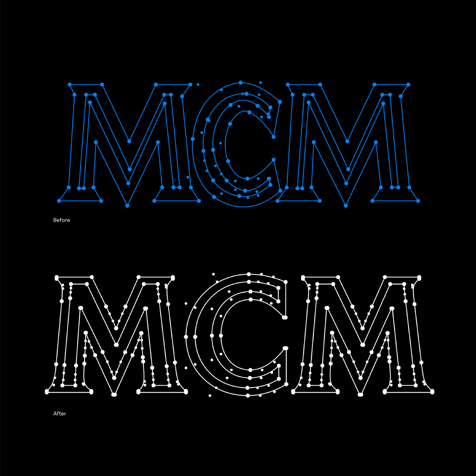
At left: diagram of MCM's original logo (above) and Sharp Type's refresh (below). At right: the final revised monogram & decal
We’ve come across a few applications of the new MCM Visetos monogram and decal, but we are particularly taken by these Crocs, which debuted at the end of June 2022. Released in two styles, the MCM X Crocs are an aesthetic horror and an alchemical marriage of two distinct design sensibilities. They share a more robust construction and an assortment of removable MCM-engraved metal Jibbitz; they also showcase the scalability of the refreshed monogram and winged decal, which took months and rounds of revisions to perfect. Römische Antiqua, arguably the most popular serif typeface in Germany during the late 1800s, was released by Genzsh & Heyse; its capital forms became the model for our design for the updated monogram.
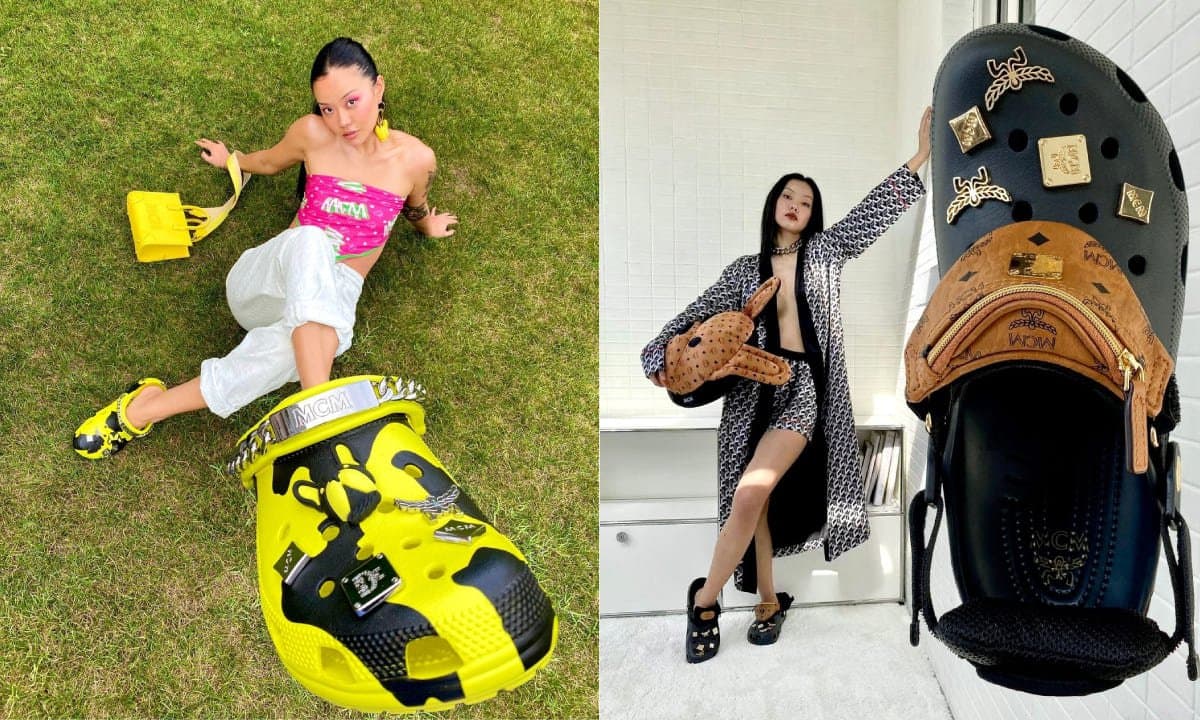
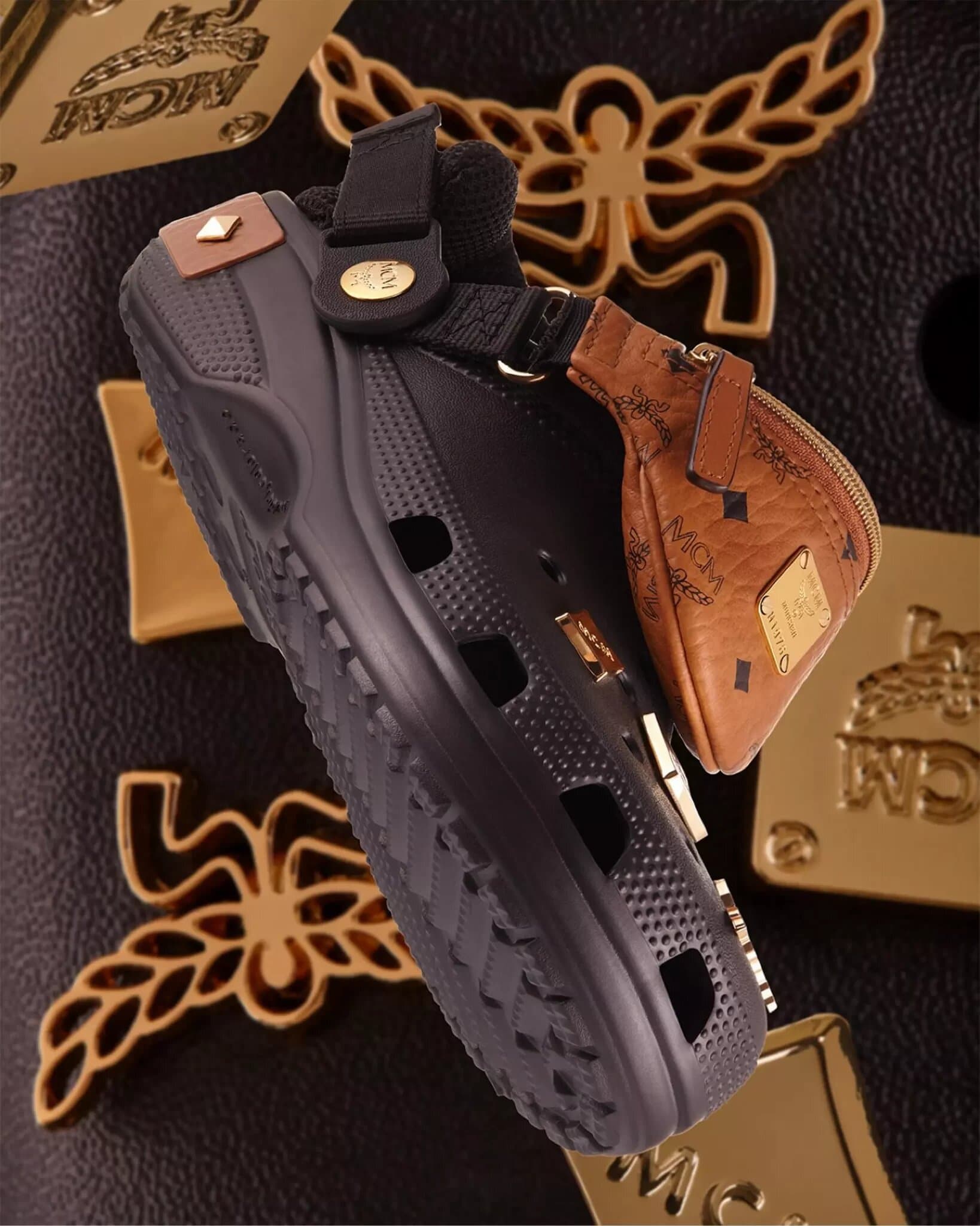
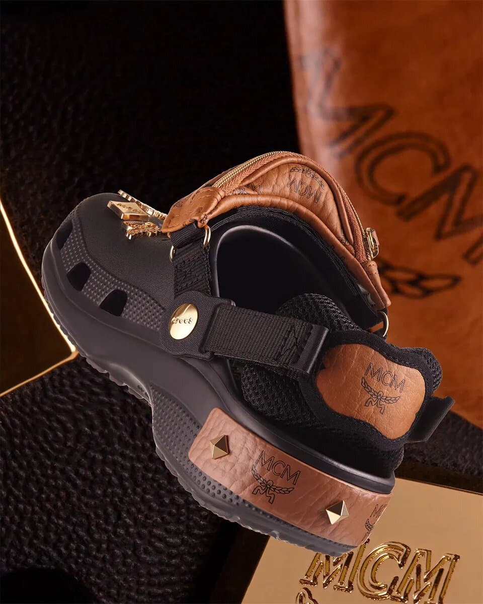
The two styles of the MCM X Crocs collab: the "Camouflage Print" on the left; on the right, the "Belt Bag" version in black
The yellow “Camouflage Print” features the M Pup charm and a winged silver dog collar. But, with its detachable mini leather belt bag, padded heel strap, and 24-carat gold-plated Jibbitz, it’s the “Belt Bag” version that fully realizes this collaboration. Bold leather-n-gold has been the foundation of MCM since its inception during the 70s in the disco capital of Munich, and what could be more emblematic of this excess than a fully-loaded foam clog that can be found on the sneaker reseller market for upwards of $600?
As a type design studio, our expertise is specific and deep, but our work is broadly applied in contexts that we could never imagine. In the past few years, collaborations have become the default marketing strategy in the world of branding, and they are often communicated as narrative stories for emotional impact. Typefaces themselves encapsulate countless histories that tangent and intertwine, threading an inarticulable narrative of its design (and the designers who design them) that only takes true shape in the final letterforms. Applied to the leather heel strap of a pair of Crocs, this consideration is easy to overlook. In a commercial world where stories are taken for granted and collaboration tends to mean something distinct from a genuine relationship, it’s grounding to come across these shoes and feel a measure of levity about it all–and to wonder what it means that we are considering a purchase of our own first pair of Crocs.
A Brief & Incomplete History of the Shoe Stash Pocket (Type Edition)
A Brief & Incomplete History of the Shoe Stash Pocket (Type Edition)
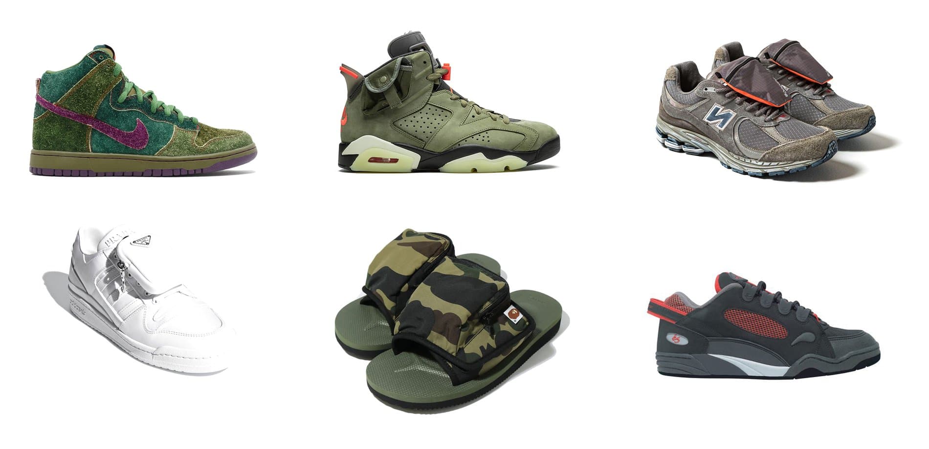
The “Belt Bag” version of the MCM Croc had us laughing down memory lane. The “stash pocket” has a storied history in sneaker culture. They originated as a key holder for runners in the 80s before being adopted by skaters in the late 90s to hide contraband. 2022 sees the pocket fully evolved into detachable pouches that have become commonplace on special-edition shoes. As sportswear, streetwear, and luxury brands continue to collaborate and converge influences (and prices) towards a common end, the mini leather pack that sits atop this MCM Croc might be the epitome of an amazing trend: where utilitarianism becomes a design concept and marketing feature that is distinct from utilitarianism itself.
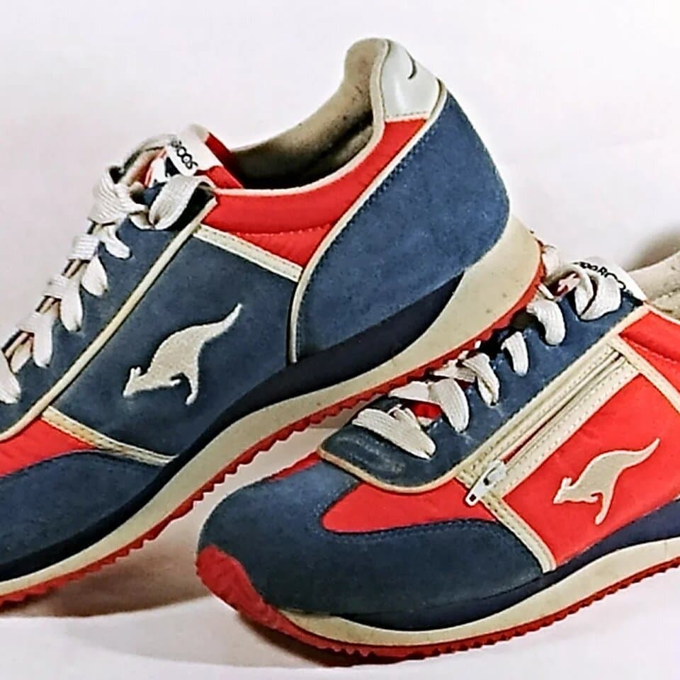
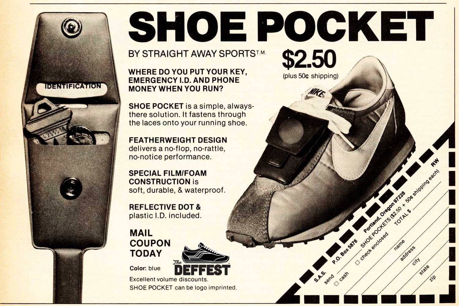
KangaROOS (1979)
The OG. The zippered pocket became the calling card for this running shoe, which capitalized on the American jogging craze of the 70s. It was the idea of Bob Gamm, a jogging enthusiast and architect who wanted a place to stash his key as he preferred to run in clothing without pockets. The shoes became immensely popular with school kids upon its release; tangentially, Crocs have become a go-to school shoe for American femme teenagers in recent years, too. The logotype leans on the perfect circulars of Futura.
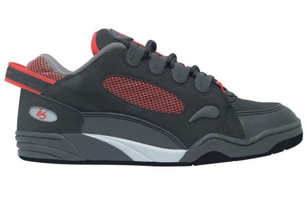
éS Chad Muska Pro (1997)
The Muska Pro foreshadowed much: as the first skate shoe to hit the $100 retail mark, it foretold the eventual intersection of streetwear aesthetics with luxury pricing; with the application of tech-forward materials, it bridged the lifestyle connotations of skate culture with the performance-driven technology of high-end sportswear; finally, its borderline cartoonish profile pioneered the puffy skate shoe aesthetic of the late 90s. Designed by legend Chad Muska and shoe designer Franck Boistel, the sly marketing of this shoe featured its velcro-sealed tongue pocket. éS debuted as the higher-end sub-brand of Sole Technology, and its swooping hand-drawn logomark was designed to distinguish it from those of sibling brands etnies and emerica, both of which used simple lowercase sans serifs.
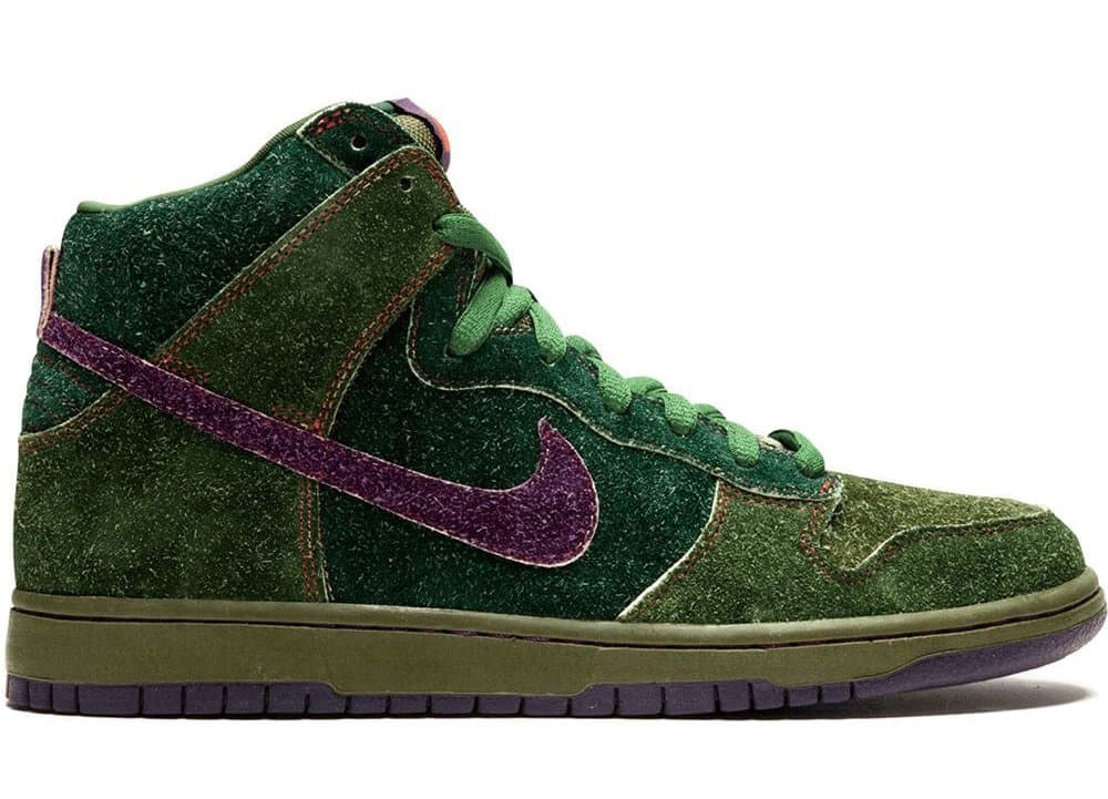
Nike Hi SB “Skunk” Dunk (2010)
The 2000s saw legacy shoe brands begin to cheekily co-opt some exaggerated idea of skate culture, turning activity into lifestyle and courting sneaker collectors in the process with capsule releases like this. The hairy suede and saturated color scheme concealed a pocket under the tongue, where the Nike SB custom Futura logotype glows an orange red.
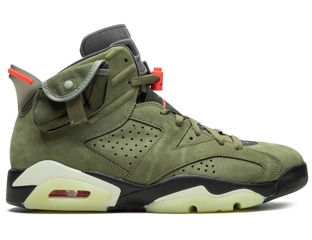
Travis Scott X Air Jordan 6 (2019)
Dali and Warhol are just two early examples of celebrities collaborating with clothing brands. It makes sense that Nike began partnering with influencers beyond the realm of professional sports. Travis Scott's Air Jordan 6 is sculptural and a little ridiculous, in no small part because of the prominent snap-button pouches on its collar. Air Jordan departs from its parent brand by foregoing Futura in favor of Haettenschweiler, a sans serif designed in 1954. The application plays against the condensed letterform design by utilizing wide spacing, giving each letter "air" to breathe and lending the logotype an iconic presence, even at small scales where the letters themselves are barely legible.
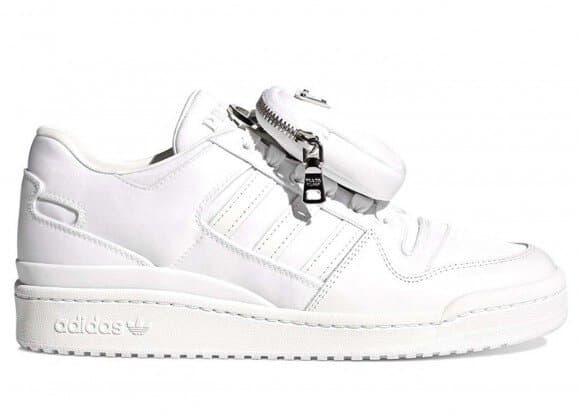
Prada X adidas Forum (Jan, 2022)
Prada dominates this take on the adidas Forum. Released in high and low-top versions in black or white, the shoe's snap-on pouch is made of Prada's proprietary Re-Nylon, which the luxury brand markets as a testament to its sustainable ethos. (The fabric is made via another collaboration: Aquafil, an Italian textile producer, uses ocean plastics to make its yarns.) The unknown legend who designed the font is one of Prada's best kept secrets. The iconic cutout in the leg of the 'R' softens the letterform design, which is itself a remarkable combination of strange angles, severe contrasts, and unique serifs. In every application on this shoe, the Prada logo literally sits above its all-lowercase collaborator's--a custom variation of ITC Avant Garde if internet research is to be believed--denoting its design hierarchy.