MCM Logotype Refresh
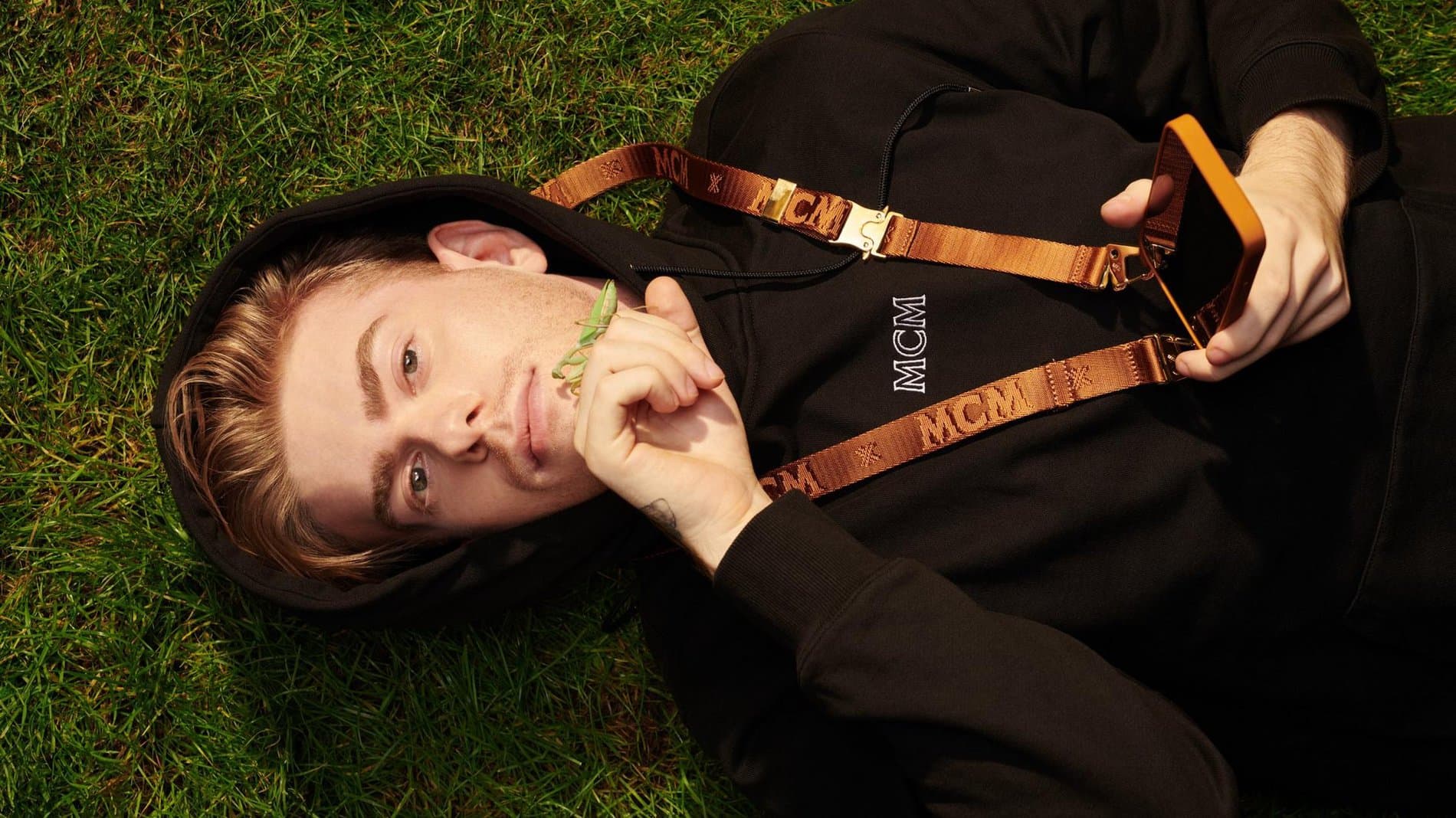
In January of 2019, Sharp Type took on the challenge of redesigning the logo for luxury leather brand MCM. This was no simple task as the distinctive 3-letter logotype and its complementary laurel wreath have been the backbone of the company’s visual identity since its inception in 1976. “MCM” originally stood for “Michael Comer Munich”, a nod to its founder combined with its city of origin. During the 70s, the Bavarian capital was a well-known destination for disco, and MCM became synonymous with the bold aesthetics and progressive ideals spirited upon its sweat-inducing sound. Even Diana Ross, one of the genre’s queens, had a penchant for sporting the brand.
In January of 2019, Sharp Type took on the challenge of redesigning the logo for luxury leather brand MCM. This was no simple task as the distinctive 3-letter logotype and its complementary laurel wreath have been the backbone of the company’s visual identity since its inception in 1976. “MCM” originally stood for “Michael Comer Munich”, a nod to its founder combined with its city of origin. During the 70s, the Bavarian capital was a well-known destination for disco, and MCM became synonymous with the bold aesthetics and progressive ideals spirited upon its sweat-inducing sound. Even Diana Ross, one of the genre’s queens, had a penchant for sporting the brand.
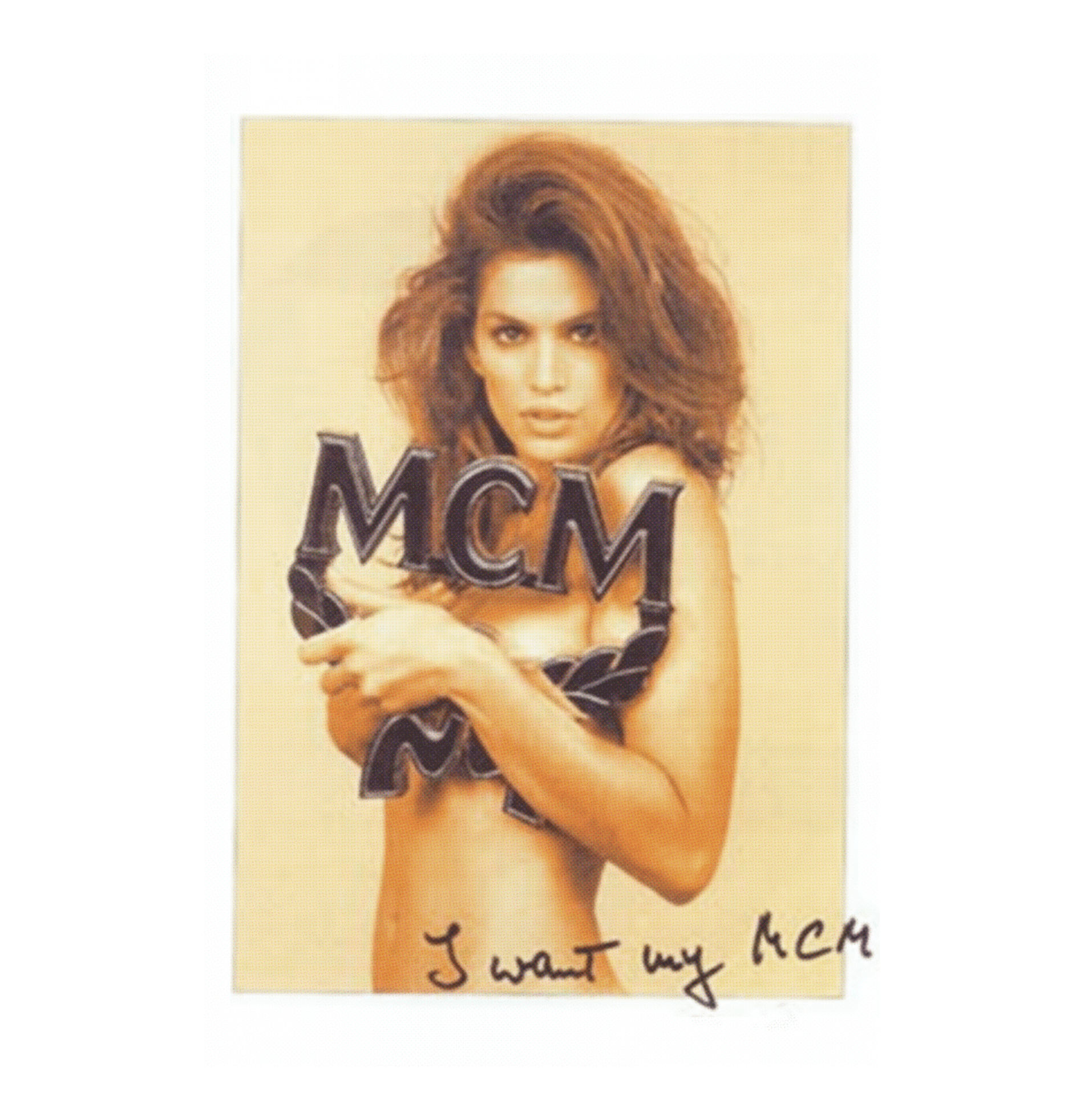
Throughout the decades, MCM maintained its iconic status within different cultural contexts, imprinting itself on the world of 80s hip hop via LL Cool J and Dapper Dan, and then 90s supermodel glam, most memorably captured by an infamous photo of Cindy Crawford wearing nothing but the MCM letters. The new millennium saw a global repositioning of the brand as its ownership changed hands to the Sungjoo Group in South Korea. Under the direction of Chief Visionary Officer, Kim Sungjoo, MCM turned its market east, while savvily presaging the cultural “cool” of its country of origin by opening its new flagship store in Berlin during the mid-2000s.
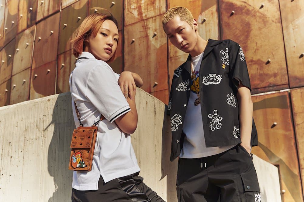
With new ownership, new direction, and new meaning, MCM — now an acronym for “Modern Creation München — approached Sharp Type for a redesign of its logomark. The challenge was to retain the logomark’s original look and spirit — but just make it better.
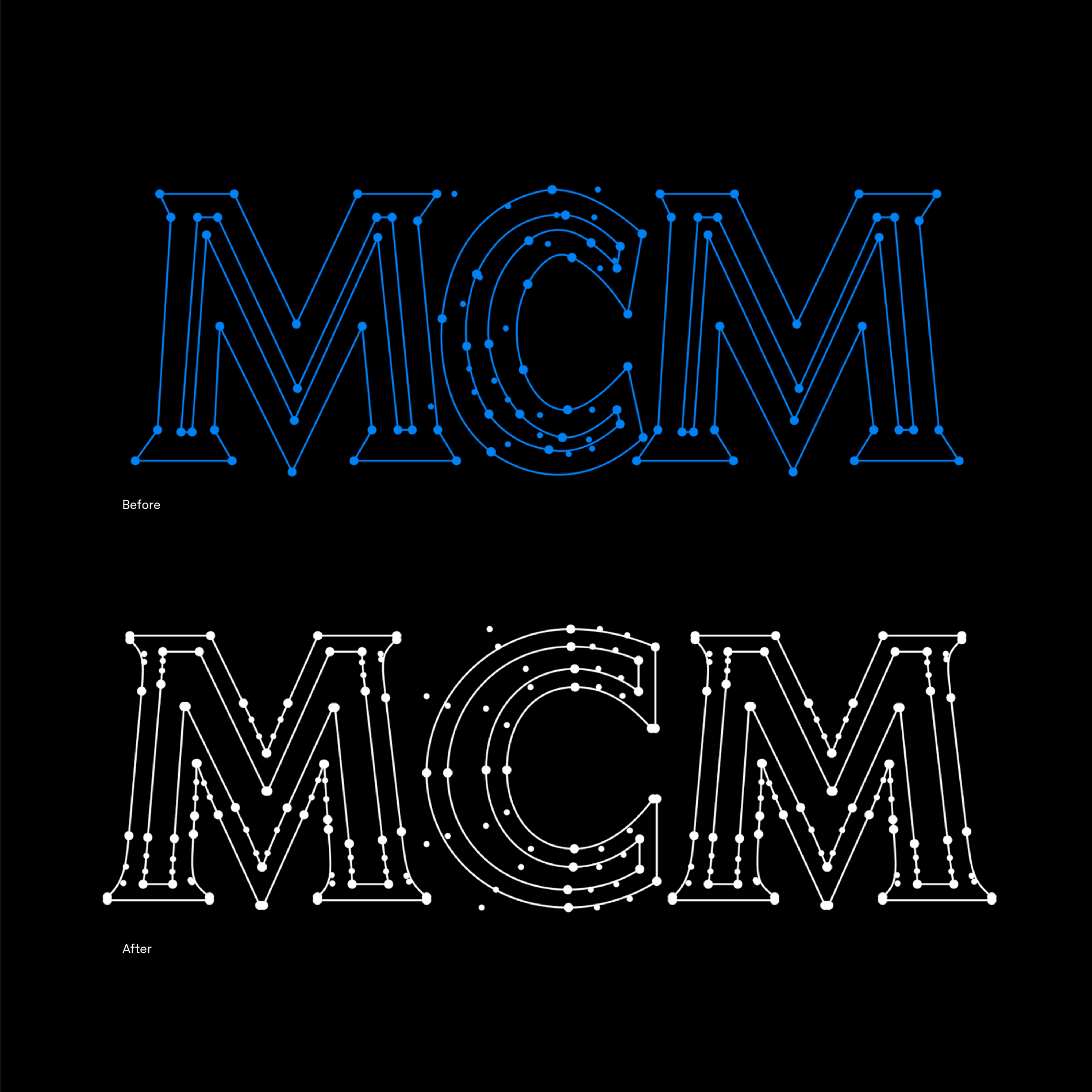
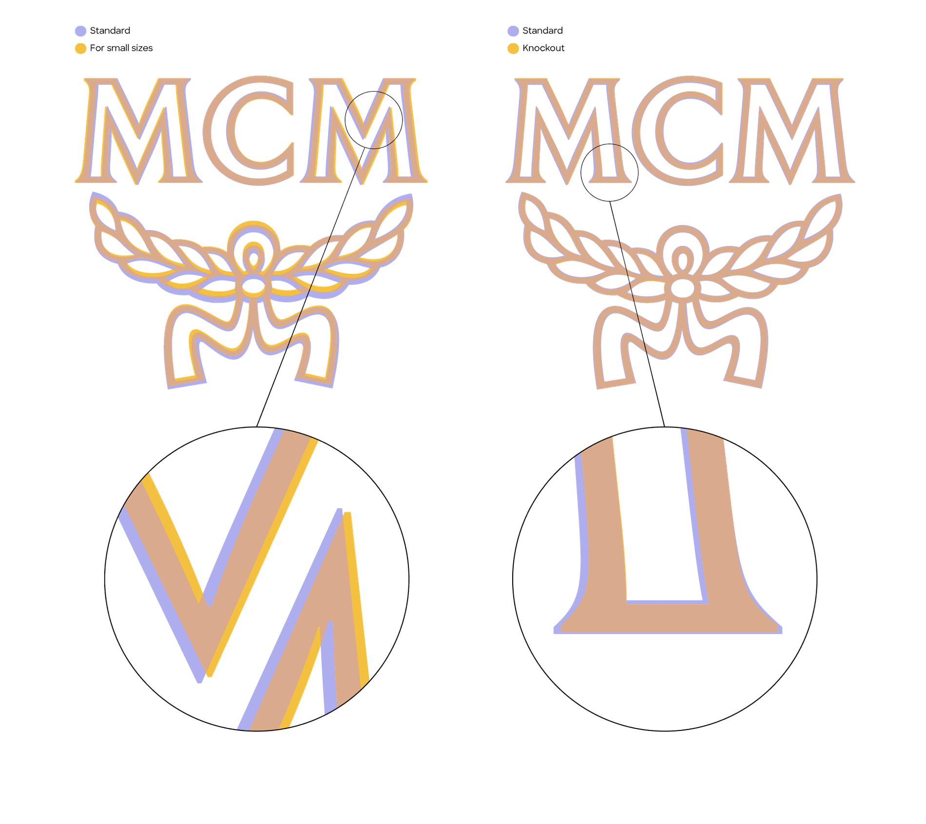
There were several aspects of the old design that we had to take into consideration when drawing the new mark. Subtle adjustments were made to the laurel wreath so that it was better balanced with the monogram: the ribbon was redrawn with a wider flare, and the wings were subtly refined. We optimized the existing letterforms, taking care to to retain their original character. To this end, we adjusted the kerning and weight for better consistency and balance.
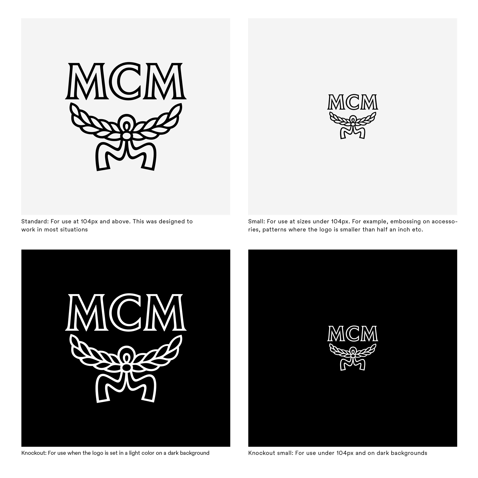
These were immediately clear issues that we could adjust to give the logomark balance. We then considered context. Practically, we had to design the mark to scale flexibly across the spectrum of its diverse applications: to blend in at small sizes in its "Cognac Visetos" diamond pattern; to stand out with a punch when used as a large graphic element or, say, an eye-catching gold-plated belt buckle.
For type inspiration, Sharp Type’s research flew past the 1980s: first to the 1880s, which were the halcyon days of DeVinne Press in New York City; the early 20th century work of Dutch typographer Jan van Krimpen; and even the centuries-old tiled-lettering found throughout European cathedrals. These chimeric references were used to redefine the "bold yet sophisticated" aesthetic that MCM holds so close, but they proved to be only the starting point. Styles like the tile-lettering were found to be too brutalist for the brand, while the letters of van Krimpen ended up being too "fragile" for the demanding settings of MCM's designs.

Type specimens of Römische Antiqua by Genzsh & Heyse, which served as the basis for the final MCM redesign
In the end, the final logotype redesign is based on the work of Genzsh & Heyse, a prominent German foundry with a subsidiary located in Munich. The forms are specifically inspired by Römische Antiqua from 1888, a predecessor to the American DeVinne types. Römische is one of the archetypal 19th’s century German printing types. It exudes the seriousness of a Scotch Roman while concurrently balancing the quirks of the British grotesques.
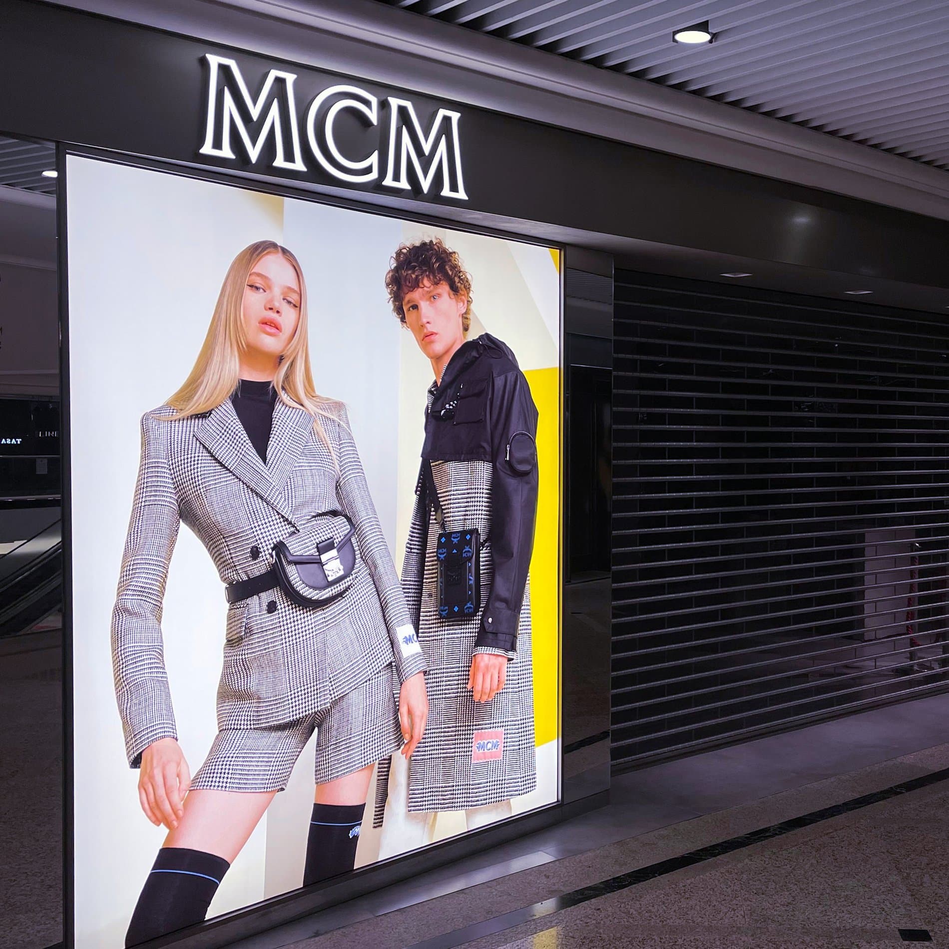
Sharp Type's rebranded logotype at MCM in Hong Kong
Due to the wide variety of graphic applications, the resulting logo is a lower contrast serif whose personality possesses an austerity that exists in good tension with the boldness of the brand. Today, MCM has become something of a “modern classic”. Sharp Type’s subtle evolution of its vintage monogram paradoxically produces a dynamic shift for the brand that may go unnoticed to the casual observer, but can be strongly felt just the same.
Show us your latest project using our typefaces by getting in touch or tagging us on social media.
IG: @sharp_type TW: @SharpTypeCo