Borshch Magazine & Sharp Grotesk
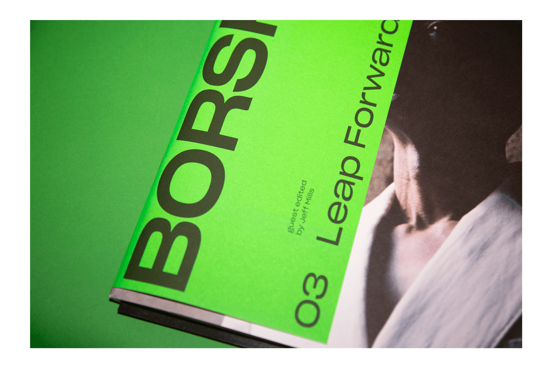
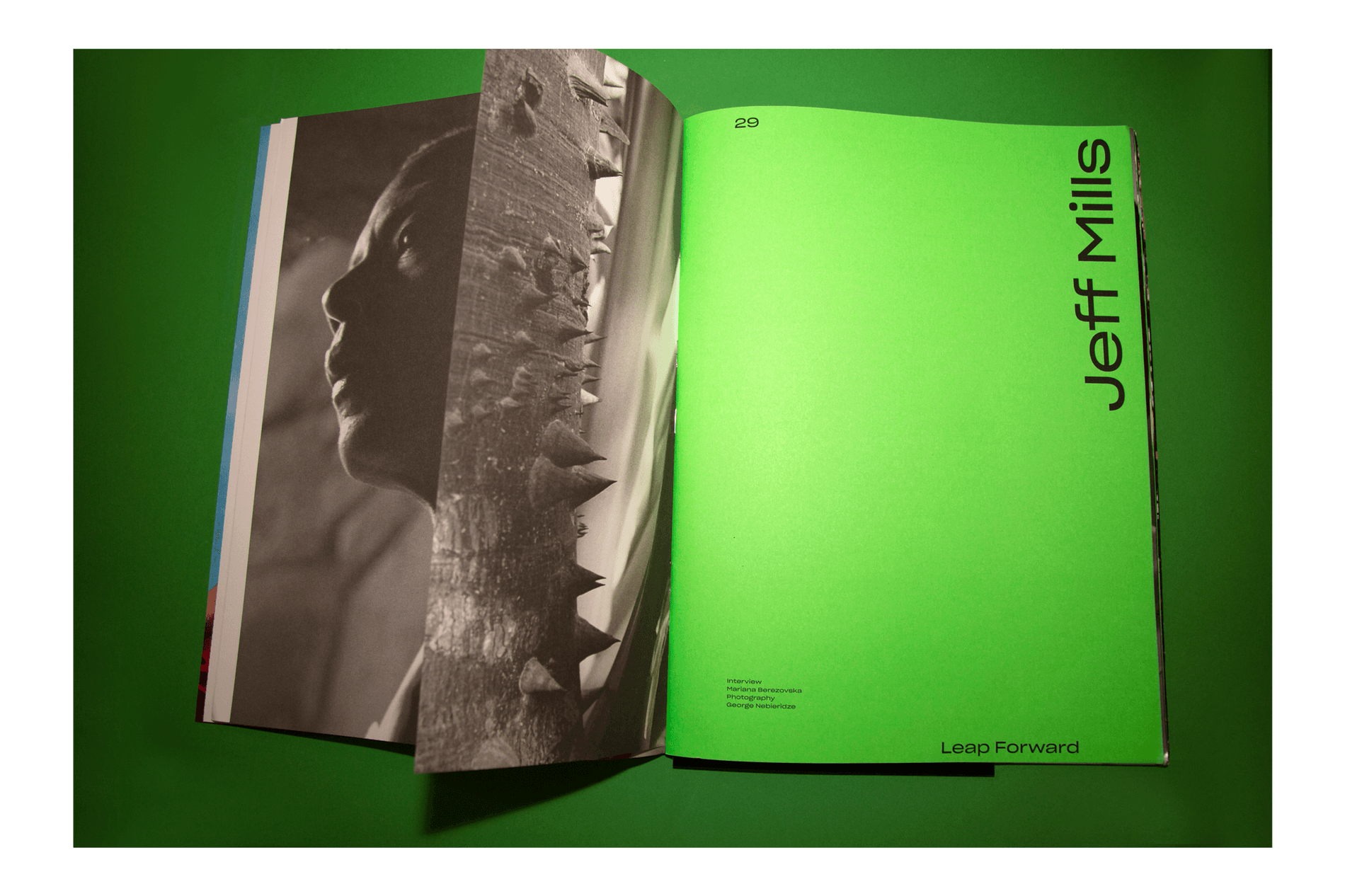
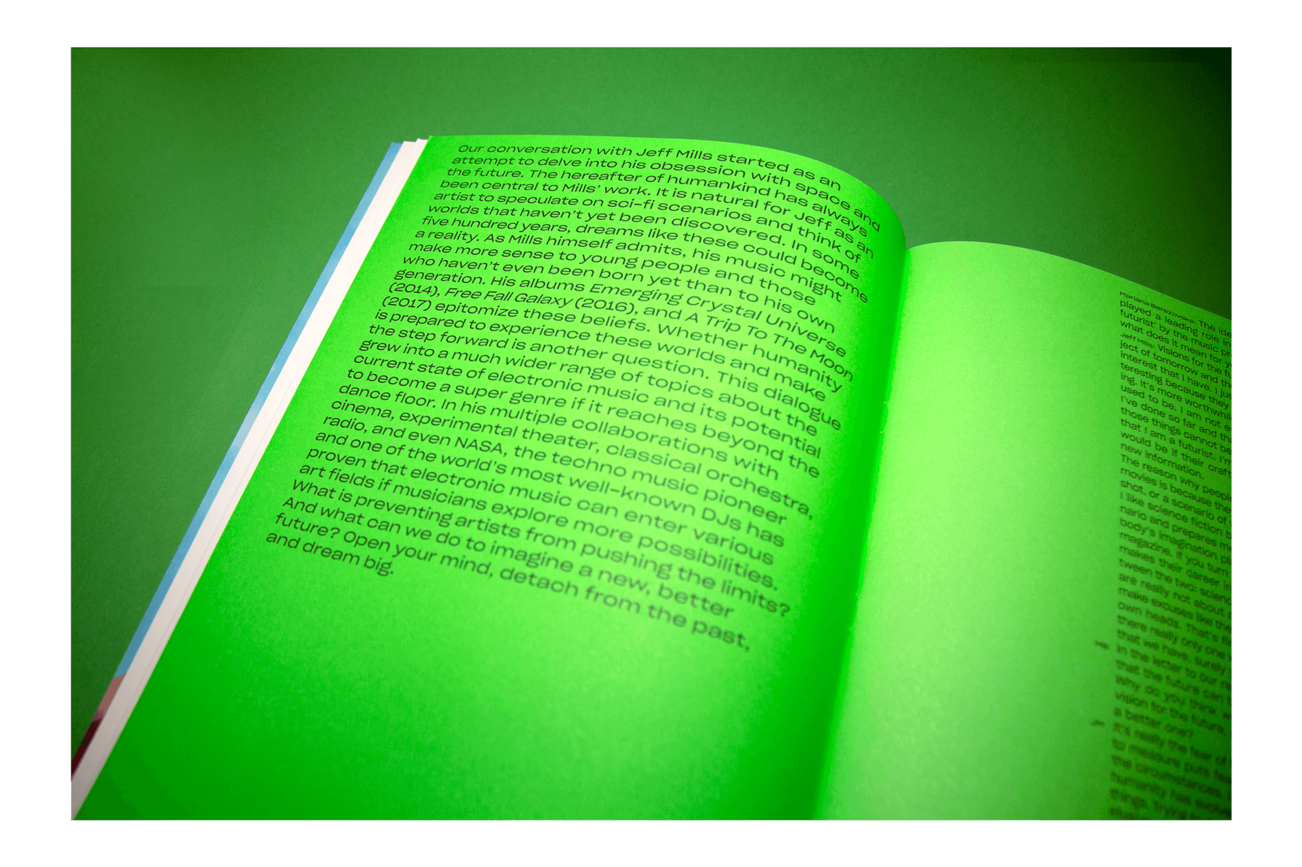
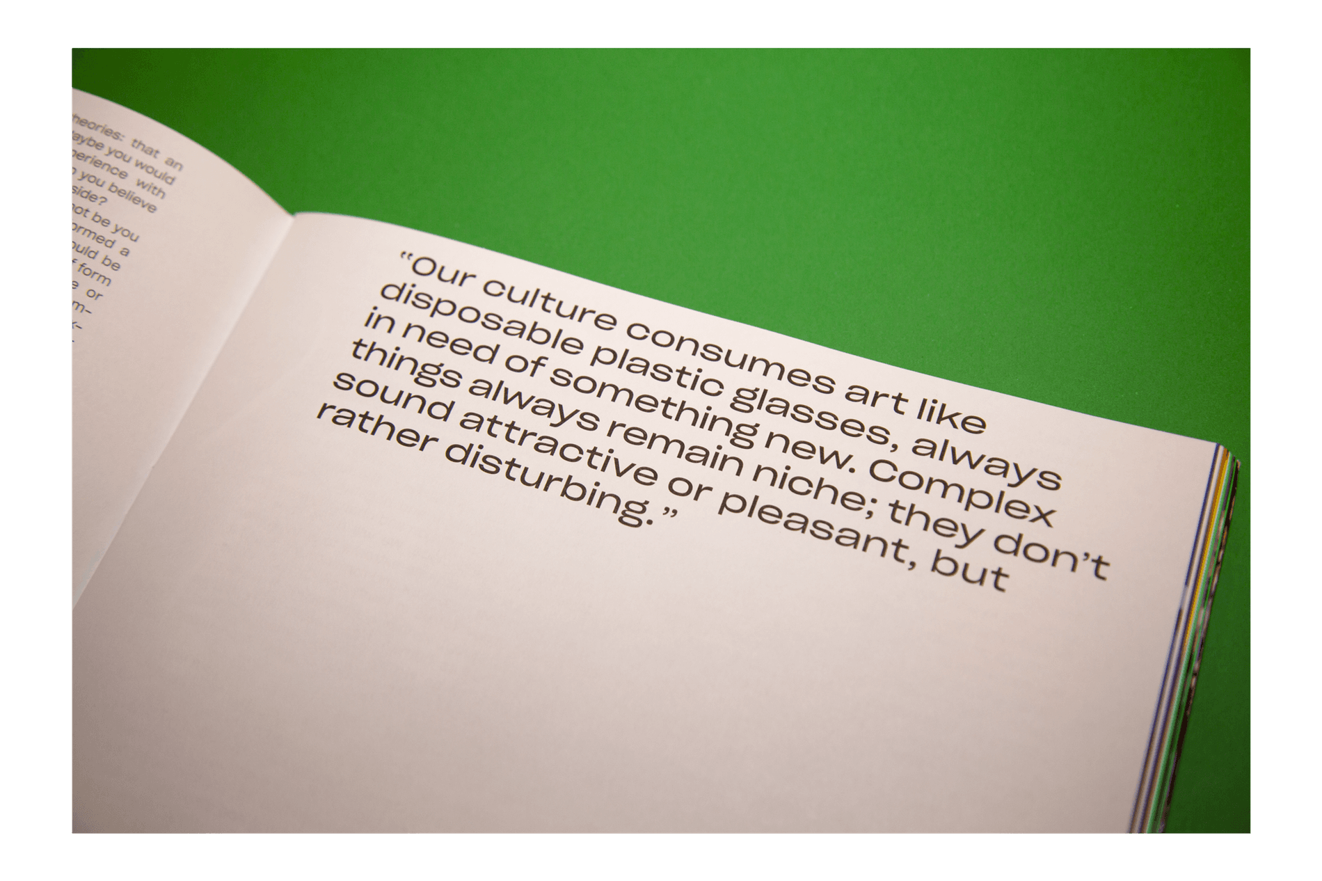
Borshch describes itself as a “magazine about electronic music on and beyond the dancefloor.” The third issue Leap Forward, guest edited by Jeff Mills, an American DJ and composer, speculates on what to expect from music in a technology-driven future.
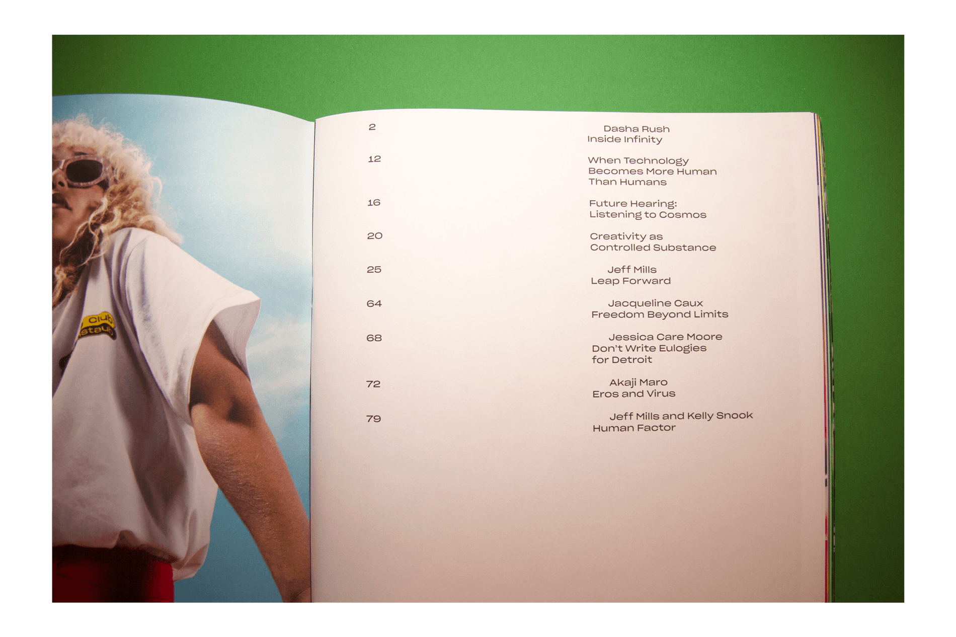
The issue uses Sharp Grotesk as a primary typeface, setting texts that reflect on the connection between techno, Futurism, and Utopianism, as well as interviews with artists who bridge experimental cinema, poetry, modern dance, astrophysics with electronic music.
Client: Borshch
Typeface: Sharp Grotesk
Art Direction: Tiago Biscaia
Borshch describes itself as a “magazine about electronic music on and beyond the dancefloor.” The third issue Leap Forward, guest edited by Jeff Mills, an American DJ and composer, speculates on what to expect from music in a technology-driven future.
The issue uses Sharp Grotesk as a primary typeface, setting texts that reflect on the connection between techno, Futurism, and Utopianism, as well as interviews with artists who bridge experimental cinema, poetry, modern dance, astrophysics with electronic music.
Client: Borshch
Typeface: Sharp Grotesk
Art Direction: Tiago Biscaia
Show us your latest project using our typefaces by getting in touch or tagging us on social media.
IG: @sharp_type TW: @SharpTypeCo
Video by Stack Magazines.