Sharp Grotesk

g
g
g
g
g
g
g
g
g
g
George Clinton, Sade Adu, Cindy Lauper, Kate Bush, Fugees, Aretha Franklin & Nina Simone.
With just enough exceptions to keep them on the radio a little, and those often as tepid as 1994's "I'll Stand by You," the songs on the albums between then and the new Viva El Amor! emulated the concision and riff-riding lyricism of "Brass in Pocket" while doing Ronstadt and Pat Benatar and Cyndi Lauper yet also Meredith Brooks and Chynna Phillips and Samantha Coles. And even if we consider such flights of defiant rhetoric essential to Hynde's musical health--we don't pay her to be right, we pay her to be vivacious and fuck-you--let us note the plight of a younger band led by a strong, blatantly emotional woman. Remember the Cranberries?
Chaka Khan has never bothered with great albums because she has such a great voice - juicy, airy, spunky, transported. Though she's fifty-four, it's also unfrayed, one reason this committed if never classic comeback makes its mark. Another is hot-no-more producers Jimmy Jam and Terry Lewis, who add bite while discreetly leaving the songwriting to the likes of Hendrix, Prince, Sly Stone and the indelible Ed Townsend. Respect as well to Mary J. Blige's New York .
Режиссером 47-минутной ленты стал Геннадий Трунов, который до этого уже снимал фильмы о турах Дорнабанды. Помимо кино, Дорн открыл краудфандинговую кампанию по сбору средств на строительство дома и танцевальной студии для коллектива Masaka Kids Africana. Артисту удалось привлечь к своему благотворительному проекту внимание нескольких танцевальных школ из Нью-Йорка, а также канала CNN.
Even before we get to the predictably muddled lyric or the predictably murky motives of the rich people who sing it, we note that something intellectually suspect is transpiring here: the latest variant on the apparently ineradicable platitude that music is the universal language. If you like, "We Are the World" is no more than lowest-common-denominator MOR dignified with a religious tinge and put in the service of toothless one-worlder do-goodism.
There's confirmation in the opening lines, the first utterly vague and the second utterly banal: "There comes a ' time when we heed a certain call/When the world must come together as one." With notable exceptions Springsteen and (in his warped way) Dylan; committed world-hunger crusader Kenny Rogers; instigator Harry Belafonte, an actual pink - these are performers who are scrupulous not to say chickenshit about keeping their social views,
It included four songs— Puma, Joseph Kobzon, The Gun and Boombastic. Two weeks later, they were hummed in the editorial offices of all major music publications.
It is a mark of Alice Cooper's enduring artistic achievement that after all this time there are still a lot of people who hate his guts. Alice's impact clearly peaked with the Billion Dollar Babies tour of two years ago, and by now most of his foes have cultivated an indifference in which Alice is reduced
R
R
R
R
R
R
R
R
R
R
Bob Dylan, Kenny Rogers, Harry Belafonte, Dean Martin, Iggy Pop, Garth Brooks, Frank Sinatra, Tom Verlaine, Joey Ramone & Sid Vicious


But getting serious about U.K. dance music is not a time-efficient undertaking for those still moved to use their ears, life, or line of credit for anything else. Not only is there too damn much of it, there’s no way to keep track, especially in the U.S., which is not its native land no matter where the mixing board is located. Having stopped following Billboard’s dance charts after too many American divas failed to justify their cult status in the early ‘80s, I was doubly skeptical when the bloodless electrodisco purveyed by such flimsy U.K. legends as 808 State and A Guy Called Gerald
Which she proceeds to prove not by continuing in the obvious rock 'n' roll mama vein of "Popstar," but by racking up two consecutive radio readymades (she and we hope) about long-term love: the midtempo debut single "Human," with a plangent chorus that begins, "Well there's blood and there's veins/And I cry when in pain/I'm only human on the inside," and the slower "From the Heart Down," a harder sell because it's more explicitly domestic and more explicitly sexual (hook: "Love me from the heart down"). And while track four, "Nails in the Road," may not be a sure-shot, how can you not root for a song that begins: "If this is public
Har du någonsin lagt märke till namnet Billy Steinberg? Han är en låtskrivare som fungerar som vad bizzare kallar en sångdoktor - en lyrisk honer, en låtsvängare, en hookfinder. Hynde rådfrågade honom först i 1994 års Last of the Independents, och du kan se varför hon kanske. Det beror på att Steinberg – vanligtvis i samarbete med Tom Kelly – har en specialisering på kvinnor: Linda Ronstadts "How Do I Make You" och Cyndi Laupers "True Colors" och Hearts "Alone", titellåten till Celine Dions Falling Into You och låtar på fem olika Pat Benatar-album, Bette Midler och Whitney Houston och Tina Turner och Belinda Carlisle and the Corrs and the Bangles
ส่วนผลการประกวดในประเภทนักเรียนนักศึกษานั้น วงมัมมี่ ได้เป็ นแชมป์ วงแกรนด์เอ็กซ์ ได้รางวัลรองชนะเลิศคู่กับรางวัลขวัญใจสื่อมวลชนมาครอง ด้วยแนวทางการแต่งตัวที่ เข้าตาสื่อ คือแม้จะเล่นเพลงร็อคดุๆ แต่พวกเขาแต่งตัวสุภาพเรียบร้อย ใส่กางเกงขายาว สีดำา เสื้อเชิ้ ตสีขาว ผูกเนคไท สวนทางกับวงอื่นๆ หลังการประกวด สมาชิกบางคนเรียน จบ โดยแต่ละคนแยกย้ ายกันไปเรียนต่อในระดับอุดมศึกษา แต่นคร เวชสุภาพร ยังคงหา สมาชิกวง โดยลงทุนถึงขนาดสละสิทธิ์ไม่เรียนในมหาวิทยาลัยที่เอ็นท์ติด แต่เลือกที่จะ เรียนในมหาวิทยาลัยเปิ ดที่เพื่อนๆ ส่วนใหญ่เรียนอยู่ เพื่อความสะดวกในการซ้อมดนตรี. วงแกรนด์เอ็กซ์เริ่ มเป็ นที่รู้จักจากการเล่นตามคลับ ตามบาร์ และต่ างจังหวัด โดยเล่นอยู่สักประมาณ 8 เดือน ก่อน ที่เพื่อนๆ บางคนในวงจะลาออกไป นคร เวชสุภาพร จึงได้ออกเดินทางหาสมาชิกคนใหม่ พร้อมกับปรับแนวทางของ วงแกรนด์เอ็กซ์ใหม่เพื่อให้เป็ นวงสตริงคอมโบอย่ างเต็มรูปแบบ ด้วยการเสริมทัพทีมเครื่องเป่ า คือ ชาย แสงชะอุ่ม (แซ็กโซโฟน), เสน่ห์ ศุภรัตน์ (ทรัมเป็ ด) และสมศักดิ์ อภิวัฒน์วีรกุล (ทรอมโบน) เข้ามาในราวปี พ.ศ. 2517 และการ เข้ามาของนักร้องนำาคนใหม่ คือ วสันต์ แต้สกุล (นามสกุลตอนนั้น) ในปี พ.ศ. 2519 มือเบสในยุคก่อตั้งกับมือคีย์- บอร์ดลาออกไป วสันต์จึงต้องหันไปเล่นคีย์บอร์ดอีกทาง ส่วนมือเบสได้แอ๊ด-ทนงศักดิ์ อาภรณ์ศิริ มาแทน
Сергей Шнуров сделал себе имя не только как музыкант, но и как актер, телеведущий, общественный деятель и современный художник. Его картины и инсталляции отличаются не меньшей провокационностью, чем его песни. Так, в Московском музее современного искусства в 2017-м году прошла его выставка «Ретроспектива Брендреализма»— о потребительском безумии, захватившем мир. Сергей Шнуров сделал себе имя не только как музыкант, но и как актер, телеведущий, общественный деятель и современный художник. Его картины и инсталляции отличаются не меньшей провокационностью, чем его песни. Так, в Московском музее современного искусства в 2017-м году прошла его выставка «Ретроспектива Брендреализма»— о потребительском безумии, захватившем мир.
I took one of my periodic vows to get serious about U.K. dance music in London this past June, after my old friend Geoff Travis told me he bought every 12-inch on Goldie's Metalheadz label. "It's like 1977 all over again," the enthusiast who brought the world the Smiths, the Raincoats, Cabaret Voltaire, and Shelleyan Orphan swore, sanely but with that telltale gleam. And so I trekked from the storefront digs of his new Trade 2 label to the
Georgia
Jack DeJohnette keeps the troops in order, injecting more notes and accents than Ginger Baker on double amphetamines into a beat that rocks. Yet this unique sound is evolving fast. Still nominally beholden to theme-and-variation, Black Beauty is soloists' music, and as such the corniest electric Miles on record. Just two months later, on Miles Davis at Fillmore, the fun formula is breaking down. Like all '70s Miles, At Fillmore is more inviting in the wake of ambient techno than it was in 1970, or 1980, but like most ambient techno it fails to cull the mesmerizing from the soothing from the boring. Moreover, several of its high points are provided by some of the most Milesian solos of this era, and that is not what the era was for. One reason jazz old-timers dismiss '70s Miles is that the bands aren't stellar. Here he is, boss-man of Coltrane and Cannonball,
FLYTRONICS: RHODES TUNE, 1997
Neil Young, Wild and Free,Bohemian Rhapsody,
Don’t Stop the Music, The Miami Sound Machine,
The Alman Brothers Band, ABBA
But Geoff, as noted, is an enthusiast, and while I never expected 1977, Alex Reece's "Pulp Fiction" proved much less. At best it's a touch weirder than the "Pulp Friction" remix on Reece's new So Far (Quango), which although it's grown on me is still too reminiscent of the proudly exhumed cocktail-fusion effects acid jazzbos think sound so sophisticated. Anyway, when it comes to pieces of plastic, I do enjoy my creature comforts, which means that these days I prefer mine digitally encoded. Given a scene that hypes rarity as quality and obscurity as authenticity while churning out singles that yoke phony futurism to vinyl fetishism, this is yet another reason not to get too serious. Dance music's natural longform is the compilation, which rarely transcends corporate self-interest. The band’s line-up exemplified the influence of post-war migration on Australian society. The Easybeats began their career in late 1964 at the little-known teen hangout, Beatle Village, located in the basement of a pub at Taylor Square on Oxford Street, in Darlinghurst, Sydney.
Although people do still move their bodies to acid house’s grandchildren and second cousins thrice removed, I can’t be the first to call the current slosh of ambient/jazzbo/jungle pseudogenres “postdance.” Yet the fad hasn’t just hung in there—it has thrived, at least on its own terms, which (as Sarah Thornton establishes in her fact-filled treatise Club Cultures) are inchoate on principle, to discourage squares. The October 2 Melody Maker and NME, for instance, each featured top 10s in what is now usually called drum-and-bass to avoid the racial indecorousness of “jungle.” Not a single record appeared on both lists. Nor was there one duplication between the 10 new releases reviewed in Melody Maker and the 15 in NME. What’s a dabbler to do?

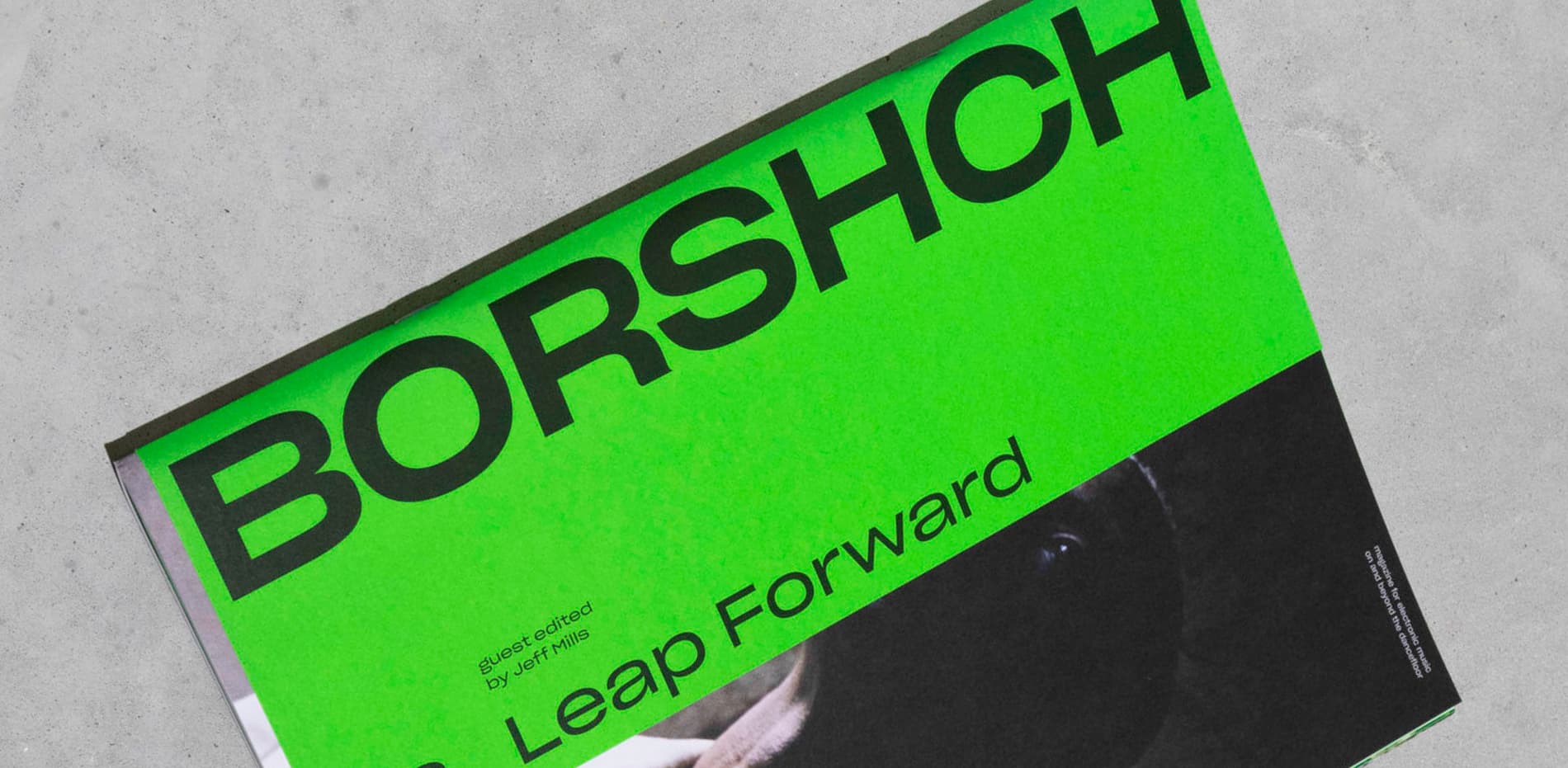
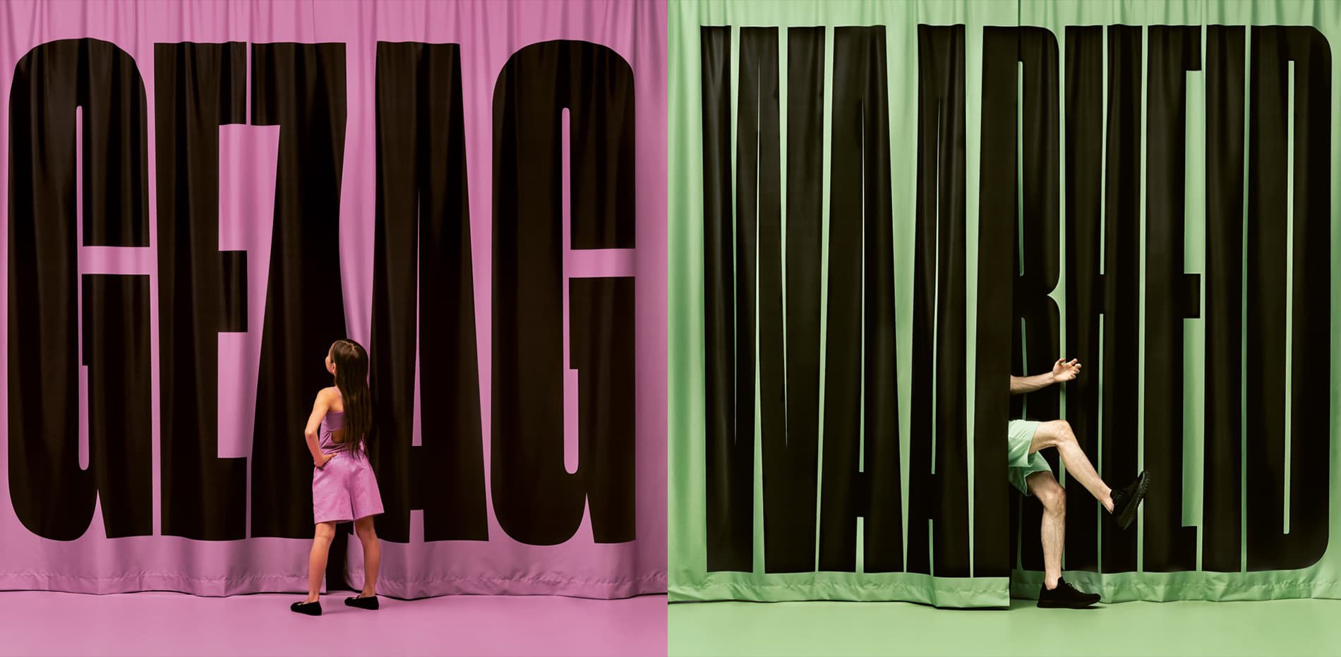
Sharp Grotesk Global is Sharp Type’s largest superfamily to date. It’s our most comprehensive Latin typeface, with twelve weights and seven widths in Roman and Italic styles. Sharp Grotesk now also represents our first multi-script release, with extensions in Greek, Cyrillic, Hangul, and Thai. Finally, a Latin variable font rounds out the collection.
Midnighter, They were one of the best known acts to come out of East L.A. Thee Midniters were among the first Chicano rock bands to have a major hit in the U.S.A. The band was one of the first to integrate horns, an unusual combination of trombone and sax, congas, keyboards, and guitars, with a sound reminicent of Blood, Sweat & Tears. All of the band’s twelve studio albums were in the Top 40 of UK charts. The Band originally formed in the West Midlands by bassist Martin Blunt, who recruited Rob Collins. The debut single “Indian Rope” proved to be an indie hit and the group soon found a major label in Beggars Banquet offshoot Situation Two in time for the release of “The Only One I Know”
В начале 1998 года Земфира переехала из родной Уфы в Москву, где начала работу со своей группой «Zемфира» над первым студийным альбомом, выпущенным спустя год. С 1999 года Земфира выпустила семь студийных альбомов, получивших значительное внимание прессы и публики. Также в её дискографию входят сборник би-сайдов и три концертных альбома. В её лирических исканиях нашли своё воплощение душевные страдания и поиски современной молодёжи. Опера је облик позоришта у којем се драма преноси у целини или углавном кроз музику и певање. Опера се појавила у Италији око 1600-е године и углавном је повезана са западном класичном музичком традицијом. Опера користи многе од елемената говорног позоришта као што су сценографија, костими и глума. Певача у опери прати и музички ансамбл.
Από κατασκευαστική άποψη τα μπουζούκια μπορούν να έχουν διαφορές μεταξύ τους όχι μόνο στον αριθμό των χορδών αλλά και σε άλλα χαρακτηριστικά, π.χ. μήκος μάνικου, πλάτος, ύψος, βάθος του ηχείου ή σκάφους, το πλάτος των ξύλινων φετών του σκάφους. Τις διαφορές αυτές καθορίζει ο κατασκευαστής που με την εμπειρία του και ανάλογα με τον ήχο που θέλει να βγάζει το όργανο, τροποποιεί τα λειτουργικά στοιχεία του για να πετύχει πιο οξύ, πιο βαθύ ή πιο βαρύ ήχο. Το μέγεθος και το είδος του ηχείου παίζουν ρόλο στην τονικότητα του οργάνου ενώ το μήκος του μάνικου, και κατ' επέκταση των χορδών, δίνουν τη διαφορά στην τονικότητα του οργάνου. Εννοείται ότι κάθε μήκος μάνικου έχει διαφορετικό πλάτος τάστων αφού όλα τα μπουζούκια έχουν τον ίδιο αριθμό τάστων. Μεγάλη σημασία στον ήχο έχει και η ποιότητα των ξύλων από τα οποία είναι κατασκευασμένο.
ส่วนผลการประกวดในประเภทนักเรียนนักศึกษานั้น วงมัมมี่ ได้เป็ นแชมป์ วงแกรนด์เอ็กซ์ ได้รางวัลรองชนะเลิศคู่กับรางวัลขวัญใจสื่อมวลชนมาครอง ด้วยแนวทางการแต่งตัวที่ เข้าตาสื่อ คือแม้จะเล่นเพลงร็อคดุๆ แต่พวกเขาแต่งตัวสุภาพเรียบร้อย ใส่กางเกงขายาว สีดำา เสื้อเชิ้ ตสีขาว ผูกเนคไท สวนทางกับวงอื่นๆ หลังการประกวด สมาชิกบางคนเรียน จบ โดยแต่ละคนแยกย้ ายกันไปเรียนต่อในระดับอุดมศึกษา แต่นคร เวชสุภาพร ยังคงหา สมาชิกวง โดยลงทุนถึงขนาดสละสิทธิ์ไม่เรียนในมหาวิทยาลัยที่เอ็นท์ติด แต่เลือกที่จะ เรียนในมหาวิทยาลัยเปิ ดที่เพื่อนๆ ส่วนใหญ่เรียนอยู่ เพื่อความสะดวกในการซ้อมดนตรี. วงแกรนด์เอ็กซ์เริ่ มเป็ นที่รู้จักจากการเล่นตามคลับ ตามบาร์ และต่ างจังหวัด โดยเล่นอยู่สักประมาณ 8 เดือน ก่อน ที่เพื่อนๆ บางคนในวงจะลาออกไป นคร เวชสุภาพร จึงได้ออกเดินทางหาสมาชิกคนใหม่ พร้อมกับปรับแนวทางของ วงแกรนด์เอ็กซ์ใหม่เพื่อให้เป็ นวงสตริงคอมโบอย่ างเต็มรูปแบบ ด้วยการเสริมทัพทีมเครื่องเป่ า คือ ชาย แสงชะอุ่ม (แซ็กโซโฟน), เสน่ห์ ศุภรัตน์ (ทรัมเป็ ด) และสมศักดิ์ อภิวัฒน์วีรกุล (ทรอมโบน) เข้ามาในราวปี พ.ศ. 2517 และการ เข้ามาของนักร้องนำาคนใหม่ คือ วสันต์ แต้สกุล (นามสกุลตอนนั้น) ในปี พ.ศ. 2519 มือเบสในยุคก่อตั้งกับมือคีย์- บอร์ดลาออกไป วสันต์จึงต้องหันไปเล่นคีย์บอร์ดอีกทาง ส่วนมือเบสได้แอ๊ด-ทนงศักดิ์ อาภรณ์ศิริ มาแทน
밴드의 생명은 신뢰와 의리다. 예컨대 영국 밴드 오아시스처럼 드러머가 드럼을 너무 못 쳐 일방적으로 해고했을 때가 바로 신뢰가 증발한 경우이고, 메탈리카처럼 리더가 멤버의 다른 활동을 통제해 그 멤버가 탈퇴한 경우가 바로 의리가 실종된 경우다. 밴드 역시 결국엔 사람과 사람의 관계이고 사람과 사람이 더 어울리지 못하면 그 팀은 이어갈 수 없는 것이다. 자우림은 그런 면에서 행운이다. 아마 멤버들이 무작정, 억지로 잘 지내려고만 했다면 여기까지 오진 못했을 것이다. 이들이 오래 함께 할 수 있었던 건 각자의 타고난 성격 덕분이다. 아니, 성격보단 인격에 가깝겠다. 자우림 멤버들은 약속이나 한 듯 가까울수록 예의를 지키는 걸 중요시 하고 서로를 존중, 존경하는 일이 습관처럼 몸에 밴 사람들이다. 그래서 김윤아는 지금 멤버들이 아니었다면 서로가 서로를 버티지 못했을 거라고 말한다. 당연히 누구 한 명이 혼자만 잘 되겠다고 팀을 나가려. 밴드의 생명은 신뢰와 의리다. 예컨대 영국 밴드 오아시스처럼 드러머가 드럼을 너무 못 쳐 일방적으로 해고했을 때가 바로 신뢰가 증발한 경우이고, 메탈리카처럼 리더가 멤버의 다른 활동을 통제해 그 멤버가 탈퇴한 경우가 바로 의리가 실종된 경우다. 밴드 역시 결국엔 사람과 사람의 관계이고 사람과 사람이 더 어울리지 못하면 그 팀은 이어갈 수 없는 것이다. 자우림은 그런 면에서 행운이다. 아마 멤버들이 무작정, 억지로 잘 지내려고만 했다면 여기까지 오진 못했을 것이다. 이들이 오래 함께 할 수 있었던 건 각자의 타고난 성격 덕분이다. 아니, 성격보단 인격에 가깝겠다. 자우림 멤버들은 약속이나 한 듯 가까울수록 예의를 지키는 걸 중요시 하고 서로를 존중, 존경하는 일이 습관처럼 몸에 밴 사람들이다. 그래서 김윤아는 지금 멤버들이 아니었다면 서로가 서로를 버티지 못했을 거라고 말한다. 당연히 누구 한 명이 혼자만 잘 되겠다고 팀을 나가려