Tarnac
Les habitants de Vieux-Bourg, commune des Côtes d’Armor sont les Vieux-Bourgeois. La femme du Vieux-Bourgeois est la Vieux-Bourgeoise et non la Vieille-Bourgeoise.
Les habitants de Vieux-Bourg, commune des Côtes d’Armor sont les Vieux-Bourgeois. La femme du Vieux-Bourgeois est la Vieux-Bourgeoise et non la Vieille-Bourgeoise.
La taille moyenne d’une commune de France métropolitaine est de 14,88km. La taille médiane des communes de France métropolitaine n’est que de 10,73 km2, à cause du nombre élevé de communes de faible superficie. Sur le territoire métropolitain, Arles, avec ses 758,93 km2 est la plus étendue de France, tandis que la plus petite est Castelmorond’Albret (Gironde) avec une superficie de seulement 0,0376 km2.
French communes vary widely in size and area, from large sprawling cities with millions of residents like Paris, to small hamlets with only a handful of residents. Communes typically are based on pre-existing villages and facilitate local governance. All communes have names, but not all named geographic area or groups of people residing together are communes (there are also “lieu-dit” or “bourg”), the difference residing in the lack of administrative powers.
En 2021, le deuxième PALMARÈS DES VILLES ET VILLAGES OÙ IL FAIT BON VIVRE sacre de nouveau Annecy et Peltre. Mais les tops 50 bougent et consacrent plus de communes moyennes et de villages proches des grandes villes. Derrière Bayonne, Angers vole à La Rochelle la troisième place du classement des villes de France où l’on vit le mieux. Côté villages, Epron (Calvados), a devancé Martinvast (Manche), et se hisse dans le top 3 des communes de moins de 2000 habitants, qui reste dominé par Peltre (Moselle) et Guéthary (Pyrénées-Atlantiques).
Martine et Marie-José habitent à Peltre depuis plusieurs décennies. Elles font une rapide énumération de tous les avantages que présente la commune: «C’est agréable à vivre ici et c’est très calme, alors qu’on n’est pas loin de la ville. On a de nombreux commerces, le train qui nous permet de rejoindre Metz en sept minutes seulement, une boulangerie, un bureau de poste, un coiffeur, un caviste...» D’autres services, tels que des restaurants et un bureau de tabac, viennent s’y ajouter. Autre point important : «La vie y est animée contrairement à d’autres villages de même taille», renchérissent les Peltroises. Elles citent tour à tour «la fête patronale, la course cycliste, le feu d’artifice, le repas des seniors, les circuits pédestres, la cueillette…»
La devise en vivaro-alpin (dialecte de l’occitan) est inscrite sous le cadran de la Tour de l’Horloge. Dieulefit est située en Drôme provençale à environ 30km de Montélimar, 60km de Valence et 140km de Lyon, 100km de Grenoble, 160km de Marseille et 160km de Montpellier à vol d’oiseau.
Se mélangent les senteurs de lavande, d’herbes méditerranéennes mais aussi le goût inimitable du petit fromage de chèvre le Picodon protégé par son AOP – avec une méthode d’affinage spécifique dite «méthode Dieulefit»-, du miel de lavande, et enfin de la truffe. Les vignes ne sont pas loin pour offrir le vin qui l’accompagne.
Rae
Rae
Au 1er janvier 2021, la France compte 778 communes nouvelles sur l’ensemble du territoire national, regroupant plus de 2 500 communes et 2,5 millions d’habitants. Dans un contexte particulier marqué par des attentes fortes des habitants (en matière sanitaire, sociale, économique, environnementale, …), la commune nouvelle peut être une voie pour les communes qui souhaitent unir leurs forces, aller au bout des logiques de mutualisation afin de réaliser des économies d’échelle mais aussi porter de nouveaux projets d’investissements et des services à la population. Avec ses 1 850 habitants, la commune de Peltre (Moselle), à la sortie de Metz, a une nouvelle fois été couronnée au classement des communes de moins de 2 000 habitants où il fait bon vivre. Martine et Marie-José habitent à Peltre depuis plusieurs décennies. Elles font une rapide énumération de tous les avantages que présente la commune: «C’est agréable à vivre ici et c’est très calme, alors qu’on n’est pas loin de la ville. On a de nombreux commerces, le train qui nous permet de rejoindre Metz en sept minutes
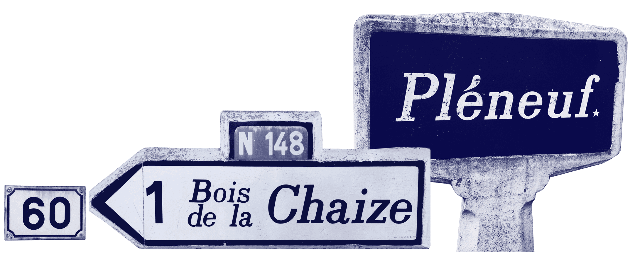
Avec ses 1 850 habitants, la commune de Peltre (Moselle), à la sortie de Metz, a une nouvelle fois été couronnée au classement des communes de moins de 2 000 habitants où il fait bon vivre. Martine et Marie-José habitent à Peltre depuis plusieurs décennies. Elles font une rapide énumération de tous les avantages que présente la commune: «C’est agréable à vivre ici et c’est très calme, alors qu’on n’est pas loin de la ville. On a de nombreux commerces, le train qui nous permet de rejoindre Metz en sept minutes seulement, une boulangerie, un bureau de poste, un coiffeur, un caviste...» D’autres services, tels que des restaurants et un bureau de tabac, viennent s’y ajouter. Autre point important : «La vie y est animée contrairement à d’autres villages de même taille», renchérissent les Peltroises. Elles citent tour à tour «la fête patronale, la course cycliste, le feu d’artifice, le repas des seniors, les circuits pédestres, la cueillette…». Plou- est un appellatif toponymique préfixé d’origine bretonne qui a pour sens «communauté» puis, par extension, «paroisse». En Bretagne, on recense 179 occurrences de l’appellatif toponymique préfixé Plouet ses variantes Plo-, Plœ-, etc. comme début de nom de lieu, ville ou village.
Plou- est un appellatif toponymique préfixé d’origine bretonne qui a pour sens «communauté» puis, par extension, «paroisse». En Bretagne, on recense 179 occurrences de l’appellatif toponymique préfixé Plouet ses variantes Plo-, Plœ-, etc. comme début de nom de lieu, ville ou village. Toutefois, en Bretagne, c’est le préfixe loc-, lok- ou locq- qui est le plus courant avec environ 250 noms de lieux recensés. Ce mot breton signifiant «lieu saint» ou «lieu consacré» tel un ermitage, un sanctuaire ou un monastère est toujours suivi du nom d’un saint (majoritairement breton), à deux exceptions près: Locminé («lieu des moines» en vieux breton, traduit du latin locus monachorum) et Locmeltro en Guern qui signifie «lieu de la vallée de la boule». La plus grande fréquence des noms en loc- est dans le Morbihan.
En 1505, alors que la duchesse Anne revient du pèlerinage à SaintJean-du-Doigt où elle s’est rendue pour demander la guérison de son fils, il lui vient la fantaisie de revenir à Morlaix en longeant la côte. Alors que le cortège s’apprêtait à grimper la côte de Plouezoc’h, il fut attaqué par une bande de brigands. L’escorte malgré sa résistance allait succomber, lorsque des paysans occupés à défricher une lande accoururent. Devant ces renforts inattendus, les brigands jugèrent prudent de s’enfuir. En interrogeant ses sauveurs la duchesse Anne apprit qu’ils s’appelaient Le Gac et étaient quoique pauvres, d’authentique noblesse. Pour les remercier elle ordonna qu’on leur bâtit, au lieu même de la rencontre, un manoir auquel elle imposa le nom de Lansalut (la lande du salut) . Toutefois, en Bretagne, c’est le préfixe loc-, lok- ou locq- qui est le plus courant avec environ 250 noms de lieux recensés. Ce mot breton signifiant «lieu saint» ou «lieu consacré» tel un ermitage, un sanctuaire ou un monastère est toujours suivi du nom d’un saint (majoritairement breton), à deux exceptions près: Locminé («lieu des moines» en vieux breton, traduit du latin locus monachorum) et Locmeltro en Guern qui signifie «lieu de la vallée de la boule». La plus grande fréquence des noms en loc- est dans le Morbihan.

«C’est agréable à vivre ici et c’est très calme, alors qu’on n’est pas loin de la ville. On a de nombreux commerces, le train qui nous permet de rejoindre Metz en sept minutes seulement, une boulangerie, un bureau de poste, un coiffeur, un caviste...» D’autres services, tels que des restaurants et un bureau de tabac, viennent s’y ajouter. Autre point important : «La vie y est animée contrairement à d’autres villages de même taille», renchérissent les Peltroises. Elles citent tour à tour «la fête patronale, la course cycliste, le feu d’artifice, le repas des seniors, les circuits pédestres, la cueillette…»
Depuis 2002, la nouvelle orthographe rétablit le trigramme breton «c’h», pouvant dans le cas présent se prononcer «[x]» ou «[k]» suivant les locuteurs. Plou- est un appellatif toponymique préfixé d’origine bretonne qui a pour sens «communauté» puis, par extension, «paroisse». En Bretagne, on recense 179 occurrences de l’appellatif toponymique préfixé Plouet ses variantes Plo-, Plœ-, etc. comme début de nom de lieu, ville ou village.
Toutefois, en Bretagne, c’est le préfixe loc-, lok- ou locq- qui est le plus courant avec environ 250 noms de lieux recensés. Ce mot breton signifiant «lieu saint» ou «lieu consacré» tel un ermitage, un sanctuaire ou un monastère est toujours suivi du nom d’un saint (majoritairement breton), à deux exceptions près: Locminé («lieu des moines» en vieux breton, traduit du latin locus monachorum) et Locmeltro en Guern qui signifie «lieu de la vallée de la boule». La plus grande fréquence des noms en loc- est dans le Morbihan.
LA FÊTE DES ESCARGOTS EST ANNULÉE CE SAMEDI Le temps pluvieux de ces dernières semaines était une aubaine pour les escargots. Pourtant, à Villecomte, ils ne seront finalement pas à la fête ce weekend. La traditionnelle fête des escargots, qui devait se tenir samedi 7 août, est annulée. Les organisateurs ont préféré la reporter à l’an prochain à cause de l’extension du pass sanitaire pour les événements de plus de 50 personnes, qu’ils ne souhaitent pas imposer. À Villecomte, environ un millier de personnes se rendent chaque année à cet événement qui rassemble 25 producteurs en tout genre. Le tumulus de Charmodot domine le village au nord. Une voie antique, celtique ou plus ancienne, arrive du nord puis se glisse entre le bois des Vaudimes et la butte de Touloison. Elle frôle le tumulus de Jean-Jacques, franchit à gué l’Ignon près de la ferme de Vaudimes, puis oblique vers le sud-ouest pour frôler le tumulus de la Charme au Moulin…
En 1505, alors que la duchesse Anne revient du pèlerinage à SaintJean-du-Doigt où elle s’est rendue pour demander la guérison de son fils, il lui vient la fantaisie de revenir à Morlaix en longeant la côte. Alors que le cortège s’apprêtait à grimper la côte de Plouezoc’h, il fut attaqué par une bande de brigands. L’escorte malgré sa résistance allait succomber, lorsque des paysans occupés à défricher une lande accoururent. Devant ces renforts inattendus, les brigands jugèrent prudent de s’enfuir. En interrogeant ses sauveurs la duchesse Anne apprit qu’ils s’appelaient Le Gac et étaient quoique pauvres, d’authentique noblesse. Pour les remercier elle ordonna qu’on leur bâtit, au lieu même de la rencontre, un manoir auquel elle imposa le nom de Lansalut (la lande du salut) . Saint-Hilaire-du-Harcouët : VILLE DÉTRUITE, VILLE RECONSTRUITE: DES VISITES À SUCCÈS. «Notre ville, quoique vieille de bientôt un millénaire, a des tas de choses à raconter. Les traces sont peut-être moins spectaculaires et visibles que dans certains lieux, mais il n’empêche qu’elles sont là. Notre cher Saint-Hilaire-du-Harcouët possède une histoire qui vaut largement le détour.» L’office de tourisme s’est lancé le défi de faire des visites guidées de la ville tout l’été. Publié le 22/07/2021 à 05h08 UN DÉPÔT DE PAIN EST OUVERT DEPUIS CE MARDI Depuis la fermeture du restaurant et épicerie Chez Steph et Dom, il n’y a plus aucun commerce dans la commune. En attendant la reprise de l’établissement, les élus ont réfléchi à une alternative et un dépôt de pain a donc été installé dans le local communal de l’ancienne épicerie. C’est la boulangerie Jeusselin de La Baconnière qui en assure l’approvisionnement. Il y a différentes sortes de pains et des viennoiseries le week-end. Ce service devrait fonctionner tout l’été. Dépôt de pain, le mardi, le jeudi et le samedi de 9 h à 12 h et le dimanche de 8 h à 12 h, à l’ancienne épicerie au 13, rue du Maine.
LA FÊTE DES ESCARGOTS EST ANNULÉE CE SAMEDI Le temps pluvieux de ces dernières semaines était une aubaine pour les escargots. Pourtant, à Villecomte, ils ne seront finalement pas à la fête ce weekend. La traditionnelle fête des escargots, qui devait se tenir samedi 7 août, est annulée. Les organisateurs ont préféré la reporter à l’an prochain à cause de l’extension du pass sanitaire pour les événements de plus de 50 personnes, qu’ils ne souhaitent pas imposer. À Villecomte, environ un millier de personnes se rendent chaque année à cet événement qui rassemble 25 producteurs en tout genre. Saint-Hilaire-de-Riez, c’est une diversité de paysages pour les amoureux de la nature en quête de calme et de sérénité: une côte rocheuse, des plages de sable, une forêt domaniale, des marais doux, breton et salés. La pratique de divers sports nautiques y est très répandue: char à voile, optimist, surf, canoë, paddle… Très appréciée, la ville passe d’environ 11000 habitants à l’année à 80000 estivants.
Saint-Hilaire-du-Harcouët : VILLE DÉTRUITE, VILLE RECONSTRUITE: DES VISITES À SUCCÈS. «Notre ville, quoique vieille de bientôt un millénaire, a des tas de choses à raconter. Les traces sont peut-être moins spectaculaires et visibles que dans certains lieux, mais il n’empêche qu’elles sont là. Notre cher Saint-Hilaire-du-Harcouët possède une histoire qui vaut largement le détour.» L’office de tourisme s’est lancé le défi de faire des visites guidées de la ville tout l’été. Publié le 22/07/2021 à 05h08 UN DÉPÔT DE PAIN EST OUVERT DEPUIS CE MARDI Depuis la fermeture du restaurant et épicerie Chez Steph et Dom, il n’y a plus aucun commerce dans la commune. En attendant la reprise de l’établissement, les élus ont réfléchi à une alternative et un dépôt de pain a donc été installé dans le local communal de l’ancienne épicerie. C’est la boulangerie Jeusselin de La Baconnière qui en assure l’approvisionnement. Il y a différentes sortes de pains et des viennoiseries le week-end. Ce service devrait fonctionner tout l’été. Dépôt de pain, le mardi, le jeudi et le samedi de 9 h à 12 h et le dimanche de 8 h à 12 h, à l’ancienne épicerie au 13, rue du Maine.
The development of a Sans serif version became evident as soon as the Slab's contrast disappeared. Slicing off the slabs revealed beginnings for a viable sans serif family. With a few adjustments, especially for the more crowded characters (the diagonal ones) you get a refreshingly wonky monolinear sans, true to the origin of the genre. Telltale formulations like the excessively wide “T” and oversized tidles indicate its origin, and harken back to the methodology employed for the very first san-serif typeface cast by the Caslon foundry in London, 1816.