Sharp Grotesk ภาษาไทย
V.2 Oct 2019
V.3 Mar 2023
ก้อง สหรัถ ศุ บุญเลี้ยง
มาลีฮวนนา เอ็นโดรฟิน
ออโต้บาห์น เดอะ ทอยส
ต ื่นตัวกับการไปฟั งเพลง
Bars at Ratdamnern
ทั้งหมดมาร่วมกันสร้างดนตรีบรรเลงที่มีซาวนด์อลังการ ล่องลอย และทรงพลัง โดยสร้างชื่อขึ้นมาในยุคบูมของดนตรีแนวนี้ในบ้านเรา นับเป็ นรุ่นไล่ๆ กับวงอาฟเตอร์นูน, กูส และอัศจรรย์จักรวาล ซึ่งเป็ น ยุคที่มายสเปซ คือพื้นที่อวดผลงานของนักดนตรี แม้ในยุคแรกๆ อินสไปเรทีฟจะไม่ได้โด่งดังมากนัก แต่ก็มีแฟนเพลงจำ�นวนหนึ่งที่ ตามไปฟั งพวกเขาเล่นสดตามปาร์ตี้ของผู้จัดต่างๆ
เดิมทีใช้ชื่อวงว่า “ละอ่อน” ในปี พ.ศ. 2539 วงได้ชนะการประกวดวงดนตรีฮอตเวฟมิวสิกอวอร์ดส์ และได้ออกอัลบั้มจำาหน่ายในปี พ.ศ. 2540 กับค่ายมิวสิก บั๊กส์ ด้วยชื่อ อัลบั้มเดียวกันกับชื่อวง ในแนวเพลงป็ อปร็อก เพลง “ได้หรือเปล่า” จากอัลบั้มดังกล่าว เป็ นเพลงที่ได้รับการยอมรับมากที่สุดของวง ต่อมาตูนกับเภาขอออกจากวงไป โดยได้ ปั้น (แบชเชอร์) มาร้องนำาแทนตูน และได้ออกอัลบั้มชุดที่สอง “เทพนิยายนายเสนาะ” ในปี พ.ศ. 2541 แต่หลังจากนั้นวงก็ได้แยกย้ายกันไปเรียนต่อ Was originally called “La-On”. In 1996, the band entered a band competition for high school students called "Hot Wave Music Awards" and won the first prize, beating nearly a hundred of other bands. La-on quickly signed a record deal with record company Music Bugs, and released a self-titled pop-rock album in 1997. "Dai Rue Plao" became their most recognized song.
วันที่ 8-17 มกราคม 2016 สองสัปดาห์กับ 8 โชว์ต่อเนื่อง เร่ ิมที่ ปั กกิ่ ง หังโจว เซี่ยงไฮ้ อู่ฮั่น ฉงชิ่ ง เฉิงตู กว่างโจว และ เซินเจิ้ น วงดนตรีที่ยังไม่ดังระเบิดในเมืองไทย กลาย เป็ นตัวเลือกของโปรโมเตอร์จีนได้อย่างไร “ปี นี้แนวดนตรีโพสต์ร็อกได้รับความนิยม มากในจีน ปกติเราจะเลือกวงจากยุโรปและอเมริกา แต่คราวนี้อยากจะหาวงใหม่มาให้คน ฟั ง เราก็เลยโฟกัสที่วงแถบเอเชียตะวันออกเฉียงใต้ ตอนที่เราได้ฟั งเพลง ‘เค แอล สตรีท (วันที่ฝนตก)’ ของวงนี้เราก็รู้ว่านี่แหละที่เราต้องการ” อารอน จาง ผู้จัดการทัวร์ เผยถึงเหตุผลที่เลือกวงอินสไปเรทีฟมาเล่นสดที่จีน ในการสัมภาษณ์ผ่านโซเชียลมีเดีย เพลงของอินสไปเรทีฟอาจมีข้อจำ�กัดทางการตลาดในตลาดดนตรีป๊ อปมหาชน จากความยาวของเพลง และการเป็ น ดนตรีเน้นบรรเลงไม่เน้นเนื้อร้อง เนื้อหาที่มีเรื่องราวในเชิงนามธรรม รวมไปถึงทุนในการออกสู่ช่องทางโปรโมท “ตอนแรกๆ ก็ไม่ค่อยรู้หรอกว่าแนวนี้เป็ นโพสต์ร็อก ไม่ได้รู้จักมาก แต่พอมีเพื่อนคนหนึ่งเอาเพลงของ “ซิกูร์ รอส” มาให้ฟั ง คือ ฟั งแล้วตายเลย ก็เลยลองทำ�เพลงแบบนั้นดู และมีดีเจจากเยสอินดี้ ชวนทำ�เพลงในอัลบั้มคอมพิเลชัน รวมเพลงจากหลายคน” นพนันท์ เผยที่มาของการทำ�เพลง และจากจุดนั้นเขาประกาศหาสมาชิกวงผ่านออนไลน์ และ เร่ ิมมีงานเล่นสด มีเล่นเพลงของตัวเองผสมกับเพลงคัฟเวอร์ โดยได้เล่นในงานของกลุ่มแพนดาเรคคอร์ด ดนตรีของพวกเขามาตามความชอบ ด้วยเหตุผลที่นพนันท์บอกว่า สมาชิกวงผ่านการเล่นดนตรี มาพอสมควรและหลายแนว การเลือกเล่นจึงเน้นที่อยากทำ�จริงๆ ไม่ใช่การตอบสนองตลาด จาก จุดประสงค์แรกของการทำ�วงเพื่อเอามัน “เรามีแบบน้อยใจนะ ว่าไม่เคยติดชาร์ตวิทยุ (ในไทย) เลย สื่อมืดสนิท ได้แต่คนฟั งแบบปากต่อปาก แต่มันก็แลกกับการสนองตัณหาตัวเอง เราอยากทำ� เพลงอย่างนี้ ก็มีเฉพาะคนที่ชอบเหมือนเราจริงๆ มาฟั งเรา เราเล่นในบ๊ ิกเมาเท่นทุกปี นะ แต่ไม่มี ใครเห็น เราก็อยู่แบบตัวเล็กๆ จางๆ แต่ก็พอมีคนบอกปากต่อปาก เพิ่มคนฟั งมาทีละนิดๆ เพราะ ช่องทางสื่อมืดมนมาก จนได้ออกอัลบั้มล่าสุด ค่อยมีสื่อมาขอสัมภาษณ์บ้าง” แต่อย่างไรก็ตาม นพนันท์ บอกว่า เคยผ่านการเล่นดนตรีต่อหน้าคนดูแค่ 10 คนถึงหลักร้อย ซึ่งในมุมของนักดนตรี ไม่มีปั ญหามากนัก เพราะเป็ นการเล่นวงดนตรี 5 ชิ้ น
๐๑๒๓๔
๕๖๗๘๙
ถ่ายทอดความรู้สึกสังคม
with Luk Krung style
เอื้อ สุนทรสนาน หรือ ครูเอื้อ เกิดเมื่อวันที่ 21 มกราคม พ.ศ.2453 ที่อำาเภอ อัมพวา จังหวัดสมุทรสงคราม ถึงแก่กรรมเมื่อวันที่ 1 เมษายน พ.ศ.2524 และ ได้รับการยกย่องจากยูเนสโก ให้เป็ นบุคคลสำาคัญของโลก ในสาขาวัฒนธรรม ดนตรีไทยสากล ในวาระครบรอบ 100 ปี ชาตกาล เมื่อ พ.ศ.2552 เอื้อเป็ นผู้ มีความสามารถหลายด้าน ทั้งการแต่งคำาร้อง ทำานอง และการเล่นดนตรี โดย เฉพาะไวโอลินที่ขึ้นชั้นระดับปรมาจารย์ สำาหรับการประพันธ์เพลงได้ประพันธ์ร่วม กับหลายท่าน แต่ส่วนใหญ่คือ แก้ว อัจฉริยกุล ซึ่งจะเป็ นคนแต่งคำาร้อง นักร้องสุนทราภรณ์จะมีการผลัดเปลี่ยนหน้าตากันไป นับจากสิ้นสุดศิลปิ นใน “ยุคต้น” มาแล้ว จะแบ่งออกเป็ นยุค
มี กมล สุโกศล แคลปป์ (สุกี้) เป็ นผู้อำ นวยการผลิต ด้วยแนว ดนตรีแบบฟั งก์ โซล โมเดิร์นร็อก และกรันจ์ที่ผสมผสานกัน อย่างลงตัว มีเพลงดังอาทิ “หมดเวลา” “บุษบา” “มานี” และ เพลงที่ประสบความส ำ เร็จสูงสุดของอัลบั้มอย่าง “ก่อน” ซึ่งต่อมาเพลงนี้ได้กลายเป็ นเพลงประจำ วงโมเดิร์นด็อก และอัลบั้ม ดังกล่าวก็ประสบความส ำ เร็จมาก และได้จุดประกายดนตรีทางเลือก แก่วงการดนตรีไทยนับแต่นั้น ในปี พ.ศ.2540 ได้ออกอัลบั้มชุดที่ 2 “คาเฟ่ ” มีเพลงดังอย่าง “รูปไม่หล่อ” และ “ติ๋ ม” ต่อมาอีกสี่ปี ออก อัลบั้มชุดที่ 3 “เลิฟมีเลิฟมายไลฟ์ ” มีเพลงดังคือ“ส่ ิงที่ไม่เคยบอก” “เวตาล” และในปี พ.ศ.2547 ออกอัลบั้มชุดที่ 4 “แดดส่อง”
ีกสี่ปี ต่อมาได้ออกอัลบั้มชุดที่ 5 “ทิงนองนอย” โดยหลังจากอัลบั้มนี้วางจำ หน่ายไปมาก กว่า 5 ปี โมเดิร์นด็อกได้ปล่อยซิงเกิลแรก “โอน้อยออก” จากอัลบั้มชุดที่ 6 โดยออกเผย แพร่เมื่อวันที่ 4 พฤศจิกายน พ.ศ. 2556 ทางช่องยูทูบของวงโมเดิร์นด็อกเอง โดยได้ ภู่กัน สันสุริยะ (ใหม่ อพาร์ตเมนต์คุณป้ า) ร่วมบันทึกเสียงเบสในเพลงนี้ด้วย อัลบั้มชุดที่ 6 นี้ยังมีโปรดิวเซอร์ชาวสก็อตอย่าง โทนี่ ดักแกน มาร่วมงานอีกด้วย ซึ่งเคยร่วมงานกับ วงม็อกไกว วงโพสต์ร็อคจากสก็อตแลนด์ และวงอินดี้ร็อก; เบลแอนด์เซบาสเตียง โดย อัลบั้มชุดที่หกนี้ได้อัดกันที่สตูดิโอทาร์บอกซ์ โรด เมืองบัฟฟาโล รัฐนิวยอร์ก หลังจากนั้นทางวงได้ปล่อยซิงเกิ้ ลที่สอง “สกาล่า” เมื่อวันที่ 5 ธันวาคม พ.ศ. 2556 จากอัลบั้มชุดที่หกของวง ใน สังกัดบริษัท โมเดิร์นด็อก จำ กัด ออกเผยแผร่ทางช่องยูทูบของวงโมเดิร์นด็อก เมื่อวันที่ 4 ธันวาคม พ.ศ. 2556 ภายในเอ็มวีมิวสิคของเพลงสกาล่า มีศิลปิ นนักร้องจำ นวนมากคับคั่งมาร่วมร้องเพลง อาทิ ชลาทิศ ตันติวุฒิ, อภิวัชร์ เอื้อถาวรสุข, สุวีระ บุญรอด, อารักษ์ อมรศุภศิริ, หรินทร์ สุธรรมจรัส, สมพล รุ่งพาณิชย์, ณัฐวุฒิ ศรีหมอก, รัดเกล้า อามระดิษ, สิงโต นำ โชค, อาทิวราห์ คงมาลัย, มาเรียม บีไฟว์, แน็ป (เรโทรสเปกต์), ตุลย์ (อพาร์ตเมนต์คุณป้ า), เม ื่อย (สครับบ์), เป๊ ก (วงซีล), ตรัย ภูมิรัตน, ปิ ยะ ศาสตรวาหา, กษิดิศ สำ เนียง และ วิน สควีซ แอนิมอล โดยเป็ นเอ็มวีที่ทางวงผลิตเองทุกขั้นตอน โดยมี โป้ ง-ปวิณ สุวรรณชีพ มือกลองของวง เป็ นผู้ควบคุมการดูแลเอ็มวีดังกล่าว ทางสมาชิกของวง กล่าวถึงสาเหตุที่เลือกใช้โรงภาพยนตร์สกาล่าเป็ นเพลง เนื่องมาจากโรงหนัง ดังกล่าวมีความคลาสสิคที่ถึงแม้จะผ่านมาหลายยุคสมัยแต่ก็ยังมีเสน่ห์ดึงดูด และอยู่ในใจคนเสมอ ซึ่งเนื้อหาเพลงก็คือการชวนคนไปดูหนัง มาสังสรรค์ และเริงร่าสนุกสนานร่วมกัน ต่อด้วยการปล่อยซิงเกิ้ ลที่สาม “ทบทวน” จาก อัลบั้มชุดที่หกของวง เมื่อวันที่ 22 เมษายน พ.ศ. 2557
กับวงดนตรีสุนทราภรณ์ Suntharaphon band
หากรับงานของทางราชการ จะใช้ชื่อว่า ‘วงดนตรีกรมโฆษณาการ’ แต่เมื่อรับงาน นอกเวลาจะใช้ชื่อ ‘วงดนตรีสุนทราภรณ์’ โดยมีศิลปิ นยุคต้นๆ ดังนี้คือ เอื้อ สุนทรสนาน, จุรี โอศิริ, รุจี อุทัยกร, มัณฑนา โมรากุล, เลิศ ประสมทรัพย์, สุภาพ รัศมิทัต, สุปาณี พุกสมบุญ, จันทนา โอบายวาทย์, วินัย จุลละบุษปะ, ชวลี ช่วงวิทย์, เพ็ญศรี พุ่มชูศรี และ พูลศรี เจริญพงษ์ เป็ นต้น
เอื้อ สุนทรสนาน หรือ ครูเอื้อ เกิดเมื่อวันที่ 21 มกราคม พ.ศ.2453 ที่อำาเภอ อัมพวา จังหวัดสมุทรสงคราม ถึงแก่กรรมเมื่อวันที่ 1 เมษายน พ.ศ.2524 และ ได้รับการยกย่องจากยูเนสโก ให้เป็ นบุคคลสำาคัญของโลก ในสาขาวัฒนธรรม ดนตรีไทยสากล ในวาระครบรอบ 100 ปี ชาตกาล เมื่อ พ.ศ.2552 เอื้อเป็ นผู้ มีความสามารถหลายด้าน ทั้งการแต่งคำาร้อง ทำานอง และการเล่นดนตรี โดย เฉพาะไวโอลินที่ขึ้นชั้นระดับปรมาจารย์ สำาหรับการประพันธ์เพลงได้ประพันธ์ร่วม กับหลายท่าน แต่ส่วนใหญ่คือ แก้ว อัจฉริยกุล ซึ่งจะเป็ นคนแต่งคำาร้อง นักร้องสุนทราภรณ์จะมีการผลัดเปลี่ยนหน้าตากันไป นับจากสิ้นสุดศิลปิ นใน “ยุคต้น” มาแล้ว จะแบ่งออกเป็ นยุคต่างๆ เรื่อยมา อาทิเช่น “ยุคกลาง” “ยุคดาวรุ่งพรุ่งนี้” “ยุคหลัง” “นักร้องปั จจุบันวงสุนทราภรณ์” และ “รุ่นปั จจุบัน” ที่จะใช้คำาเรียกเฉพาะว่า “นักร้องคลื่นลูกใหม่สุนทราภรณ์” มีศิลปิ น อาทิ เชี่ยวชาญ กิจสมบัติชัย, บัญชา รักษาจันทร, ณัฐวุฒิ เนตรเจริญ, พรชัย เอกศิริพงษ์, วิรัช ศรีพงษ์, พิเชษฐ์ จิรารัตนาศิริ, สุทธิพงศ์ อยู่สำาราญ, อรุณวตี ฉัตรเท, นิธิมา วิชเวช, สุบงกช ทองช่วง, นลินรัตน์ กาญจนคเชนท์, แพรวทิพย์ สุทธนนท์, พรวลี เอกศิริพงษ์, วิสสุดา วัณโณ, ปิ ยวรรณ สงวนทรัพย์, ณัฏฐ์นรี มะลิทอง, ชาตรี ชุ่มจิตร, นฤดล ผิวอ่อน, ศราวิน วงษ์สุวรรณ, วฤณพร เครือภู่, หนึ่งฤทัย สิงห์ทอง, ศศิพิมพ์ อาทยะกุล, อัมพาพร ตั้งจิตวิทยาคุณ, สรวิชญ์ ครมวิชิต, ชณัฐศิกาญ แจ่มแจ้ง เป็ นต้น
ถือว่ามีวงใต้ดินเพียงไม่กี่วงที่ทำ ได้แบบนี้ และได้รับความนิยมในลำ ดับต้นๆ ของวงการเพลงเพื่อ ชีวิต มาลีฮวนน่ายังออกอัลบั้มมาอย่างต่อเนื่อง ในปี 2540 พวกเขามีอัลบั้มชุดที่ 2 “คนเช็ดเงา” ออกมา ก็ได้รับการต้อนรับจากแฟนเพลงอย่างอบอุ่น โดยมีเพลง “โมรา” และ “ชะตากรรม” เป็ น เพลงดังประจำ อัลบั้ม ปี 2542 มาลีฮวนน่าออกอัลบั้มชุดที่ 3 “กลับกลาย” ที่โดดเด่นด้วยเนื้อหา ที่เต็มไปด้วยบทกวี ขณะที่เรื่องราวก็เน้นการปลุกปลอบให้กำ ลังใจ ในปี ถัดมา มาลีฮวนน่าก็เปิ ด บริษัทของตัวเองในชื่อ “ดรีม เรคอร์ดส์” ที่สองแกนนำ ของวง คฑาวุธ ทองไทย กับธงชัย รักษ์- รงค์ เป็ นหุ้นส่วนใหญ่ โดยมีอัลบั้มชุดที่ 4 “เพื่อนเพ” ออกมาเป็ นอัลบั้มแรก อัลบั้มชุดนี้มีที่มาจาก การที่ทางวงได้เดินทางไปเปิ ดการแสดงในที่ต่างๆ แล้วได้พูดคุยกับเพื่อนพ้องมากมาย ไม่ว่าจะเป็ น กลุ่มศิลปิ น นักประพันธ์ ที่หลายๆ คนเขียนงานเพลงขึ้นมาแล้วไม่มีโอกาสที่จะได้เผยแพร่ โดยมีเพลง “หัวใจพรือโฉ้” “ลมเพลมพัด” “เรือรักกระดาษ” เป็ นแรงส่ง สำ คัญและทำ ให้อัลบั้ม “บุปผาชน” ของมาลีฮวนน่าเป็ นอัลบั้มเพลงใต้ดินที่ ประสบความสำ เร็จมากที่สุดชุดหนึ่งในบ้านเรา และนับจากนั้น พวกเขาก็ไม่ได้ เป็ นที่รู้จักแค่ในแวดวงคนฟั งเพลงเพื่อชีวิตหรือแฟนเพลงที่เป็ นนักคิดนักเขียนอีกต่อไปแล้ว ยิ่งในปี 2538 บริษัทไมล์สโตน ของมาโนช พุฒตาล ได้ ชักชวนวงมาลีฮวนน่าเข้าไปร่วมงาน ยิ่งทำ ให้พวกเขากลายเป็ นที่รู้จักในวง กว้างมากขึ้น จนสามารถออกทัวร์ทั่วประเทศได้ในปี ต่อมา วงดนตรีจากแดนใต้ที่ชื่อว่า “มาลีฮวนน่า” ก็ได้เริ่ มต้นเดินบนถนนดนตรีของเมืองไทย พวกเขาร่วมกันทำ งานเพลงที่มีแรงขับมาจากความรู้สึกนึกคิดที่มีต่อสภาพสังคม สภาพ แวดล้อม เพื่อระบายความอัดอั้นอันเกิดจากความแตกต่างของวัย และปมด้อยทางสถานภาพสังคม หากก็ไม่ได้มีผลงานเป็ นรูปเป็ นร่างออกมา จนปี 2537 มาลีฮวนน่าก็ออกเดิน ทางบนถนนสายดนตรีเต็มตัว ด้วยผลงานชุดแรก “บุปผาชน” ที่ได้รับการช่วยเหลือจาก อาจารย์ยงยุทธ คำ ศรี แกนนำ ของวงด้ามขวาน วงดนตรีเพื่อชีวิต ที่ทำ งานในแบบใต้ดิน ออกมาและประสบความสำ เร็จจากการมีแฟนเพลงติดตามเหนียวแน่น
ก่อตั้งโดยเอื้อและเพื่อนๆ
Eua Sunthornsanan
เป็ นชื่อวงดนตรีร็อกไทยซึ่ ง ประกอบด้วยสองพี่น้อง อัสนี โชติกุล และ วสันต์ โชติกุล พ.ศ.2517 ป้ อม-อัสนี โชติกุล กับน้อง ชาย โต๊ะ-วสันต์ โชติกุล จากอำาเภอเมือง จังหวัดเลย เข้ามาศึกษาต่อในกรุงเทพ โดยออกอัลบั้มชุดแรกคือ “บ้าหอบฟาง” สังกัดค่ายไนท์สปอต โปรดักชั่น ในสังกัด WEA แม้จะไม่ประสบความสำาเร็จเท่าที่ ควร แต่ก็มีเพลงดังอยู่บ้างอย่าง “บ้าหอบฟาง” ต่อมาจึงย้าย มาสังกัดจีเอ็มเอ็ม แกรมมี่ และมีผลงานชุดที่ 2 “ผักชีโรยหน้า”
เพลงติดหูอื่นๆ ในอัลบั้ม “ฟั กทอง” อาทิ “ได้อย่างเสียอย่าง” “อยากจะลืม” “วัวลืมตัว” และ “กรุงเทพมหานคร” และอัลบั้มนี้เองที่ทำายอดขายเกิด 1 ล้านตลับเป็ นชุดแรกของวง และนับเป็ นอัลบั้มขายดีที่สุดในปี พ.ศ.นั้นเลยทีเดียว ปี พ.ศ. 2533 ได้ออกอัลบั้มชุดที่ 5 “สับปะรด” มีเพลงดังอย่าง “เธอปั นใจ” “เกี่ยวก้อย” “คงเดิม” และ “กุ้มใจ” อัลบั้มนี้ เป็ นอีกชุดที่ทำายอดขายเกิน 1 ล้านตลับอีกชุดของวงเป็ นชุดที่สอง ปี พ.ศ. 2536 ได้ออก อัลบั้มชุดที่ 6 “รุ้งกินน้ำา” มีเพลงดังอย่าง “รักเธอเสมอ” “ลาก่อน” “ลงเอย” จนปี พ.ศ. 2538 พวกเขาทั้งคู่จึงตัดสินใจตั้งค่ายเพลง มอร์ มิวสิก ในเครือจีเอ็มเอ็ม แกรมมี่ ต่อเนื่องมาในปี พ.ศ. 2540 ได้ออกอัลบั้มชุดที่ 7 “บางอ้อ” มีเพลงดังอย่าง “อยากได้ยินว่ารักกัน” “ข้าวเย็น” “ไอ เลิฟ ยู” และ “คนหลายใจ” ซึ่งแต่งโดยร็อคเกอร์ชื่อดัง “เสก โลโซ” และเป็ นอัลบั้มชุดสุดท้ายที่มียอดขายเกิน 1 ล้านตลับ ของวง ปี พ.ศ. 2545 ได้ออกอัลบั้มชุดที่ 8 “จินตนาการ” มีเพลงดังอย่าง “สิทธิ์ ของเธอ” “รับไม่ไหว” และ “ลูกผู้ชาย” ปี พ.ศ. 2549 ได้ออกอัลบั้มชุดที่ 9 “เด็กเลี้ยงแกะ” มีเพลงดังอย่าง “อยากให้อยู่ด้วยไหม” ปี พ.ศ. 2554 ทั้งคู่ก็ได้ ก่อตั้ง “บริษัท สหภาพดนตรี จำากัด” ร่วมกับ นิติพงษ์ ห่อนาค, ชาตรี คงสุวรรณ และ วุฒินันต์ ภิรมย์ภักดี และเมื่อปี พ.ศ. 2558 บริษัท สหภาพดนตรี ก็ได้ทำาการเปลี่ยนชื่อมาเป็ น “มิวสิกมูฟเอนเตอร์เทนเมนต์” มาจนถึงปั จจุบัน
The band returned in 2002 under the new name “Bodyslam”, shifting to heavier rock music with only three of the original six members remaining; “Toon” Atiwara Kongmalai (vocals, rhythm guitar), “Pid” Thanadol Changsawek (bass) and “Pao” Ratthapol Pannachet (lead guitar). The first self-titled album under their new name as a three-piece band was successful. The second album, Drive, was released in 2003. ตูนและเภาได้ก่อตั้งวงขึ้นใหม่ในปี พ.ศ. 2545 ด้วยชื่อวงว่า “บอดี้สแลม” ซึ่งเปลี่ยนแนวเพลงไปเป็ นแนวร็อกที่หนัก หน่วงมากขึ้น ด้วยสมาชิกเพียงสามคนที่เหลืออยู่ ได้แก่ อาทิวราห์ คงมาลัย (ตูน) นักร้องนำา, ธนดล ช้างเสวก (ปิ๊ด) มือเบส และ รัฐพล พรรณเชษฐ์ (เภา) มือกีตาร์ วงอธิบายว่า ที่มาของชื่อนี้มาจากชื่อท่าหนึ่งของมวยปล้ำา แต่ถ้าแปล ความหมายตรงตัว “บอดี้” แปลว่า ร่างกาย ส่วน “สแลม” แปลว่า การทุ่ม เมื่อนำามารวมกันเป็ น “บอดี้สแลม” ก็จะมี นิยามที่ว่า “การทุ่มสุดตัว” คือการทำางานเพลงกันเต็มที่แบบทุ่มสุดตัว ต่อมาได้ออกวางจำาหน่ายอัลบั้มชุดที่สอง “ไดรฟ์ ” ในปี พ.ศ. 2546 โดยมี เพลงฮิตอย่าง “ปลายทาง” “ความซื่อสัตย์” “ชีวิตที่ฉันเหลืออยู่” และ “หวั่นไหว” และได้ชนะรางวัลมิวสิกวิดีโอในสาขา “กลุ่มศิลปิ นที่เป็ นที่ชื่นชอบ” ใน มิวสิกวิดีโอของเพลง “ปลายทาง” ในวันที่ 17 เมษายน พ.ศ. 2547 บอดี้- สแลมได้ออกคอนเสิร์ต “ฮอตเวฟ ไลฟ์ : บอดี้แสลม แม็กซิมัม ไลฟ์ ” จัด ณ หอประชุมใหญ่ มหาวิทยาลัยธรรมศาสตร์ (ท่าพระจันทร์) ซึ่งเป็ นคอนเสิร์ต ที่ทาง 91.5 ฮอตเวฟ จัดให้ โดยเป็ นคอนเสิร์ตครั้งแรกของวง
เพลงลูกกรุง เพลงลูกทุ่ง
The melody of song
สมาชิกวงแกรนด์เอ็กซ์เข้าร่วมประกวดวงสตริงคอมโบชิงแชมป์ ประเทศไทย ในปี พ.ศ. 2515 ประเภทนักเรียนนักศึกษา ซึ่ งการ ประกวด 2 ครั้งก่อนหน้ านั้น คือ พ.ศ. 2512 และ พ.ศ. 2513 (ปี พ.ศ. 2514 งดเพราะเหตุการณ์ความวุ่นวายทางการเมือง) โดยวง “ดิอิมพอสซิเบิ้ล” คว้าแชมป์ ไปครองทั้งสองครั้ง รวมถึงครั้งที่ 3 ในปี พ.ศ. 2515 ด้วยเช่นกัน
ส่วนผลการประกวดในประเภทนักเรียนนักศึกษานั้น วงมัมมี่ ได้เป็ นแชมป์ วงแกรนด์เอ็กซ์ ได้รางวัลรองชนะเลิศคู่กับรางวัลขวัญใจสื่อมวลชนมาครอง ด้วยแนวทางการแต่งตัวที่ เข้าตาสื่อ คือแม้จะเล่นเพลงร็อคดุๆ แต่พวกเขาแต่งตัวสุภาพเรียบร้อย ใส่กางเกงขายาว สีดำา เสื้อเชิ้ ตสีขาว ผูกเนคไท สวนทางกับวงอื่นๆ หลังการประกวด สมาชิกบางคนเรียน จบ โดยแต่ละคนแยกย้ ายกันไปเรียนต่อในระดับอุดมศึกษา แต่นคร เวชสุภาพร ยังคงหา สมาชิกวง โดยลงทุนถึงขนาดสละสิทธิ์ไม่เรียนในมหาวิทยาลัยที่เอ็นท์ติด แต่เลือกที่จะ เรียนในมหาวิทยาลัยเปิ ดที่เพื่อนๆ ส่วนใหญ่เรียนอยู่ เพื่อความสะดวกในการซ้อมดนตรี วงแกรนด์เอ็กซ์เริ่ มเป็ นที่รู้จักจากการเล่นตามคลับ ตามบาร์ และต่ างจังหวัด โดยเล่นอยู่สักประมาณ 8 เดือน ก่อน ที่เพื่อนๆ บางคนในวงจะลาออกไป นคร เวชสุภาพร จึงได้ออกเดินทางหาสมาชิกคนใหม่ พร้อมกับปรับแนวทางของ วงแกรนด์เอ็กซ์ใหม่เพื่อให้เป็ นวงสตริงคอมโบอย่ างเต็มรูปแบบ ด้วยการเสริมทัพทีมเครื่องเป่ า คือ ชาย แสงชะอุ่ม (แซ็กโซโฟน), เสน่ห์ ศุภรัตน์ (ทรัมเป็ ด) และสมศักดิ์ อภิวัฒน์วีรกุล (ทรอมโบน) เข้ามาในราวปี พ.ศ. 2517 และการ เข้ามาของนักร้องนำาคนใหม่ คือ วสันต์ แต้สกุล (นามสกุลตอนนั้น) ในปี พ.ศ. 2519 มือเบสในยุคก่อตั้งกับมือคีย์- บอร์ดลาออกไป วสันต์จึงต้องหันไปเล่นคีย์บอร์ดอีกทาง ส่วนมือเบสได้แอ๊ด-ทนงศักดิ์ อาภรณ์ศิริ มาแทน
ในปี เดียวกันนี้ แกรนด์เอ็กซ์ได้ จำารัส เศวตาภรณ์ มาเพิ่ มในฐานะนักร้องนำา และกีตาร์คอร์ด ก่อนออกซิงเกิ้ลแรก “คู่นก” ตามมาในปี พ.ศ. 2520 หลัง จากนั้นวงแกรนด์เอ็กซ์ก็ ได้ออกผลงาน ทัวร์คอนเสิร์ต และรับสมาชิกใหม่ เพิ่ มขึ้นมาเรื่อยๆ อีกหลายปี จนกระทั่งได้ประกาศยุบวงในปี พ.ศ. 2562 โดย จัดคอนเสิร์ตครั้งสุดท้ ายในวันที่ 3 สิงหาคม ที่อิมแพ็ค อารีน่ า เมืองทองธานี “แกรนด์เอ็กซ์ บริบูรณ์” พร้อมกับสโลแกน; คอนเสิร์ตครั้งประวัติศาสตร์ที่ ต้องจารึกในวงการเพลงไทย ฉลองครบรอบ 50 ปี การก่อตั้งวงฯ โดยสรุป วงแกรนด์เอ็กซ์มีสมาชิกหลัก คือ นคร เวชสุภาพร (กีตาร์, ร้องนำา และหัวหน้ าวง), ประสิทธิ์ ไชยะโท (กลอง, ร้องนำา), วสันต์ สิริสุขพิสัย (ออร์แกน, ร้องนำา), เสน่ห์ ศุภรัตน์ (ทรัมเป็ ต,ร้องนำา), ทนงศักดิ์ อาภรณ์ศิริ (เบส,ร้องนำา), พนัส หิรัญกสิ (แซ็กโซโฟน,ร้องนำา), โชคดี พักภู่ (ทรอมโบน,ร้องนำา), ดนุพล แก้วกาญจน์ (ร้องนำา), ศรายุทธ สุปั ญโญ (คีย์บอร์ด, เสียงประสาน) ส่วนสมาชิกเพิ่ มเติม คือ ไอศูรย์ วาทยานนท์ เข้ามาเพิ่ มภายในวงแกรนเอ็กซ์ใน อัลบั้ม “สายใย”, สุธี แสงเสรีชน เข้ามาร่วมงานในตำาแหน่งกีตาร์โซโล และร้องนำาในอัลบั้มชุดที่ 17 “นิรันดร์กาล”, อริชัย อรัญนารถ และ จอนนี่ แอนโฟเน่ เข้ามาในอัลบั้มพิเศษ “ขวดโหล 1 และ 2”, พิทพล โชติสรยุทธ์ เข้ามาใน อัลบั้มชุดที่ 18 “อยากให้ความรักแก่คนทั้งโลก”, จาคมัย ศรีวาลัย เข้ามาในอัลบั้มชุดที่ 19 “ได้ ไหม” ทำาหน้ าที่ตีกลองแทนจอนนี่ที่ลาออกไป Was originally called “La-On”. In 1996, the band entered a band competition for high school students called "Hot Wave Music Awards" and won the first prize, beating nearly a hundred of other bands. La-on quickly signed a record deal with record company Music Bugs, and released a self-titled pop-rock album in 1997. "Dai Rue Plao" became their most recognized song.
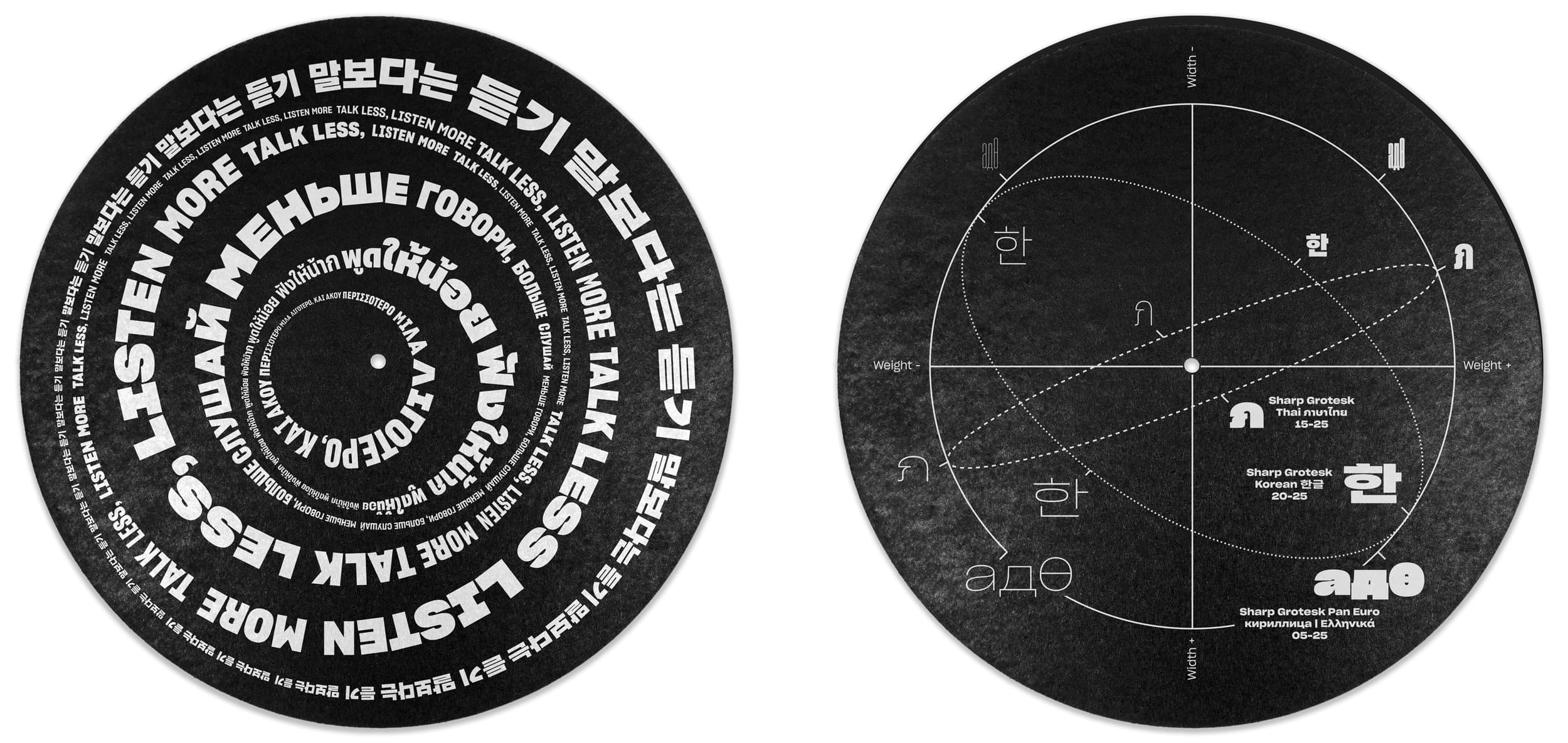
Sharp Grotesk Global is Sharp Type’s largest superfamily to date. It’s our most comprehensive Latin typeface, with twelve weights and seven widths in Roman and Italic styles. Sharp Grotesk now also represents our first multi-script release, with extensions in Greek, Cyrillic, Hangul, and Thai. Finally, a Latin variable font rounds out the collection.
Midnighter, They were one of the best known acts to come out of East L.A. Thee Midniters were among the first Chicano rock bands to have a major hit in the U.S.A. The band was one of the first to integrate horns, an unusual combination of trombone and sax, congas, keyboards, and guitars, with a sound reminicent of Blood, Sweat & Tears. All of the band’s twelve studio albums were in the Top 40 of UK charts. The Band originally formed in the West Midlands by bassist Martin Blunt, who recruited Rob Collins. The debut single “Indian Rope” proved to be an indie hit and the group soon found a major label in Beggars Banquet offshoot Situation Two in time for the release of “The Only One I Know”
В начале 1998 года Земфира переехала из родной Уфы в Москву, где начала работу со своей группой «Zемфира» над первым студийным альбомом, выпущенным спустя год. С 1999 года Земфира выпустила семь студийных альбомов, получивших значительное внимание прессы и публики. Также в её дискографию входят сборник би-сайдов и три концертных альбома. В её лирических исканиях нашли своё воплощение душевные страдания и поиски современной молодёжи. Опера је облик позоришта у којем се драма преноси у целини или углавном кроз музику и певање. Опера се појавила у Италији око 1600-е године и углавном је повезана са западном класичном музичком традицијом. Опера користи многе од елемената говорног позоришта као што су сценографија, костими и глума. Певача у опери прати и музички ансамбл.
Από κατασκευαστική άποψη τα μπουζούκια μπορούν να έχουν διαφορές μεταξύ τους όχι μόνο στον αριθμό των χορδών αλλά και σε άλλα χαρακτηριστικά, π.χ. μήκος μάνικου, πλάτος, ύψος, βάθος του ηχείου ή σκάφους, το πλάτος των ξύλινων φετών του σκάφους. Τις διαφορές αυτές καθορίζει ο κατασκευαστής που με την εμπειρία του και ανάλογα με τον ήχο που θέλει να βγάζει το όργανο, τροποποιεί τα λειτουργικά στοιχεία του για να πετύχει πιο οξύ, πιο βαθύ ή πιο βαρύ ήχο. Το μέγεθος και το είδος του ηχείου παίζουν ρόλο στην τονικότητα του οργάνου ενώ το μήκος του μάνικου, και κατ' επέκταση των χορδών, δίνουν τη διαφορά στην τονικότητα του οργάνου. Εννοείται ότι κάθε μήκος μάνικου έχει διαφορετικό πλάτος τάστων αφού όλα τα μπουζούκια έχουν τον ίδιο αριθμό τάστων. Μεγάλη σημασία στον ήχο έχει και η ποιότητα των ξύλων από τα οποία είναι κατασκευασμένο.
ส่วนผลการประกวดในประเภทนักเรียนนักศึกษานั้น วงมัมมี่ ได้เป็ นแชมป์ วงแกรนด์เอ็กซ์ ได้รางวัลรองชนะเลิศคู่กับรางวัลขวัญใจสื่อมวลชนมาครอง ด้วยแนวทางการแต่งตัวที่ เข้าตาสื่อ คือแม้จะเล่นเพลงร็อคดุๆ แต่พวกเขาแต่งตัวสุภาพเรียบร้อย ใส่กางเกงขายาว สีดำา เสื้อเชิ้ ตสีขาว ผูกเนคไท สวนทางกับวงอื่นๆ หลังการประกวด สมาชิกบางคนเรียน จบ โดยแต่ละคนแยกย้ ายกันไปเรียนต่อในระดับอุดมศึกษา แต่นคร เวชสุภาพร ยังคงหา สมาชิกวง โดยลงทุนถึงขนาดสละสิทธิ์ไม่เรียนในมหาวิทยาลัยที่เอ็นท์ติด แต่เลือกที่จะ เรียนในมหาวิทยาลัยเปิ ดที่เพื่อนๆ ส่วนใหญ่เรียนอยู่ เพื่อความสะดวกในการซ้อมดนตรี. วงแกรนด์เอ็กซ์เริ่ มเป็ นที่รู้จักจากการเล่นตามคลับ ตามบาร์ และต่ างจังหวัด โดยเล่นอยู่สักประมาณ 8 เดือน ก่อน ที่เพื่อนๆ บางคนในวงจะลาออกไป นคร เวชสุภาพร จึงได้ออกเดินทางหาสมาชิกคนใหม่ พร้อมกับปรับแนวทางของ วงแกรนด์เอ็กซ์ใหม่เพื่อให้เป็ นวงสตริงคอมโบอย่ างเต็มรูปแบบ ด้วยการเสริมทัพทีมเครื่องเป่ า คือ ชาย แสงชะอุ่ม (แซ็กโซโฟน), เสน่ห์ ศุภรัตน์ (ทรัมเป็ ด) และสมศักดิ์ อภิวัฒน์วีรกุล (ทรอมโบน) เข้ามาในราวปี พ.ศ. 2517 และการ เข้ามาของนักร้องนำาคนใหม่ คือ วสันต์ แต้สกุล (นามสกุลตอนนั้น) ในปี พ.ศ. 2519 มือเบสในยุคก่อตั้งกับมือคีย์- บอร์ดลาออกไป วสันต์จึงต้องหันไปเล่นคีย์บอร์ดอีกทาง ส่วนมือเบสได้แอ๊ด-ทนงศักดิ์ อาภรณ์ศิริ มาแทน
밴드의 생명은 신뢰와 의리다. 예컨대 영국 밴드 오아시스처럼 드러머가 드럼을 너무 못 쳐 일방적으로 해고했을 때가 바로 신뢰가 증발한 경우이고, 메탈리카처럼 리더가 멤버의 다른 활동을 통제해 그 멤버가 탈퇴한 경우가 바로 의리가 실종된 경우다. 밴드 역시 결국엔 사람과 사람의 관계이고 사람과 사람이 더 어울리지 못하면 그 팀은 이어갈 수 없는 것이다. 자우림은 그런 면에서 행운이다. 아마 멤버들이 무작정, 억지로 잘 지내려고만 했다면 여기까지 오진 못했을 것이다. 이들이 오래 함께 할 수 있었던 건 각자의 타고난 성격 덕분이다. 아니, 성격보단 인격에 가깝겠다. 자우림 멤버들은 약속이나 한 듯 가까울수록 예의를 지키는 걸 중요시 하고 서로를 존중, 존경하는 일이 습관처럼 몸에 밴 사람들이다. 그래서 김윤아는 지금 멤버들이 아니었다면 서로가 서로를 버티지 못했을 거라고 말한다. 당연히 누구 한 명이 혼자만 잘 되겠다고 팀을 나가려. 밴드의 생명은 신뢰와 의리다. 예컨대 영국 밴드 오아시스처럼 드러머가 드럼을 너무 못 쳐 일방적으로 해고했을 때가 바로 신뢰가 증발한 경우이고, 메탈리카처럼 리더가 멤버의 다른 활동을 통제해 그 멤버가 탈퇴한 경우가 바로 의리가 실종된 경우다. 밴드 역시 결국엔 사람과 사람의 관계이고 사람과 사람이 더 어울리지 못하면 그 팀은 이어갈 수 없는 것이다. 자우림은 그런 면에서 행운이다. 아마 멤버들이 무작정, 억지로 잘 지내려고만 했다면 여기까지 오진 못했을 것이다. 이들이 오래 함께 할 수 있었던 건 각자의 타고난 성격 덕분이다. 아니, 성격보단 인격에 가깝겠다. 자우림 멤버들은 약속이나 한 듯 가까울수록 예의를 지키는 걸 중요시 하고 서로를 존중, 존경하는 일이 습관처럼 몸에 밴 사람들이다. 그래서 김윤아는 지금 멤버들이 아니었다면 서로가 서로를 버티지 못했을 거라고 말한다. 당연히 누구 한 명이 혼자만 잘 되겠다고 팀을 나가려