Sharp Grotesk 한글
가 각 간 갇 갈 갉 갊 갋 감 갑 값 갓 갔 강 갖 갗 같 갚 갛 개 객 갠 갣 갤 갬 갭 갯 갰 갱 갸 갹 갼 걀 걋 걍 걔 걘 걜 걥 거 걱 건 걷 걸 걺 검 겁 겂 것 겄 겅 겆 겉 겊 겋 게 겐 겔 겜 겝 겟 겠 겡 겨 격 겪 견 겯 결 겷 겸 겹 겻 겼 경 곁 계 곈 곌 곕 곗 고 곡 곤 곧 골 곪 곬 곯 곰 곱 곳 공 곶 과 곽 관 괄 괆 괌 괍 괏 괐 광 괘 괜 괠 괢 괩 괬 괭 괴 괵 괸 괼 굄 굅 굇 굉 교 굔 굘 굠 굡 굣 굥 구 국 군 굳 굴 굵 굶 굻 굼 굽 굿 궁 궂 궈 궉 권 궐 궜 궝 궤 궷 궸 귀 귁 귄 귈 귐 귑 귓 귕 규 균 귤 귬 그 극 근 귿 글 긁 긂 긇 금 급 긋 긍 긑 긓 긔 기 긱 긴 긷 길 긺 김 깁 깃 깄 깅 깆 깊 까 깍 깎 깐 깔 깖 깜 깝 깟 깠 깡 깥 깨 깩 깬 깯 깰 깸 깹 깻 깼 깽 꺄 꺅 꺆 꺌 꺍 꺼 꺽 꺾 껀 껄 껌 껍 껏 껐 껑 껓 껕 께 껙 껜 껨 껫 껭 껴 껸 껼 꼇 꼈 꼉 꼍 꼐 꼬 꼭 꼰 꼲 꼳 꼴 꼼 꼽 꼿 꽁 꽂 꽃 꽅 꽈 꽉 꽐 꽜 꽝 꽤 꽥 꽸 꽹 꾀 꾄 꾈 꾐 꾑 꾕 꾜 꾸 꾹 꾼 꿀 꿇 꿈 꿉 꿋 꿍 꿎 꿔 꿘 꿜 꿨 꿩 꿰 꿱 꿴 꿸 뀀 뀁 뀄 뀌 뀐 뀔 뀜 뀝 뀨 뀰 뀼 끄 끅 끈 끊 끌 끎 끓 끔 끕 끗 끙 끝 끼 끽 낀 낄 낌 낍 낏 낑 나 낙 낚 난 낟 날 낡 낢 남 납 낫 났 낭 낮 낯 낱 낳 내 낵 낸 낻 낼 냄 냅 냇 냈 냉 냐 냑 냔 냗 냘 냠 냡 냣 냥 냬 너 넉 넋 넌 넏 널 넒 넓 넘 넙 넛 넜 넝 넢 넣 네 넥 넨 넫 넬 넴 넵 넷 넸 넹 녀 녁 년 녇 녈 념 녑 녔 녕 녘 녜 녠 녱 노 녹 논 놀 놁 놂 놈 놉 놋 농 놑 높 놓 놔 놘 놜 놨 놰 뇄 뇌 뇐 뇔 뇜 뇝 뇟 뇡 뇨 뇩 뇬 뇰 뇸 뇹 뇻 뇽 누 눅 눈 눋 눌 눍 눔 눕 눗 눙 눝 눠 눴 눼 뉘 뉜 뉠 뉨 뉩 뉴 뉵 뉻 뉼 늄 늅 늉 느 늑 는 늗 늘 늙 늚 늠 늡 늣 능 늦 늧 늪 늫 늬 늰 늴 늼 늿 닁 니 닉 닌 닏 닐 닒 님 닙 닛 닝 닞 닠 닢 다 닥 닦 단 닫 달 닭 닮 닮 닳 담 답 닷 닸 당 닺 닻 닽 닿 대 댁 댄 댈 댐 댑 댓 댔 댕 댖 댜 댠 댱 더 덕 덖 던 덛 덜 덞 덟 덤 덥 덧 덩 덫 덮 데 덱 덴 델 뎀 뎁 뎃 뎄 뎅 뎌 뎐 뎔 뎠 뎡 뎨 뎬 도 독 돈 돋 돌 돎 돐 돔 돕 돗 동 돛 돝 돠 돤 돨 돼 됐 되 된 될 됨 됩 됫 됬 됭 됴 두 둑 둔 둗 둘 둚 둠 둡 둣 둥 둬 뒀 뒈 뒙 뒝 뒤 뒨 뒬 뒵 뒷 뒹 듀 듄 듈 듐 듕 드 득 든 듣 들 듥 듦 듧 듬 듭 듯 등 듸 듼 딀 디 딕 딘 딛 딜 딤 딥 딧 딨 딩 딪 딮 따 딱 딴 딷 딸 땀 땁 땃 땄 땅 땋 때 땍 땐 땔 땜 땝 땟 땠 땡 땨 떠 떡 떤 떨 떪 떫 떰 떱 떳 떴 떵 떻 떼 떽 뗀 뗄 뗌 뗍 뗏 뗐 뗑 뗘 뗬 또 똑 똔 똘 똠 똡 똣 똥 똬 똭 똰 똴 뙇 뙈 뙜 뙤 뙨 뚜 뚝 뚠 뚤 뚧 뚫 뚬 뚱 뛔 뛰 뛴 뛸 뜀 뜁 뜅 뜌 뜨 뜩 뜬 뜯 뜰 뜳 뜸 뜹 뜻 뜽 뜾 띃 띄 띈 띌 띔 띕 띠 띡 띤 띨 띰 띱 띳 띵 라 락 란 랃 랄 람 랍 랏 랐 랑 랒 랖 랗 래 랙 랜 랟 랠 램 랩 랫 랬 랭 랲 랴 략 랸 럇 량 럔 러 럭 런 럲 럳 럴 럼 럽 럿 렀 렁 렇 레 렉 렌 렐 렘 렙 렛 렜 렝 려 력 련 렫 렬 렴 렵 렷 렸 령 례 롄 롑 롓 로 록 론 롣 롤 롬 롭 롯 롱 롸 롹 롼 뢍 뢔 뢨 뢰 뢴 뢸 룀 룁 룃 룅 료 룐 룔 룝 룟 룡 루 룩 룬 룰 룸 룹 룻 룽 뤄 뤘 뤠 뤤 뤼 뤽 륀 륄 륌 륏 륑 류 륙 륜 률 륨 륩 륫 륭 르 륵 른 를 름 릅 릇 릉 릊 릍 릎 릐 릔 리 릭 린 릴 림 립 릿 맀 링 맆 마 막 만 많 맏 말 맑 맒 맘 맙 맛 맜 망 맞 맟 맡 맢 맣 매 맥 맨 맫 맬 맴 맵 맷 맸 맹 맺 먀 먁 먄 먈 먐 먕 머 먹 먼 멀 멂 멈 멉 멋 멍 멎 멓 메 멕 멘 멜 멤 멥 멧 멨 멩 며 멱 면 멷 멸 몃 몄 명 몇 몌 몐 모 목 몫 몬 몯 몰 몱 몲 몸 몹 못 몽 뫄 뫈 뫘 뫙 뫠 뫴 뫼 묀 묄 묌 묍 묏 묑 묘 묜 묠 묩 묫 무 묵 묶 문 묻 물 묽 묾 뭄 뭅 뭇 뭉 뭍 뭏 뭐 뭔 뭘 뭡 뭣 뭥 뭬 뮈 뮊 뮌 뮐 뮙 뮤 뮨 뮬 뮴 뮷 뮹 므 믁 믄 믈 믐 믓 믕 믜 믠 믱 미 믹 민 믿 밀 밂 밈 밉 밋 밌 밍 및 밑 바 박 밖 밗 반 받 발 밝 밞 밟 밤 밥 밧 방 밭 배 백 밴 밷 밸 뱀 뱁 뱃 뱄 뱅 뱉 뱌 뱍 뱐 뱜 뱝 뱟 뱡 버 벅 번 벋 벌 벎 범 법 벗 벙 벚 벟 베 벡 벤 벧 벨 벰 벱 벳 벴 벵 벼 벽 변 별 볌 볍 볏 볐 병 볕 볘 볜 복 볶 본 볻 볼 볿 봄 봅 봇 봉 봐 봔 봤 봥 봬 뵀 뵈 뵉 뵌 뵐 뵘 뵙 뵤 뵨 뵴 부 북 분 붇 불 붉 붊 붐 붑 붓 붕 붙 붚 붜 붠 붤 붰 붴 붸 뷁 뷔 뷕 뷘 뷜 뷥 뷩 뷰 뷴 뷸 븀 븃 븅 브 븍 븐 블 븜 븝 븟 븡 븨 븩 븰 븽 비 빅 빈 빋 빌 빎 빔 빕 빗 빘 빙 빚 빛 빠 빡 빤 빧 빨 빪 빰 빱 빳 빴 빵 빻 빼 빽 뺀 뺄 뺌 뺍 뺏 뺐 뺑 뺘 뺙 뺜 뺨 뻐 뻑 뻔 뻗 뻘 뻠 뻣 뻤 뻥 뻬 뼁 뼈 뼉 뼘 뼙 뼛 뼜 뼝 뽀 뽁 뽄 뽈 뽐 뽑 뽓 뽕 뾔 뾰 뿅 뿌 뿍 뿐 뿔 뿜 뿟 뿡 쀼 쁑 쁘 쁜 쁠 쁨 쁩 쁭 삐 삑 삔 삘 삠 삡 삣 삥 사 삭 삯 산 삳 살 삵 삶 삼 삽 삿 샀 상 샅 샆 새 색 샌 샏 샐 샘 샙 샛 샜 생 샤 샥 샨 샬 샴 샵 샷 샹 샾 섀 섁 섄 섈 섐 섕 서 석 섞 섟 선 섣 설 섦 섧 섬 섭 섯 섰 성 섶 세 섹 센 섿 셀 셈 셉 셋 셌 셍 셔 셕 션 셜 셤 셥 셧 셨 셩 셰 셴 셸 솅 소 속 솎 손 솓 솔 솖 솜 솝 솟 송 솥 솨 솩 솬 솰 솽 쇄 쇈 쇌 쇔 쇗 쇘 쇠 쇤 쇨 쇰 쇱 쇳 쇼 쇽 숀 숄 숌 숍 숏 숑 수 숙 순 숟 술 숨 숩 숫 숭 숯 숱 숲 숴 쉈 쉐 쉑 쉔 쉘 쉠 쉥 쉬 쉭 쉰 쉴 쉼 쉽 쉿 슁 슈 슉 슌 슐 슘 슛 슝 스 슥 슨 슫 슬 슭 슲 슴 습 슷 승 시 식 신 싣 실 싥 싫 심 십 싯 싰 싱 싳 싶 싸 싹 싻 싼 싿 쌀 쌈 쌉 쌌 쌍 쌓 쌔 쌕 쌘 쌜 쌤 쌥 쌨 쌩 쌰 쌱 썅 써 썩 썬 썰 썲 썸 썹 썼 썽 쎄 쎈 쎌 쏀 쏘 쏙 쏜 쏟 쏠 쏢 쏨 쏩 쏭 쏴 쏵 쏸 쏼 쐈 쐐 쐤 쐬 쐰 쐴 쐼 쐽 쑀 쑈 쑝 쑤 쑥 쑨 쑬 쑴 쑵 쑹 쒀 쒔 쒜 쒸 쒼 쓔 쓩 쓰 쓱 쓴 쓸 쓺 쓿 씀 씁 씌 씐 씔 씜 씨 씩 씫 씬 씰 씸 씹 씻 씼 씽 씿 아 악 안 앉 않 앋 알 앍 앎 앓 암 압 앗 았 앙 앜 앝 앞 애 액 앤 앨 앰 앱 앳 앴 앵 야 약 얀 얄 얇 얌 얍 얏 얐 양 얕 얗 얘 얜 얠 얩 얭 어 억 언 얹 얺 얻 얼 얽 얾 엄 업 없 엇 었 엉 엊 엌 엎 엏 에 엑 엔 엘 엠 엡 엣 엤 엥 여 역 엮 연 열 엶 엷 염 엽 엾 엿 였 영 옅 옆 옇 예 옌 옏 옐 옘 옙 옛 옜 오 옥 옦 온 옫 올 옭 옮 옰 옳 옴 옵 옷 옹 옻 와 왁 완 왈 왐 왑 왓 왔 왕 왜 왝 왠 왬 왯 왰 왱 외 왹 왼 욀 욈 욉 욋 욌 욍 요 욕 욘 욜 욤 욥 욧 용 우 욱 운 욷 울 욹 욺 움 웁 웃 웅 웇 워 웍 원 월 웜 웝 웠 웡 웨 웩 웬 웰 웸 웹 웽 위 윅 윈 윌 윔 윕 윗 윘 윙 유 육 윤 율 윰 윱 윳 융 윷 으 윽 윾 은 읃 을 읇 읊 음 읍 읏 응 읒 읓 읔 읕 읖 읗 의 읜 읠 읨 읫 이 익 인 읻 일 읽 읾 잃 임 입 잇 있 잉 잊 잌 잍 잎 자 작 잔 잖 잗 잘 잚 잠 잡 잣 잤 장 잦 재 잭 잰 잴 잼 잽 잿 쟀 쟁 쟈 쟉 쟌 쟎 쟐 쟘 쟝 쟤 쟨 쟬 저 적 전 젇 절 젉 젊 젋 점 접 젓 정 젖 제 젝 젠 젤 젬 젭 젯 젱 져 젼 졀 졈 졉 졌 졍 졔 조 족 존 졸 졺 좀 좁 좃 종 좆 좇 좋 좌 좍 좔 좝 좟 좡 좨 좼 좽 죄 죈 죌 죔 죕 죗 죙 죠 죡 죤 죵 주 죽 준 줄 줅 줆 줌 줍 줏 중 줘 줬 줴 쥐 쥑 쥔 쥘 쥠 쥡 쥣 쥬 쥰 쥴 쥼 즈 즉 즌 즐 즘 즙 즛 증 지 직 진 짇 질 짊 짐 집 짓 짔 징 짖 짗 짙 짚 짜 짝 짠 짢 짤 짧 짬 짭 짯 짰 짱 째 짹 짼 쨀 쨈 쨉 쨋 쨌 쨍 쨔 쨘 쨩 쩌 쩍 쩐 쩔 쩜 쩝 쩟 쩠 쩡 쩨 쩽 쪄 쪘 쪼 쪽 쫀 쫄 쫌 쫍 쫏 쫑 쫓 쫘 쫙 쫠 쫬 쫴 쬈 쬐 쬔 쬘 쬠 쬡 쭁 쭈 쭉 쭌 쭐 쭘 쭙 쭝 쭤 쭸 쭹 쮜 쮸 쯔 쯤 쯧 쯩 찌 찍 찐 찔 찜 찝 찡 찢 찧 차 착 찬 찮 찰 참 찹 찻 찼 창 찾 채 책 챈 챌 챔 챕 챗 챘 챙 챠 챤 챦 챨 챰 챵 처 척 천 철 첨 첩 첫 첬 청 체 첵 첸 첼 쳄 쳅 쳇 쳉 쳐 쳔 쳤 쳬 쳰 촁 초 촉 촌 촐 촘 촙 촛 총 촤 촨 촬 촹 최 쵠 쵤 쵬 쵭 쵯 쵱 쵸 춈 추 축 춘 출 춤 춥 춧 충 춰 췄 췌 췐 취 췬 췰 췸 췹 췻 췽 츄 츈 츌 츔 츙 츠 측 츤 츨 츰 츱 츳 층 츼 치 칙 친 칟 칠 칡 칢 침 칩 칫 칬 칭 카 칵 칸 칻 칼 캄 캅 캇 캉 캐 캑 캔 캘 캠 캡 캣 캤 캥 캨 캬 캭 캰 컁 컄 커 컥 컨 컫 컬 컴 컵 컷 컸 컹 컽 케 켁 켄 켈 켐 켑 켓 켕 켘 켜 켠 켤 켬 켭 켯 켰 켱 켸 코 콕 콘 콜 콤 콥 콧 콩 콰 콱 콴 콸 쾀 쾅 쾌 쾡 쾨 쾰 쿄 쿠 쿡 쿤 쿨 쿰 쿱 쿳 쿵 쿼 퀀 퀄 퀑 퀘 퀭 퀴 퀵 퀸 퀼 큄 큅 큇 큉 큐 큔 큘 큠 크 큭 큰 클 큼 큽 킁 킄 키 킥 킨 킬 킴 킵 킷 킸 킹 타 탁 탄 탈 탉 탐 탑 탓 탔 탕 태 택 탠 탤 탬 탭 탯 탰 탱 탸 턍 터 턱 턴 털 턺 텀 텁 텃 텄 텅 테 텍 텐 텔 템 텝 텟 텡 텨 텬 텼 톄 톈 토 톡 톤 톧 톨 톰 톱 톳 통 톺 톼 퇀 퇘 퇴 퇸 툇 툉 툐 투 툭 툰 툴 툼 툽 툿 퉁 퉈 퉜 퉤 튀 튁 튄 튈 튐 튑 튕 튜 튠 튤 튬 튱 트 특 튼 튿 틀 틂 틈 틉 틋 틍 틑 틔 틘 틜 틤 틥 티 틱 틴 틸 팀 팁 팃 팅 파 팍 팎 판 팓 팔 팖 팜 팝 팟 팠 팡 팤 팥 패 팩 팬 팯 팰 팸 팹 팻 팼 팽 퍄 퍅 퍝 퍼 퍽 펀 펄 펌 펍 펏 펐 펑 펖 페 펙 펜 펠 펨 펩 펫 펭 펴 편 펼 폄 폅 폈 평 폐 폘 폡 폣 포 폭 폰 폴 폼 폽 폿 퐁 퐅 퐈 퐝 푀 푄 표 푠 푤 푭 푯 푸 푹 푼 푿 풀 풂 품 풉 풋 풍 풔 풩 퓌 퓐 퓔 퓜 퓟 퓨 퓬 퓰 퓸 퓻 퓽 프 픈 플 픔 픕 픗 픙 피 픽 핀 필 핌 핍 핏 핐 핑 하 학 한 할 핥 함 합 핫 항 핱 핳 해 핵 핸 핻 핼 햄 햅 햇 했 행 햏 햐 햔 햣 향 허 헉 헌 헐 헒 험 헙 헛 헝 헡 헣 헤 헥 헨 헬 헴 헵 헷 헹 혀 혁 현 혈 혐 협 혓 혔 형 혜 혠 혤 혭 호 혹 혼 홀 홅 홈 홉 홋 홍 홑 화 확 환 활 홧 황 홰 홱 홴 횃 횅 회 획 횐 횔 횝 횟 횡 효 횬 횰 횹 횻 후 훅 훈 훌 훑 훔 훗 훙 훠 훤 훨 훰 훵 훼 훽 휀 휄 휑 휘 휙 휜 휠 휨 휩 휫 휭 휴 휵 휸 휼 흄 흇 흉 흐 흑 흔 흖 흗 흘 흙 흝 흠 흡 흣 흥 흩 희 흰 흴 흼 흽 힁 히 힉 힌 힐 힘 힙 힛 힜 힝 힣
ㄱ ㄲ ㄳ ㄴ ㄵ ㄶ ㄷ ㄸ ㄹ ㄺ ㄻ ㄼ ㄽ ㄾ ㄿ ㅀ ㅁ ㅂ ㅃ ㅄ ㅅ ㅆ ㅇ ㅈ ㅉ ㅊ ㅋ ㅌ ㅍ ㅎ
ㅏ ㅐ ㅑ ㅒ ㅓ ㅔ ㅕ ㅖ ㅗ ㅘ ㅙ ㅚ ㅛ ㅝ ㅞ ㅟ ㅠ ㅡ ㅢ ㅣ
여름이야기 착해빠졌어
수취인불명 강남스타일
충분히예뻐 뻔한멜로디
그날의 반딧물을 당신의
The Glow Of Firefly
그룹명은 세상의 시선에 흔들리지 않고 두려움 없이 앞으로 나아가겠다는 자기 확신과 강한 의지를 내포한다. 미니 2집 «안티프래자일»이 발매 첫날 일본에서 3만 6,812 장의 판매량을 기록하며 17일 오리콘 일간 앨범 랭킹 1위를 차지했다. 르세라핌의 음반은 발매와 동시에 오리콘 차트 정상으로 직행하며 일본에서의 뜨거운 인기를 끌고있다.
LE SSERAFIM의 웹툰 및 소설 세계관인 크림슨 하트와 별개로 앨범 스토리텔링 컨셉도 존재한다. 그 중 하나는 데뷔 앨범인 미니 1집 FEARLESS의 프로모션에서 계속 앞으로 나아가는 전진과 성공을 의미하는 엔젤 넘버 ‘326-8469’가 등장하는 CASTING CALL에서 LE SSERAFIM 브랜드 런웨이를 할 멤버들이 캐스팅 오디션을 본 후 2022 “FEARLESS” SHOW 무대에 섰으며, 이후 미니 2집 «ANTIFRAGILE»의 트레일러 ‹The Hydra›에서도 새 앨범에 대한 런웨이를 했다. 르세라핌의 신곡 « 안티프래자일 »의 공식 퍼포먼스 영상이 오늘(27일) 오전 7시 현재 총 조회 수 1,327만 건을 돌파했다. 스페셜 퍼포먼스 비디오, 두 가지 버전의 안무 연습 영상, 퍼포먼스 뮤직비디오 등 총 4편의 공식 영상은 오늘 오전 7시 기준 각각 498만, 283만, 123만, 423만 뷰를 기록 중이다. 특히 지난 20일 공개된 안무 연습 영상은 칼군무와 ‘칼각’으로 큰 화제를 모으고 있다. 고정된 앵글로 촬영된 이번 영상에서 멤버들은 팔을 뻗는 각도, 몸을 굽히는 높이까지 완벽하게 맞춰 감탄을 자아낸다. 글로벌 숏폼 모바일 비디오 플랫폼 틱톡에서의 반응도 심상치 않다. 오늘 오전 7시 현재 틱톡에서 ‘ANTIFRAGILE’ 음원이 사용된 영상의 수는 2만 5천 건을 돌파했다.
춤
춤
춤
첫 입맞춤을 떠올려봐요
Remember The Kiss
현재까지 방탄소년단은 전세계에서 3,000만 장 가량의 음반을 판매하였고, 대한민국 역대 최다 음반 판매량을 기록한 음악 그룹이다. 방탄소년단은 32개의 엠넷 아시안 뮤직 어워드, 29개의 멜론 뮤직 어워드, 24개의 골든 디스크, 19개의 기네스 세계 기록과 가온 차트 뮤직 어워드, 14개의 하이원 서울가요대상, 10개의 MTV 유럽 뮤직 어워드, 6개의 아메리칸 뮤직 어워드 등을 수상했다.
방탄소년단은 SNS를 통한 팬들과의 소통이 활발하여 2017년과 2018년 전 세계에서 가장 많은 리트윗을 기록한 연예인이자 트위터 최다 활동 음악 그룹으로 기네스 세계 기록에 오르기도 했다. 또한 2017년 라인프렌즈와 협업하며 직접 창작한 캐릭터 ‹BT21›을 선보였고, 현재 다양한 캐릭터 상품을 출시하고 있다. 방탄소년단은 그룹명의 의미에 맞게 사회 활동 및 자선 활동에 활발히 참여하고 있으며, 유니세프와 함께 ‹LOVE MYSELF› 캠페인을 진행하면서 소속사 빅히트 뮤직과 함께 5억 원을 기부하였다. 또한 유엔 총회에서 두 차례 연설하였고, 이를 계기로 타임지 표지를 장식하기도 했다. 방탄소년단은 2013년 데뷔 이후 2년여 동안 학교 3부작 시즌제 앨범 (2013–2014)을 발표했고, ‘꿈 없어졌지/ 숨 쉴 틈도 없이/학교와 집 아니면 PC방이 다인 쳇바퀴/같은 삶들을 살며 일등을 강요’(N.O) 등의 가사를 통해 현재의 교육 현실이나, 청소년의 꿈에 대해 본인들이 생각하는 메시지를 전달했다. 이후 청춘 2부작 시즌제 앨범 (2015)를 통해서는 n포 세대(쩔어), 수저론, 열정 페이(뱁새) 등 청춘들이 공감할 만한 소재를 다뤘다(청춘 2 부작). 이처럼 꾸준히 성장한 모습을 보여준 방탄소년단은 «화양연화» 발표 이후가 전환점이 됐다는 평을 받고 있다. 또 “곡에 우리들의 이야기를 담아내며 진정성 있는 이야기를 하고 싶다.”라고 밝혔다.
모래 위에 적힌 글씨처럼
The Farthest Place
의 웹툰 및 소설 세계관인 크림슨 하트와 별개로 앨범 스토리텔링 컨셉도 존재한다. 그 중 하나는 데뷔 앨범인 미니 1집 FEARLESS의 프로모션에서 계속 앞으로 나아가는 전진과 성공을 의미하는 엔젤 넘버 ‘326-8469’가 등장하는 CASTING CALL에서 LE SSERAFIM 브랜드 런웨이를 할 멤버들이 캐스팅 오디션을 본 후 2022 “FEARLESS” SHOW 무대에 섰으며, 이후 미니 2집 «ANTIFRAGILE»의 트레일러 ‹The Hydra›에서도 새 앨범에 대한 런웨이를 했다.
르세라핌의 신곡 « 안티프래자일 »의 공식 퍼포먼스 영상이 오늘(27일) 오전 7시 현재 총 조회 수 1,327만 건을 돌파했다. 스페셜 퍼포먼스 비디오, 두 가지 버전의 안무 연습 영상, 퍼포먼스 뮤직비디오 등 총 4편의 공식 영상은 오늘 오전 7시 기준 각각 498만, 283만, 123만, 423만 뷰를 기록 중이다. 특히 지난 20일 공개된 안무 연습 영상은 칼군무와 ‘칼각’으로 큰 화제를 모으고 있다. 고정된 앵글로 촬영된 이번 영상에서 멤버들은 팔을 뻗는 각도, 몸을 굽히는 높이까지 완벽하게 맞춰 감탄을 자아낸다. 글로벌 숏폼 모바일 비디오 플랫폼 틱톡에서의 반응도 심상치 않다. 오늘 오전 7시 현재 틱톡에서 ‘ANTIFRAGILE’ 음원이 사용된 영상의 수는 2만 5천 건을 돌파했다. 안티프레자일 곡에 대한 설명은 ‘힘든 시간 역시 성장을 위한 자극으로 받아들이고 이를 통해 더 단단해지겠다’로 쓰여있다. ‘힘든 시간’이 의미하는 것은 팬이 아닐지라도 멤버 탈퇴를 연상하게 하는 다소 직설적인 표현이다. 그간 많은 아이돌이 같은 이슈를 두고 마치 없었던 일처럼 천천히 부정 이슈를 지워갔던 것에 비해, 이들은 노골적으로 이를 수면 위로 끌어내 단번에 해소하고자 하는 과감한 길을 택했다. 얹어낸 멜로디도 이러한 해소가 묻어난다. 아프로 라틴(아프리카와 라틴 아메리카의 음악을 혼합한) 스타일의 팝 장르에 무게감 있는 라틴 리듬을 가미했다. 라틴이 주는 강렬한 사운드는 더없이 생동감 넘치고 비트는 박력 있다. ‘ANTIFRAGILE’의 마지막 무대를 마친 르세라핌은 14일 하이브 레이블즈 유튜브 채널에 ‘Impurities’ 뮤직비디오를 게재하며 후속곡 활동의 시작을 알렸다. 힙합 리듬과 감미로운 코드 진행이 조화로운 R&B 장르의 ‘Impurities’는 모험을 하면서 생긴 상처와 새롭게 섞여 들어온 욕망으로 인한 불투명함 모두 내가 견뎌온 시간이 남긴 훈장이자 상징이라고 말하는 곡이다. 이 곡은 이달 말 웹툰, 웹소설 형태로 공개 예정인 하이브 오리지널 스토리 ‘크림슨 하트(Crimson Heart)’의 테마곡이기도 하다. ‘Impurities’ 뮤직비디오는 프로젝션 매핑 기법을 활용해 불순물이 섞이는 과정을 시각적으로 보여주며 시작한다. 이어 순백의 의상을 입은 다섯 멤버는 콘크리트 건물 속에서 유려한 춤선이 돋보이는 칼군무로 걸그룹 퍼포먼스 최강자의 면모를 과시했다. 르세라핌은 오는 18일 KBS2 뮤직뱅크, 20일 SBS 인기가요에서 ‘Impurities’ 무대를 선보일 예정이다. 타이틀곡때와는 또 다른 유려함이 돋보이는 퍼포먼스와 함께 이들의 다채로운 매력을 새롭게 집중시키는 기반이 될 전망이다
한
한
한
일기장 안에 모든 말을
Letter On The Sand
20대 초반에는 자작곡 ‹금요일에 만나요›, 세대를 초월하여 폭넓은 리스너층을 확보한 ‹너의 의미›가 수록된 리메이크 앨범 꽃갈피, 그리고 본격적으로 프로듀싱을 하기 시작한 앨범 «CHAT-SHIRE»등을 기점으로 자신만의 음악을 하는 아티스트로 전향하는 데에 성공했는데, 이는 십수 년째 국민적 인기와 영향력을 이어가는 롱런의 기반이 되었다고 평가된다. 그 후 앨범 프로듀싱과 거의 모든 곡의 작사를 자신이 직접 하면서 발매하는 곡들마다 히트곡으로 만들어내며 싱어송라이터로서도 승승장구하고 있다.
르세라핌의 신곡 « 안티프래자일 »의 공식 퍼포먼스 영상이 오늘(27일) 오전 7시 현재 총 조회 수 1,327만 건을 돌파했다. 스페셜 퍼포먼스 비디오, 두 가지 버전의 안무 연습 영상, 퍼포먼스 뮤직비디오 등 총 4편의 공식 영상은 오늘 오전 7시 기준 각각 498만, 283만, 123만, 423만 뷰를 기록 중이다. 특히 지난 20일 공개된 안무 연습 영상은 칼군무와 ‘칼각’으로 큰 화제를 모으고 있다. 고정된 앵글로 촬영된 이번 영상에서 멤버들은 팔을 뻗는 각도, 몸을 굽히는 높이까지 완벽하게 맞춰 감탄을 자아낸다. 글로벌 숏폼 모바일 비디오 플랫폼 틱톡에서의 반응도 심상치 않다. 오늘 오전 7시 현재 틱톡에서 ‘ANTIFRAGILE’ 음원이 사용된 영상의 수는 2만 5천 건을 돌파했다. 안티프레자일 곡에 대한 설명은 ‘힘든 시간 역시 성장을 위한 자극으로 받아들이고 이를 통해 더 단단해지겠다’로 쓰여있다. ‘힘든 시간’이 의미하는 것은 팬이 아닐지라도 멤버 탈퇴를 연상하게 하는 다소 직설적인 표현이다. 그간 많은 아이돌이 같은 이슈를 두고 마치 없었던 일처럼 천천히 부정 이슈를 지워갔던 것에 비해, 이들은 노골적으로 이를 수면 위로 끌어내 단번에 해소하고자 하는 과감한 길을 택했다. 얹어낸 멜로디도 이러한 해소가 묻어난다. 아프로 라틴(아프리카와 라틴 아메리카의 음악을 혼합한) 스타일의 팝 장르에 무게감 있는 라틴 리듬을 가미했다. 라틴이 주는 강렬한 사운드는 더없이 생동감 넘치고 비트는 박력 있다.
다 꺼내어 줄 순 없지만
Where Waves Were
1989년 80년대 메탈키드의 롤모델이었던 록밴드 시나위의 베이시스트로 아티스트 커리어를 시작했으며, 1992년 3인조 랩 댄스 트리오 서태지와 아이들로 오버그라운드에 데뷔하였다. 당시 이태원 클럽 음악으로 천대받던 댄스 뮤직을 대중에게 알리며 1집 타이틀곡 ‹난 알아요›로 17주 동안 가요 차트 1위를 수성한 전설적인 뮤지션. 이후 3인조 활동을 통해 힙합, 발라드, 일렉트로니카, 스래시 메탈, 갱스터 뮤직 등 매우 넓은 스펙트럼의 장르를 소화하며 음반을 발표하는 족족 사회에 신드롬을 일으켰다. 1998년 솔로로 전향한 이후에는 밴드 사운드 활동에 매진해왔다.
잠정 은퇴한 지 2년 후 1998년 7월 7일 서태지는 갑자기 첫 번째 솔로 음반을 발표했다. 훗날 서태지는 당시를 회고하며 “은퇴를 선언했을 때 음악과 무관한 삶을 살 수 있을 줄 알았지만 1년의 휴식 끝에 음악을 계속할 수밖에 없었다.”라고 밝혔다. 또한, 첫 솔로 음반을 발표할 당시 “연예인으로는 은퇴한 서태지가 음악가로서 팬들에게 보내는 선물이 되기를 바란다.”라고 하였다. 이 음반은 아무런 제목도 없이 Seo Tai Ji(서태지)라는 이름만 적혀 있었으며, 수록된 6곡의 노래 모두 특정한 제목이 없는 상태에서 그대로 발매되었다. 이 앨범은 6곡의 노래와 3곡의 간주곡이 담긴 28분짜리 소형 음반으로, 보라색 케이스에 담겨 발매되었다. 서태지는 거리패션에 많은 영향을 미치면서 1990년대 패션유행을 선도했다. 1집 «난 알아요»에서는 밝은 랩댄스곡에 어울리도록 상표를 떼지 않은 원색 의상과 컬러풀한 티셔츠를 착용한 스쿨룩 패션을 선보였고 2집 «하여가»에서는 새로운 장르인 레게와 힙합에 맞춰 힙합바지와 레게머리를 했다. 힙합바지는 방송불가 판정을 받아 다른 스타일로 금세 바꿔야 했지만, 레게머리는 청소년층에 많은 인기를 끌었다. 특히 2000 년에 서태지가 귀국할 때 입고 들어온 삼지창 흑백무늬의 옷은 명절 전후 경향의 옷가게에서 날개 돋친 듯 팔리고 있었다. 헤드뱅잉을 하기에 무리가 없는 박스형의 티셔츠와 데님 팬츠의 세미 힙합 스타일이 유행이었다.
했
했
했
그대란 행운이 온 걸까
You Will Disappear
2008년 6월에 발표한 7집 이후 3년여 만인 2011년 8월 8집 «음모론»으로 음악 활동을 재개하였으며, 컴백과 함께 MBC 우리들의 일밤 «나는 가수다»에 출연을 확정지어 7월 25일부터 경연에 참여했다. 1997년 ‹Hey, Hey, Hey›를 시작으로 ‹밀랍천사›, ‹매직 카펫 라이드›, ‹팬이야›, ‹하하하쏭›, ‹스물다섯, 스물하나›등 다채로운 콘셉트의 곡을 통해 청춘과 인간, 사회에 관한 주제를 꾸준히 다루며 대중에게 큰 사랑을 받아왔다. ‘자줏빛 비가 내리는 숲’을 의미하는 밴드명처럼 몽환적이면서도 현실적인 이야기를 한다.
2017년 6월 28일 “갑작스럽고 안타까운 소식을 전해드리게 돼 유감스럽게 생각한다. 우리 드러머 구태훈이 개인적인 사정으로 당분간 함께 활동하지 못하게 됐다.”며 구태훈 멤버가 팀에 복귀할 수 있도록 이해와 응원 부탁했다. 공연에서는 세션 드러머가 참여하고 있으며 검색창에 자우림을 검색하면 자우림의 프로필에서 이선규, 김진만, 김윤아 세 명의 멤버만 나오게 된다. 구태훈은 1990년대 중반에 기획자가 되기 위해 드럼 연주를 접었으나, 자우림의 음악을 듣고 회사에 사표를 냈던 적이 있다는 것을 고려하면, 먼 길을 돌아와 제자리를 찾은 셈이다. 정규 앨범 사이사이에 멤버들 각자 이런저런 활동들을 하고 있다. 김윤아는 2001년 «봄날은 간다» OST 이후 네 장의 솔로 앨범을 발매하였고, «김윤아의 뮤직웨이»나 «마담B의 살롱»같은 음악프로 MC 등을 하였다. 2011 년 스타 오디션 위대한 탄생에 멘토로 출연하거나 영화출연, 패션화보 촬영 등 가장 활발한 개인활동을 하고있다. 블랙코미디 영화 그때 그 사람들에서는 심수봉 역할로 출연하였는데 엔카를 정말 찰지게 부른다. 이선규와 김진만은 퍼니파우더의 이승복과 프로젝트 밴드 ‘초코크림롤스’를 결성하여 정규 앨범을 발매했다. 또 이선규는 절친 김C와 함께 ‘페퍼민트 클럽’, ‘론리 허스 밴드’등의 프로젝트 밴드를 하였다. 평론가들과 사이가 한참 안좋던 시절 ‘보컬이 다른 파트를 다 누른다’ ‘자우림 거 김윤아 밴드다’ ‘자우림의 음악은 진정성이 없다’는 말들이 나왔으나, 멤버 변동 없이 10년이 넘어가면서부터는 그런 말이 쑥 들어갔다. 애초에 그런 식이었다면 성인 네 명이 모인 팀이 십 년 넘게 지속될 리가 없으니. 음악에 대한 평가야 다양하겠으나, 적어도 밴드음악의 불모지에서 20년 넘게 멤버교체 없이 음악만 해 온 밴드에게 진정성이 없다고 말하는 것은 이제 시비를 건 본인만 머쓱한 일이 되어버렸다. 평론가들과 매우 사이가 안 좋았다. 1-4집까지는 그래도 우호적이었으나 5-6집 시기에는 혹평이 쏟아졌다.
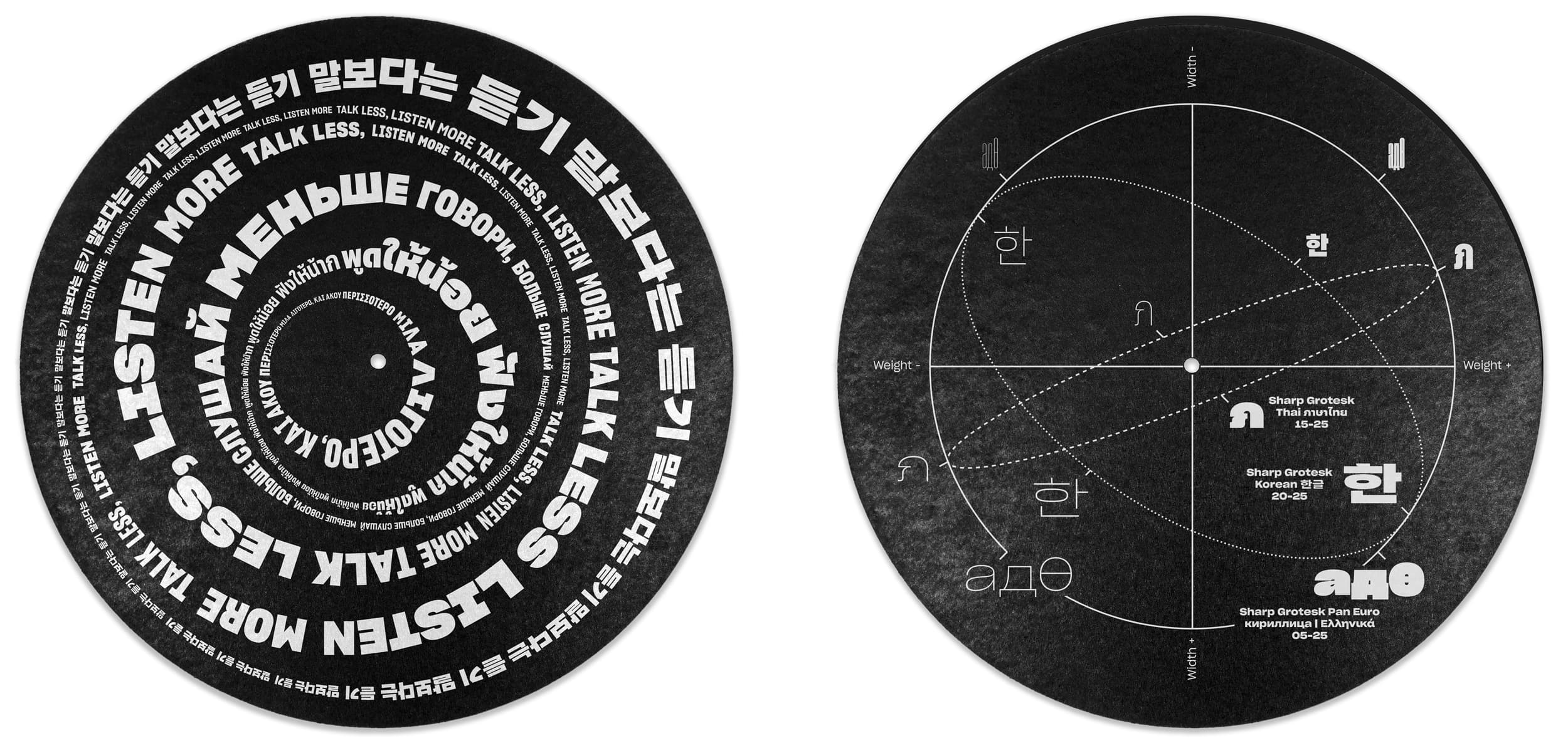
Sharp Grotesk Global is Sharp Type’s largest superfamily to date. It’s our most comprehensive Latin typeface, with twelve weights and seven widths in Roman and Italic styles. Sharp Grotesk now also represents our first multi-script release, with extensions in Greek, Cyrillic, Hangul, and Thai. Finally, a Latin variable font rounds out the collection.
Midnighter, They were one of the best known acts to come out of East L.A. Thee Midniters were among the first Chicano rock bands to have a major hit in the U.S.A. The band was one of the first to integrate horns, an unusual combination of trombone and sax, congas, keyboards, and guitars, with a sound reminicent of Blood, Sweat & Tears. All of the band’s twelve studio albums were in the Top 40 of UK charts. The Band originally formed in the West Midlands by bassist Martin Blunt, who recruited Rob Collins. The debut single “Indian Rope” proved to be an indie hit and the group soon found a major label in Beggars Banquet offshoot Situation Two in time for the release of “The Only One I Know”
В начале 1998 года Земфира переехала из родной Уфы в Москву, где начала работу со своей группой «Zемфира» над первым студийным альбомом, выпущенным спустя год. С 1999 года Земфира выпустила семь студийных альбомов, получивших значительное внимание прессы и публики. Также в её дискографию входят сборник би-сайдов и три концертных альбома. В её лирических исканиях нашли своё воплощение душевные страдания и поиски современной молодёжи. Опера је облик позоришта у којем се драма преноси у целини или углавном кроз музику и певање. Опера се појавила у Италији око 1600-е године и углавном је повезана са западном класичном музичком традицијом. Опера користи многе од елемената говорног позоришта као што су сценографија, костими и глума. Певача у опери прати и музички ансамбл.
Από κατασκευαστική άποψη τα μπουζούκια μπορούν να έχουν διαφορές μεταξύ τους όχι μόνο στον αριθμό των χορδών αλλά και σε άλλα χαρακτηριστικά, π.χ. μήκος μάνικου, πλάτος, ύψος, βάθος του ηχείου ή σκάφους, το πλάτος των ξύλινων φετών του σκάφους. Τις διαφορές αυτές καθορίζει ο κατασκευαστής που με την εμπειρία του και ανάλογα με τον ήχο που θέλει να βγάζει το όργανο, τροποποιεί τα λειτουργικά στοιχεία του για να πετύχει πιο οξύ, πιο βαθύ ή πιο βαρύ ήχο. Το μέγεθος και το είδος του ηχείου παίζουν ρόλο στην τονικότητα του οργάνου ενώ το μήκος του μάνικου, και κατ' επέκταση των χορδών, δίνουν τη διαφορά στην τονικότητα του οργάνου. Εννοείται ότι κάθε μήκος μάνικου έχει διαφορετικό πλάτος τάστων αφού όλα τα μπουζούκια έχουν τον ίδιο αριθμό τάστων. Μεγάλη σημασία στον ήχο έχει και η ποιότητα των ξύλων από τα οποία είναι κατασκευασμένο.
ส่วนผลการประกวดในประเภทนักเรียนนักศึกษานั้น วงมัมมี่ ได้เป็ นแชมป์ วงแกรนด์เอ็กซ์ ได้รางวัลรองชนะเลิศคู่กับรางวัลขวัญใจสื่อมวลชนมาครอง ด้วยแนวทางการแต่งตัวที่ เข้าตาสื่อ คือแม้จะเล่นเพลงร็อคดุๆ แต่พวกเขาแต่งตัวสุภาพเรียบร้อย ใส่กางเกงขายาว สีดำา เสื้อเชิ้ ตสีขาว ผูกเนคไท สวนทางกับวงอื่นๆ หลังการประกวด สมาชิกบางคนเรียน จบ โดยแต่ละคนแยกย้ ายกันไปเรียนต่อในระดับอุดมศึกษา แต่นคร เวชสุภาพร ยังคงหา สมาชิกวง โดยลงทุนถึงขนาดสละสิทธิ์ไม่เรียนในมหาวิทยาลัยที่เอ็นท์ติด แต่เลือกที่จะ เรียนในมหาวิทยาลัยเปิ ดที่เพื่อนๆ ส่วนใหญ่เรียนอยู่ เพื่อความสะดวกในการซ้อมดนตรี. วงแกรนด์เอ็กซ์เริ่ มเป็ นที่รู้จักจากการเล่นตามคลับ ตามบาร์ และต่ างจังหวัด โดยเล่นอยู่สักประมาณ 8 เดือน ก่อน ที่เพื่อนๆ บางคนในวงจะลาออกไป นคร เวชสุภาพร จึงได้ออกเดินทางหาสมาชิกคนใหม่ พร้อมกับปรับแนวทางของ วงแกรนด์เอ็กซ์ใหม่เพื่อให้เป็ นวงสตริงคอมโบอย่ างเต็มรูปแบบ ด้วยการเสริมทัพทีมเครื่องเป่ า คือ ชาย แสงชะอุ่ม (แซ็กโซโฟน), เสน่ห์ ศุภรัตน์ (ทรัมเป็ ด) และสมศักดิ์ อภิวัฒน์วีรกุล (ทรอมโบน) เข้ามาในราวปี พ.ศ. 2517 และการ เข้ามาของนักร้องนำาคนใหม่ คือ วสันต์ แต้สกุล (นามสกุลตอนนั้น) ในปี พ.ศ. 2519 มือเบสในยุคก่อตั้งกับมือคีย์- บอร์ดลาออกไป วสันต์จึงต้องหันไปเล่นคีย์บอร์ดอีกทาง ส่วนมือเบสได้แอ๊ด-ทนงศักดิ์ อาภรณ์ศิริ มาแทน
밴드의 생명은 신뢰와 의리다. 예컨대 영국 밴드 오아시스처럼 드러머가 드럼을 너무 못 쳐 일방적으로 해고했을 때가 바로 신뢰가 증발한 경우이고, 메탈리카처럼 리더가 멤버의 다른 활동을 통제해 그 멤버가 탈퇴한 경우가 바로 의리가 실종된 경우다. 밴드 역시 결국엔 사람과 사람의 관계이고 사람과 사람이 더 어울리지 못하면 그 팀은 이어갈 수 없는 것이다. 자우림은 그런 면에서 행운이다. 아마 멤버들이 무작정, 억지로 잘 지내려고만 했다면 여기까지 오진 못했을 것이다. 이들이 오래 함께 할 수 있었던 건 각자의 타고난 성격 덕분이다. 아니, 성격보단 인격에 가깝겠다. 자우림 멤버들은 약속이나 한 듯 가까울수록 예의를 지키는 걸 중요시 하고 서로를 존중, 존경하는 일이 습관처럼 몸에 밴 사람들이다. 그래서 김윤아는 지금 멤버들이 아니었다면 서로가 서로를 버티지 못했을 거라고 말한다. 당연히 누구 한 명이 혼자만 잘 되겠다고 팀을 나가려. 밴드의 생명은 신뢰와 의리다. 예컨대 영국 밴드 오아시스처럼 드러머가 드럼을 너무 못 쳐 일방적으로 해고했을 때가 바로 신뢰가 증발한 경우이고, 메탈리카처럼 리더가 멤버의 다른 활동을 통제해 그 멤버가 탈퇴한 경우가 바로 의리가 실종된 경우다. 밴드 역시 결국엔 사람과 사람의 관계이고 사람과 사람이 더 어울리지 못하면 그 팀은 이어갈 수 없는 것이다. 자우림은 그런 면에서 행운이다. 아마 멤버들이 무작정, 억지로 잘 지내려고만 했다면 여기까지 오진 못했을 것이다. 이들이 오래 함께 할 수 있었던 건 각자의 타고난 성격 덕분이다. 아니, 성격보단 인격에 가깝겠다. 자우림 멤버들은 약속이나 한 듯 가까울수록 예의를 지키는 걸 중요시 하고 서로를 존중, 존경하는 일이 습관처럼 몸에 밴 사람들이다. 그래서 김윤아는 지금 멤버들이 아니었다면 서로가 서로를 버티지 못했을 거라고 말한다. 당연히 누구 한 명이 혼자만 잘 되겠다고 팀을 나가려