Ogg


Margelia, Lagerfeld, Ana Wintour, Christian Dior, Issey Miyake, Andre Leon Talley & Bill Cunningham.
Luxury or nothing. There is so much to say about Andre Leon Talley and nothing said will ever be enough. No one person, not even ALT himself, could be counted on to weave all of his glories and hitches into a complete, fitting and accurate garment. We will have to depend on one another to create this last ensemble. So, this morning, I just want to celebrate how he moved through the world.
It’s easy, I think, to dismiss ways of being as cultural contributions, but I believe that people are culture. How they live and move and myth-make and endure and drape and pose and want and want and want and observe and comment and declare. That’s culture. Andre Leon Talley’s sense of self was culture. And, I argue, it was culture at its best. One look at him and you wanted more for yourself.
Aa
Aa
Aa
Aa
Aa
Lil Nas X + Jean Paul Gaultier Collaboration . . . Sep 20, 2021 — This collab comes days after the Montero release on September 17, marking Lil Nas X's celebrated marriage of rap, pop and, above all, ...
When the biggest provocateurs come together, you know the outcome is going to bring drama. The pieces: a long sleeve top with playful biblical imagery printed on tulle. I don’t understand even a minimal part of a machine. For me it’s a toy to be broken. Love is a very difficult word to use for the importance I give to love.
“I don’t live for fashion, I live for beauty and style.” So says haute couture eminence grise Andre Leon Talley in the opening seconds of Kate Novack’s The Gospel According to Andre, and the director takes those words as gospel. The documentary is a deeply loving, frequently beautiful testament to the former Vogue editor, who rose from humble beginnings in North Carolina to become arguably the high fashion world’s first major African-American tastemaker, as well as the type of multi-lingual, Russian-lit-citing public intellectual who is perfectly at ease gossiping on TV with Wendy Williams. At times hesitant to press Talley on some uncomfortable but important aspects of his life, the film amounts to essentially a long, intimate brunch conversation with its inimitable subject, and for those with even a passing interest in fashion, that should be plenty. There are plenty of famous names who show up to sing Talley’s praises – Tom Ford, Diane von Furstenberg, Marc Jacobs, Manolo Blahnik, and of course Talley’s primary foil Anna Wintour, who credits him for teaching her about fashion in her earliest days as Vogue editor-in-chief – but some of the most memorable anecdotes come from his childhood friends. Through them and Talley’s memories, we get a crystal clear image of the fashionista as a young man, raised by his beloved grandmother, and eternally
Best known for his long association with Vogue, Talley has long stood out even in the peacockish world of couture: his imposing six-and-a-half-foot profile, usually decked out in lavish capes and jackets, is as much a staple of Paris runways as flashbulbs and champagne flutes. Alongside plenty of vintage footage, Novack follows him around New York City, his home in White Plains, and his hometown of Durham throughout the summer and fall of 2016, giving fly-on-the-wall access as he dresses famous friends and mulls on the upcoming presidential election. “Gospel” is Novack’s first solo feature, though she co-directed “Eat This New York” with husband Andrew Rossi, whose “Page One: Inside the New York Times” she also produced, and she seems to have an implicit understanding that shot composition is every bit as important in a documentary as in a narrative feature. She and cinematographer Bryan Sarkinen capture some wonderful imagery here, and she does deft work to weave in eye-popping runway footage from fashion eras past and present.
I hate any kind of machines but the telephone, because I need it a lot. All the machines frighten me because I’m not able to use them. I don’t understand even a minimal part of a machine. For me it’s a toy to be broken. Love is a very difficult word to use for the importance I give to love. Perhaps it will be marvelous to be in love every day, every moment, but it’s very
To celebrate the 10th anniversary of his eponymous brand, party animal-turned-streetwear sensation Marcelo Burlon brought together the brightest stars in sports and fashion for a Spring/Summer 23 Menswear presentation that married the rich textiles of his Patagonian roots with the bright colors and flowing silhouettes of the coastal European club scene that he
A
A
A
A
A
Described by Fran Lebowitz as perhaps the only Studio 54 regular who wasn’t there for the sex and the drugs
Diligence and passion as a fashion journalist would see him rise to gigs in Paris with Women’s Wear Daily and back in New York at Vogue. But it was through a chance meeting with legendary fashion editor Diana Vreeland, whom he regarded as something of a second mother, that he first ascended to the upper echelons.
I hate any kind of machines but the telephone, because I need it a lot. All the machines frighten me because I’m not able to use them. I don’t understand even a minimal part of a machine. For me it’s a toy to be broken. Love is a very difficult word to use for the importance I give to love. Perhaps it will be marvelous to be in love every day, every moment, but it’s very
To celebrate the 10th anniversary of his eponymous brand, party animal-turned-streetwear sensation Marcelo Burlon brought together the brightest stars in sports and fashion for a Spring/Summer 23 Menswear presentation that married the rich textiles of his Patagonian roots with the bright colors and flowing silhouettes of the coastal European club scene that he

V
V
V
V
V
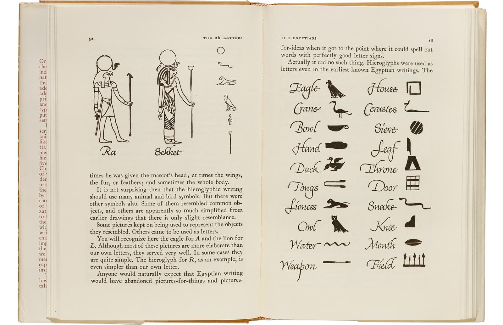
Inspired by the hand lettering of 20th century book designer and calligrapher Oscar Ogg, Ogg captures the unique mix of calligraphic and typographic form achieved through his use of hand carved pen nibs, brushes, and white-out. The transitional stroke ductus of Ogg roman made for maximum legibility with an extremely compact word-shape, even when set at 8pt and below. In this vein, Ogg Text came to take on an unmistakably Dutch flavor.
Like most other sedimentary rocks, most limestone is composed of grains. Most grains in limestone are skeletal fragments of marine organisms such as coral or foraminifera. These organisms secrete shells made of aragonite or calcite, and leave these shells behind when they die. Other carbonate grains comprising limestones are ooids, peloids, intraclasts, and extraclasts. Limestone often contains variable amounts of silica in the form of chert (chalcedony, flint, jasper). Limestone has numerous uses: as a building material, an essential component of concrete (Portland cement), as aggregate for the base of roads, as white pigment or filler in products such as toothpaste or paints, as a chemical feedstock for the production of lime, as a soil conditioner, or as a popular decorative addition to rock gardens. The primary source of the calcite in limestone is most commonly marine organisms. Some of these organisms can construct mounds of rock known as reefs, building upon past generations. Limestone has numerous uses: as a building material, an essential component of concrete (Portland cement), as aggregate for the base of roads, as a chemical feedstock for the production of lime, as a soil conditioner, and for rock gardens.
Some limestones do not consist of grains at all, and are formed completely by the chemical precipitation of calcite or aragonite, i.e. travertine. Secondary calcite may be deposited by supersaturated meteoric waters (groundwater that precipitates the material in caves). This produces speleothems, such as stalagmites and stalactites. Another form taken by calcite is oolitic limestone, which can be recognized by its granular (oolite) appearance. The primary source of the calcite in limestone is most commonly marine organisms. Some of these organisms can construct mounds of rock known as reefs, building upon past generations. Limestone has numerous uses: as a building material, an essential component of concrete (Portland cement), as aggregate for the base of roads, as a chemical feedstock for the production of lime, as a soil conditioner, and for rock gardens. The primary source of the calcite in limestone is most commonly marine organisms. Some of these organisms can construct mounds of rock known as reefs, building upon past generations. Limestone has numerous uses: as a building material, an essential component of concrete (Portland cement), as aggregate for the base of roads, as a chemical feedstock for the production of lime, as a soil conditioner, and for rock gardens.
In the US, aragonite in the form of stalactites and “cave flowers” is known from Carlsbad Caverns and other caves. Massive deposits of oolitic aragonite sand are found on the seabed in the Bahamas. ragonite is the high pressure polymorph of calcium carbonate. As such, it occurs in high pressure metamorphic rocks such as those formed at subduction zones. Aragonite forms naturally in almost all mollusk shells. The type location for aragonite is Molina de Aragón in the Province of Guadalajara in Castilla-La Mancha, Spain, for which it was named in 1797. The mineral is not named for the region of Aragon: Molina de Aragón is located in the historic region of Castile. Turquoise is insoluble in all but heated hydrochloric acid. Its streak is a pale bluish white and its fracture is conchoidal, leaving a waxy lustre. Despite its low hardness relative to other gems, turquoise takes a good polish. Turquoise may also be peppered with flecks of pyrite or interspersed with dark, spidery limonite veining.
Aragonite also forms in the ocean and in caves as inorganic precipitates called marine cements and speleothems, respectively. Aragonite is not uncommon in serpentinites where high Mg in pore solutions apparently inhibits calcite growth and promotes aragonite precipitation. Aragonite is metastable at the low pressures near the Earth’s surface and is thus commonly replaced by calcite in fossils. Aragonite older than the Carboniferous is essentially unknown. It can also be synthesized by adding a calcium chloride solution to a sodium carbonate solution. As a secondary mineral, turquoise forms by the action of percolating acidic aqueous solutions during the weathering and oxidation of preexisting minerals. For example, the copper may come from primary copper sulfides such as chalcopyrite or from the secondary carbonates malachite or azurite; the aluminium may derive from feldspar; and the phosphorus from apatite. Climate factors appear to play an important role as turquoise is typically found in arid regions, filling or encrusting cavities and fractures in typically highly altered volcanic rocks, often with associated limonite and other iron oxides.
In aquaria, aragonite is considered essential for the replication of reef conditions. Aragonite provides the materials necessary for much sea life and also keeps the pH of the water close to its natural level, to prevent the dissolution of biogenic calcium carbonate. Aragonite has been successfully tested for the removal of pollutants like zinc, cobalt and lead from contaminated wastewaters. Aragonite is thermodynamically unstable at standard temperature and pressure, and tends to alter to calcite on scales of 107 to 108 years. The mineral vaterite, also known as μ-CaCO3, is another phase of calcium carbonate that is metastable at ambient conditions typical of Earth’s surface, and decomposes even more readily than aragonite. For example, the copper may come from primary copper sulfides such as chalcopyrite or from the secondary carbonates malachite or azurite; the aluminium may derive from feldspar; and the phosphorus from apatite. Climate factors appear to play an important role as turquoise is typically found in arid regions, filling or encrusting cavities and fractures in typically highly altered volcanic rocks, often with associated limonite and other iron oxides.