Sharp Type

We care about your privacy. Sharp Type uses cookies to improve your experience on this website. Read about how we use cookies in our Terms of Use. If you continue to use this site, you consent to our use of cookies.

Tap to Edit
  • Left Align
  • Center Align
  • Scale Text
Grandiloquence
  • Left Align
  • Center Align
  • Scale Text
FORWARD
  • Left Align
  • Center Align
  • Scale Text
Quintessential
  • Left Align
  • Center Align
  • Scale Text
PALAVER
  • Left Align
  • Center Align
  • Scale Text
Magnanimity
  • Left Align
  • Center Align
  • Scale Text
SUBLIME
  • Left Align
  • Center Align
  • Scale Text
Librocubularist
  • Left Align
  • Center Align
  • Scale Text
MAGNIFY
  • Left Align
  • Center Align
  • Scale Text
Bouleversement
  • Left Align
  • Center Align
  • Scale Text
WRITRIX

About Carta Nueva

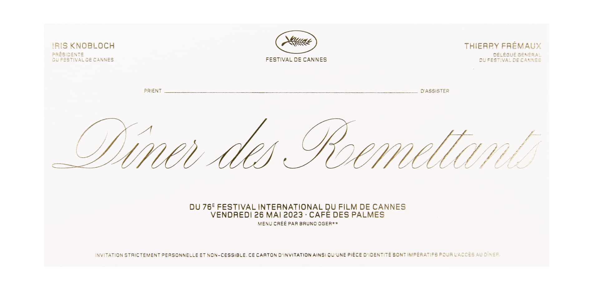
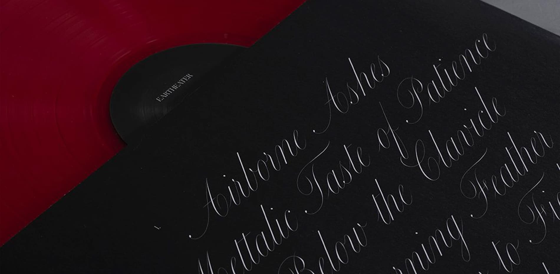
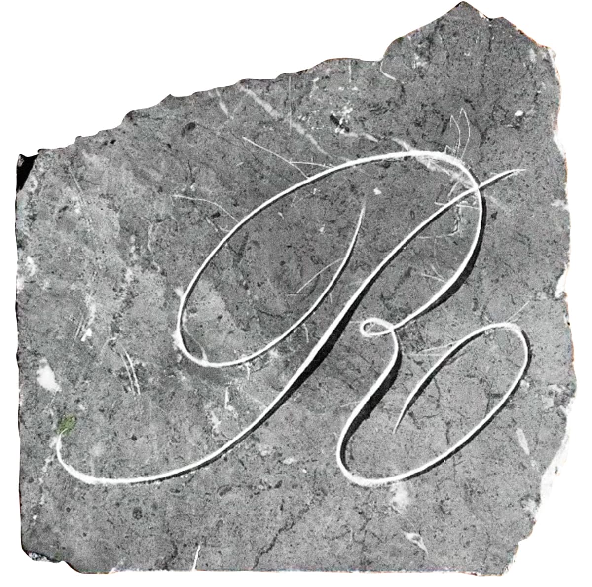
Carta Nueva is the digital re-imagination of a pointed-nib calligraphy model from 1851 in Barcelona, Spain (designer unknown). 170 years after the original calligrapher’s penning and printing, the manual made its way into our hands at an antique fair in Madrid. When type designer My-Lan Thuong began designing Carta Nueva in 2019, she could not have anticipated just how far these letterforms would take her. Under her care and imagination, we knew the spirit of the letterforms would be treated thoughtfully and take on a new life of their own for the 21st century. Much like its designer, Carta is poised and lively, with an unbounded potential for growth and flourishment.


5 optical sizes, 5 total fonts

Carta Nueva Construction

Carta_model-1.jpg

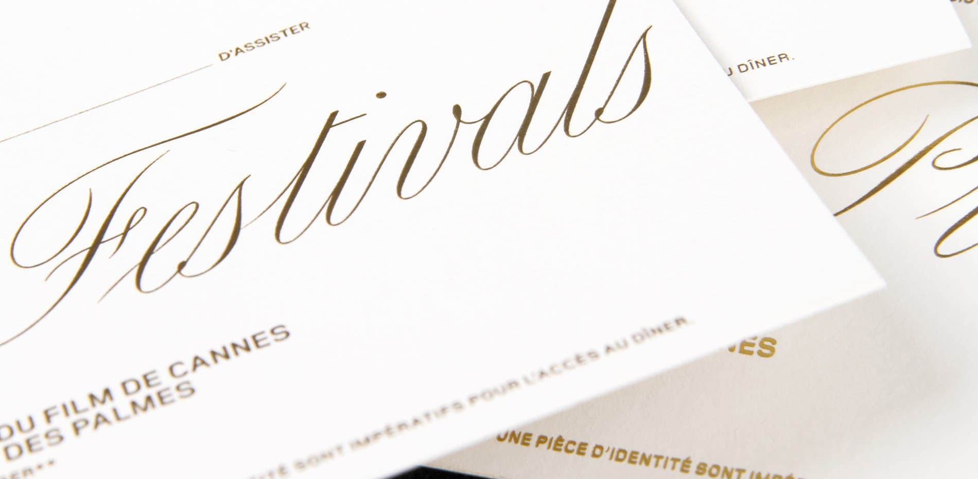
Carta Nueva’s beauty shines in the rhythm and contrast of the strokes. While drawn digitally, Carta Nueva preserves the essence of the calligrapher’s choreography — adding pressure on downward strokes to establish a consistent beat, then becoming as light as air on the upward strokes to taper to a fine point. The hairlines almost disappear upon contact with the stems, requiring them to be drawn at a 4096 units per em scale to capture every intricacy. Around this orderly tempo, the nib winds, loops, and arabesques. This lively twirl is accentuated most in the ornamental drawings of the uppercase letters.

Carta-ductus.svg
carta-sketches-all

As with any typeface that is in conversation with history, there comes a point where the designer takes over to write her own finale. While the original manual included the standard alphabet, My-Lan envisioned what the remaining glyph set would look like, including punctuation, symbols, mathematical signs, accented and special letters. My-Lan’s inventiveness shines through in her sketches and calligraphic prototypes which have always been an integral part of her process. While hand-sketching allows a quick exploration of shapes, the practice of calligraphy with a pointed-nib pen was important to understand the ductus, weight distribution, and bouma of the connected script. 

carta-system-effervescence.svg

Carta Nueva intends to reproduce the virtuosity and flow of cursive writing, which requires a robust set of contextual alternates. The typeface currently includes 1,698 glyphs, in contrast to ~600 glyphs found in a standard Latin typeface. Each lowercase has 4 to 6 alternates that are automatically activated depending on its position and neighboring letters. The shapes, instrokes, and outstrokes were structured to work together, in order for the typeface as a whole to look naturally penned in every possible combination.

Carta Nueva Optical Sizes

Carta Nueva’s charm is emphasized by the high-contrast between the downstrokes and extreme thins on the upstrokes. At the same time, one of the challenges was preserving the airy quality of the razor-thin hairlines without them vanishing at smaller sizes. In order to let Carta Nueva shine in any scenario and medium from digital screens to printed paper, My-Lan drew variants that subtly add hairline stroke weight while maintaining the typeface’s sturdy, graceful posture. Carta’s five optical sizes are versatile and can make a grand gesture through a single word and headline, and also dedicate attention to delicate paragraphs of text.

carta-opt-sizes.svg

Multi-directional Family

Beyond this first style, Carta Nueva will soon grow into a multi-directional family that will make heads turn. 

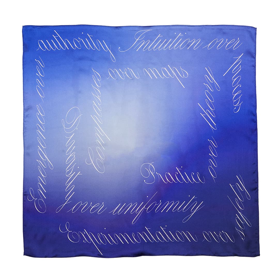
Although the standard for setting Latin is horizontal, My-Lan believes the Latin alphabet can just as successfully embrace verticality and directionality. This concept of multi-directional writing has been on her mind for several years now, and began while working on her diploma project at École Estienne in Paris. The project, fittingly titled Vertigo, puzzled with how to adapt the Latin alphabet to vertical typesetting. 

During her research, My-Lan felt that instead of simply stacking letters or rotating them, finding the sweet spot in-between the two would offer a solution for words to look stable and legible when set vertically. Practicing calligraphy was key to finding the combination of variables to achieve this balance, and Carta’s Spencerian-style script proved to be best suited for this exploration.

carta-sketches-vertical

The development of the Carta Nueva’s directional styles is not only about perfecting a technical challenge, but also an opportunity for My-Lan to push boundaries and go beyond conventions in type design. Carta Upward, in particular, reflects both innovation and imagination in the genre of vertical typesetting by defying gravity with grace. 

Through a rigorous finessing of skewing, rotating, distorting, and optically correcting letterforms along horizontal and vertical baselines, Carta’s signature silhouette is maintained in all directions. These styles lead to possibilities where horizontal and vertical counterparts can be paired together, with text that climbs like vines and cascades like water.

Given the complexity of this design, Carta Nueva’s multidirectional expansion will be released in a second version. For now, we will leave you with a sneak preview of Carta Backward, Downward, and Upward.

carta-multi-direction.svg
carta-not-def


Designed in 2020 by My-Lan Thuong.

Version History
V.1. November 2020

By submitting your email you agree to receive updates about Sharp Type. You can unsubscribe at any time. View our full Privacy Policy.