Typology & Post Grotesk
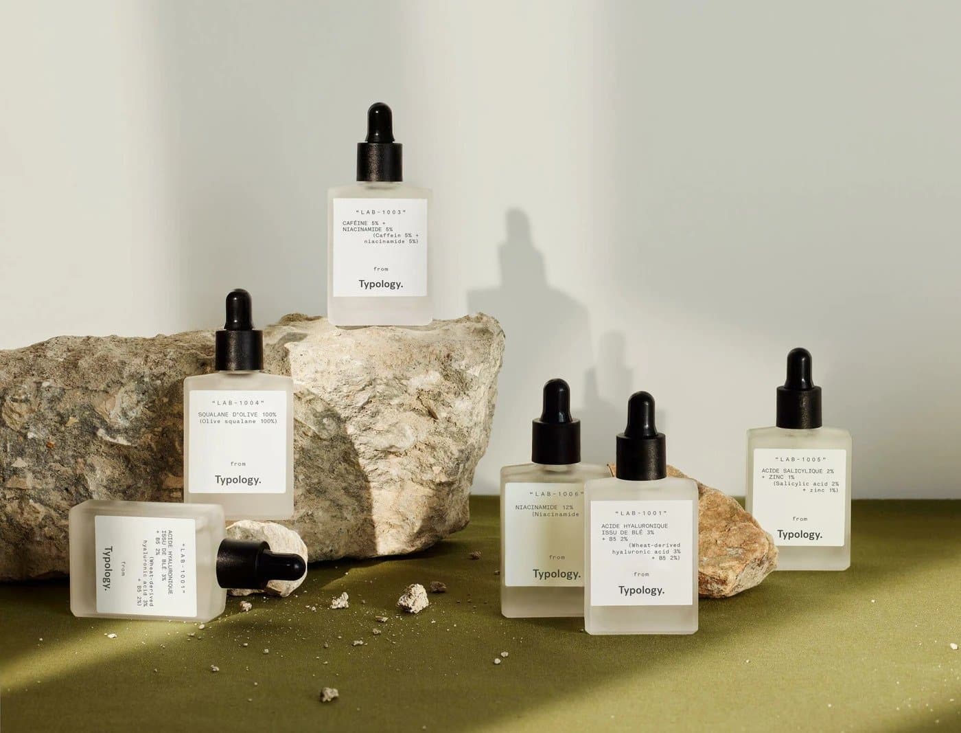
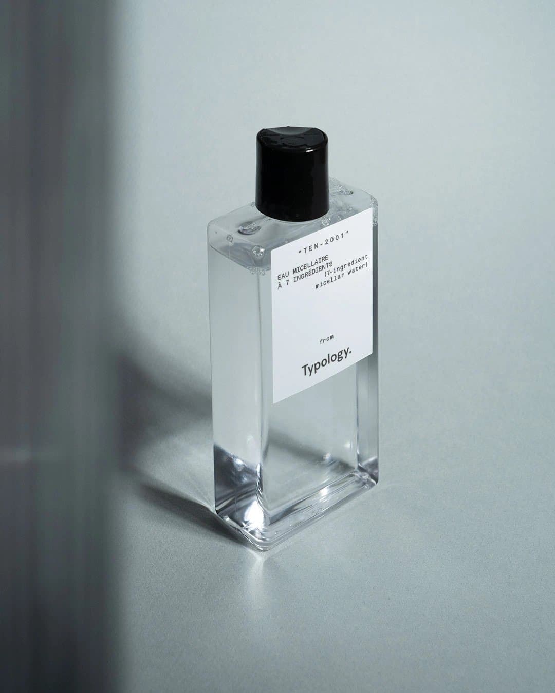
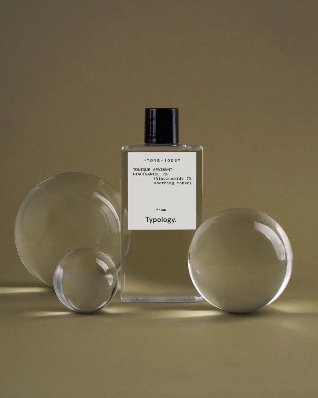
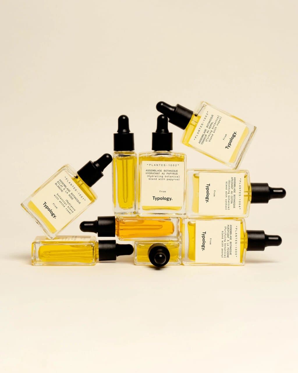
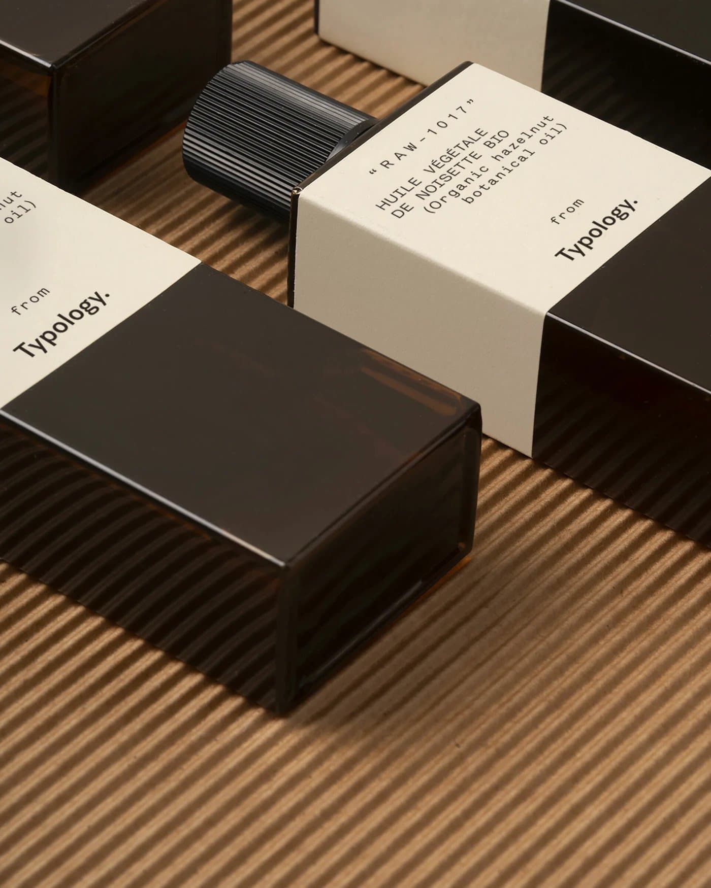
Transparency and simplicity are the elemental virtues of Parisian skincare line Typology, which was founded in 2019 with a mission to give clarity to its users – and not just to their skin. From the local provenance of their skincare recipes to the careful sourcing of their ingredients to their all-natural vegan formulation process, founder Ning Li wanted every part of the brand to reflect a considered, pared-back approach. Naturally, the language and packaging of the brand embodies this ethos, too. London-based Shaz Madani Studio led the creative direction and selected Sharp Type’s Post Grotesk for Typology’s logotype.
Transparency and simplicity are the elemental virtues of Parisian skincare line Typology, which was founded in 2019 with a mission to give clarity to its users – and not just to their skin. From the local provenance of their skincare recipes to the careful sourcing of their ingredients to their all-natural vegan formulation process, founder Ning Li wanted every part of the brand to reflect a considered, pared-back approach. Naturally, the language and packaging of the brand embodies this ethos, too. London-based Shaz Madani Studio led the creative direction and selected Sharp Type’s Post Grotesk for Typology’s logotype.
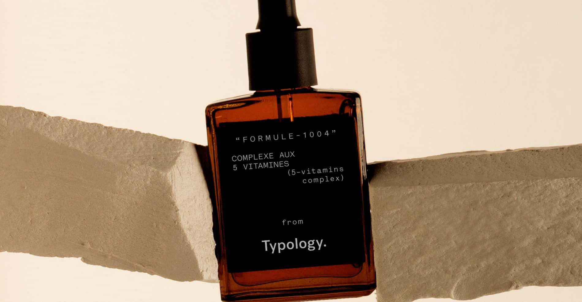
Post Grotesk is a contemporary version of a traditional grotesk sans-serif designed by Sharp Type collaborator Josh Finklea. It has beautifully utilitarian construction and texture, allowing for an almost limitless variety of applications. As the type “face” of Typology, Post Grotesk communicates the unaffected clarity that defines the brand.
Show us your latest project using our typefaces by getting in touch or tagging us on social media.
IG: @sharp_type
https://www.instagram.com/sharp_type/
TW: @SharpTypeCo
Featured Fonts
Featured Fonts