The Malee Scholarship 2021 Women of Typographic Excellence
The Malee Scholarship recognizes eight Women of Typographic Excellence for their achievements and contributions to the type design industry.
The Malee Scholarship recognizes eight Women of Typographic Excellence for their achievements and contributions to the type design industry.
Women of Typographic Excellence was established in our inaugural year to recognize exceptional applicants and shine a light on their accomplishments. This year The Malee Scholarship recognizes the following women as achieving Typographic Excellence: Corinne Ang, B. Benedicto, Salomi Desai, Ana Michel, Mónica Munguía, Karla Pasten, Sophia Tai, and Emi Takahashi. Together they represent Bolivia, Brazil, Canada, India, Mexico, the Netherlands, and the Philippines. The Malee Team was impressed with their collective interest in pursuing multi-script type design that reflects their own backgrounds, as well as their drive to design typefaces for underrepresented global scripts. Many of them are also either part of or have started their own local communities to support others who are eager to learn about type and the letter arts.
Corinne Ang
Corinne Ang is a Filipino graphic and type designer currently based in Brooklyn, New York. She graduated with a BFA in Graphic Design at the Rhode Island School of Design this June 2021. Prior to moving to the United States, Corinne was raised in Hong Kong and lived in Singapore. Growing up as a third culture kid, she became interested in the complex entanglements of differing cultures occupying the spaces of which she has been a part. This investigation into interpersonal connections is reflected in her design practice through her fondness of typography and publication. Corinne looks forward to exploring as many possibilities within the world of letterforms. In the future, she hopes to teach to support other voices and provide space for a wider range of narratives to unfold.
B. Benedicto
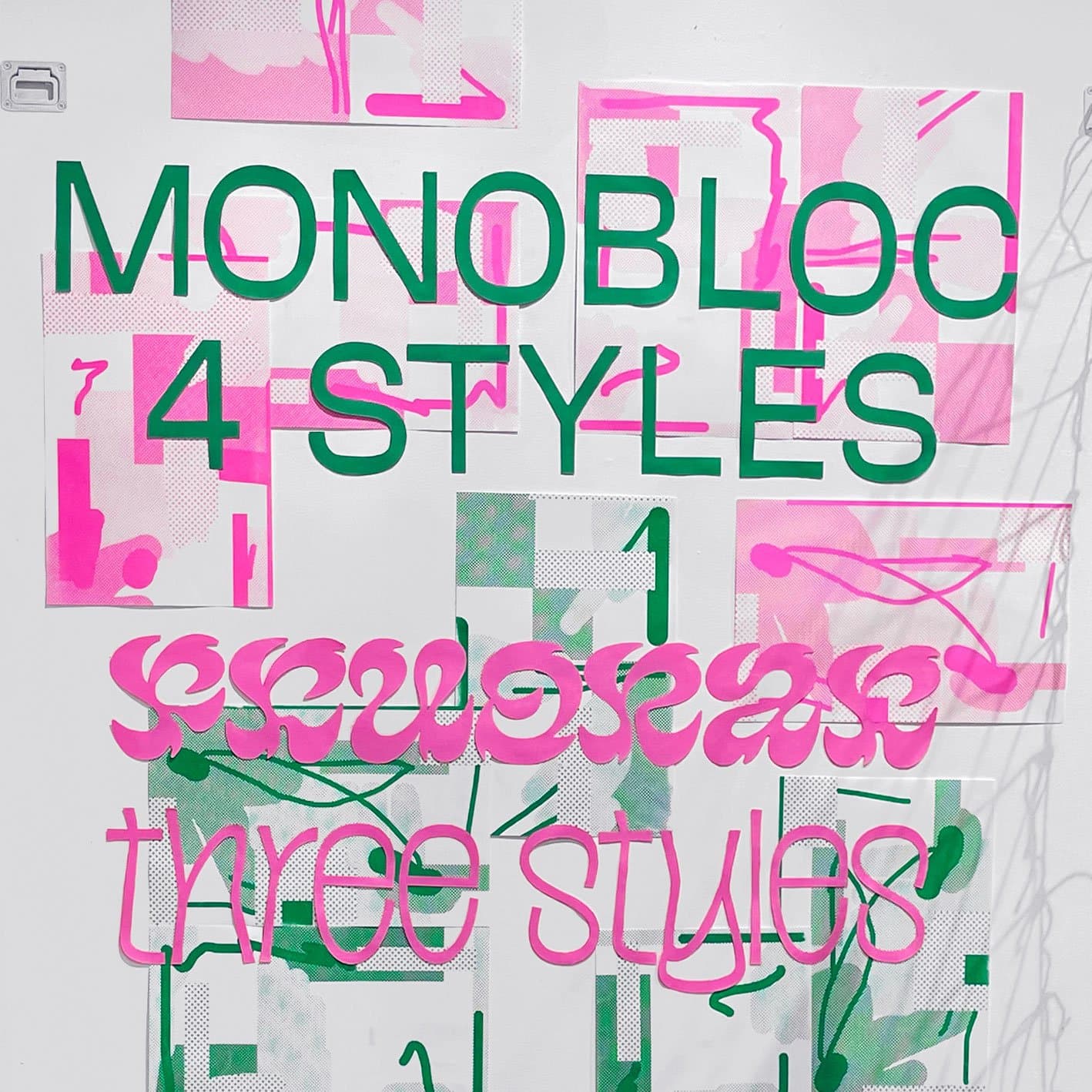
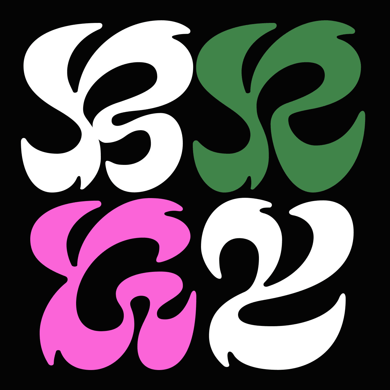
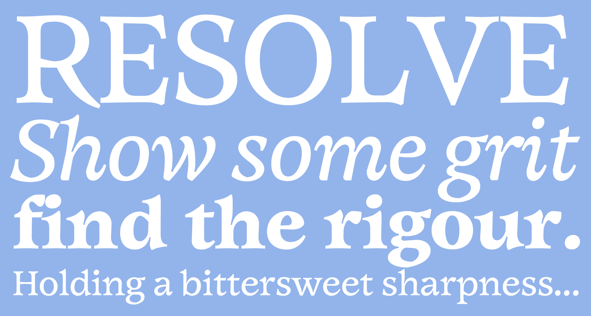
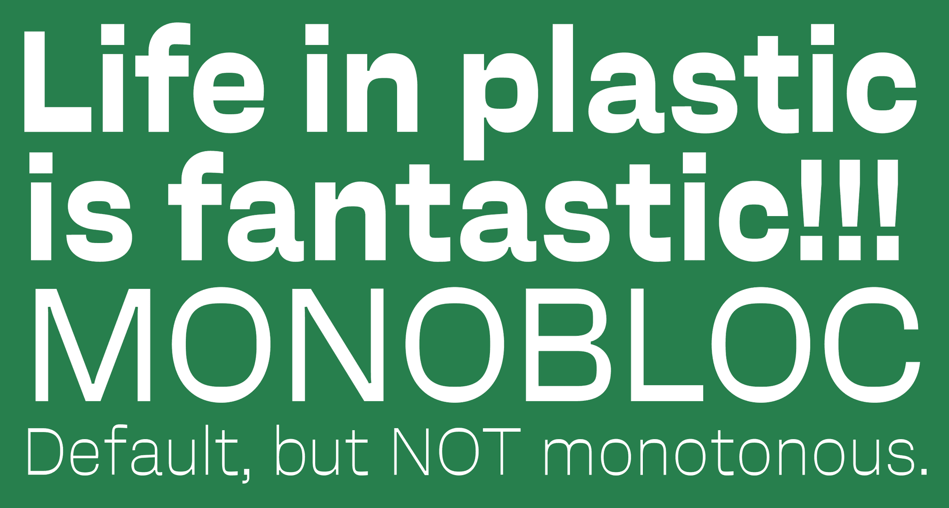
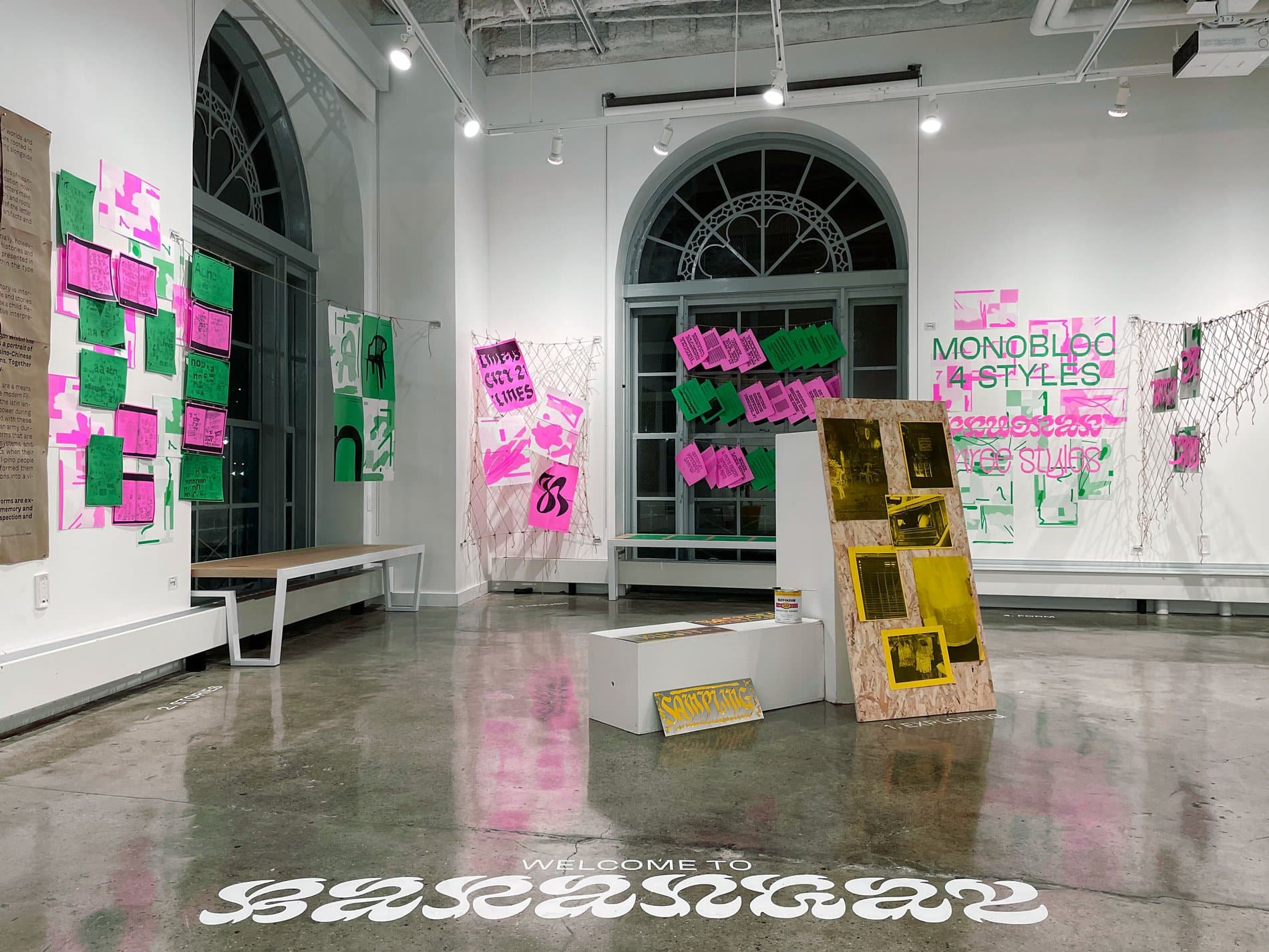
B. is Latin American letter-maker, researcher, educator and non-binary dyke based in Fortaleza, Brazil. As a transdisciplinary designer with a MA in Graphic Design and Editorial Projects (FBAUP - Universidade do Porto), they work with calligraphy, type, graphic and editorial design.
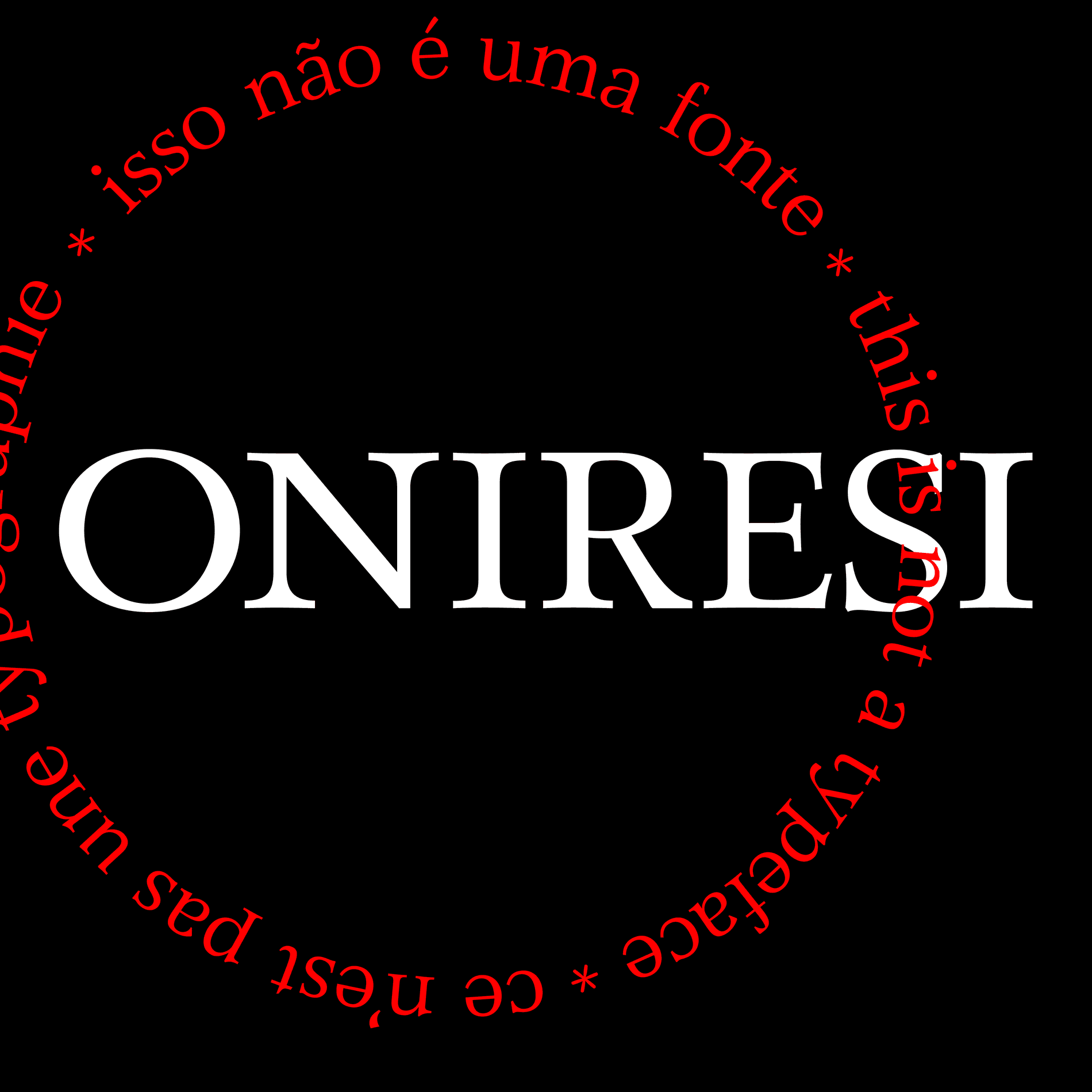
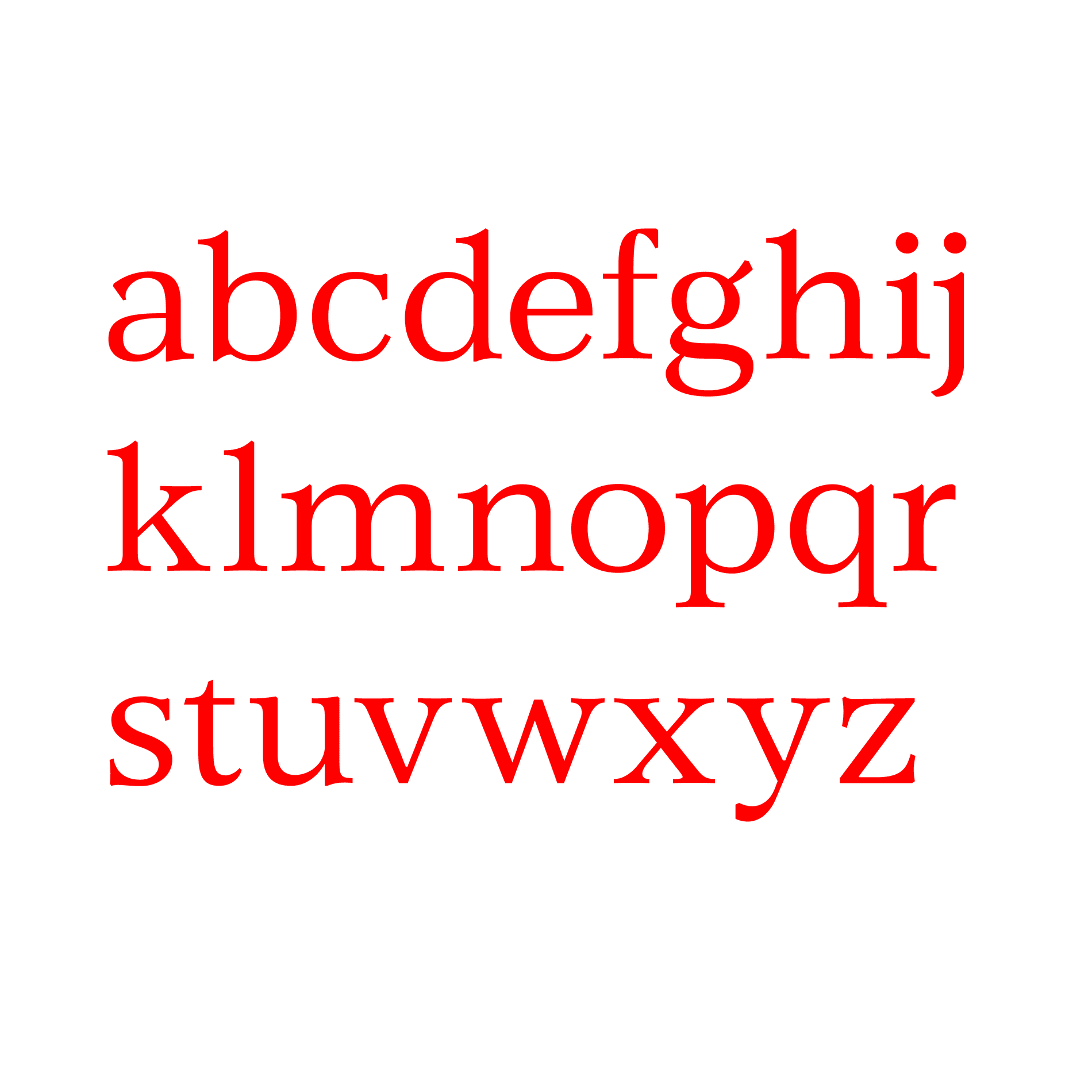
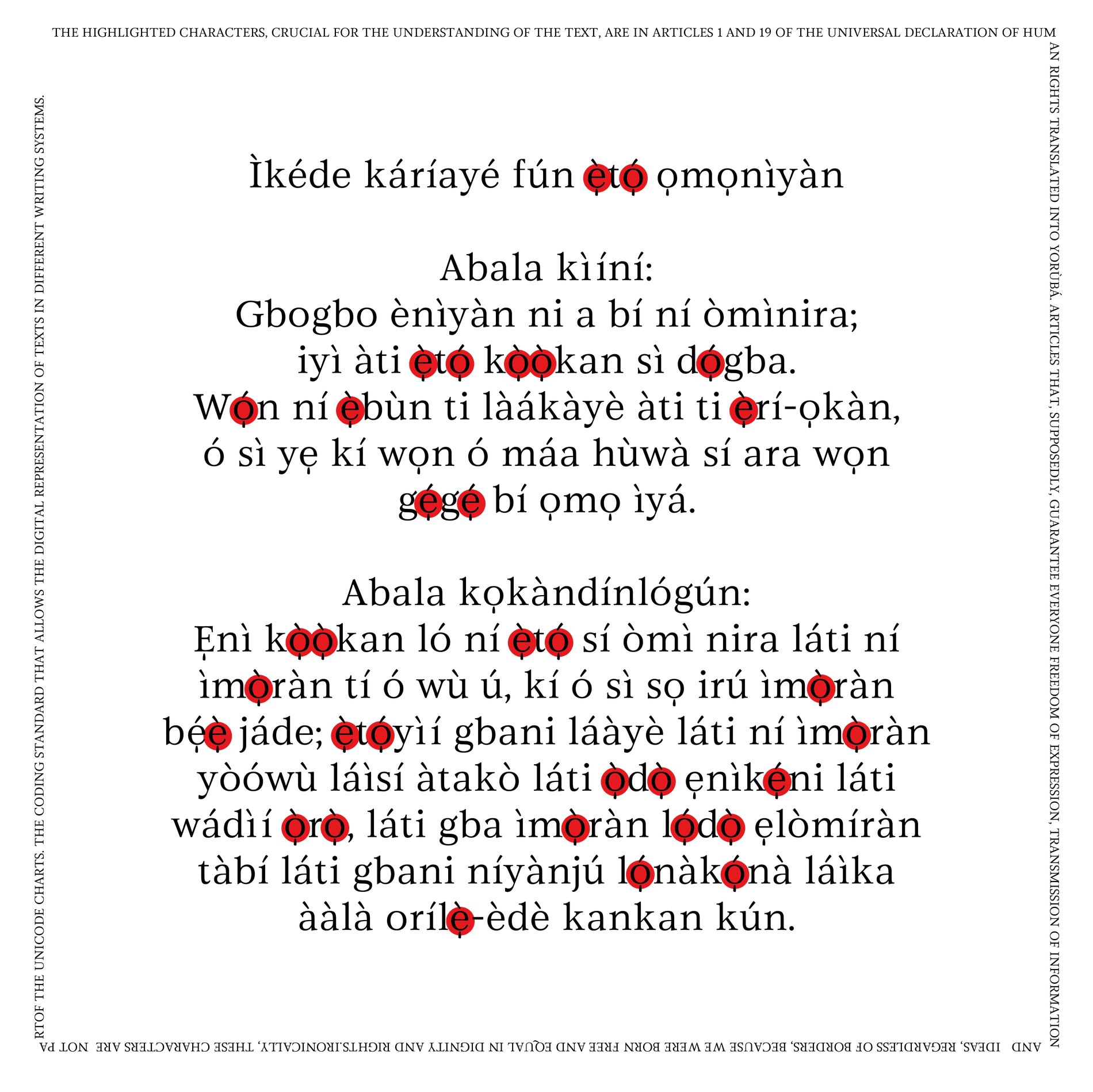
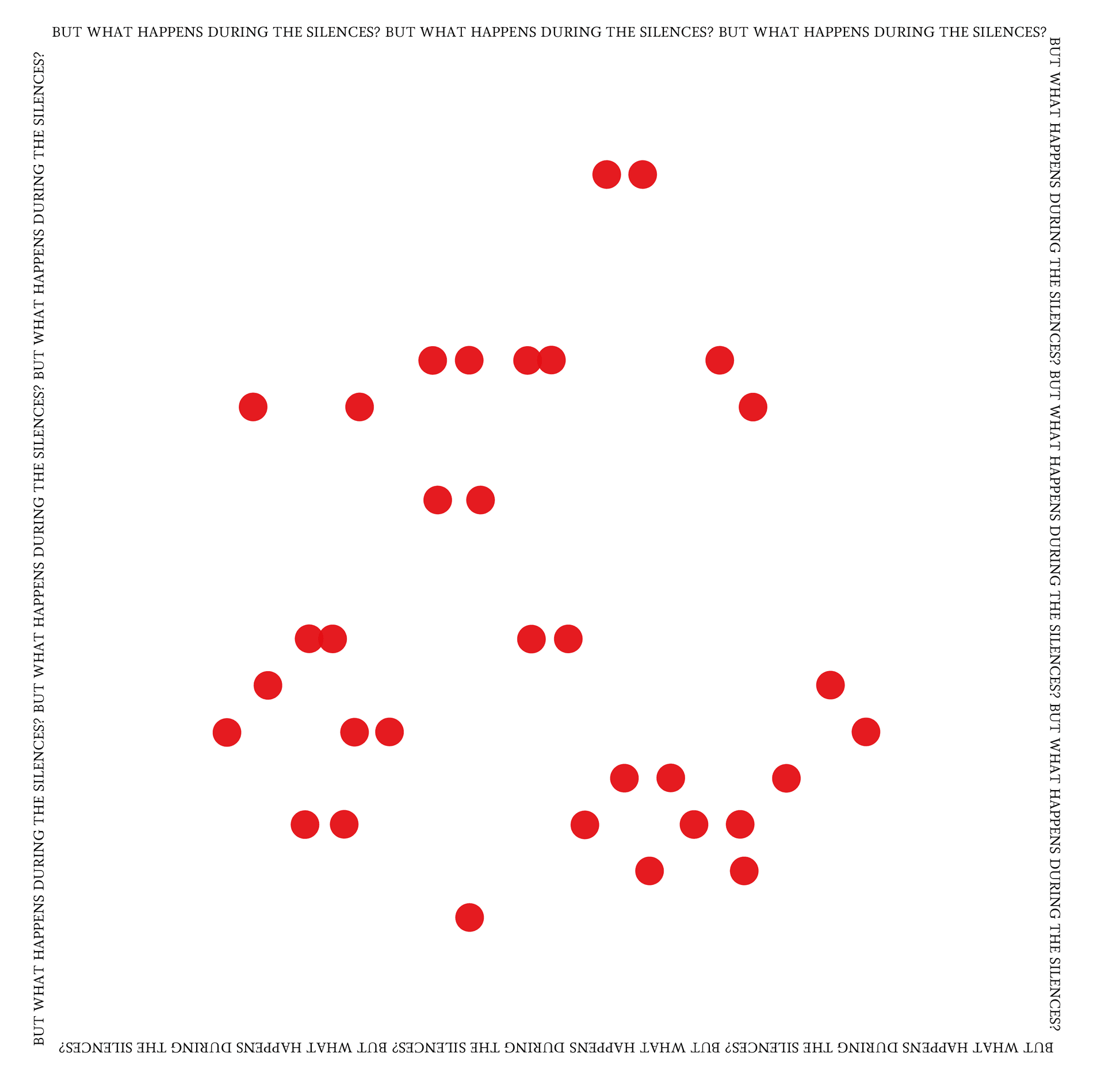
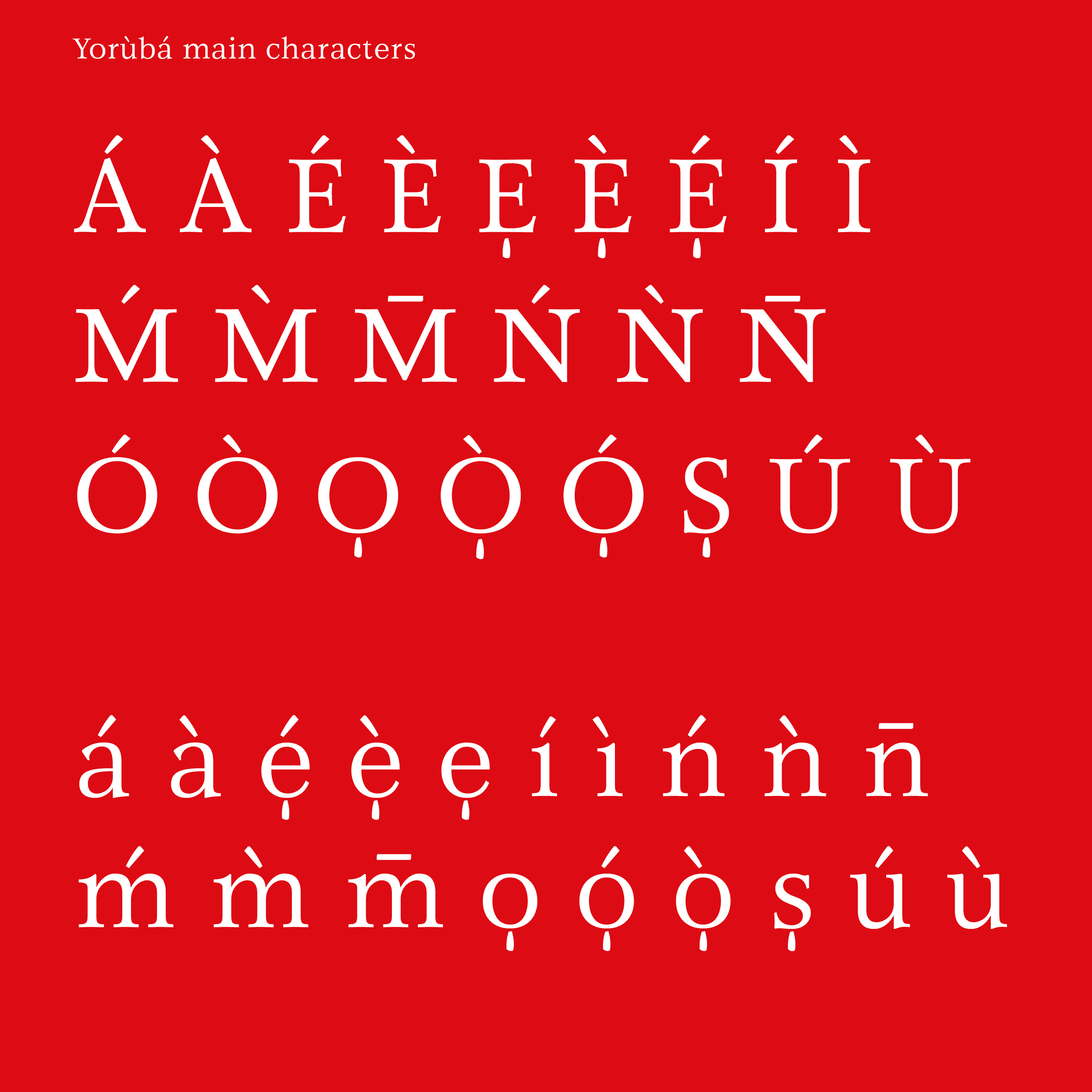
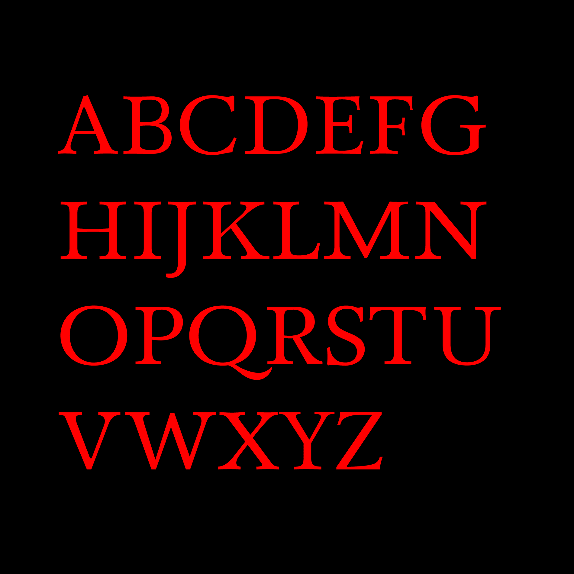
B. is currently working on a project called Oniresi, a typeface designed to suit and celebrate the specificities of the Yoruba (Èdé Yorùbá) language. The project was first created in the 1980s by Professor Dr. Victor Manfredi (African Studies Center of Boston University) and developed with the help of a German type designer. Back then, the idea was to create one unified character map for typewriters and typesetting that contemplated the most common languages in Nigeria, in addition to Yoruba, English, Igbo and Hausa. The goal is to apply a critical view by approaching the original drawings with another mindset and listening to current communication needs of the Yoruba users in the digital era. In Unicode, the Yoruba diacritics are inconsistent and wrongly considered to be optional rather than essential for reading and writing. Oniresi is not a revival, but an endeavor to take another path – one that leaves behind what we no longer want to perpetuate.
Salomi Desai
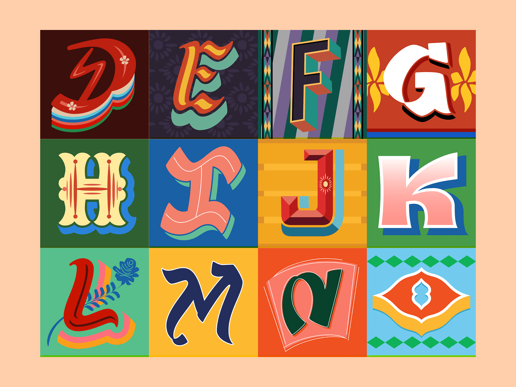
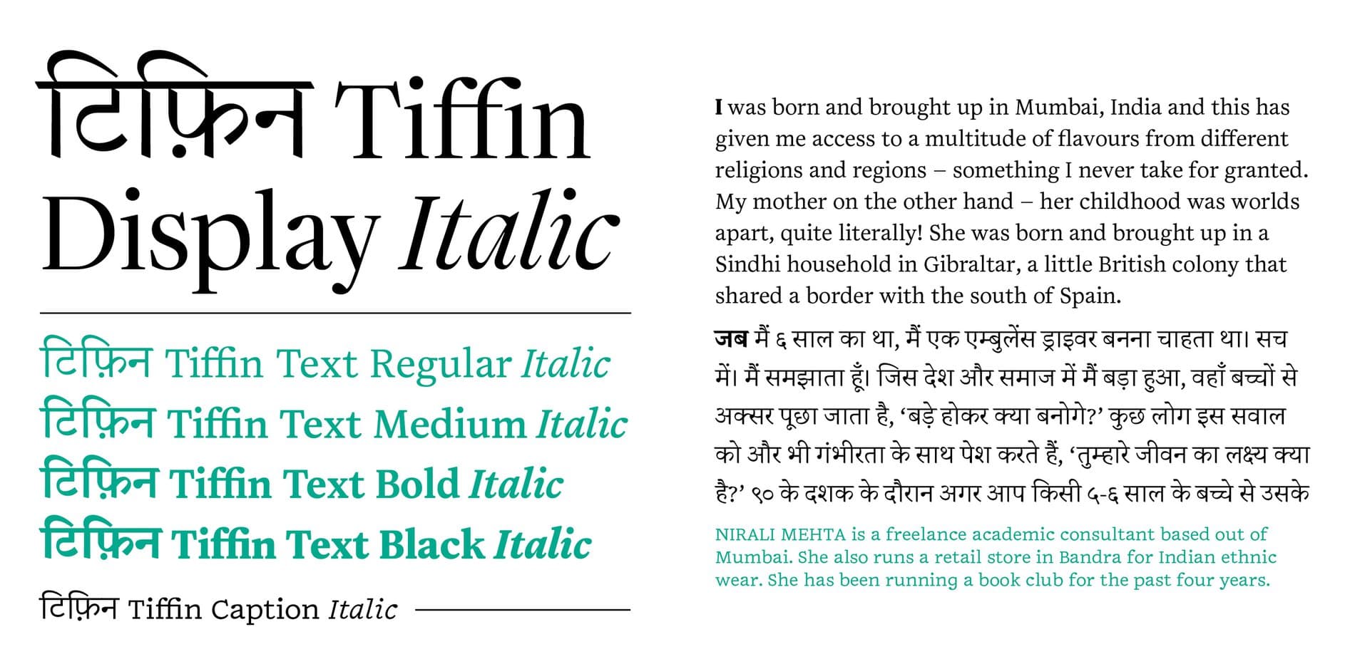
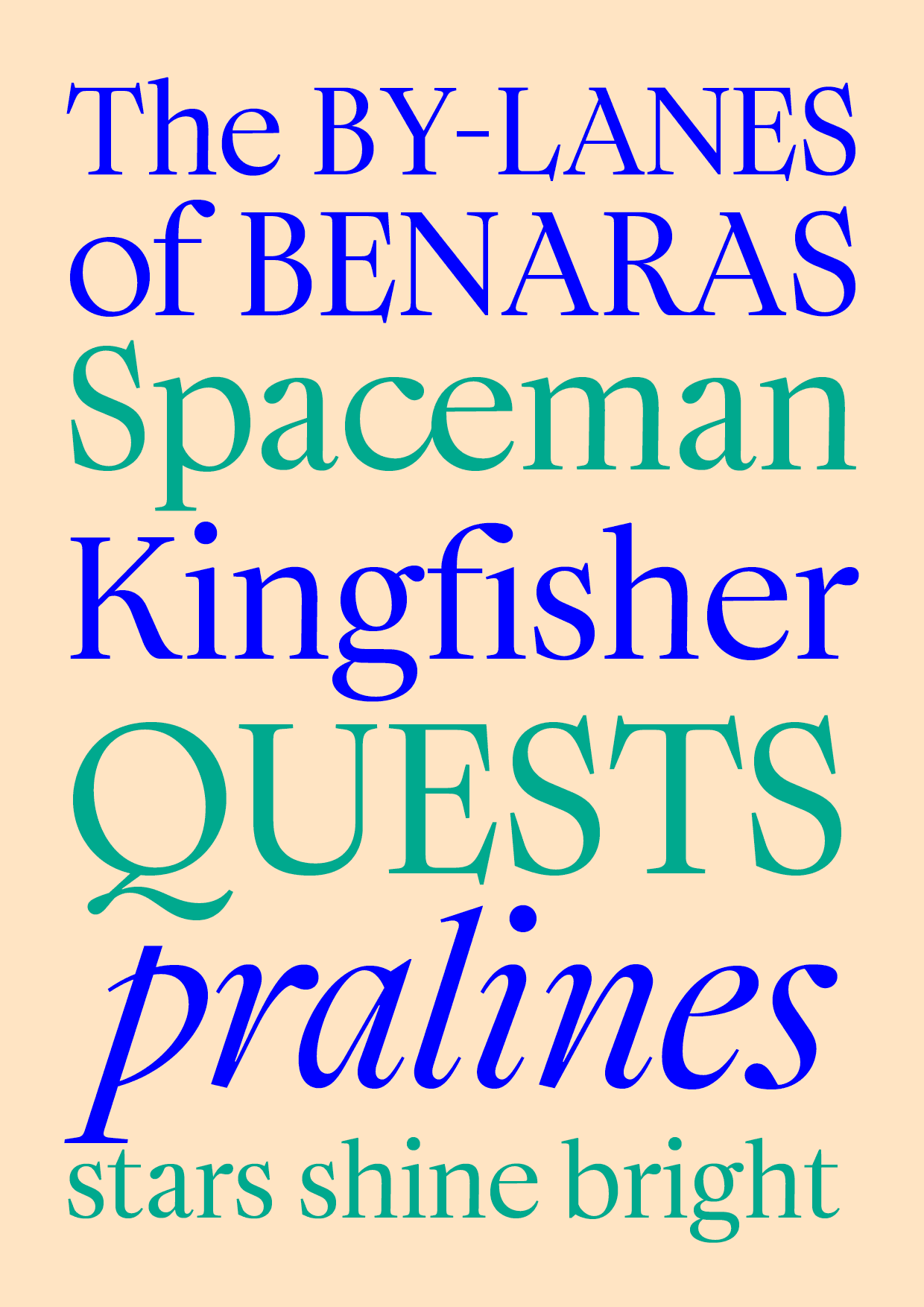
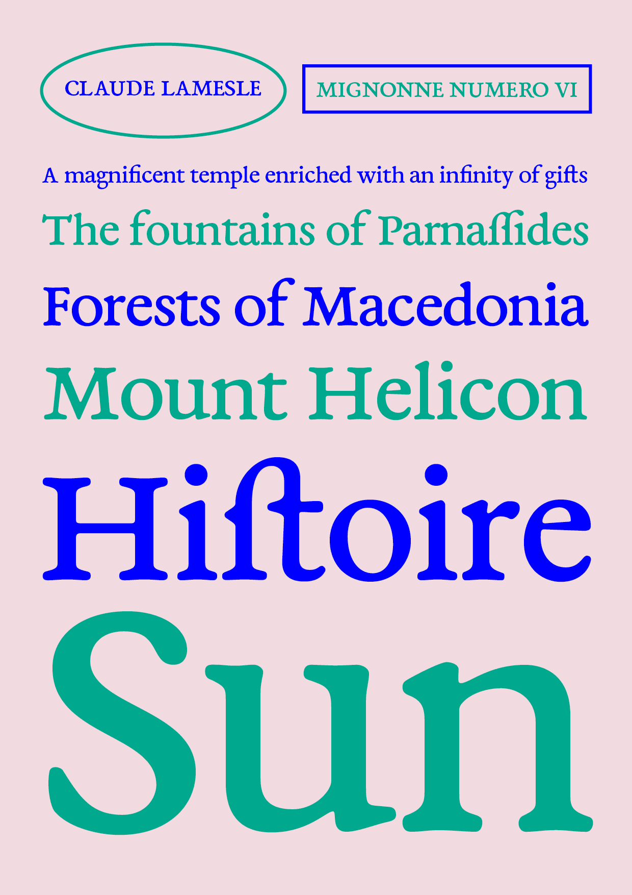
Salomi Desai is a type designer and graphic designer from Mumbai, India. She was introduced to typography while pursuing her BA in Graphic Design at Central Saint Martins, London. In February 2021, she graduated from ÉSAD Type at the Amiens School of Art & Design in France. At ÉSAD, she designed a Latin and Devanagari typeface for literary magazines, bringing together her cultural heritage and her experience of using typography to celebrate the multilingual upbringing and environment of many Indians.
Previously, she interned and worked as a junior type designer at Mota Italic, and is currently a type designer at Universal Thirst working on Latin and Indic script projects. Through her practice, she recognized a need for more resources for others to learn about and appreciate Indic type design and history. She hopes to contribute to these resources and inspire others to value the richness of their heritage in a multicultural world.

Ana Michel
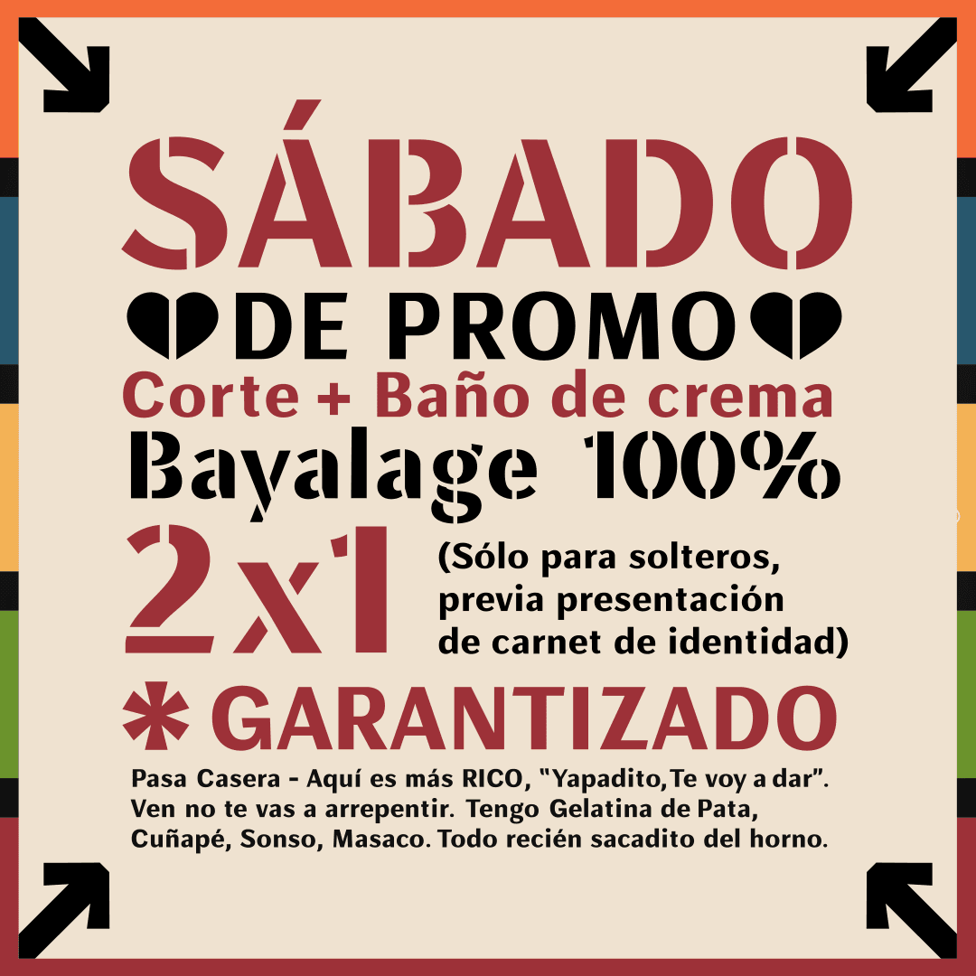
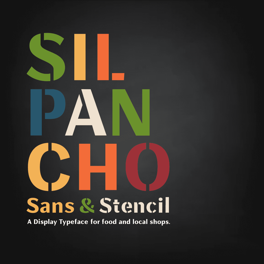
Ana Michel is a graphic designer and educator in Cochabamba, Bolivia. She has a degree in Graphic Design from the Universidad Privada Boliviana (UPB). Since 2013, she began teaching herself lettering, calligraphy, and typography and has also led several lettering workshops in cities throughout Bolivia. In 2019, she attended the Type@Paris program. In 2020, she was part of Juan Villanueva’s Display Type Design class at Type@Cooper, and received the BIPOC scholarship. During this class, she designed a typeface called SILPANCHO that is inspired by vernacular signage in Bolivia.
She has worked in graphic design for around 18 years now and runs her own design studio. In her Typography classes at UPB, she encourages students to see the potential of Bolivia’s cultural diversity and identity, to be inspired by it and apply it on their projects, seeking a type design rich in national identity along the way. This year, after recognizing a lack of type design programs in Bolivian universities, Ana launched @tipograbo an initiative that organizes activities for a community of Bolivian designers interested in type.


Mónica Munguía
Mónica Munguía is a type designer based in Mexico. She has a MA in Typographic Design from the Gestalt Studies Center in Veracruz and is the co-author of the book Elementype, a practical guide to typographic use. She is a founder of Momutype Foundry and Studio, where she produces custom and retail fonts for international clients. She was the first woman in Mexico to work with an international foundry with her gothic font Black Moon published by FontYou in 2014 and is part of the TypeThursday Mexico City team as a dialogue leader.
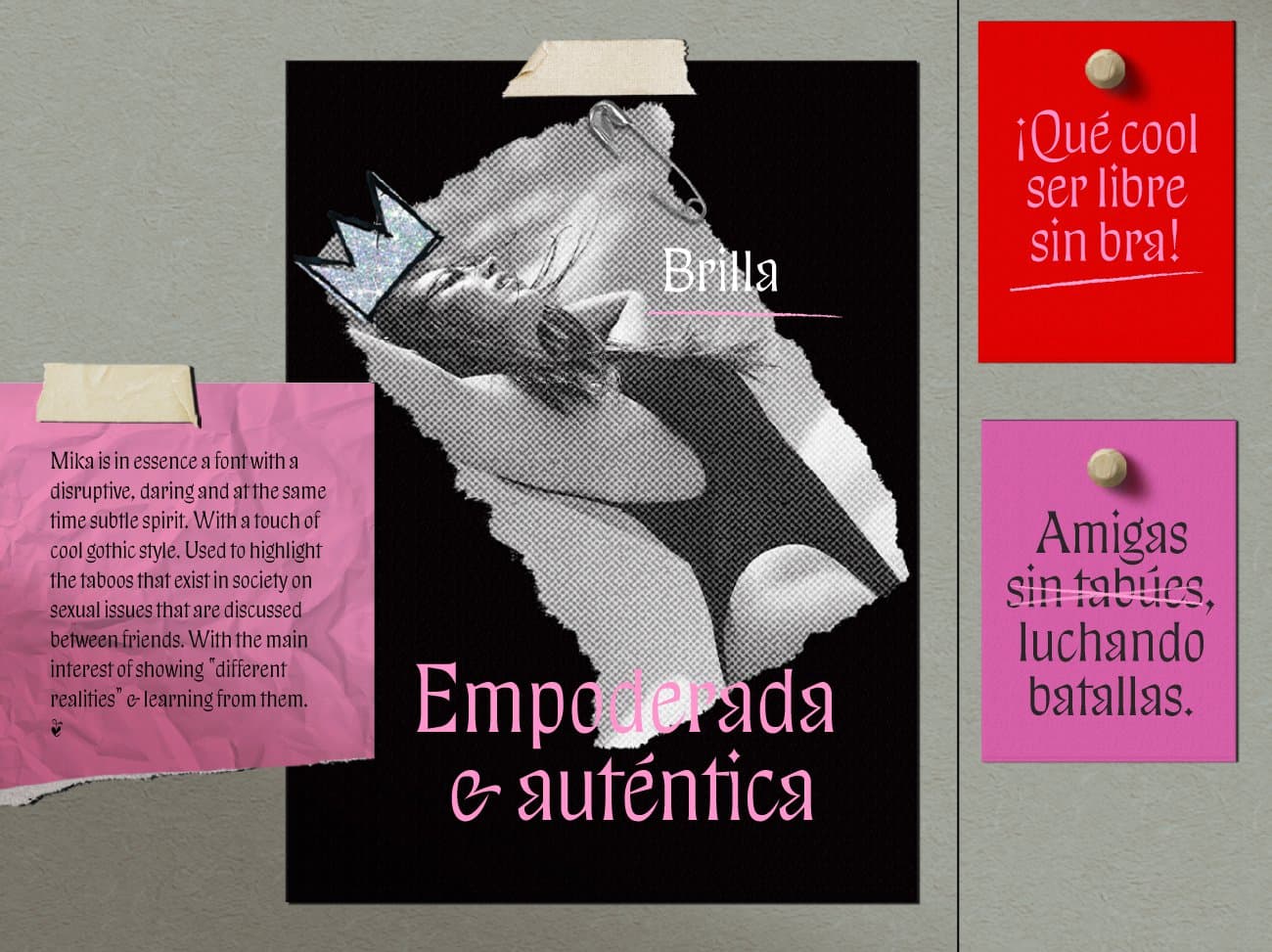
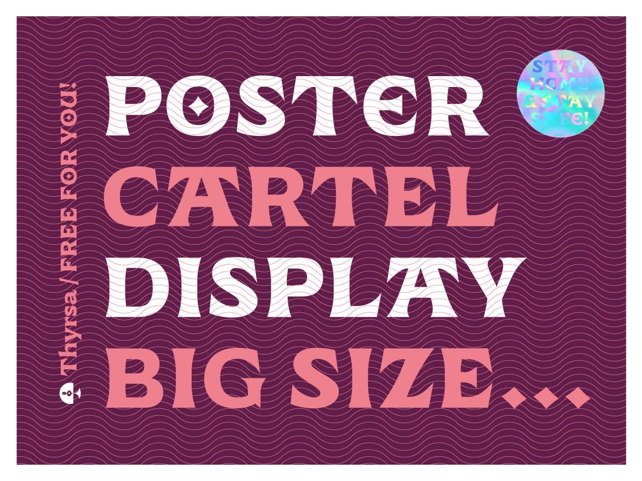
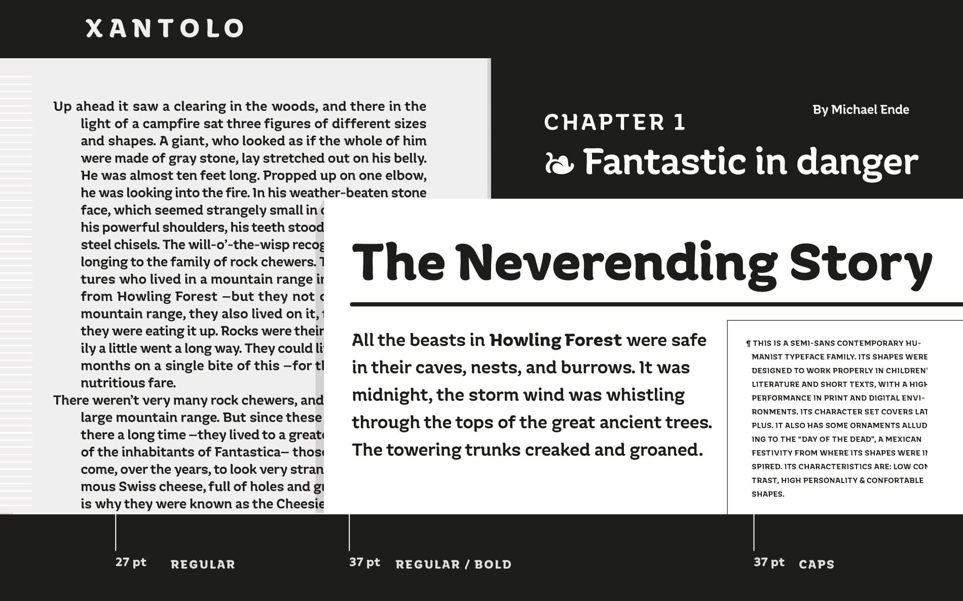
She has spoken at ATypI, TypeLab, Tipografía México, Tipografilia, and Mi TipoEs. She received the international award Clap and Latino Types. Her interest in disseminating this discipline led her to obtain the PADID and FONCA scholarship for the National Center of the Arts and the Secretariat of Culture of Mexico. She is currently developing Thyrsa, a female empowerment typeface family that was given away during the July 2020 talk at Ladies Wine & Design Mexico City. She is also a member of Times New Woman.

Karla Pasten
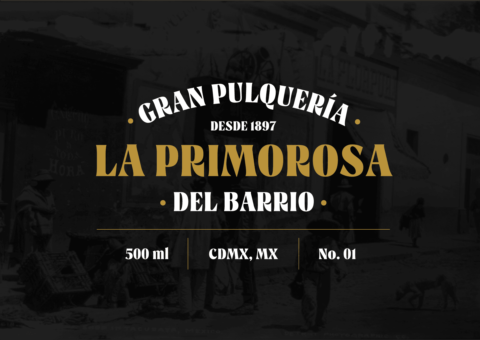
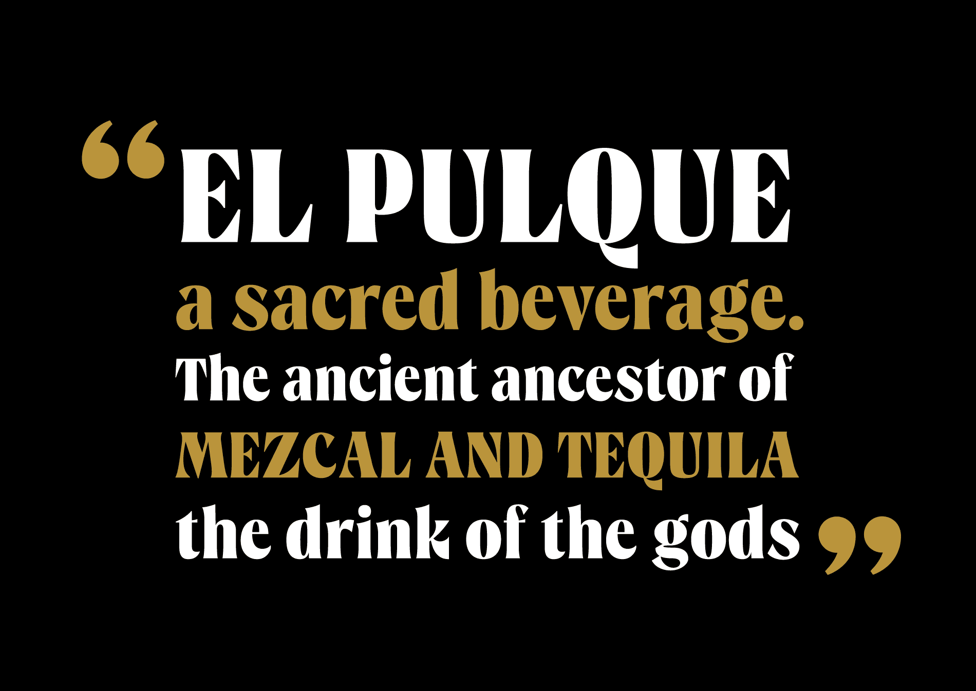
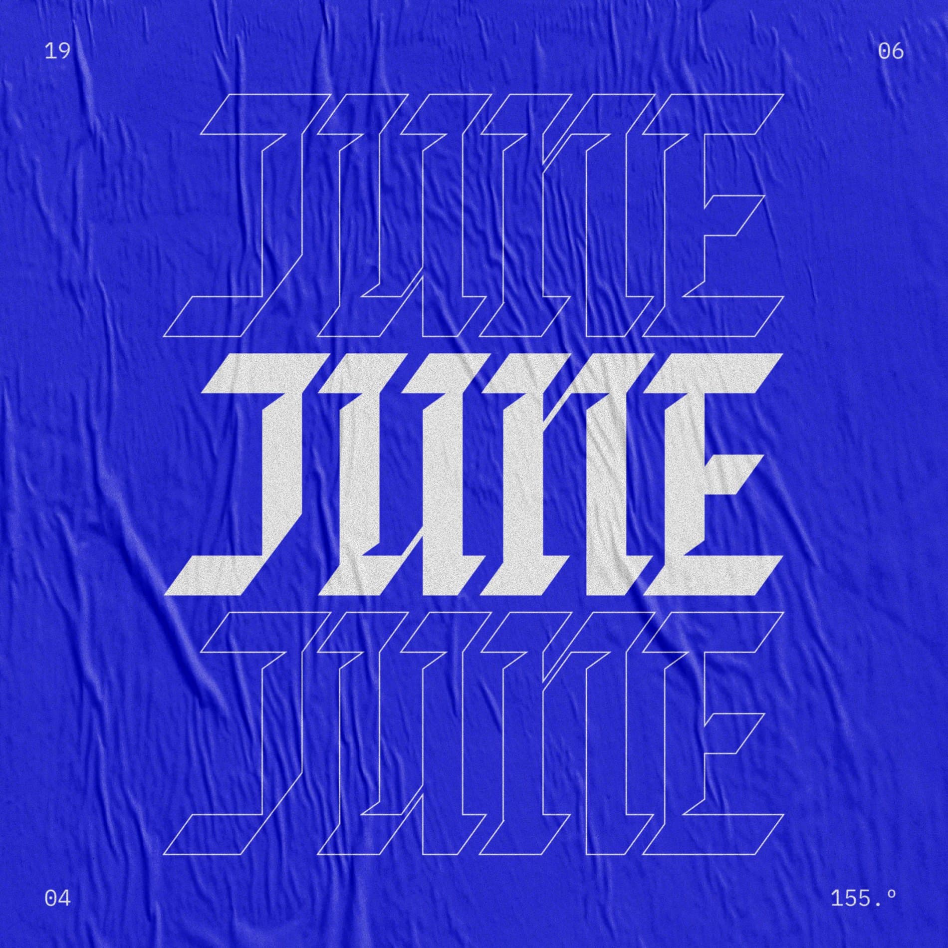
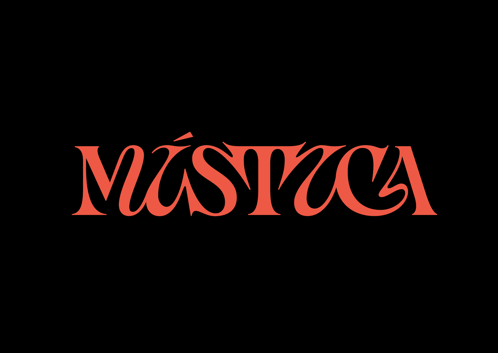
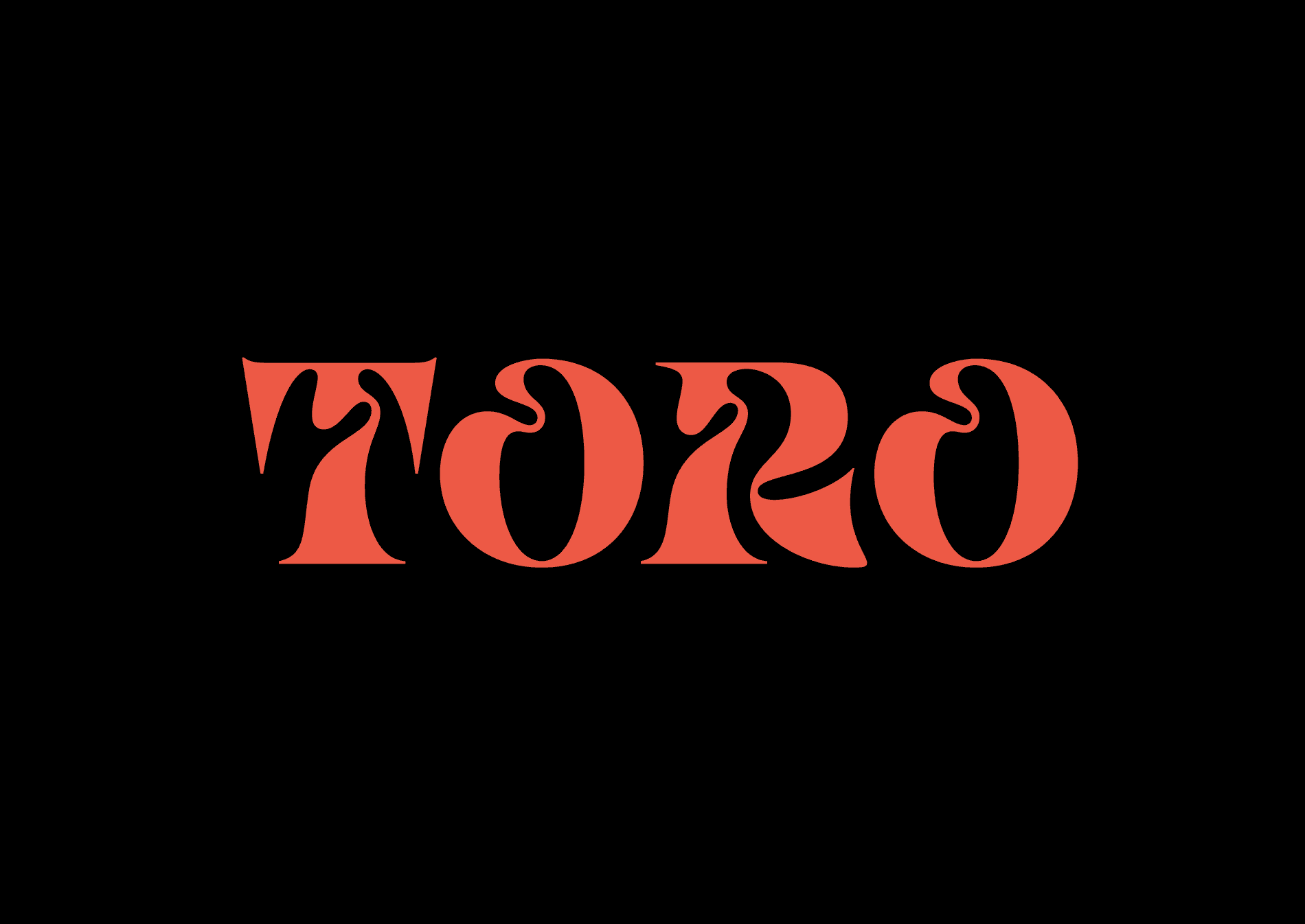
Karla Pasten is a freelance graphic designer, letterer, and illustrator born in the small city of Pachuca, Hidalgo, and studied in Sinaloa, a city in northwest Mexico. She believes in the power of words to express what we feel, not only for what they say but for how they are represented. Her love for lettering led her to continue exploring and pushing the limits of her expressivity in letters. She is a currently a student in Type West 2021 and part of Times New Woman, an initiative to empower Spanish-speaking women interested in letters, and to recognize women in the industry. Her first typeface, Pulque, is a serif display typeface inspired by the pulquerías titles from the late 19th to 20th century in Mexico City.

Sophia Tai
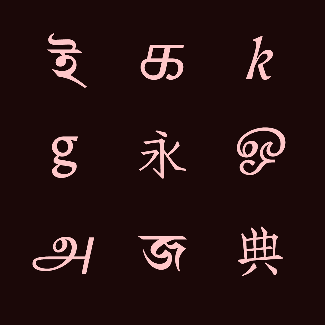
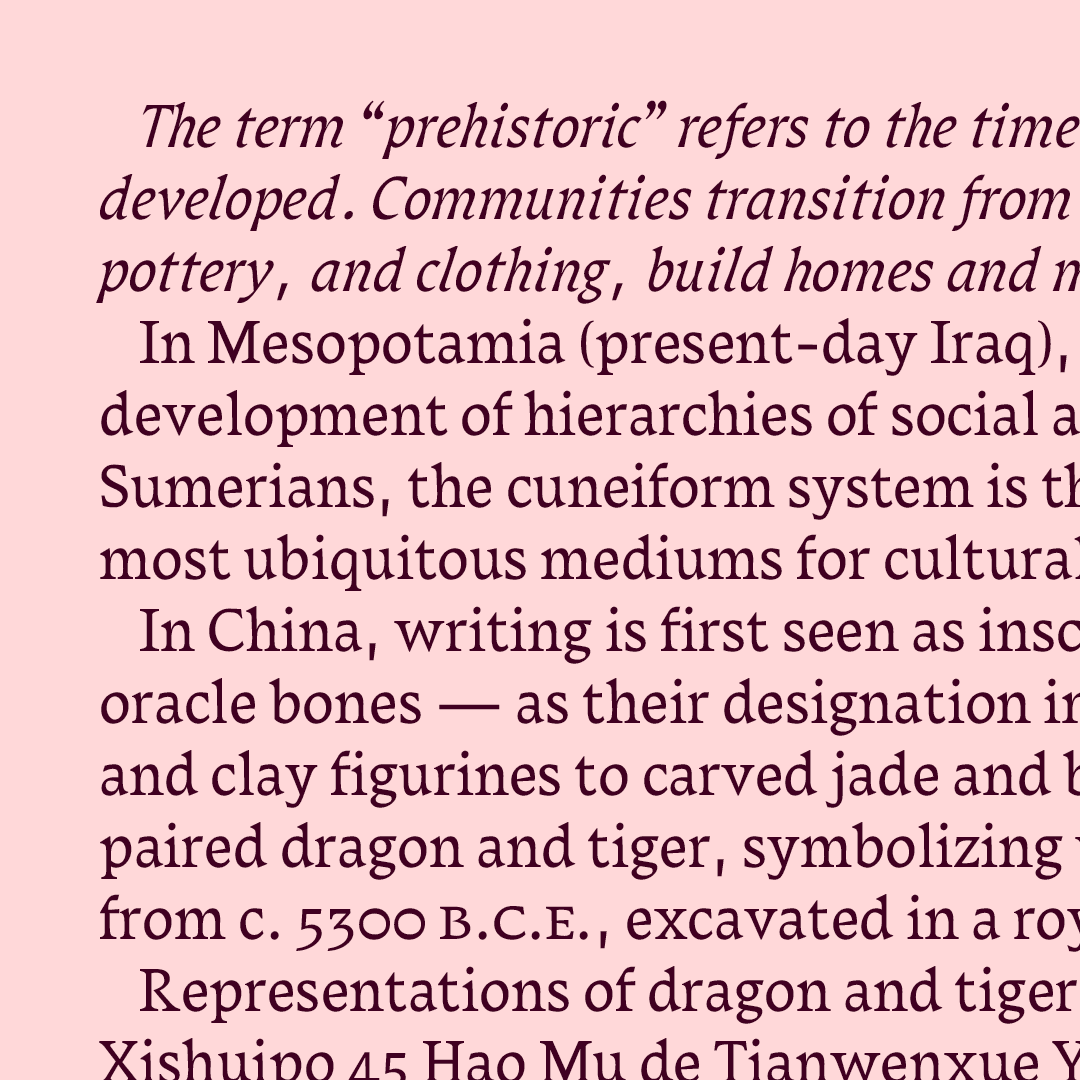
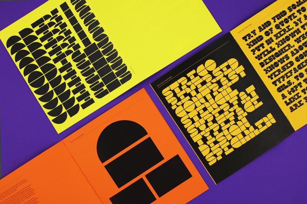
Sophia Tai designs visual systems like typefaces, digital products, and brands. She comes from a Dutch-Hungarian-Chinese background and is now based in the United Kingdom. She fell in love with designing type during a study exchange in Berlin, where was accepted to a typeface design module. In the following year, she graduated from University of the Arts London with Streco Stencil Superfat display typeface. Her project was selected from more than 750 submissions and exhibited at the Salon XVII Degree Show, featured inDesign Calendar’s Typography Edition, traveled to the Here</>There exhibition at SIA Beijing, and was presented at TypeThursday London events, where she became a core organizing member in 2019. Sophia is currently finishing the MA Typeface Design course at University of Reading where she learned about type history and how to design multi-script text typefaces to further enhance her multicultural background and quality of work. She looks forward to continue designing for multi-script typefaces and welcomes future opportunities.



Emi Takahashi
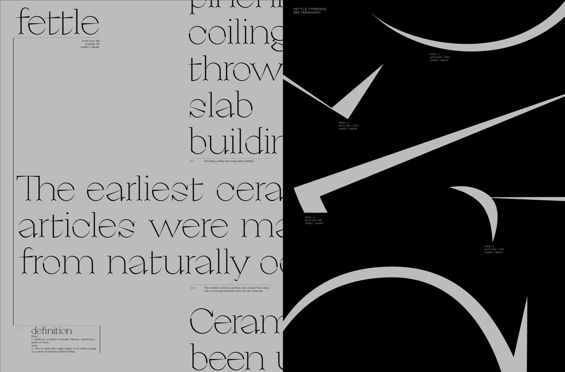
Emi Takahashi is a Canadian-born Japanese-French graphic designer currently living and working in Toronto. She received her education at OCAD University and at The Royal Danish Academy. Her earliest interest in type design dates back to her Shodō classes at Japanese school when she started to view letterforms as more than a means of communication. Now a self-taught type designer, she’s exploring variable type design as a tool to help articulate multidisciplinary concepts.
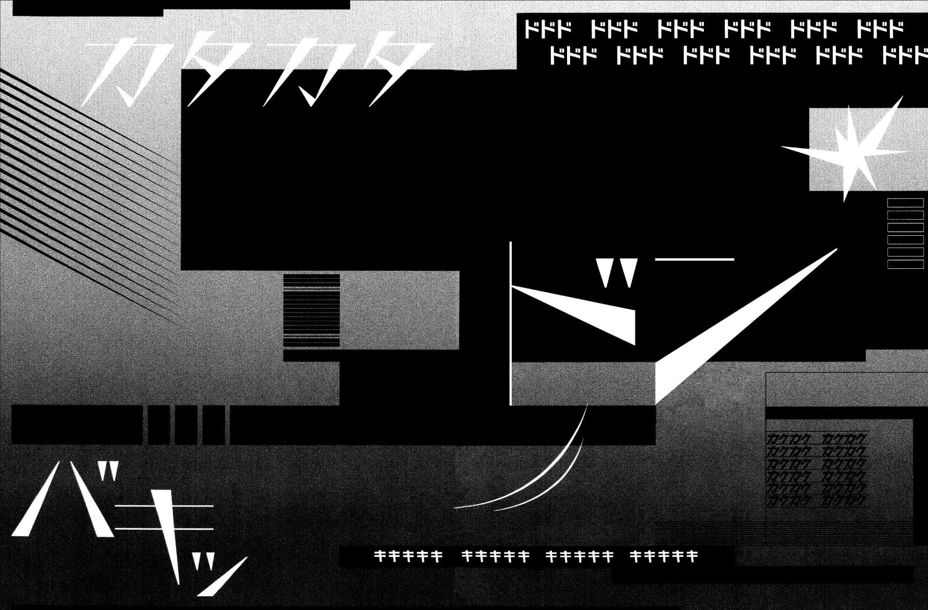
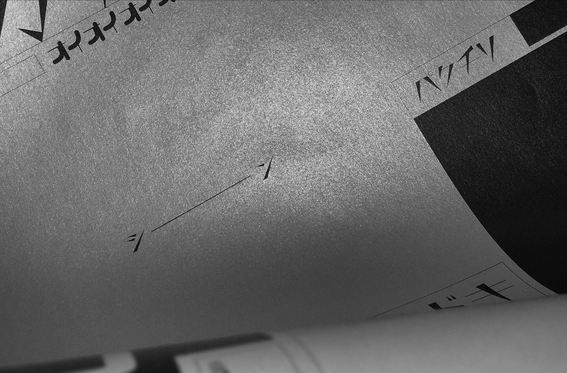
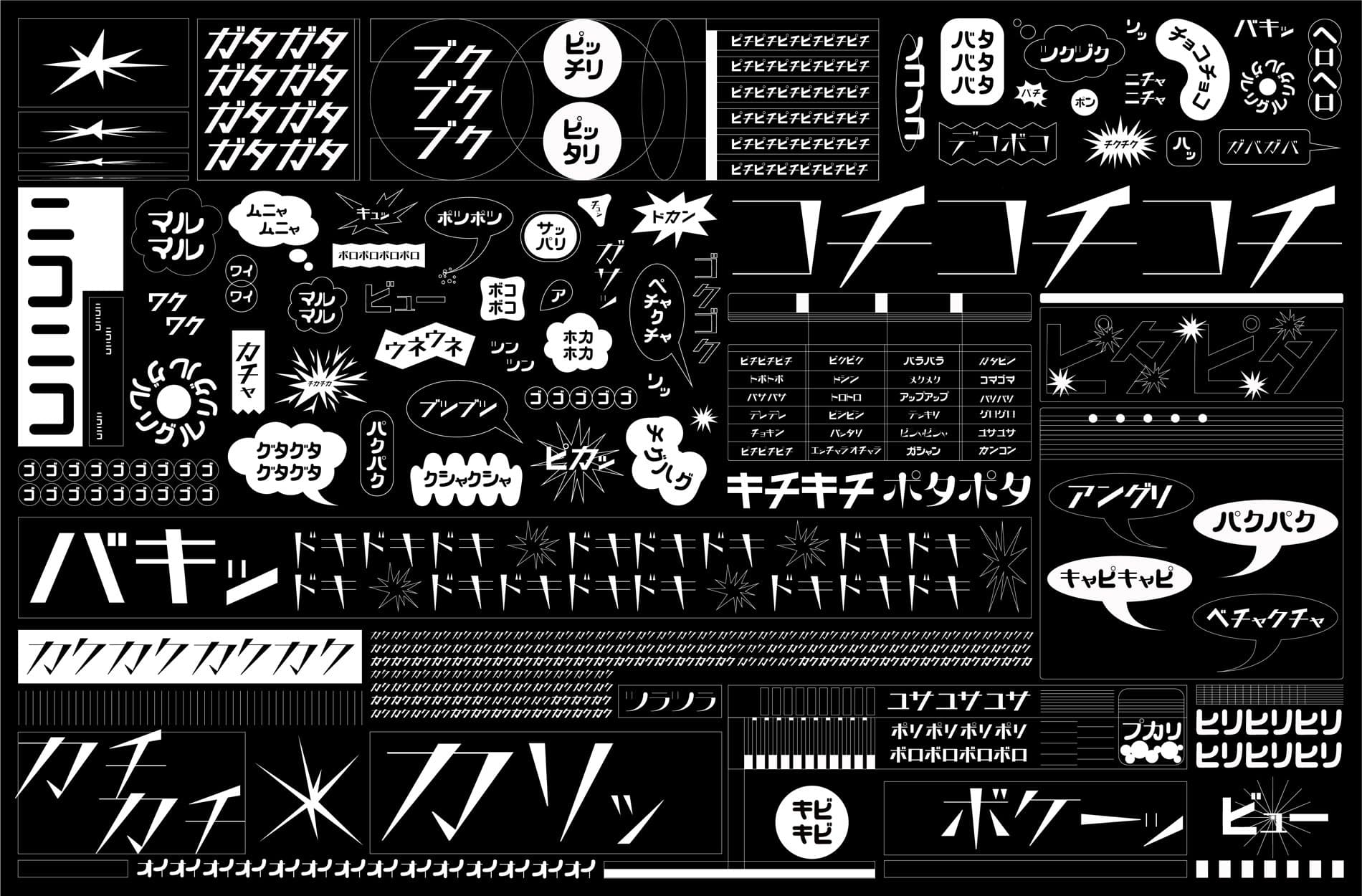
Kachi-Buwa, her bachelor project completed in 2020, is a Katakana variable typeface that is designed to display and perform Japanese onomatopoeic expressions. The project investigates how graphic representation can communicate the nuances in connotations and culture-specific contexts expressed by these onomatopoeia. It bridges sound, form, and meaning through the “kiki-bouba effect”, which maps the fictitious words “kiki” on spiky shapes and “bouba” on rounded shapes. The typeface is still a work in progress, and she plans to release it in the near future. Emi is committed to expanding her type design skills and to finding ways to support diverse, original, and experimental perspectives in the field of variable type design.
