The Malee Scholarship 2021 Finalists
Meet Aline Kaori Yoshimatsu, Jéssica Silva, and Thy Hà: three women who demonstrate a commitment to type design and education.
Meet Aline Kaori Yoshimatsu, Jéssica Silva, and Thy Hà: three women who demonstrate a commitment to type design and education.
The Malee Scholarship is honored to announce Aline Kaori Yoshimatsu, Jéssica Silva, and Thy Hà as 2021 Finalists. We were especially impressed with their talent in type design as well as their commitments to educating the next generation of lettering artists and type designers. Aline actively teaches lettering workshops and creates content about typography in Portuguese. Jéssica is actively learning as a design student in college, and has dreams of becoming a teacher of typography in the future. Thy writes about Vietnamese typography and also contributes to a digital archive of old, deteriorating signs around Vietnam as a member of typography collective Lưu Chữ. We are honored to recognize the three of them as Scholarship Finalists for their passion and the knowledge they have to offer to the type design industry.
Aline Kaori Yoshimatsu
Aline Kaori is a Japanese-Brazilian freelance lettering artist, calligrapher, and in-progress type designer. Born and based in São Paulo, Brazil, Aline first took an interest in typography in 2012 as a high school student in a Multimedia technical course. She later pursued a design degree at the School of Architecture and Urbanism of the University of São Paulo (FAU USP). Looking to hone her craft in the letter arts, during this time she also took many workshops on the side with masters such as John Stevens, Julian Waters, Cláudio Gil, Ale Paul, Martina Flor, Fiona Ross, and more. For two years, she interned at Oficina Tipográfica São Paulo (OTSP), a letterpress workshop, under the guidance of Marcos Mello and Claudio Rocha. Aline is an active part of the Brazilian letter arts community, using her skills to create content, offer critiques, and teach classes locally and internationally to make the letter arts accessible to an even greater audience.
When did you first get interested in letterforms?
Looking back now, I see that I got interested in letterforms even before I fully understood what they were. Ever since I was a kid, drawing has been a huge part and companion of my life. I used to read a lot of comics and watch cartoons, and I remember trying to copy the illustrative titles and onomatopoeias (which I obviously tried to use in every possible school work that required a title, lol). I also took great joy in improving my handwriting, exploring all sorts of swash caps and getting all excited about using different pens and colors. I remember once seeing a particularly beautiful tailed minuscule “f” that my science teacher made on the blackboard, and deliberately deciding that I would make it my own!
It was only later in my high school/Multimedia technician course that I heard the term “typography”. In one of the design classes, I was lucky enough to have a teacher who introduced us to this fascinating universe and I fell hard for it. After the “type bug” bit me, there was no coming back! I was hooked — exploring different font options, drawing letters out of my handwriting or by copying typefaces, all the while learning the basics of graphic design. It wasn’t until much later at university that I learned about type history, fell in love with calligraphy, discovered type design, and finally put a name to what I had been “doodling”: lettering.
Tell us about Pitaya Italic.
A couple of years into my letter arts studies, I would often write or draw words in my sketchbook and ask myself: “Could I make a typeface out of this?”. In 2017, when I could finally take the Type Design elective at university, I had the perfect excuse to see if I could make it happen.
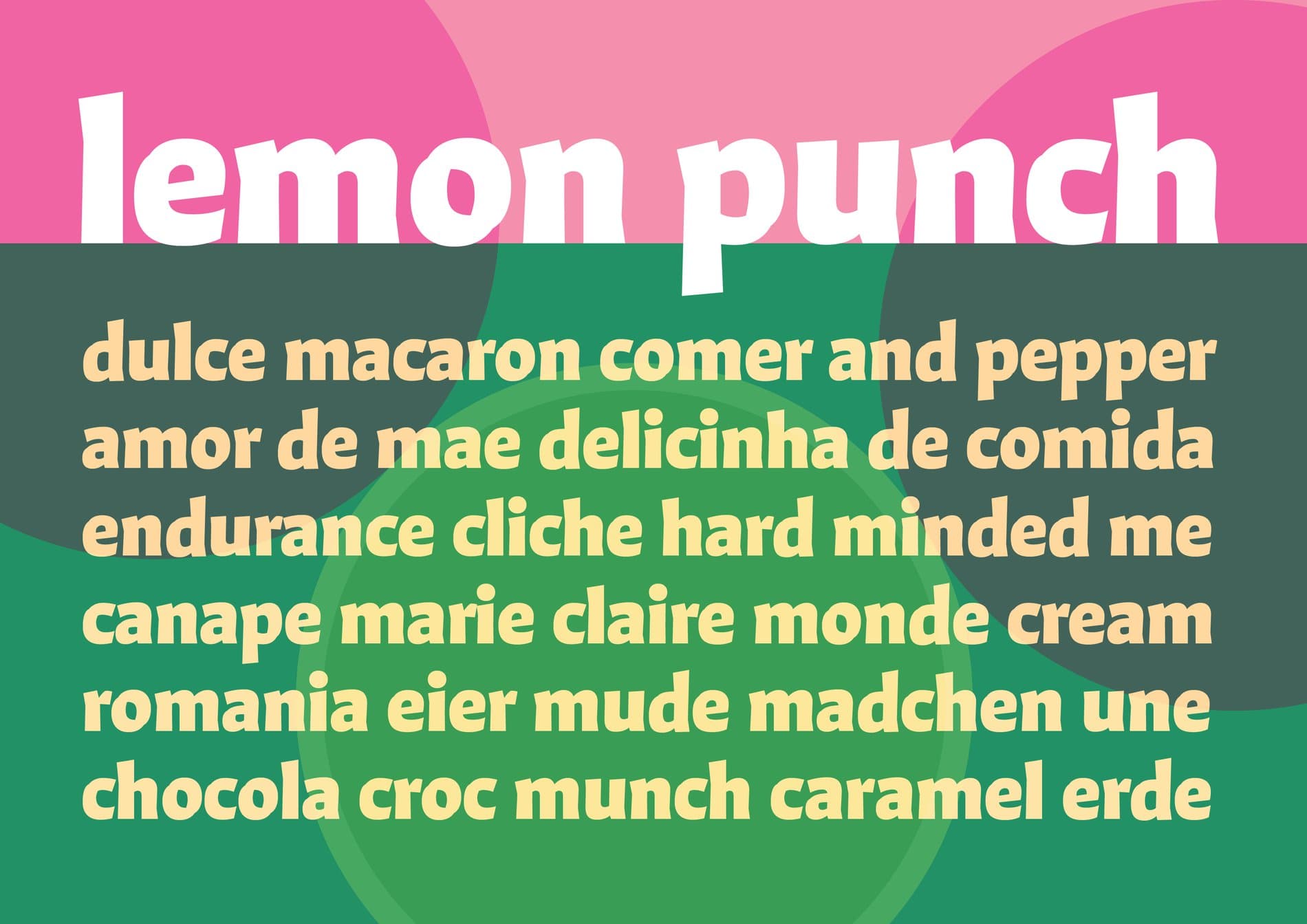
Pitaya Italic is a display typeface born from my take on a calligraphic italic, but with — quite literally — a twist. Its structure is loosely based on the classic Italian Chancery from the Renaissance, but overall it is heavily influenced by the virtuous work of more contemporary master calligraphers such as John Stevens, Julian Waters, and Christopher Haanes.
Ever since learning about pen manipulation (pen twists and pressure) in calligraphy, I’ve been fascinated with the finesse in the forms and the active quality of the strokes in calligraphic masterpieces. I remember going through sheets and sheets of paper trying to figure out how to achieve that, not just through technique and muscle memory, but also by understanding and internalizing the quality of these forms in my mind’s eye. Lettering provided me with liberties when exploring and harmonizing the twists and loops of Pitaya, some of which don’t follow standard calligraphic movements or angles. It was a vital step between calligraphy and type design so I could ensure the letterforms work together as a system.
Pitaya was my first typeface project, conceived during an intense 3 months. I was already really happy to have made that into reality while learning how to work with a font editor, but I was beyond surprised that in 2018, Pitaya was selected for the 8th Biennial of Tipos Latinos in the “New Talent” category. This gave me a major confidence boost that I was on the right track and that type design could be a real possibility for my future.
Pitaya Italic was a solidification of my studies and investigations in letterforms up until that moment, in the form of a typeface. Perhaps Pitaya Roman (which I am now slowly working on, while revisiting the italic) will become the same, but with a couple more years and experiences added under the belt. Let’s see what will come out of this new mix!
“ I was super nervous, thinking ‘who am I to be teaching something to grad students!?’, but once the class started and letterforms were the focus, the shyness faded. What remained was only the joy of sharing passion and process, and seeing students becoming all excited about letters and working with their hands.”
What motivates you to teach? Are there some defining experiences as an educator that have impacted your practice? What do you hope to pass onto your students?
As a shy person, I never considered teaching as a serious career possibility. I thought I could do it when I became much older and established in the field, so then I’d have things to share and teach. But in 2016, I received a kind invitation from a mentor and I taught my first lettering workshop to 20 or so grad students. I was super nervous, thinking “who am I to be teaching something to grad students!?”, but once the class started and letterforms were the focus, the shyness faded. What remained was only the joy of sharing passion and process, and seeing students becoming all excited about letters and working with their hands.
Nothing beats the joy of seeing this excitement and passion for letterforms bloom in students. My job is to provide the foundation, support, and tools so that they can assess their own work and grow independently. I want to empower them to see and experience things by themselves to find their own process and path.
A sense of responsibility and gratitude also fuels me to keep teaching, having received generous guidance from countless teachers, support from the letter arts community, plus access to tons of free resources on the Internet. In the same spirit, I feel like it is my duty as someone who’s had such privileges to pay this forward to the best of my abilities so more people can learn too, and the craft can be passed on to the next generation.
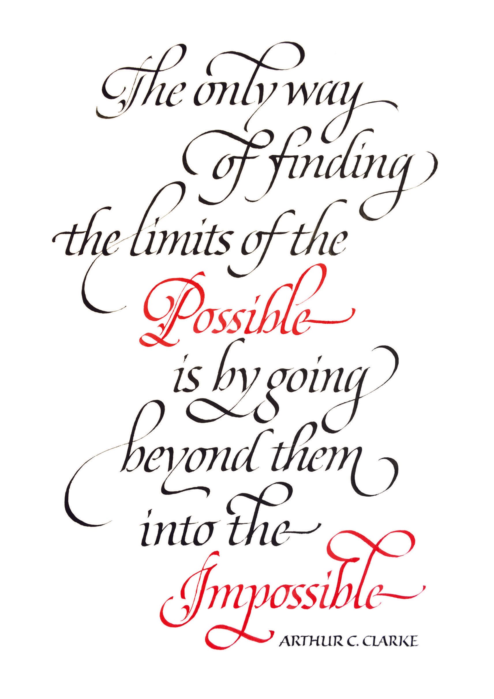

Tell us more about your other experiences with letters, like letterpress, calligraphy, and lettering. How have they informed your type design practice?
I was lucky to have my first contact with calligraphy, lettering, type design, sign painting, and letterpress printing early on in my studies — all stemming from my love for letterforms and wish to explore different ways of crafting and using them. These pursuits would come and go in seasons. It took me a while to understand that it was normal to alternate between them, to miss doing one when I was focused on the other, and that it was impossible for me to practice and improve my skills in all of them simultaneously.
In my experience, the triad of calligraphy, lettering, and type design are interconnected. For example, calligraphy and history of writing serves as a starting point for all the others. Type design’s attention to counterforms, spacing, and making letters as a system helps consistency and rhythm in calligraphy and lettering. The freedom of lettering influences and enriches exploring possibilities in calligraphy and type. All of these improve a critical eye for letterforms. Plus, my broader passion and practice of drawing (not just letterforms) ends up feeding into all of these by giving me fluidity, a better sense of composition, and helping me to combine letters with illustration.
Since I enjoy them all, I have often struggled with the idea of having to choose and specialize in one of them so I could have a better shot of finding work in this field. But thanks to the kind encouragement of my friends and the letter arts community, I realized to have cultivated all of these skills early on is actually a strength. I see these “different” pursuits in a holistic way, like they are building up into something more and I am paving a path of my own. As a wise friend and mentor told me, things take the time they take, and this process of finding one’s own voice can’t be rushed — it takes a lot of exploring, and not just type-related things. So I will try my best to be patient despite all the millennial anxieties in my head and make sure to have fun in the process :)
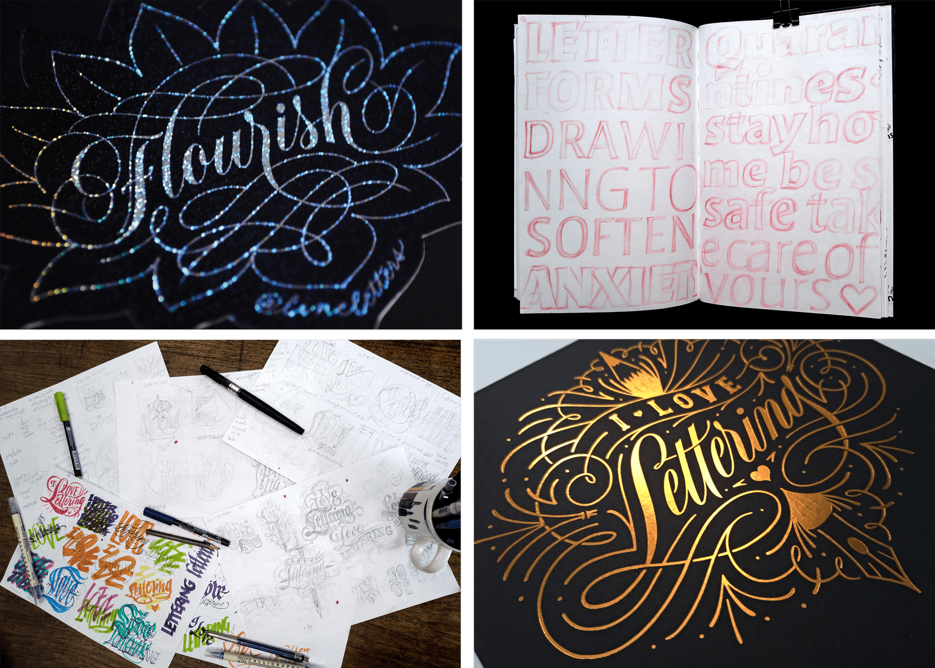
What has the process been like creating content about typography in Portuguese?
Within our Brazilian letter arts community we run free livestreams in Portuguese, addressing different calligraphy/lettering-related topics, promoting discussions, interviews, and offering critiques, to make content available in our own language for local professionals and students. As teachers, we do our best to bring the things we learned through taking workshops abroad or with international teachers to our classes and discussions.
For years now having quality content accessible in our language has been a concern. Thanks to the collaborative efforts among type designers and teachers, we now have more content in Portuguese: books, magazines, podcasts, interviews, discussions, workshops, and more that are mostly free or generally accessible. We also have DiaTipo, a fantastic typographic conference that happens in Brazil every year.
Of course we still have a long way to go but it makes me happy to see that students and professionals now have access to much more content in their native language than what was before. This also helps in decentralizing workshops and discussions that used to happen only in a couple of cities or states, giving voice to a broader part of the country.
What’s next for you?
I must say I feel very self-conscious answering this question in the second year of a global pandemic after much grief, frustrated plans, and personal crisis—but one can hope, right?
Starting from more solid and positive grounds, I recently started working as a part-time assistant at Cyla Costa Studio. I couldn’t be happier to be finally putting all my different and specialized skills to use there while learning new ones. I’d been going through many emotional rollercoasters about my career and making ends meet before that, so now I feel really relieved to have something steadier to rely on and where I can do what I love.
I hope to have more time, structure, and financial security to develop typefaces and other kinds of personal projects on the side. As I mentioned earlier, I am now working on adjusting Pitaya Italic and developing Pitaya Roman, which will later be released through the Positype Flourish label.
I want to keep on taking and teaching classes locally and internationally—I can’t wait to be back in a physical classroom with everyone, making letterforms, getting our hands dirty, and learning from one another. In the near future I hope I will also be able to dedicate more time into fostering community and creating content.
I am still finding my path within the industry and also looking for my own voice personally, so most of all I hope to keep on learning and experimenting as much as I can. But before I commit to all of those things, I guess I need to make time for rest and take care of my physical and mental health so I stop burning myself out every now and then, and be actually well enough to make these things happen ;)
Jéssica Silva
Jéssica Silva is a design student from Varginha, Brazil. She is currently pursuing a BA in Graphic Design at Anhembi Morumbi University in São Paulo. Jéssica is expected to graduate in December 2022 and will be the first in their family to receive a college education. For a year, she worked at her university’s letterpress studio, and in 2020, she received the BIPOC Scholarship for the Intro Modern Type Design course at Type West, as well as a scholarship for Tereza Bettinardi's Design Book Club. These collective experiences were formative in her decision and excitement to pursue type design.
When did you first get interested in letterforms?
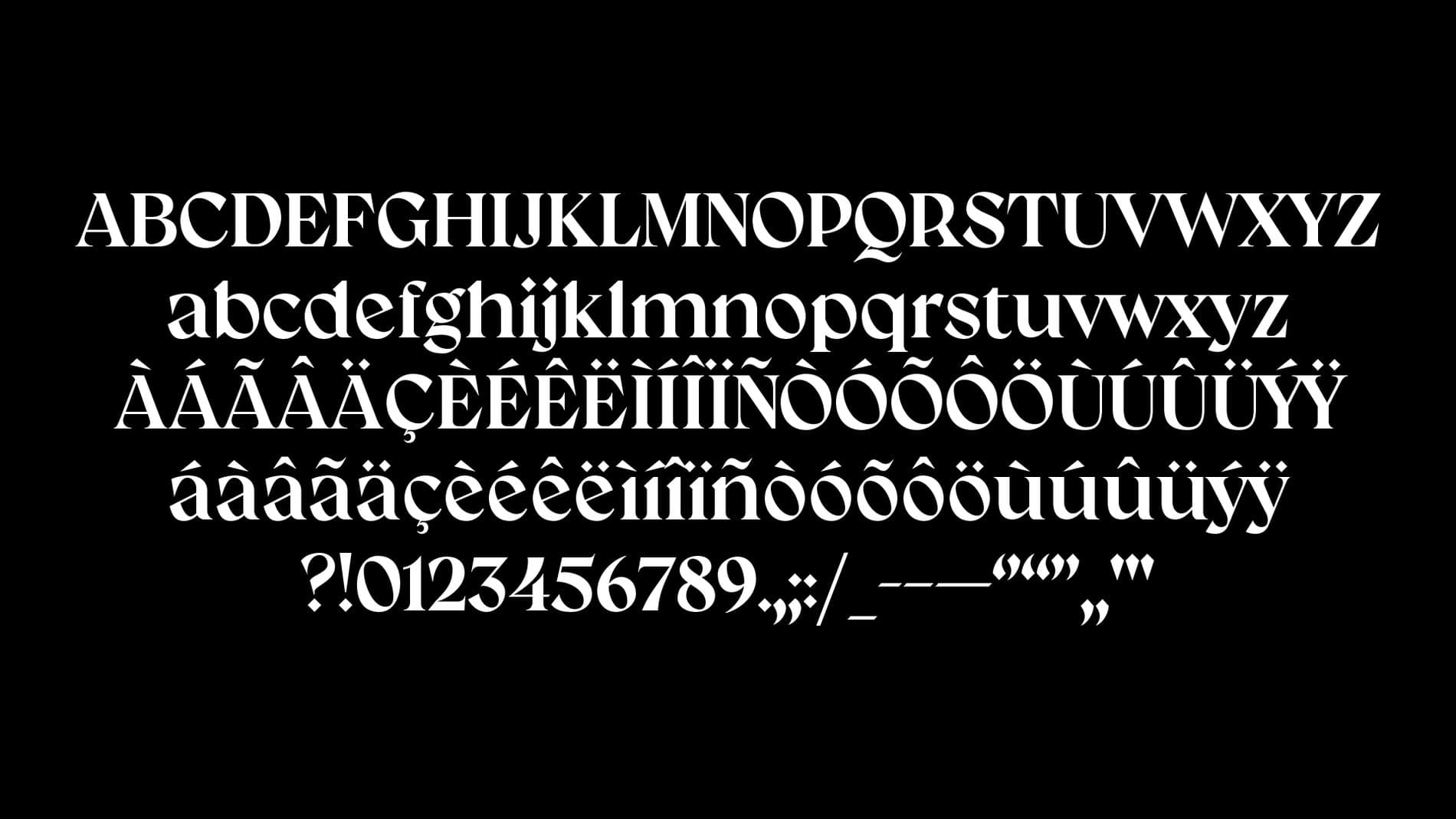
I've always been drawing and letterforms were always in my sketchbooks. I liked to draw compositions of music lyrics that were important to me. During high school, lettering with brush pens became popular among students, and I saw it as an opportunity to do what I normally do (draw different and fun letters) to help me with my studies. Whenever I had to study a subject I didn't like, I made beautiful summaries which was a good excuse to draw titles and color in some details — and it really worked! My math grades went up after I started using lettering to study.
After I entered design school and worked in the typography workshop, I started to really love letterforms. The contact with wood type and the need to study the History of Typography classes made me pay more attention to the details and semiotics of letters. When I first thought about this process, I already had a favorite letter in the alphabet.
You mentioned how you were interested in a range of careers before college, and considered being a surgeon, prosecutor, and a geography teacher! We admire your inquisitive attitude, and are curious how your interests outside of type may interact or influence the way you approach your work?
That's actually a pretty good question. I don't know if I ever thought about it, but I think that's more present than I realize. I've always liked to study, and I am passionate about political and social matters. I try to keep myself informed to position myself the best way I can. This is extremely necessary in certain situations, like the situations my people and I have been facing in my country. I think this has always been related to my choices, both personal and professional. These days all of my interests influence me — they drive me to pursue projects that focus on what I believe and defend and also make me pay attention to the small details. For example, I look at work done by Brazilian or Latin American type designers, especially women. I try to use as many references as possible and I always try to keep studying.
“These days all of my interests influence me — they drive me to pursue projects that focus on what I believe and defend and also make me pay attention to the small details.”
Was there a moment when you decided you wanted to become a type designer?
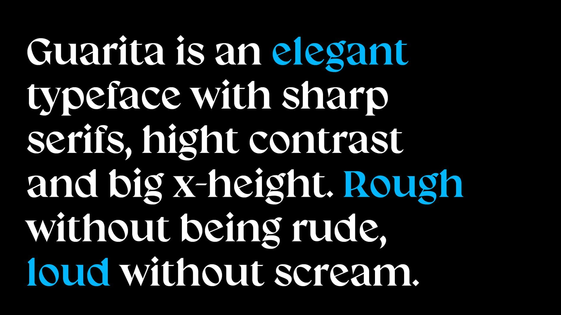
There was a special moment, but it was also part of a bigger process. For a long time, I saw myself as just a type enthusiast. I used to picture type designers as magical divinities from a distant reality who can work wonders with a font editor. Developing a typeface seemed too complex to me. But the more I spent time working with my teacher at my university’s letterpress studio, the more I realized that type designers are human beings just like me and that drawing a typeface isn’t that hard. At the beginning of 2020 before the pandemic hit, I asked my teacher if he could mentor me in type design as part of my internship. When he agreed, a little light went off in my head and I thought “well, I think that’s it, that’s the thing!” After that I kind of became obsessed with studying type design.
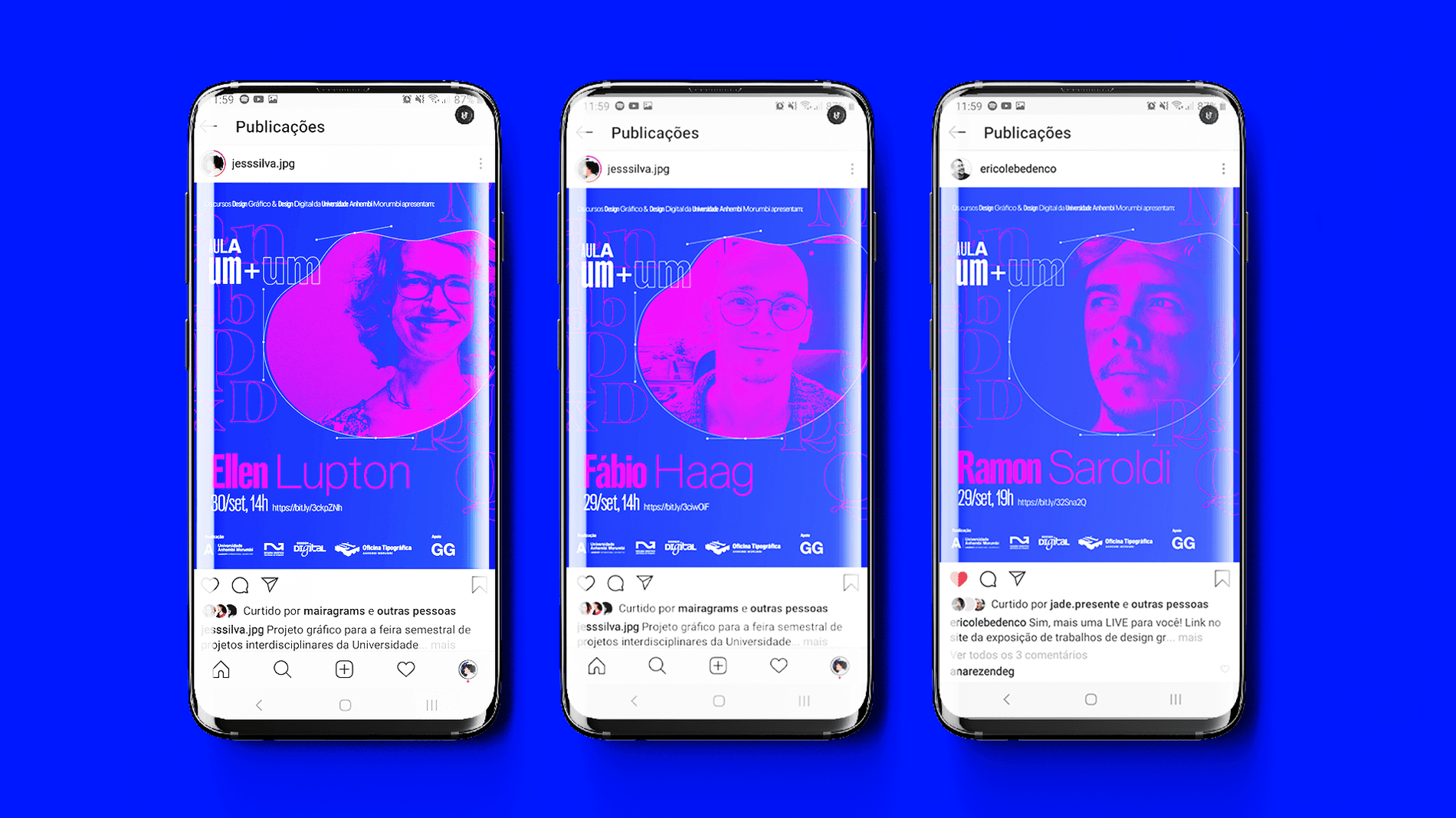
Tell us more about your experiences working at your university’s letterpress studio.
It was one of the best experiences of my life. When I started I couldn’t believe I was chosen. More advanced students had applied, and my portfolio only had a few projects. I didn’t even expect to become an intern, I thought I would just be part of some mentorships. All the equipment had been moved into a new space recently, there was a lot to organize and a lot of movable type was disorganized and unidentified.
I fell in love with the smell of paint and solvent, the noise of the press, the elegance of the large wood types, and the delicate small types. My teacher guided me to read studies on the identification of movable type and on collections of other academic letterpress studios around Brazil. I learned the basics of micro typography, and I began to study more on my own. Érico Lebedenco is the kind of teacher who won’t just teach you what is necessary to get a certificate, but he will teach you everything he can to help you professionally. I have no doubt that he was responsible in the process of finding myself in type design.
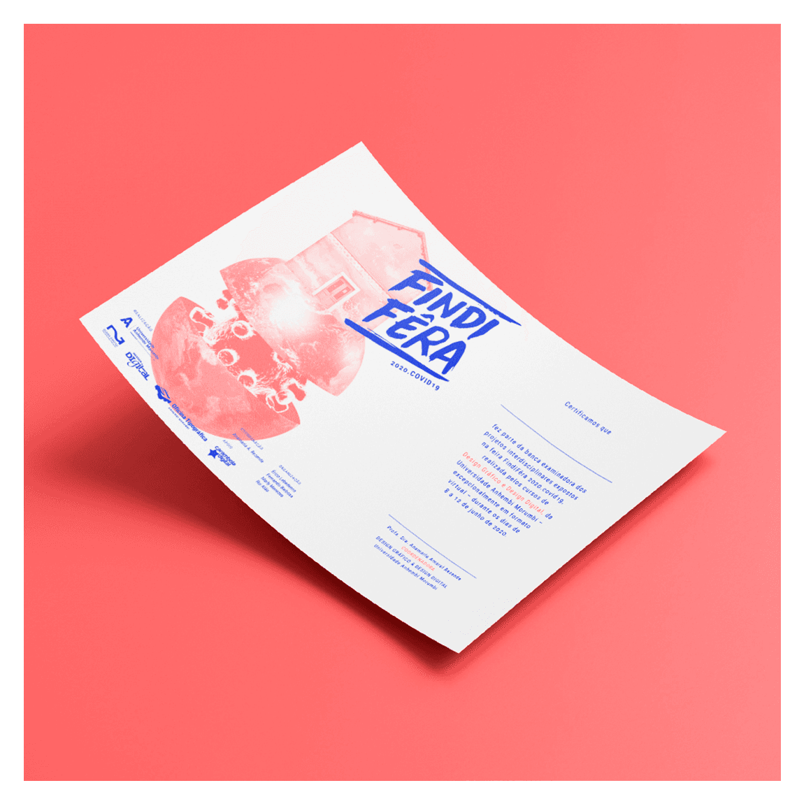
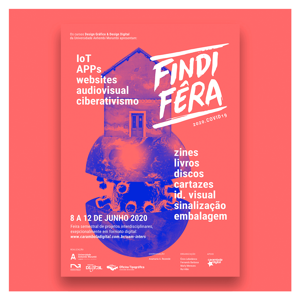
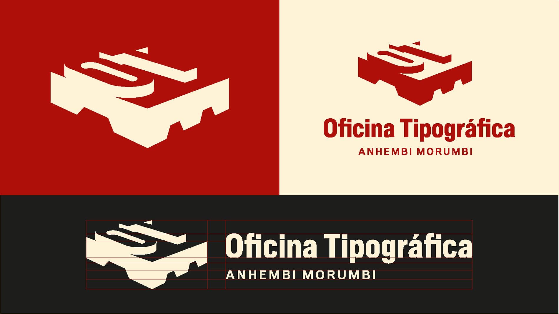
I also helped develop the studio’s visual identity. I developed initial studies using the studio’s resources – from drawing the Vandercook press engine, to printing the initials of the studio’s name with movable blank space. During the pandemic, we went remote, and I lost access to the letterpress studio, but I kept developing the graphic pieces of communication for my course. In addition, my teacher and I started a little group of typography studies. Despite isolation and distance, we continued the main purpose of the studio: to promote typographic investigation.
What are you currently learning about or fascinated with in your university studies?
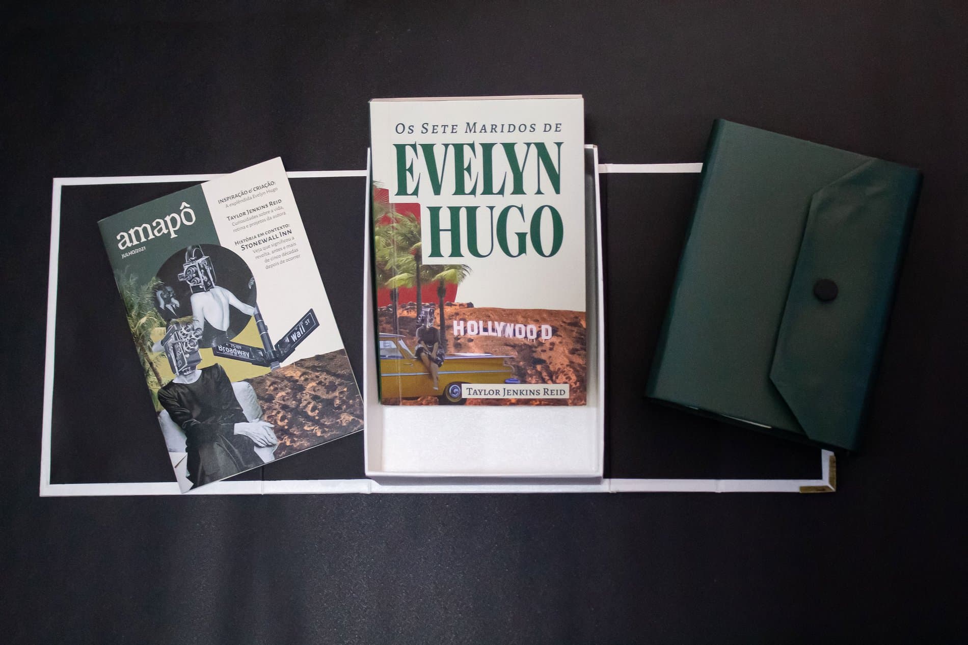
The last few months have been full of challenges. Each semester, students are required to create an interdisciplinary project to develop a specific skill and this semester consisted of producing a book and a literary kit. I was surprised at how much I actually liked the process. Although it was tiring, researching and developing the book with my colleagues was a lot of fun, and I want to professionally explore this more in the future.
This was also an important project due to subject we explored. We re-edited the book The Seven Husbands of Evelyn Hugo, and related specific events of the plot to the history of the Golden Age of Hollywood. I designed a special display typeface for this project. Besides that, this semester we had a very specific bookbinding subject and I ended up finding a new hobby! It turns out that binding new sketchbooks while listening to music is very relaxing.
What’s next for you?
That is, by far, the most difficult question of this interview. It is a little hard for me to say what’s next for me in the political situation and state of health my country is in. If everything goes as planned, I will graduate next year, and I’m trying to save enough money to get into a postgraduate course on type design. Everything depends on my financial situation, but my dream is to apply to Letterform Archive’s Type West.
In the long run, in addition to working as a freelancer, I plan to keep studying typography, to pursue a master’s degree, and maybe (emphasis on the maybe) even teach on the subject. I know that at some point in my life I will become a teacher. I’ve always enjoyed teaching, and when I really like a subject I tend to get into a trance and spend hours talking about it without realizing. One thing I've done throughout this pandemic was study, and I believe that this practice will always be present in my daily life.
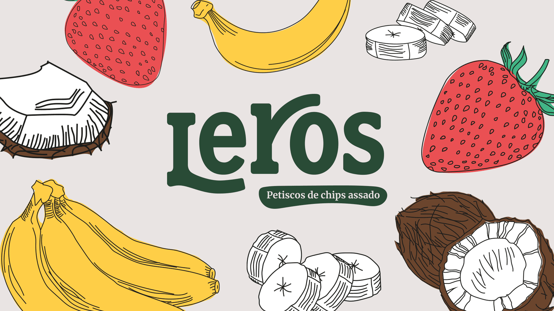
“Developing a typeface seemed too complex to me. But the more I spent time working with my teacher at my university’s letterpress studio, the more I realized that type designers are human beings just like me and that drawing a typeface isn’t that hard.”
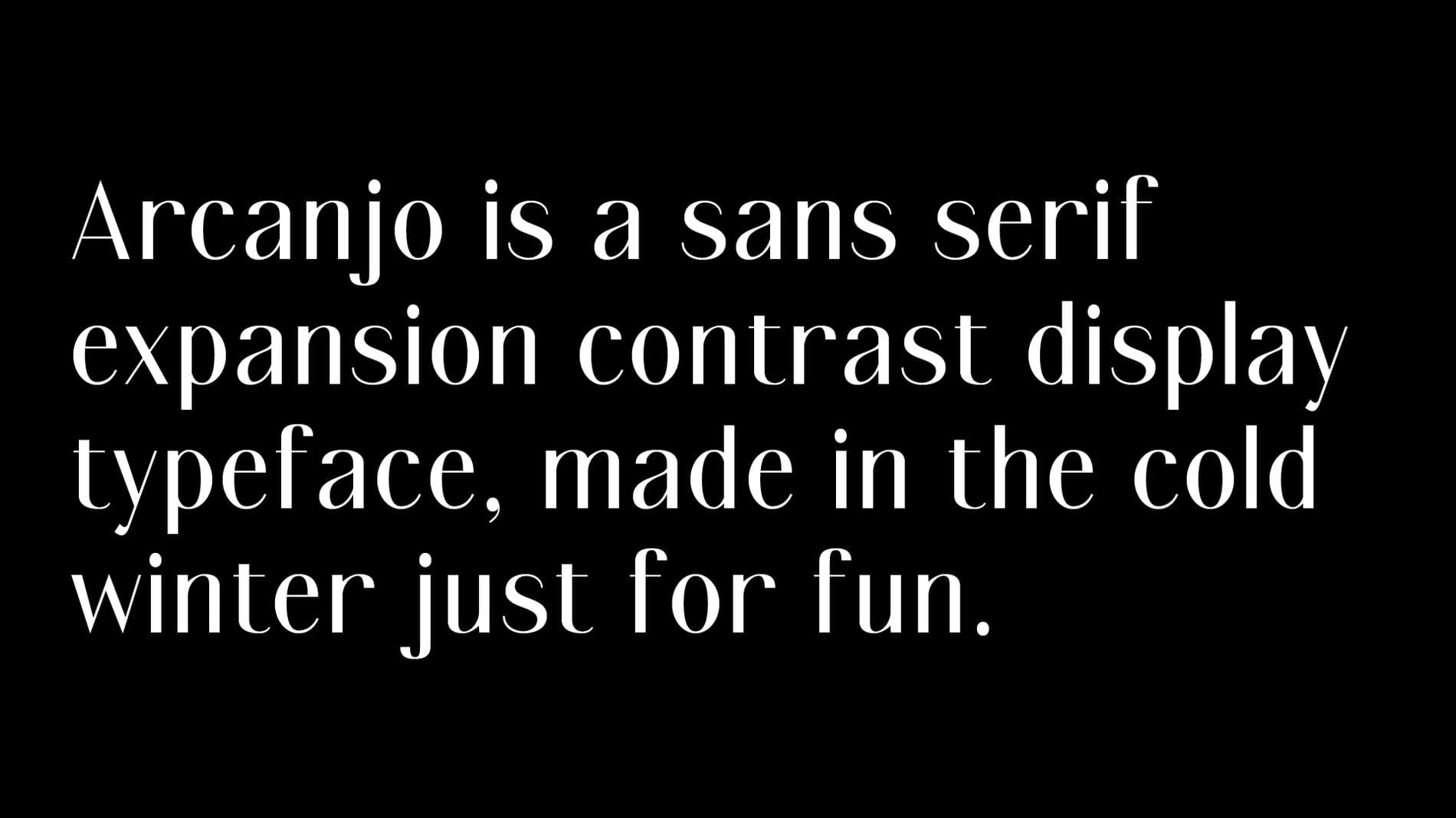
Thy Hà
Thy Hà is a Vietnamese digital designer, born and raised in Sài Gòn (Hồ Chí Minh City), and currently based in Melbourne, Australia. In 2019, she received her MA in Communication Design at Royal Melbourne Institute of Technology. Her interest in type began from a curiosity about cursive handwriting and hand-painted letters she saw growing up in Vietnam. She has been an active contributor to The Lost Type Vietnam, founded by Lưu Chữ. Together they photograph old, deteriorating signs around Vietnam, archive, and share stories about them on social media through hashtags #luuchu and #thelosttypevietnam. In 2020, Thy became a content coordinator and type designer at the Vietnamese typography collective Lưu Chữ. Seeing how type design is still perceived as a ‘Western-centric’ discipline, she hopes to minimize the dissimilarity gap between the markets in the future. Thy is also a fountain pen addict.
When did you first get interested in letterforms?
From a young age, I have always been curious about the intricate forms and styles of letters. Growing up in Vietnam, I learned to write cursive letters like Copperplate Script styles. When I was in primary school, there were some contests about handwriting. My former teacher would select a student with the best handwriting to be the contestant, but I was not selected. I wondered why we had to write in this style instead of the neatly printed letters in my textbooks. Why did the style of letters differ in the handwritten letters and the printed letters in my textbooks? Why is the letter ‘a’, in handwriting, drawn as a single-story with a small tail, but printed in the textbook as a double-story? These questions have led me to go down the rabbit hole of discovering letterform designs.
Part of your work at Lưu Chữ is to publish articles about Vietnamese typography. Could you share a few of your articles with us?
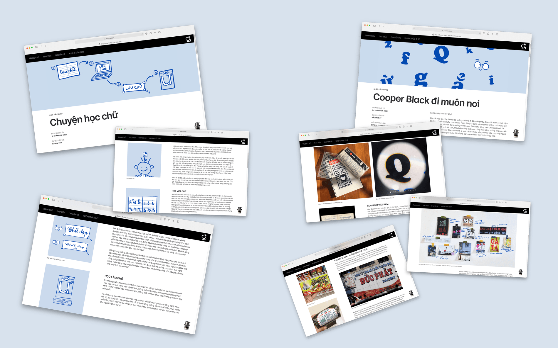
My recent blog “Globetrotting with Cooper Black” (Cooper Black đi muôn nơi) was about the popularity of this font in Vietnam. Cooper Black is everywhere around us. Living in Melbourne, I usually go to the Vietnamese market to buy cooking ingredients. I noticed many packaging designs of Vietnamese food also use Cooper Black. That exploration sparked my interest in digging into this Cooper typeface. I collaborated with my team members in Lưu Chữ to collect the blog materials. We found out that there is an enormous use of this font for restaurant signages and food packaging designs. Sometimes it is stretched, sometimes it is squeezed, but its characteristics are distinctive. Cooper Black has become a food font in Vietnam.
“Those signages are not only valuable because of the beautiful hand-drawn letters with fancy diacritics, but also the historical story behind them. If we could identify the year a signage was drawn and its painter, we would understand the cultural absorption that it reflected from China, France or America.”
When working on the The Lost Type Vietnam initiative, what have you noticed about Vietnamese typography? What have been some of the responses to the project?
Vietnamese typography is still an understudied field here in Vietnam. Despite the long history, few resources mention the typographic aspect of Vietnamese letters. The Lost Type Vietnam initiative started with enthusiasm in old shop signage letters. Hand-painted shop signs are a cultural heritage of Vietnam. They gave us a glimpse of the rich history of Vietnamese typography. Those signages are not only valuable because of the beautiful hand-drawn letters with fancy diacritics, but also the historical story behind them. If we could identify the year a signage was drawn and its painter, we would understand the cultural absorption that it reflected from China, France or America. Through Lost Type Vietnam, we hoped to put the spotlight on Vietnamese typographic history.
Fountain pens. Do you have favorites? What makes a good fountain pen for you?
Hmm, it is like you ask what my favorite fonts are! Currently my two favorites are the clear Pilot Kakuno with EF nib and the blue TWSBI 580-AL mini with EF nib. I am obsessed with extra fine nibs and clear (see-through) barrels where I can see the ink colors. Also the Pilot Kakuno nib has a smiley face on it which is really cute. For me, a good fountain pen needs to be easy to hold, have a converter, can produce smooth writing lines and be affordable (of course).
You mentioned you are interested in both the design and engineering aspects of type. Could you share more about this? How has this affected your type design practice, if at all?
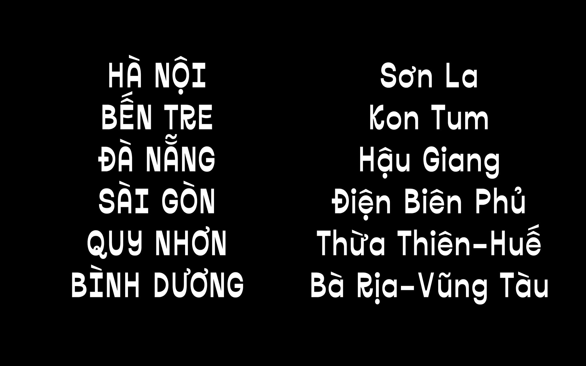
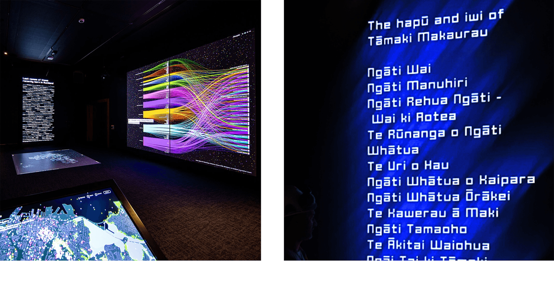
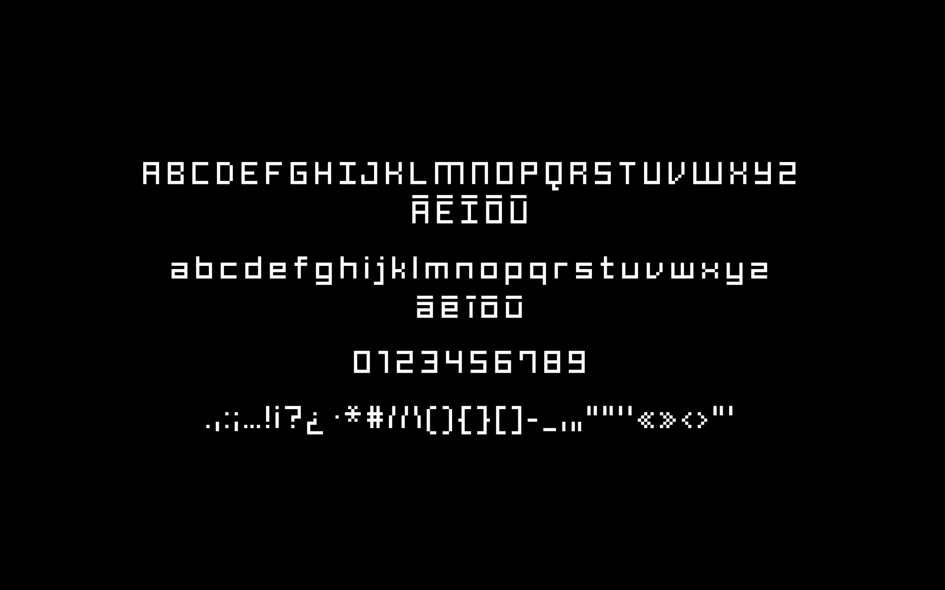
Vietnamese has stackable diacritics and their positions can easily affect the legibility and readability of the text. The top diacritic usually can be either on the top or to the left or right to the bottom diacritic. Therefore, designing stackable diacritics requires extra care. The position of a mark in a pair can be different in another. Knowing how Mark to Mark Positioning works is quite helpful in this case. Last year, I worked on the custom Māori pixel fonts with OOM Creative. These fonts were used for the data visualization screens of Tāmaki Herenga Waka galleries at Auckland Museum. When the fonts were tested on-site at the museum, they appeared blurry with red and blue shadows. This prompted me to look up all the possible rasterization issues. I discovered it was because of the ClearType setting on Windows system, this setting added sub-pixels to the font edges. Once this option was turned off, the fonts appeared clearer. Since then I gained a new appreciation for font engineering. I have been paying close attention to Python-based font quality assurance tools like FontTools and Font Bakery. This has given me more control over my font production because I am conscious of the potential technical issues that need to be monitored during the design process.
What’s next for you?
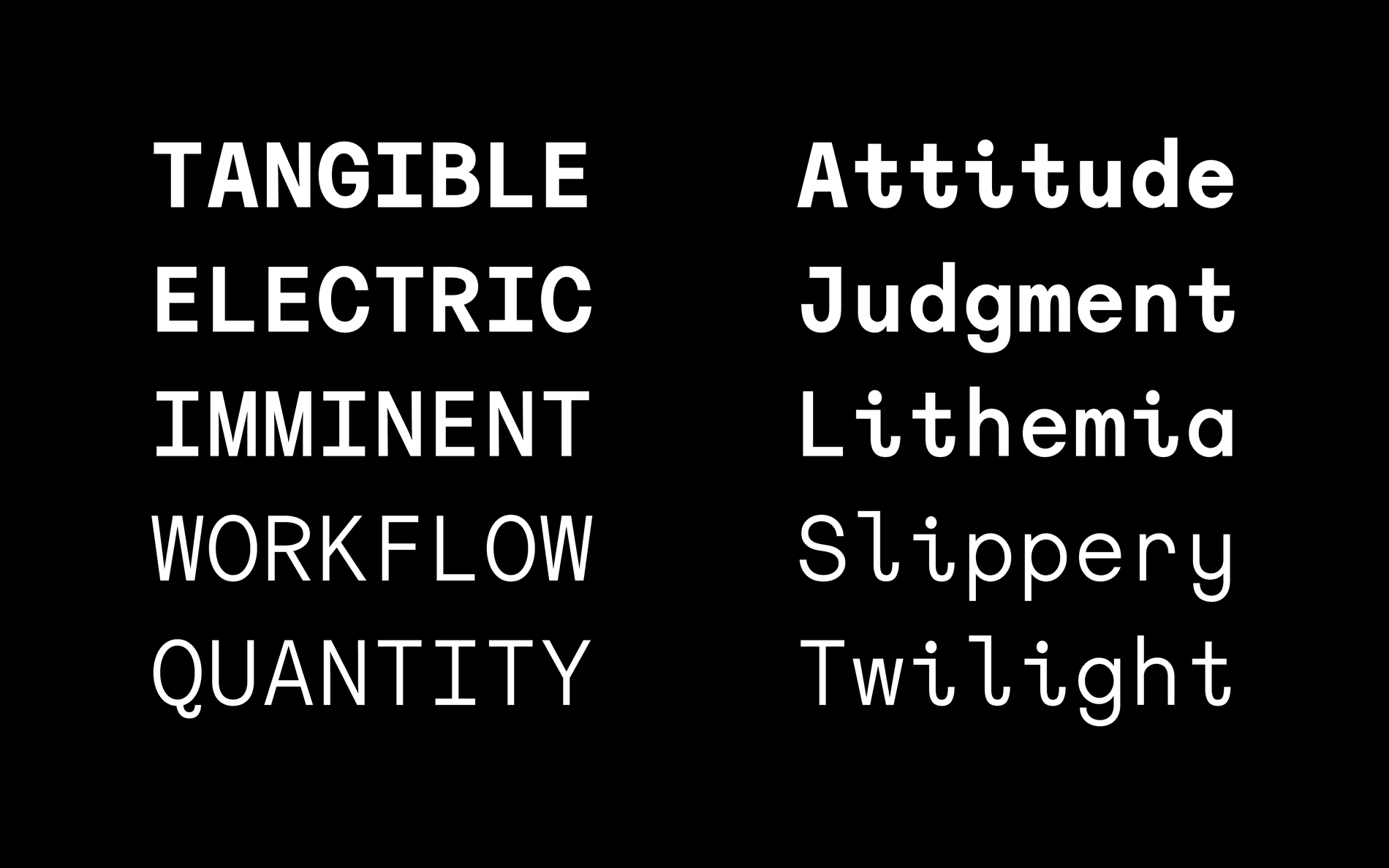
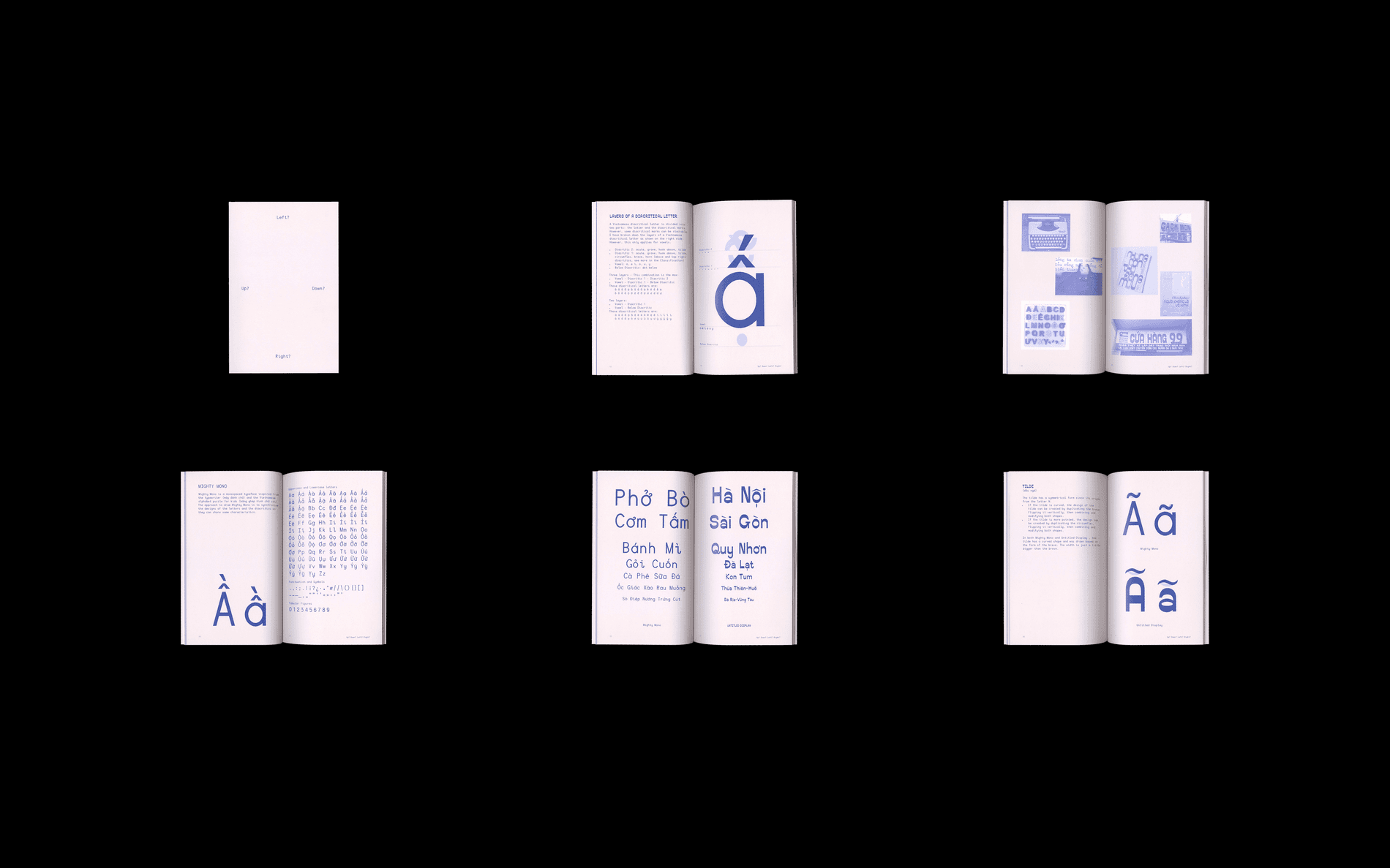
Fonts, fonts, and more fonts! I will be publishing my typeface Mighty Mono this year. Mighty Mono is a monospaced typeface project I have been working on since my master's research project. I am also working with my team members at Lưu Chữ to publish our first digital typefaces and many other interesting typographic research pieces. I am only just beginning my type design journey and have many more things to learn. I am hoping to enroll in a course where I can expand my knowledge and type design skill sets. I am also passionate about education and would like to see the typography representation within universities expanded. So maybe becoming an academic?
