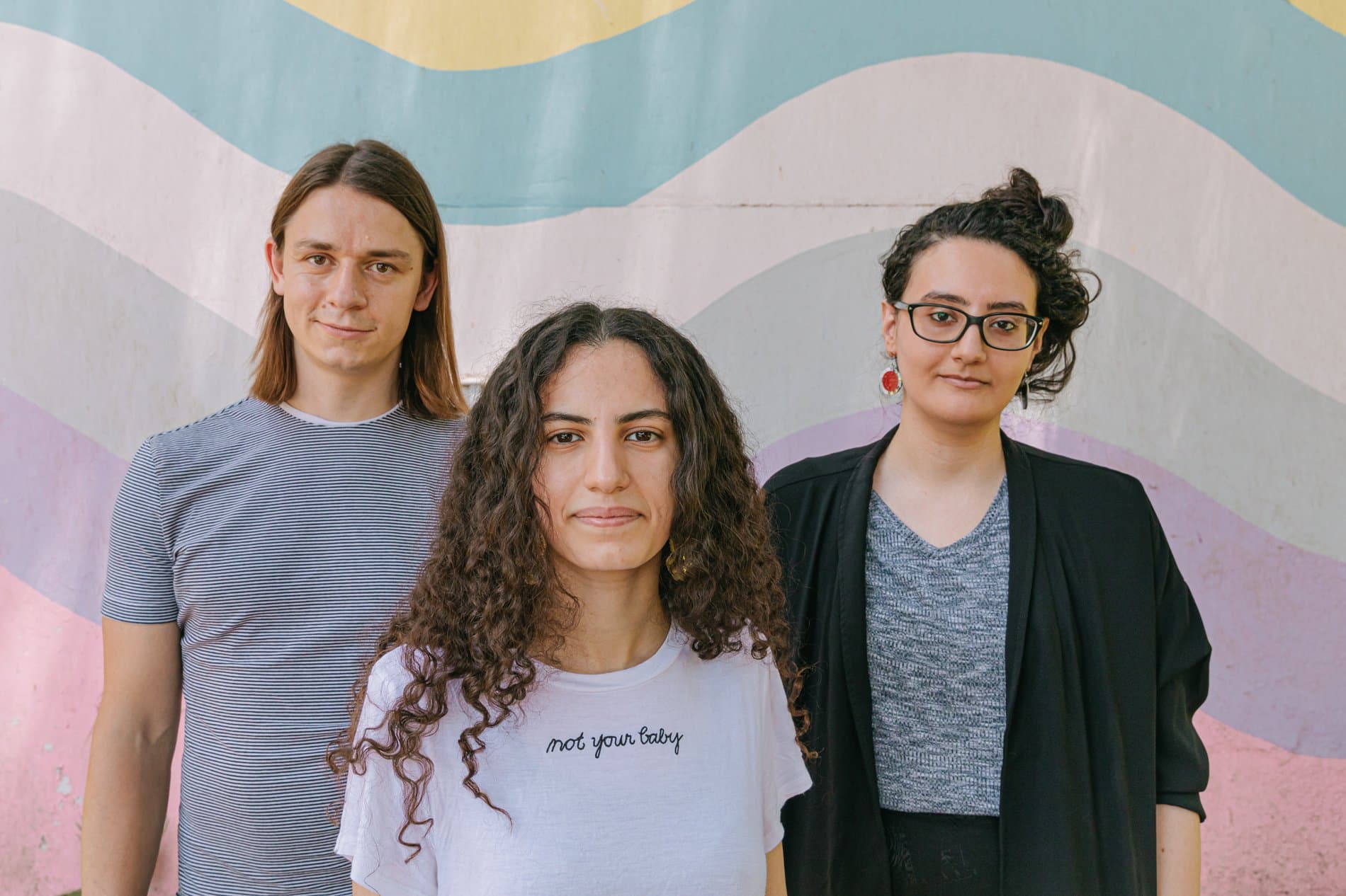
The Malee Scholarship 2020 Finalists
Meet Shahd El-Sabbagh, Beatriz Lozano and Huệ Minh Cao: three young women who demonstrate great potential and commitment to type design.
Meet Shahd El-Sabbagh, Beatriz Lozano and Huệ Minh Cao: three young women who demonstrate great potential and commitment to type design.
For the first year of The Malee Scholarship, our team was overjoyed and overwhelmed to receive an incredible pool of applicants from all over the globe — each with unique stories and journeys to type design. The Malee Scholarship is honored to announce Shahd El-Sabbagh, Beatriz Lozano, and Huệ Minh Cao as Scholarship Finalists. We were impressed with their ever-growing curiosity for type design and commitment to the craft. We were especially moved by the pride they have for their cultural background, and how their identities join forces with their passion for letterforms and type design. These three women are recognized as Scholarship Finalists for their drive, unique perspectives, and knowledge they have to offer to the type design industry.
Shahd El-Sabbagh
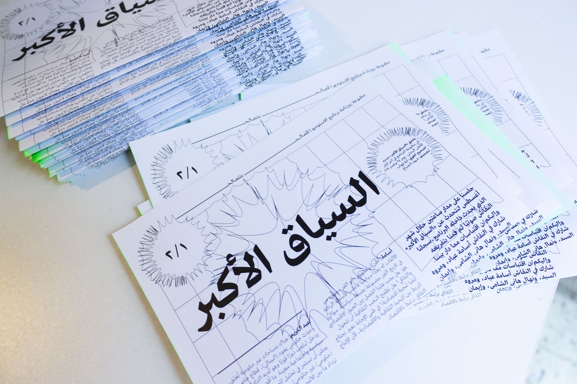
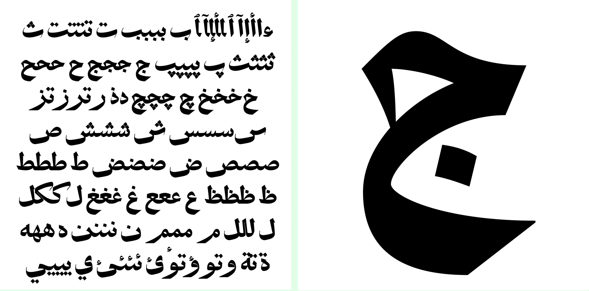
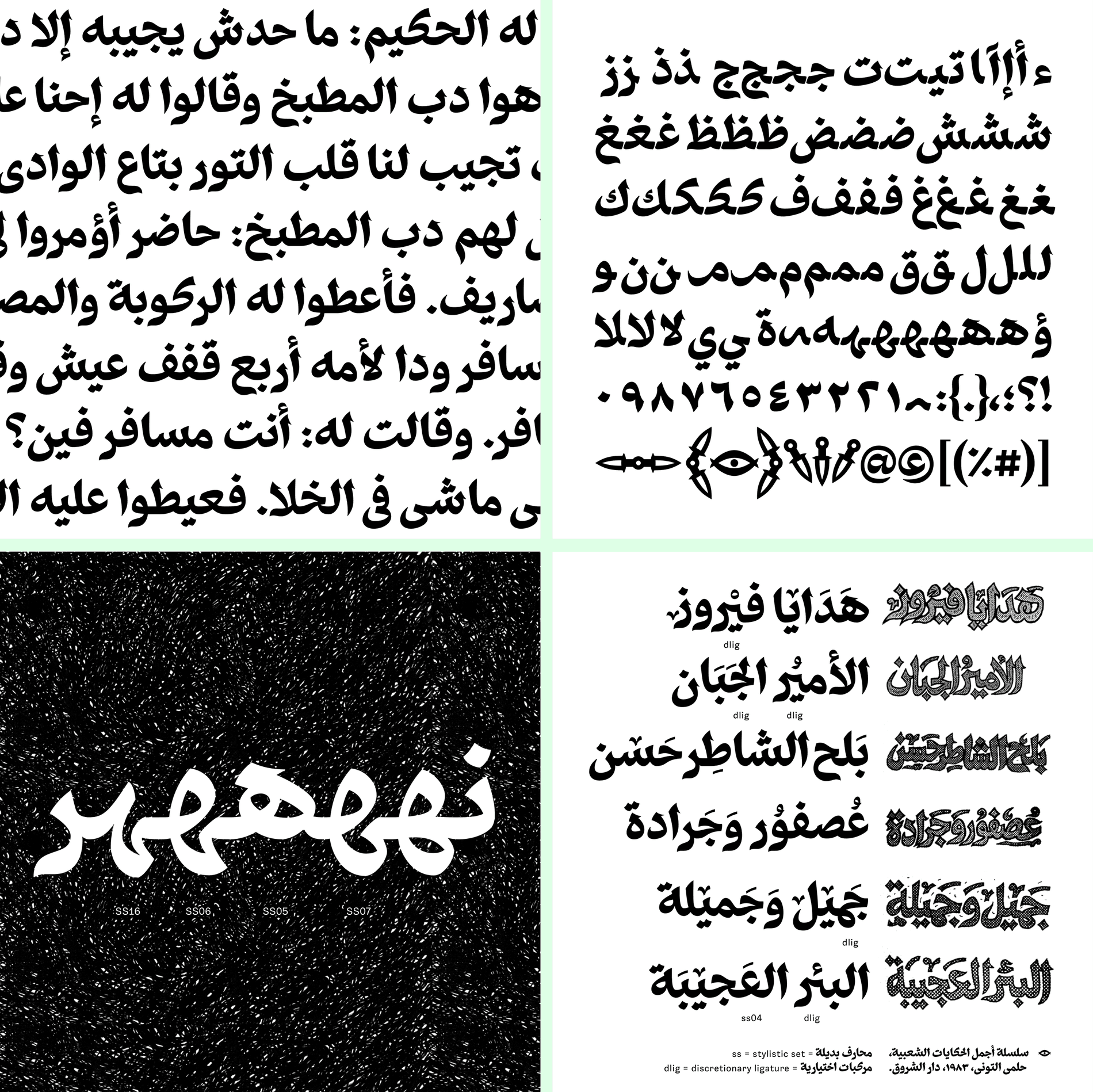
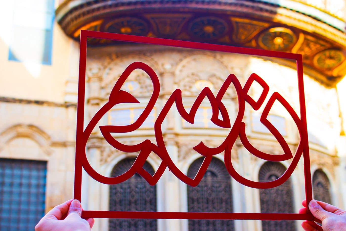
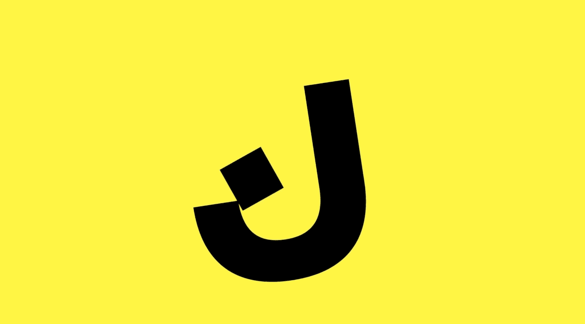
Shahd El-Sabbagh is an Egyptian graphic designer and Arabic type designer. Born and based in Cairo, Egypt, Shahd graduated with a Bachelor’s and Pre-Master’s degree in Graphic Design from German University In Cairo (GUC) in 2020. At the young age of 22 she has already accomplished a great deal professionally in both the cultural and commercial fields, designing Arabic typefaces, visual identities and printed matter. Shahd is a co-founder of Heheh Type, a Cairene Arabic type collective with Nour el Shamy and Manuel von Gebhardi. One of Shahd’s missions is to foster greater inclusion, access, and support to designing Arabic type.
When did you first get interested in letterforms?
After majoring in graphic design, I struggled with developing a creative aesthetic and an identity of my own, especially because I was enrolled in a very Eurocentric program. I was amazed being introduced to the Iranian Graphic design landscape and its contrast to the more ‘westernized’ approaches that surrounded me. I was clued in on how the Arabic script could be used and exist in contemporary visual design. My graphic design work then slowly started to become more oriented to Arabic typography, and as I began exploring the various forms, textures and rhythms of Arabic type, I searched more for similar experiences across the region.
During this time, I was lucky to meet Manuel von Gebhardi, who was teaching Intro to Latin and Arabic Type Design in Egypt. Guided by his pedagogy, it was clear that type design and development allowed me to navigate both research and practice across multiple intersectionalities while drawing beautiful curves. I have always wanted to ‘draw’ in the conventional sense, but found drawing letterforms to be my escape — sketching and scribbling letters given their familiarity was freeing, natural, and so enjoyable.
How does your background and upbringing shape who you are?
For most of my childhood, my father worked in editorial design at a local newspaper and magazine, so I've been tempted to explore ‘paper space’ and all the visual forms it contains within its borders. I was fascinated by editorial illustrations, and remember wanting to be drawing when I got older. Little did I know I'd be drawing letterforms instead. I have been very lucky and extremely privileged to be afforded bilingual education and have the chance to study design. If not for that, I don't think I would have had a chance to be designing typefaces now.
What are some examples of typography unique to Egypt that got you interested in type? Who are some of your favorite type designers in Egypt, and beyond?
Non-classical calligraphic hybrids and hand-lettering have been the most dominant forms of typography in movie titles, book covers, shop signs, ads, and editorials. It never fails to inspire me. There has been a great reliance on freehand work for so long to compensate for technical hurdles and the rigidness of mechanical type. Calligraphers also worked outside of Classicism, making every piece conceptually unique.
“I’m learning to explore our design history outside of specific famous names and instead through wider contexts. Acknowledging how many people, myself included, may be capitalizing on this undocumented legacy of great craftsmen is more important to me than repeating the same few famous names in the industry.”
Of course, it’s sad how most of these brilliant designers were often uncredited and never got the praise they deserve. I'm learning to explore our design history outside of specific famous names and instead through wider contexts. Acknowledging how many people, myself included, may be capitalizing on this undocumented legacy of great craftsmen is more important to me than repeating the same few famous names in the industry. The work by uncredited craftspeople is undeniably important, not just within the design scene, but also in my own learning process and practice.
What have you learned about starting and running your type design foundry Heheh Type with Nour el Shamy and Manuel von Gebhardi?
We’ve been collaborating for a few months and have published one project. I've learned so much about the business of design and project management in this little time, which would have taken me a lot longer if I were on my own. Navigating collectivism, especially within an exclusively virtual workspace has been tricky, yet very valuable and rewarding. There is still a lot to learn about the Arabic market, especially when you shift the focus from the Gulf and big corporations. We’re hoping to make fonts that are accessible and affordable for a wider audience.
Tell us more about your latest release at Future Fonts!
Future Fonts was the perfect opportunity to start publishing and we were lucky to be the first to bring Arabic to the platform. Personally, I found it difficult to embrace the “in-progress-ness” of myself, our collective, and the fact that the public is watching us learn and grow in real time. Yet, this was also why FuFo was a great opportunity for new Arabic movements and styles within the type scene to flourish.
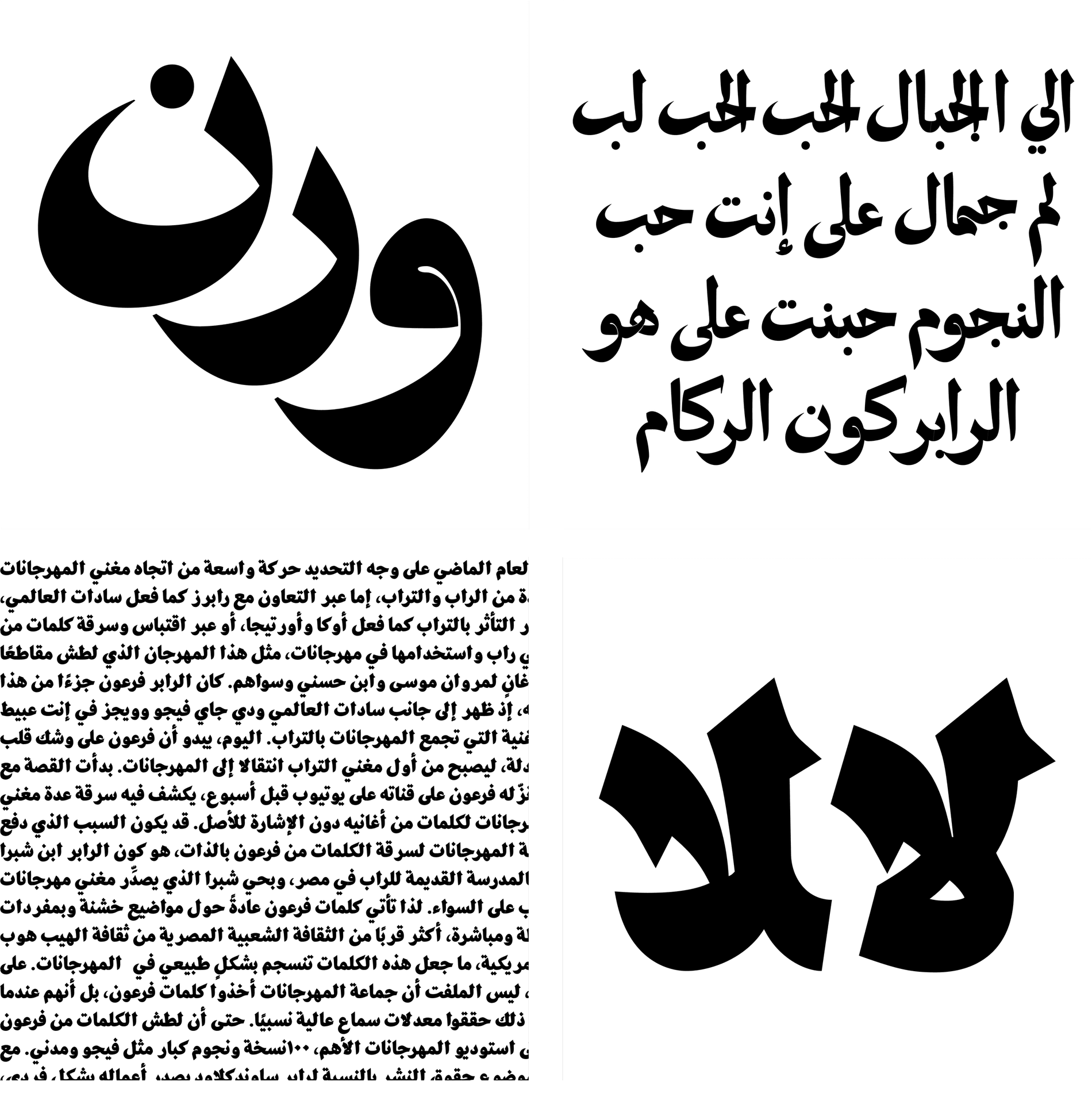
Dobb was designed by Nour El Shami, and was my very first collaborative type project with her and Manuel. The style, Mamluk Thuluth, was later adapted by an Egyptian artist Helmi El Touni who did book cover hand-letterings for a series of children’s folktales published in the 80s called Agmal El Hikayat El Shaabiyya(The Most Beautiful Folktales). It’s not only a gorgeous publication, but also had sentimental value for us since both Nour and I grew up with these books as kids.
You mentioned how your foundry values transparency and openness as a founding value. Can you talk more about this?
We define Heheh as a learning-by-doing space that allows collaborative experimentation and mutual support. We believe this isn’t limited to the three of us, and hope that Heheh will grow with and beyond ourselves whether its by bringing people in, or by just sharing useful information, assets, processes, and failures publicly.
I was lucky as a young designer to kickstart my career and be surrounded by many generous people who demonstrated this open model, instead of one of isolation and protectionism. I've benefited from frank discussions about money, workflow, and design business from many experienced designers. I’ve been taught the importance of transparency and openness, and plan on giving back in those same ways.
You questioned “where do we stand in the niche industry centered largely in the West?” What is your perspective on this and can you talk more about the initiatives you've been taking?
I believe the social, political, and economic contexts are at the heart of any design practice and should guide our critique of what has been designed, what is being designed, and our own practices. The history of modern Egyptian visual design is filled with amazing type work, and I can't help but wonder what the Arabic type scene would’ve been like if they had more access to the tools and knowledge to produce fonts and contribute to their native language. It’s still a question, as very little has changed.
“I am trying to orient my career within the frameworks of local design collectivism and local subjectivities, and make a small contribution to decolonial efforts through letterforms and typographic functionalities that are true to the Arabic script.”
Although I'm still quite new to the type industry and navigating the very margins of it, I am trying to orient my career within the frameworks of local design collectivism and local subjectivities, and make a small contribution to decolonial efforts through letterforms and typographic functionalities that are true to the Arabic script. I have been working on Arabic translation of type and type related terminology, which hopefully will be publicized soon. It’s important that we have vocabulary in our mother tongue to enable us to talk about our work and develop local nuanced meanings, narratives, and histories told by natives.
What’s next for you?
Although I have already been working since the beginning of my undergraduate studies, graduation is a milestone worth pausing and reflecting on. The ‘Now what?!’ feeling hasn't been quite resolved yet. However, after moving past the fear of co-publishing my first typeface, I am excited to work on other projects, since our pipeline is quite full with projects for a versatile catalog.
Beatriz Lozano
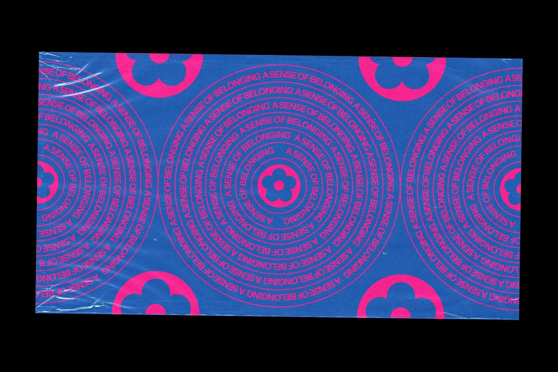
Beatriz Lozano is a Brooklyn-based designer at Sunday Afternoon studio. She is a proud daughter of immigrants, a first-generation Mexican American woman, and first-gen college graduate from the University of Michigan. As the daughter of previously undocumented immigrants, she understood the complexities of our immigration system and the importance for citizens to use their privilege to advocate for equality. While at college, she was first enrolled as a Mechanical Engineering student, but fell in love with graphic design, visual communication, and type design through her involvement with immigrant rights activism activism. She realized that mobilizing people for a greater cause through design was something she would want to commit to for the rest of her life. Today, Beatriz is also interested in exploring custom type, 3D, and motion design to create variable typefaces that are designed to be animated.
When did you first get interested in letterforms?
I’ve been fascinated by letterforms since I was a kid. In elementary school, I drew bubble letters for all of my class projects. Whenever my family traveled, I took photos of the lettering on signs — especially when we were visiting family in Mexico because the hand-painted signs outside of shops and restaurants are magnificent.
How does your background and upbringing shape who you are or your approach or drive to design?
Growing up in the suburbs of metro-Detroit as the only Latinx family in the neighborhood, my parents always made sure that my siblings and I understood and valued the beauty of our Mexican culture and heritage through food, language, and art — in spite of the racism and xenophobia we faced in Michigan. This appreciation often manifests in my work including most recently in my typeface Ancho.
As the daughter of immigrants, I am so fortunate to have been raised by parents who have lived through vastly different experiences than I have, because it meant that from a young age I was exposed to multiple ways of thinking, and recognizing that there are no absolutes. Different languages, incomes, education levels are not better than each other, but simply just different. It gave me an open mind and a curiosity to constantly question: a mentality that is essential to my design process. As a first-generation Mexican American and first-gen college grad, I hope for my design work to support marginalized communities and make design more accessible, especially to other women of color.
“I find that to this day, the projects that I love the most are the ones that are rooted in using design to empower marginalized communities.”
We are inspired by the way you’ve used your design work to advocate for social justice issues, like immigrant rights. What inspired you to merge design and activism?
I believe visual communication is an incredibly powerful tool, because in many ways it is a universal language that can help share different perspectives, educate, and create empathy. In college I was originally on the path to becoming a mechanical engineer but discovered my love of design through activism, so the two are always connected for me. I find that to this day, the projects that I love the most are the ones that are rooted in using design to empower marginalized communities.

What impact do you hope to have on the type industry, and how do you think your unique experience and background will inform your approach to type design?
I hope to help reimagine how type and specifically kinetic type can exist in our digital world. Currently, kinetic type is created through the sequential application of two siloed processes: type design and motion. As a designer with a motion background, I’m eager to incorporate motion thinking from the very beginning, designing variable typefaces that are thoughtfully made to be animated.
Tell us more about your recent typeface, Ancho!
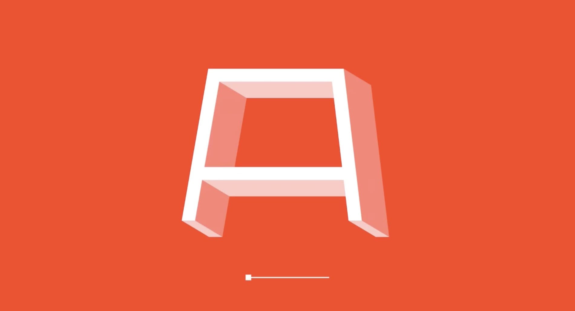
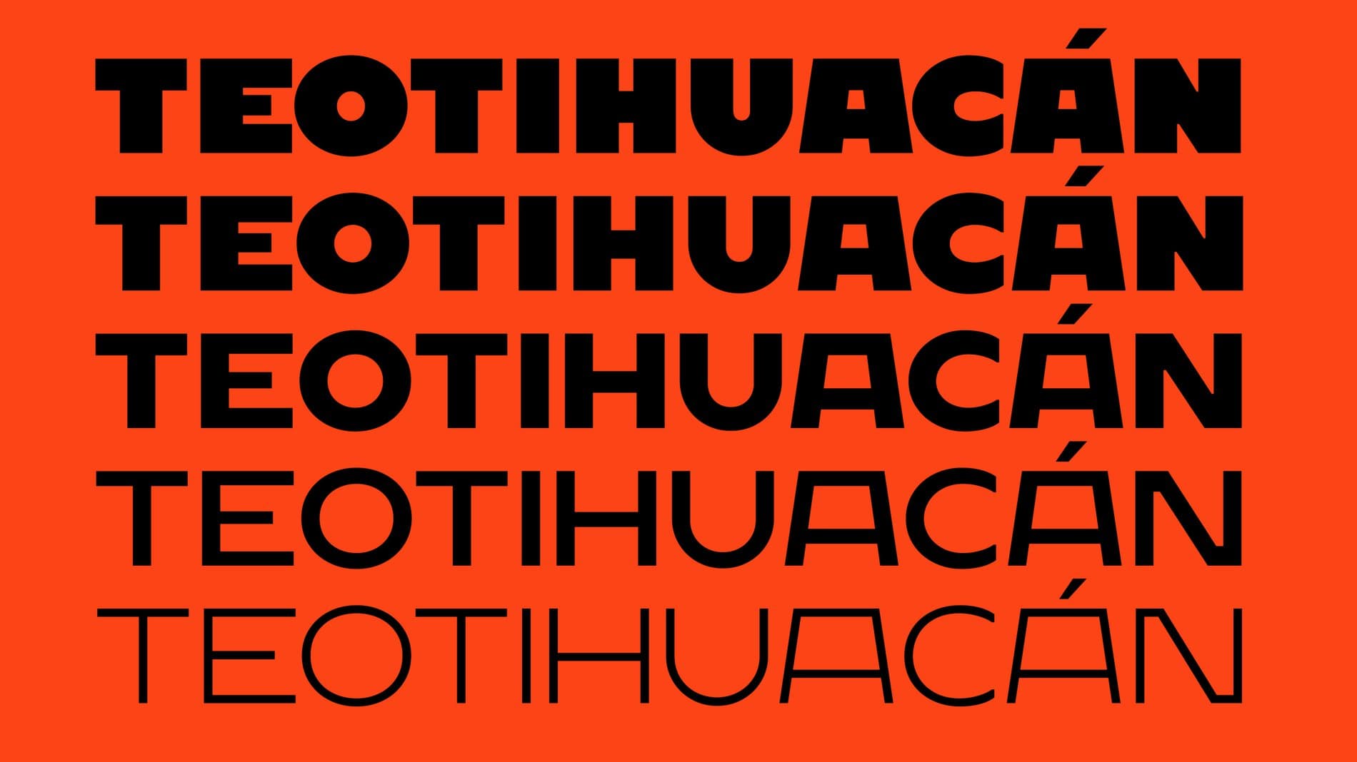
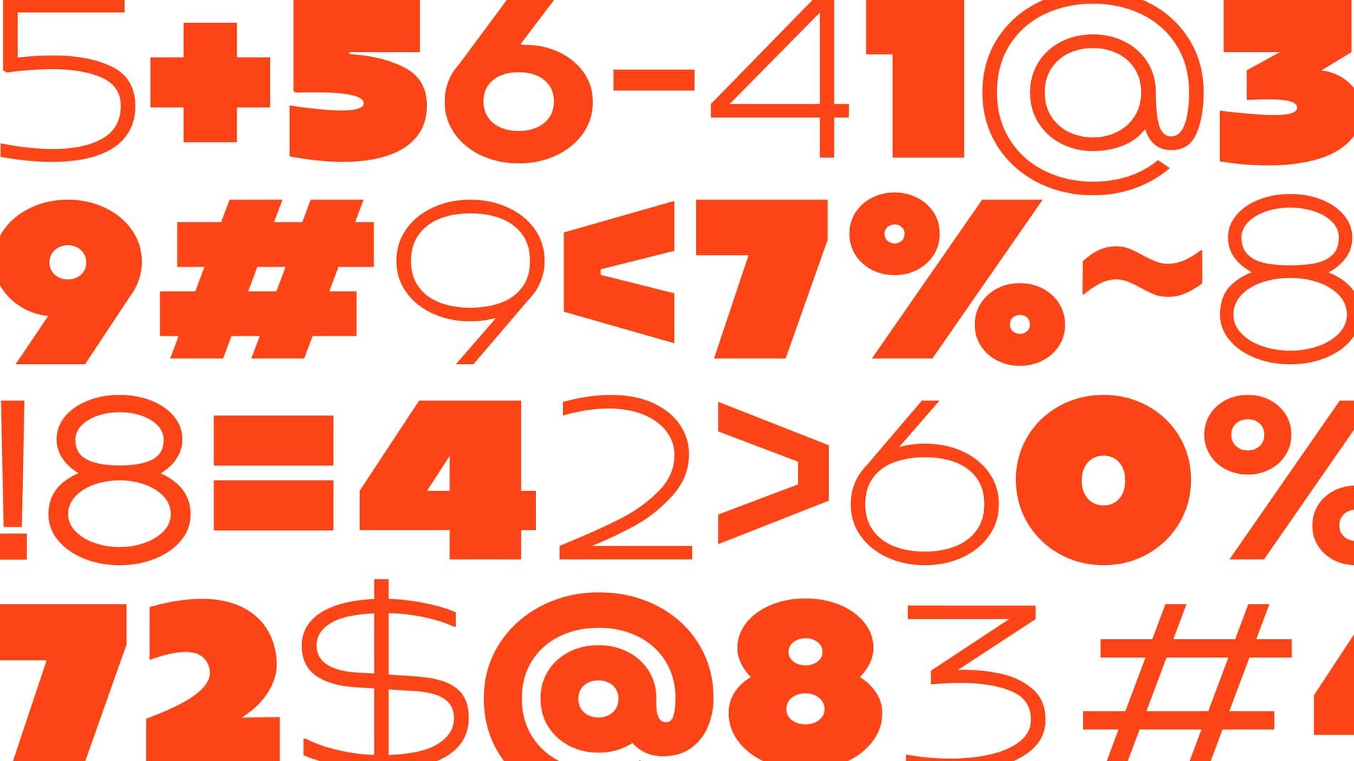
Ancho is a variable display sans inspired by Mexican cuisine and the architecture of Teotihuacán. It’s my first completed typeface, and was a personal project that I took on to learn the type design process and honor my culture. Ancho originally started as a poster series based on different dishes of Mexican cuisine, which evolved to creating custom lettering for the most popular peppers we use in our dishes. Eventually I honed in on the Ancho pepper, whose name translates to “wide” and had a lot of exciting potential to exaggerate the forms of the letters. In a year, I’m hoping to release an updated version which will include the lowercase characters and more alternates.
Tell us what excites you about variable type and the projects you have developed experimenting with this ever-evolving technology? What do you think is the future for this medium?
Ancho is the only variable typeface I’ve designed yet, but I’m constantly experimenting with variable lettering experiments using Glyphs, Python, DrawBot, or Processing. Recently I’ve been exploring the use of components in Glyphs, and how to evoke an illusion of dimensionality through distortion and shape repetition.
As for the future of the medium, perhaps it’s just wishful thinking but I’m convinced that within the next two years AfterEffects will be capable of supporting OpenType features, which will transform the way we can animate with variable fonts and continue to inspire type designers to be more experimental with their design systems.
“Ancho originally started as a poster series based on different dishes of Mexican cuisine, which evolved to creating custom lettering for the most popular peppers we use in our dishes. Eventually I honed in on the Ancho pepper, whose name translates to ‘wide’ and had a lot of exciting potential to exaggerate the forms of the letters.”
Who are some of your favorite type designers?
It’s difficult to pick just a few, but I’ll do my best to narrow it down! Wael Morcos, Sharp Type, Colophon Foundry, Berton Hasabe & Miguel Reyes. I have also been really inspired by up and coming designers including Tré Seals, whose typefaces are inspired by historical movements, as well as Frida Medrana, who’s at the forefront of innovative variable font designs.
What’s next for you?
I’m currently enrolled in a display type and generative type classes at Cooper Union, to keep improving my drawing skills as well as expanding my understanding of how type can be coded. Through these classes, I’m in the early stages of designing a new variable font that is inspired by the hand-painted signs that can be seen throughout markets in Mexico. It’s a brush inspired typeface with adjustable width and curvature.
Huệ Minh Cao
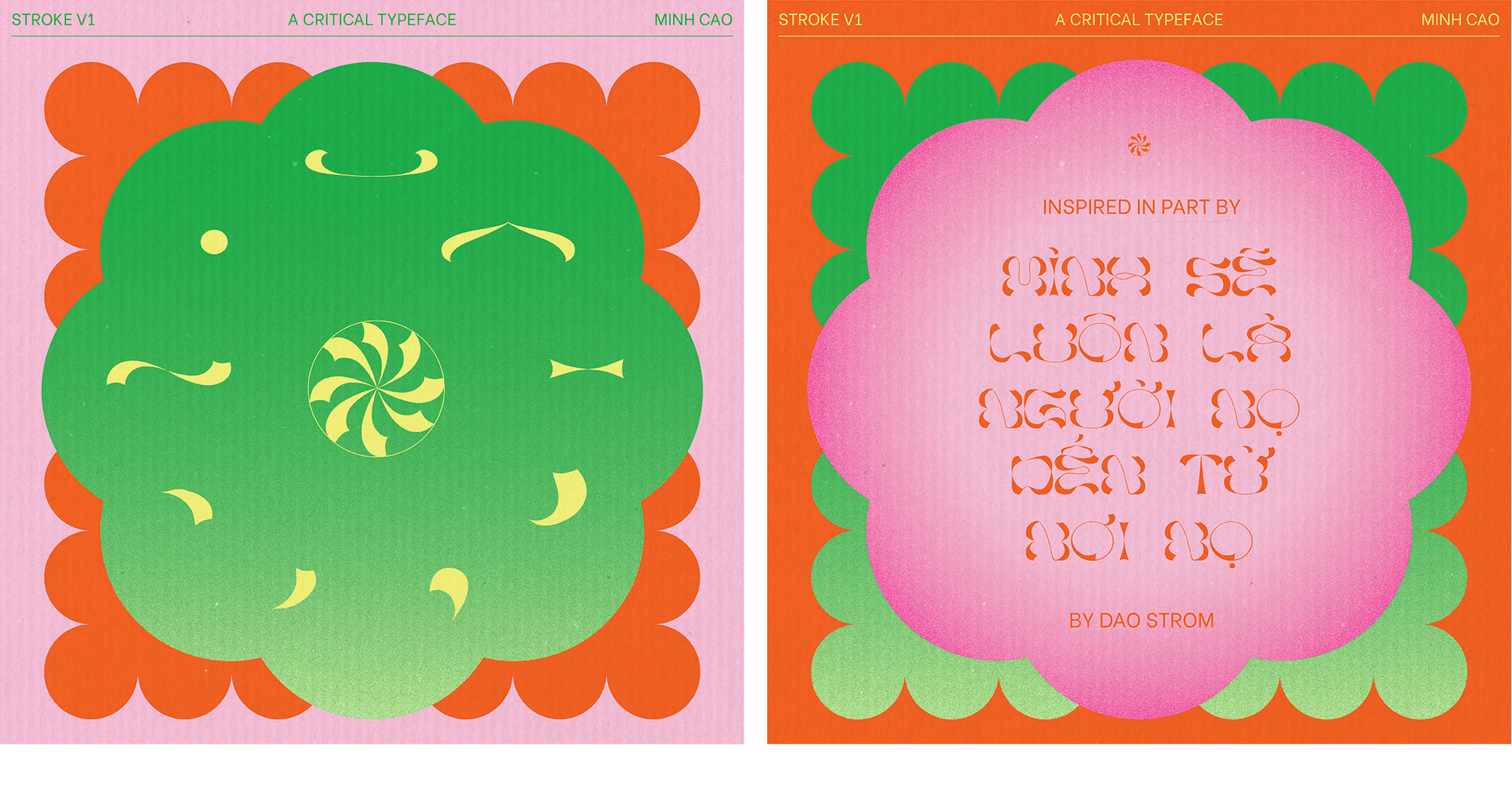
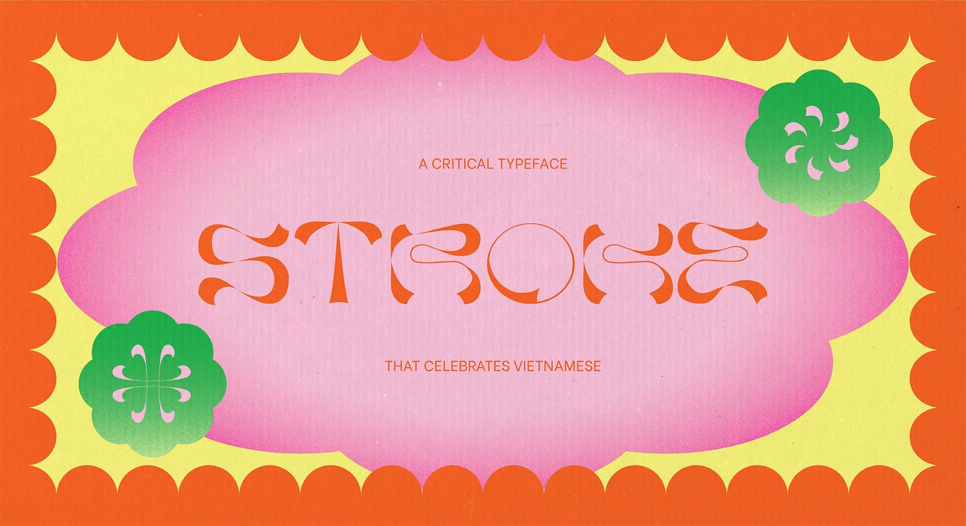
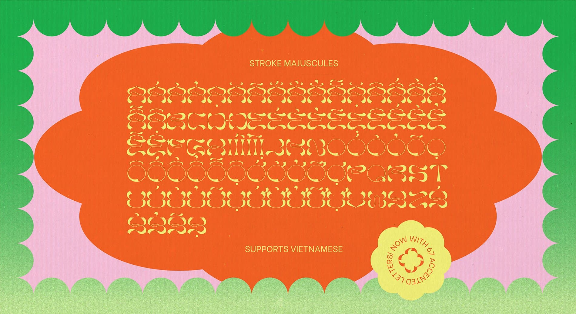
Huệ Minh Cao is a designer in love with the written word, from the things they mean to the shapes they make. She received her degree in Design from the University of Texas at Austin in 2020. Her background as a mixed Vietnamese-American has encouraged her to connect with her cultural heritage and history — both for herself, and as a teaching tool. She’s currently studying Vietnamese and learning the letterforms, so others can too. Huệ Minh is excited about the opportunities to express identity and culture through letterforms. One of her in-progress typefaces is called Stroke, a Latin typeface that celebrates Vietnamese diacritics.
When did you first get interested in letterforms?
When I was in elementary school, I was super into graphology — this old, pseudoscience-y study of handwriting. It was my in-class-party-trick. It tells you to look at the pen pressure, the angle, the terminals, even the loops of ‘g’s in handwriting. Supposedly, you could learn about a person’s personality through their letterforms. I remember something about how the height of the cross stroke on a lowercase ‘t’ reflected your level of curiosity. I always thought that was cool, and made a point to cross my t’s nice and high.

How does your background and upbringing shape who you are?
I’m Vietnamese and white. Often, when you’re multiethnic, you can feel distant from, or not totally accepted by, the various groups you belong to. I’ve noticed that a lot of my work, even in childhood drawings, has been based in me inching closer to my Vietnamese heritage. This has led to seeking answers in odd places (planting a lifelong love of research and super-sleuth-ery).
“Typefaces themselves are already tools, but what if my lil’ experience in creative coding helped folks generate their own type? What if my love of historical research became a free archive?”
What impact do you hope to have on the type industry and how do you think your unique experience and background will inform your approach to type design?
It would be so cool to make type design tools that are helpful, resonant, and promote agency in the design process. Typefaces themselves are already tools, but what if my lil’ experience in creative coding helped folks generate their own type? What if my love of historical research became a free archive? Recently, I’ve been thinking about making a tool that helps designers easily add their own diacritics onto typefaces that don’t fully support their language. I’m not too sure how yet, but I’m happy to keep exploring.

You mentioned you’ve been taking Vietnamese classes! How is that going and how has learning the language shaped your perspective on type design?
It’s been fun! I’ve been reading Vietnamese children’s stories — and I noticed my attention to the proportions of diacritics has been getting a little better as I read more words. I’m learning to train my eyes, and I’m getting to see some of the mistakes I made in my first typeface. I’m excited to get better over time. Taking lessons has really reinforced my interest in Vietnamese as a written language.
What is your favorite Vietnamese character or diacritic?
I like the pairing of a letter with a circumflex (â, ê, ô) with a dấu sắc (ấ, ế, ố)—it’s like a little puzzle. The positions of the marks are variable! They can stack on top of each other! They can sit almost side by side, like little pals! Wow. :)
“My hope is that someone will see [Stroke] and be reminded that, ‘Hey, Vietnamese diacritics exist, and they’re not too much extra work to add!’ and decide to give designing these diacritics a go.”
Tell us more about your typeface, Stroke. What are your hopes for the project?
Stroke is a critical typeface that celebrates Vietnamese diacritics. In Vietnamese, diacritics are essential because they convey tone and pronunciation. However, type designers often neglect to include those diacritics, despite the fact that it’s already a Latin script. Since so few typefaces include Vietnamese diacritics, people who want to design in Vietnamese are often limited to using a small range of typefaces, getting a type designer to make a custom typeface, or even crafting their own diacritics to tack onto existing ones.
So, while there are designers making typefaces that supported Vietnamese language, they were often utilitarian. Functional. They weren’t expressive, dynamic, or specific. Stroke is meant to call attention to — and really celebrate — Vietnamese diacritics. It was made by centering the diacritics in the design process, and only after making those first, molding the letterforms to fit them. This made the letters come out funky and kinda fun!
This typeface was my senior capstone project. As a part of an early critique, a type designer in Austin, Simon Walker, declared he would incorporate Vietnamese diacritics in all future typefaces. It was a small, happy bonus! My hope is that someone will see this typeface and be reminded that, ‘Hey, Vietnamese diacritics exist, and they’re not too much extra work to add!’ and decide to give designing these diacritics a go. (If this someone is you, hello :) Donny Trương’s online book Vietnamese Typography is super helpful.)
Who are some of your favorite type designers?
I’m in love with the whimsy and openness Leah Maldonado brings to the type community. She’s really about making typography fun and accessible, and I appreciate how she’s fostering a sense of childlike-play in type design which normally can feel very grown up and serious. Also, no surprise here that I’m inspired by TienMin Liao. She’s a powerhouse, and her multi-scriptural type conveys emotion, presence, and joy in a way I want to echo. Ribaasu is a personal favorite. And Stefanie Vogl’s otherworldly letters? Just insane.
What’s next for you?
Going back to the basics. I’m currently learning to make a simple sans-serif. My experience in type design is minimal, and I started with something that did not necessarily follow rules. I’m now trying to learn those rules. Next time, I’ll break ‘em with more intent!