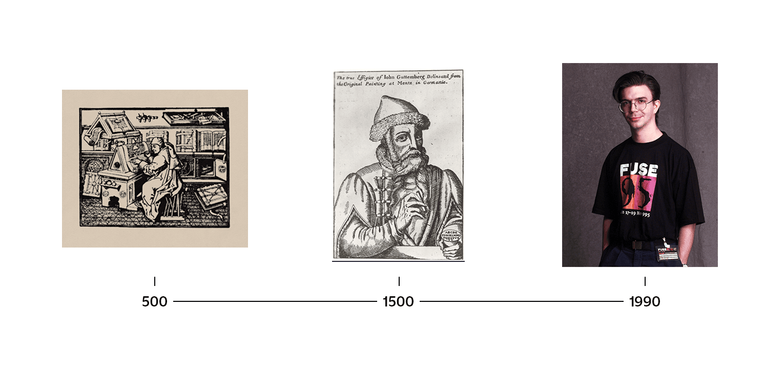
The Hauntology of Ghost
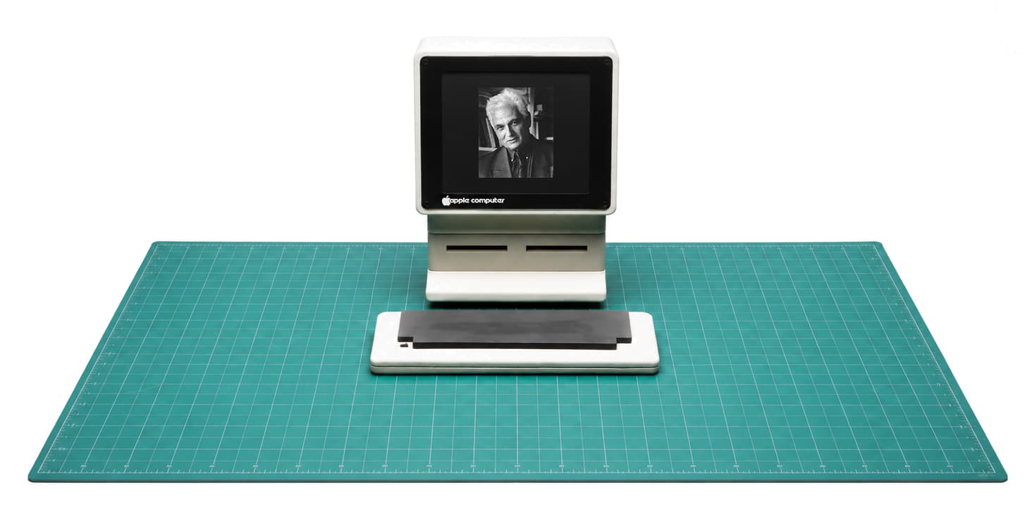
Jacque Derrida’s concept of hauntology describes how elements of the past—particularly ideas of the future—linger in the present like ghosts, revived over and over.
Jacque Derrida’s concept of hauntology describes how elements of the past—particularly ideas of the future—linger in the present like ghosts, revived over and over.
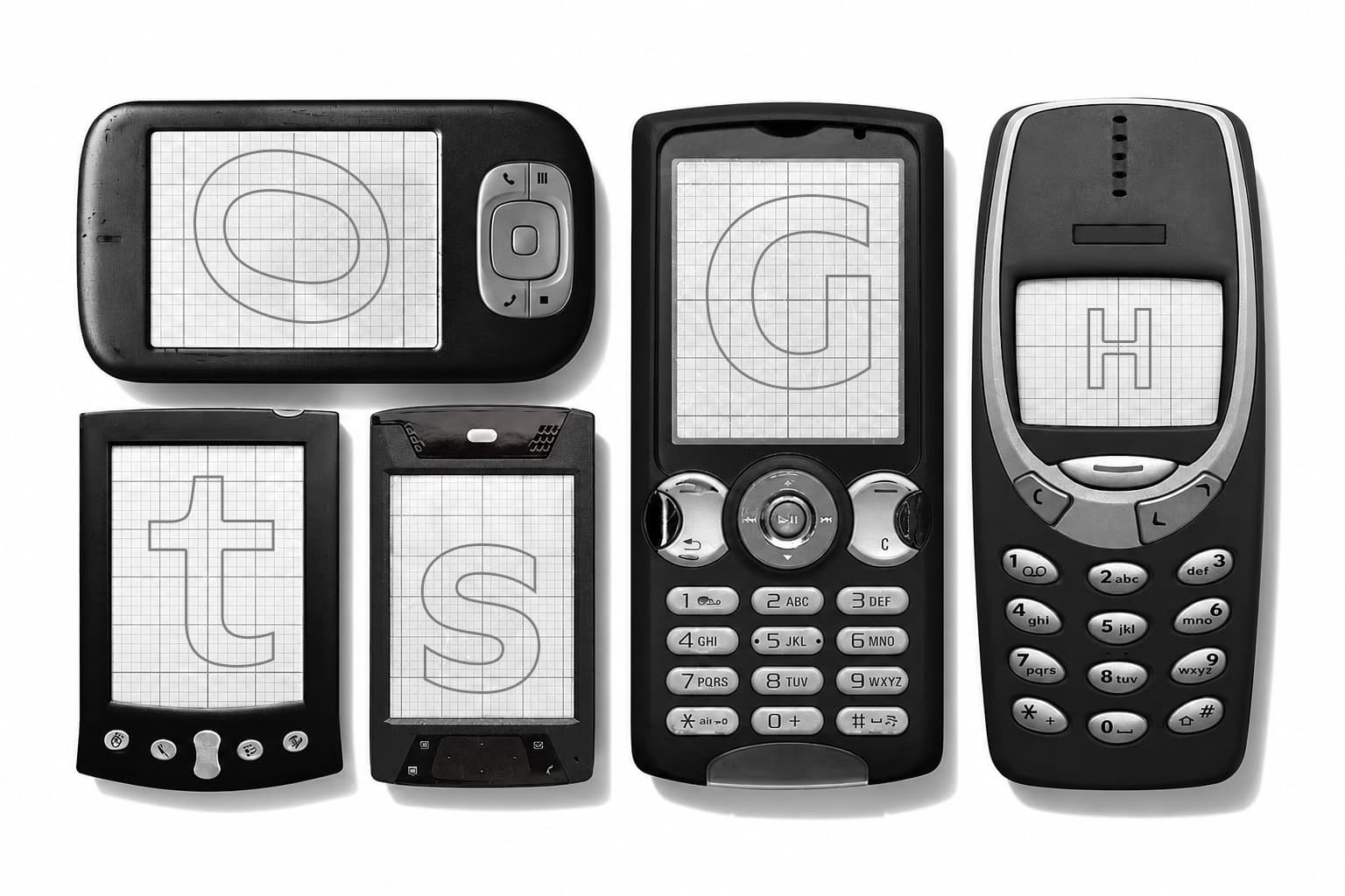
Within the type industry, revival culture continues to define design trends, reanimating past design languages through the digitization of classic fonts, anachronistic replicas of older typefaces, and retro display faces that recall bygone subcultural aesthetics.
This synchronic approach to design recycles past ideas of modernity—most recently the gloss of Y2K optimism—rendering a typographic landscape that no longer imagines radically new futures, and instead remixes existing ones, often with declining results. Nostalgia for past design futures, recycling of historical styles, and use of obsolete digital aesthetics can only be deemed authentic when set against a globalized design industry that employs increasingly corporate, system-friendly typography to flattening effect.
NEW NORMAL ⏪ NEW FUTURE
NEW NORMAL ⏪ NEW FUTURE

How can we disrupt this loop of repetition in order to reopen the future? In 2012, Mark Fisher published “What Is Hauntology?” in which he opined, “If electronic music was ‘futuristic,’ it was in the same sense that fonts are ‘gothic’—the futuristic now connoted a settled set of concepts, affects, and associations.” Without the leading edge of innovation, in type design, as elsewhere in culture, we exist, in Franco Berardi’s suggestive phrase, “after the future,” at an end of history.
“More broadly, and more troublingly,” Fisher continues, “the disappearance of the future [means] the deterioration of a whole mode of social imagination: the capacity to conceive of a world radically different from the one in which we currently live.”
If contemporary type design culture remains haunted by nostalgia for these lost futures, perhaps
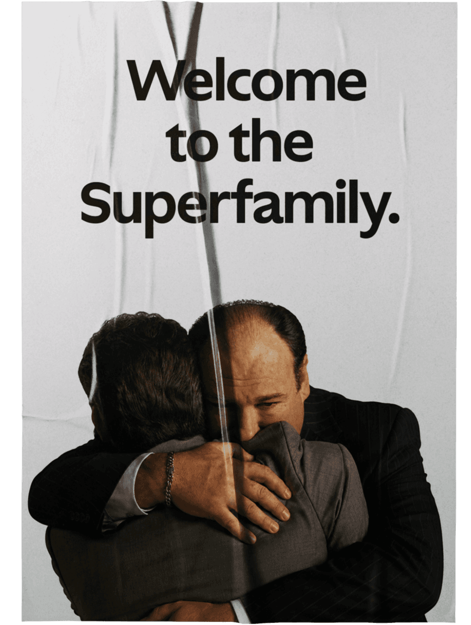
Ghost, then, offers an alternative. Previously, we defined Ghost’s design language as a new normal: a set of complex, deeply nuanced design decisions that defy classification with the intent to move beyond superficial novelty and into something truly new. Type design doesn’t simply communicate words—it transparently reveals whether a culture fosters the possibility of the future, or is haunted by its absence. Ghost is a microcosm of Sharp Type’s ambition as a studio for how we move forward: In form, in spirit and in name, Ghost Superfamily is a winking acknowledgement that type design remains a living, breathing art form—so long as the creative energies behind it believe in the future.

Ghost Construction
Ghost Construction
Humanist sans-serifs are arguably best understood by the ways in which they uniquely play to and against the genre’s technical parameters. All “humanism” in type has its rightful basis in the hand of the scribe through the discipline of writing with the stroke translation of a broad nib pen or brush. So where does a Humanist sans fit into this picture in terms of actual utility? This question was the basis of designer Lucas Sharp’s exploration of the genre. “I have often pondered the ‘why’ when reading text set in these faces, and found compelling contemporary examples of the genre to be few and far between. Inevitably, I wish that I was just reading a decent serif text face.”
The core issue according to Sharp is that, within the typographic community, the Humanist sans has become something of a “floating signifier” – a descriptor wherein everybody sees different things. Consequently, this has resulted in a genre exhausted of meaning. Most Humanist sans lack both a calligraphic basis and the cleanliness of rational construction, choosing to feign “humanism” by simply avoiding right angles and circular bowls instead of establishing a clear connection to the human hand. Using a framework pioneered by Edward Johnston with his eponymous sans, Ghost takes a different approach.
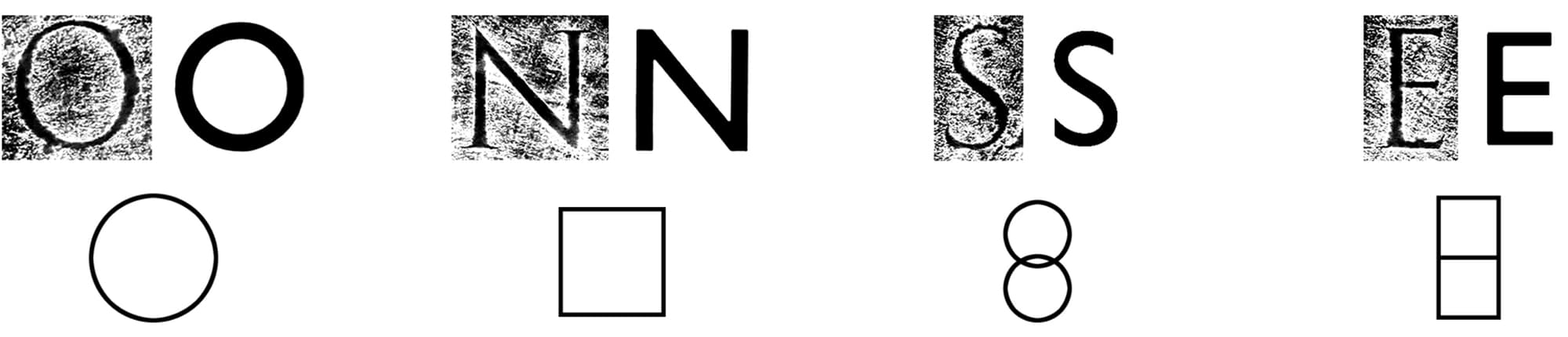
Instead of adopting the looseness and organic qualities of the actual strokes common to the contemporary Humanist sans, Ghost, too, conceives of these calligraphic motifs as mechanically constructed expressions. Like Johnston Sans, Ghost is connected to the human hand not by imitation but by representation.

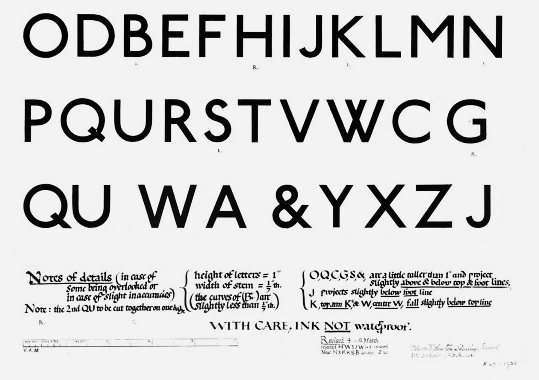
A key moment of Ghost’s construction is the characteristic form of the curvilinear strokes terminating on a vertical sheer. This ingeniously simple adaptation of the monumental Roman capital form into the universe of the sans serif was Sharp’s initial inspiration for exploring this genre in the first place. “When I first internalized that connection, something clicked.” Subtle nods to the monumental Roman capitals are found throughout the uppercase, synthesizing their essence into this newer aesthetic paradigm.

With Ghost, Sharp took this methodology and instead applied it to Grotesk construction and a bouma of tight-but-not-touching texture. The subtle stroke modulation (aka contrast) found in many examples of early 20th century grotesks like Morris Fuller Benton’s Franklin Gothic reinforces Ghost’s connection to the Roman monumental style; the more oval bowl shapes and uniform letter width proportions play against it.
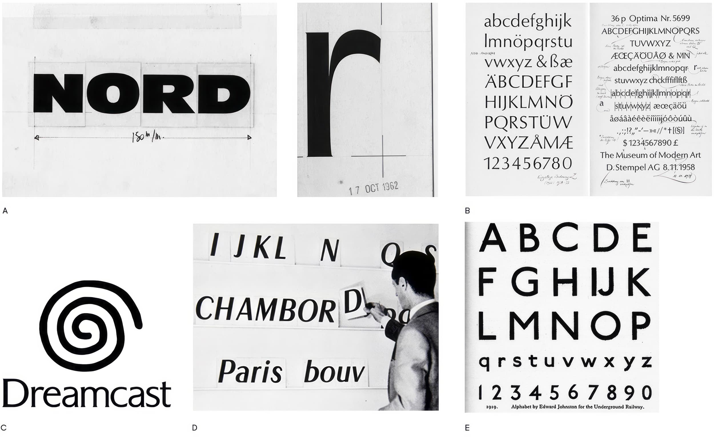
An intriguing combination of Humanist sans criterions like Johnston’s, but also mid-century gems like Friz Quadrata, Antique Olive, and especially Hermann Zapf’s Optima, underscore Sharp’s personal yet unprecious approach here. To those of a certain generation whose idea of “normalcy” was shaped between the late 80’s through the 00’s, these faces represent a potent set of cultural touchstones. In exploring these aesthetics and their associations, Ghost became a meditation on nostalgia–a spectral recollection that comes with the implicit acknowledgement that one can never really go back. The name “Ghost” is an admission of this experience: that normalcy has always been informed by the past.
An Idealized Normal
An Idealized Normal
The idea of normalcy lives clearly in the cultural imagination – a “normal person”, a “normal day” – and this idea is rooted in a sense of familiarity, repetition, and homeostasis. Normalcy becomes aspirational, and its typographic manifesto is written in Ghost.
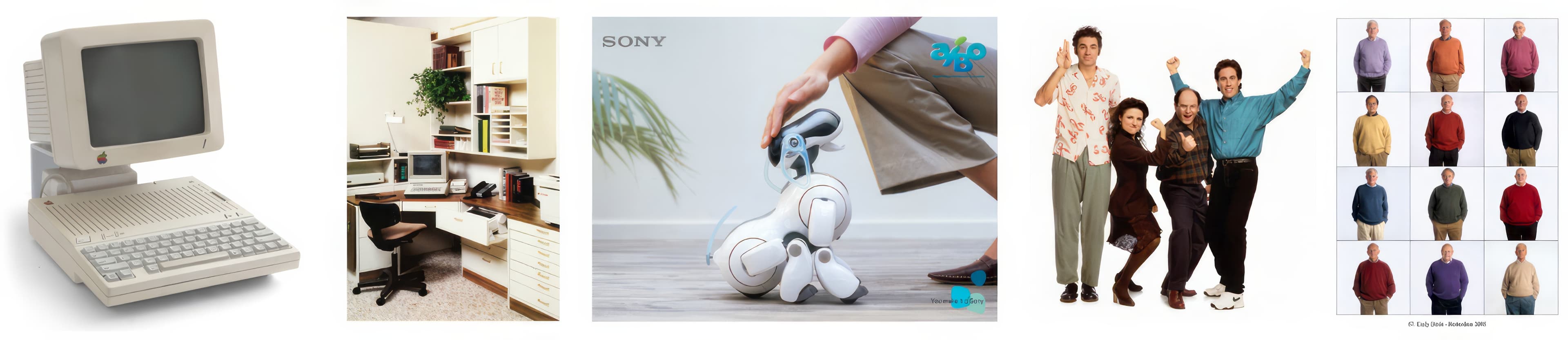
Normalcy’s cultural relevance might best be understood by the definitively 21st century phenomenon known as normcore. The term has become synonymous with a fashion sensibility that is oddly conspicuous in its plainness; this corresponds with its original intended meaning, which is paradoxically broader and more specific. Writer and strategist Emily Segal, who is credited with introducing the term into the cultural lexicon, has said, “[Normcore is] an approach to the world that is about adaptability and being able to go into a lot of different communities at once.” It has become a vehicle for understanding how information travels through the internet and arguably boils down to a matter of standardized aesthetics, aka “normalcy”.
“Don’t give in to nostalgia” is Cinema Paradiso’s advice to the artist. The message here turns self-criticism and past reflection into a conduit for creativity. It indicates a balancing act. Ghost is a tension of tenses - past, present, and future. There’s the inescapable reference to Humanist sans icons of the past, an observational engagement with the present typographic landscape, and our steady gaze towards the future. If we normalize this tension, we create space for a new standard.
Featured Fonts
Featured Fonts