Process: Rosalie
Please meet Rosalie: a contemporary display serif by My-Lan Thuong, born from a medieval mural in Guérande, France.
Please meet Rosalie: a contemporary display serif by My-Lan Thuong, born from a medieval mural in Guérande, France.
Rosalie is a study in polarities; it is both sharp and round, calligraphic and constructed, historic and futuristic, narrow and wide. With its unusual proportions and exuberant swashes, high contrast, and innovative shapes, Rosalie contains a unique mix of simultaneously complimentary and contradictory forms. The typeface’s development tracks the creative evolution of Thuong’s type design practice through many years of development. After 6 years in the making, Rosalie is now available as a duo of complementary Roman and Italic styles, both including OmniLatin language support.
Rosalie Beginnings
Rosalie Beginnings
The idea for Rosalie first sprouted in October of 2017, on a rainy day visit of the medieval town of Guérande (Loire Atlantique, France). In the Collégiale Saint-Aubin, a 12th century church, My-Lan was amazed by the painted letterings covering the walls. The style was unlike anything she had seen before: fussy yet elegant, medieval yet timeless. She was fascinated by the originality of the shapes, the twirls, the curves, the drops, and the ornamental elements.
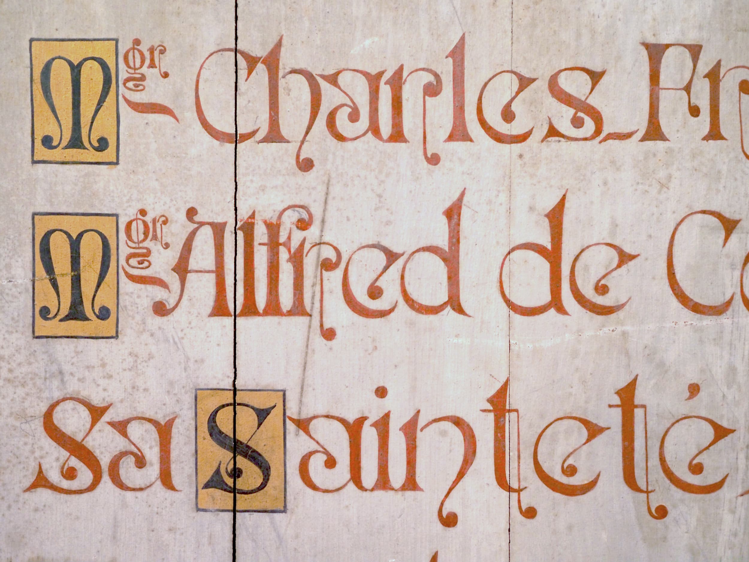
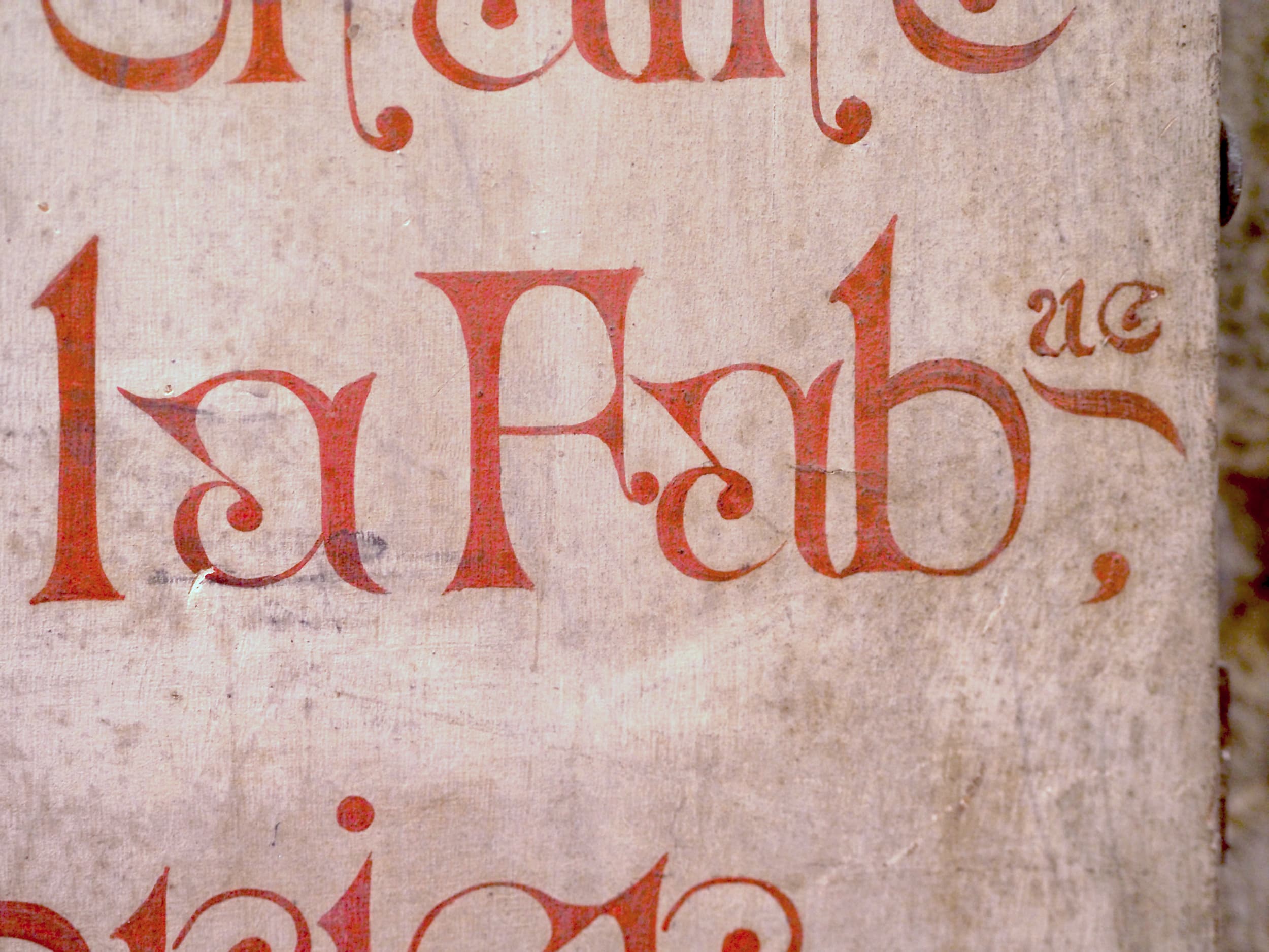
There was something complex about the contrast: sometimes looking quite vertical but actually being very oldstyle (translation) to a point where it can even get reversed, like in the /o. All of these features together create some visual cacophony that still manages to end up in an elegant result. The /c and its ending as a serif pointing inward became the starting point of the design and is still carrying the original inspiration.
First Version and Early Sketches
First Version and Early Sketches
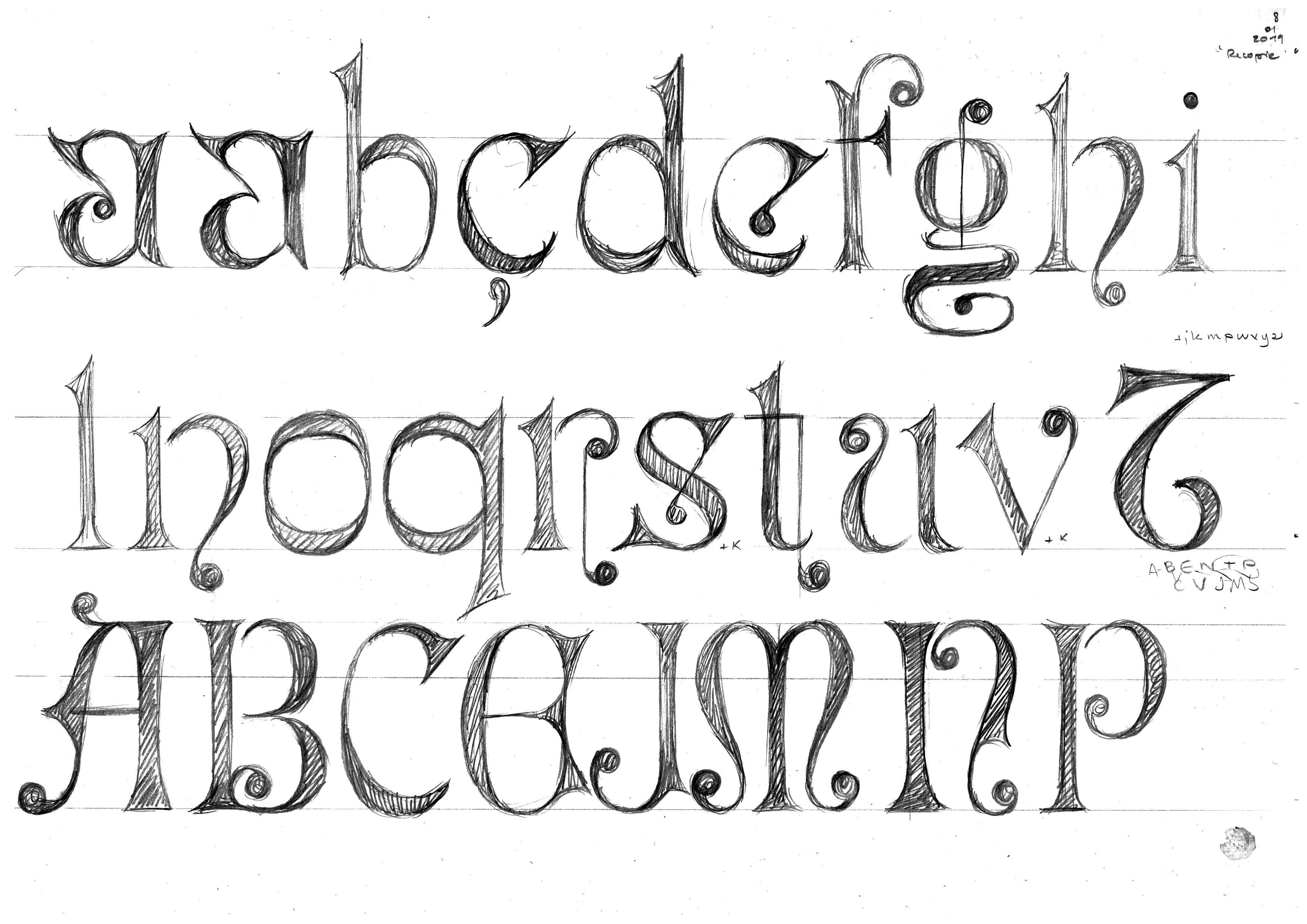
Although she loved the original letterings from Guérande, My-Lan’s intial goal was to adapt the design to something more practical and less extravagant while still staying true to the spirit of the original–to turn this calligraphic medieval lettering into a contemporary typeface. Her development process always involves a lot of sketching, pencil on paper, and so she drew many versions until she settled on an acceptable starting point that she then digitized.
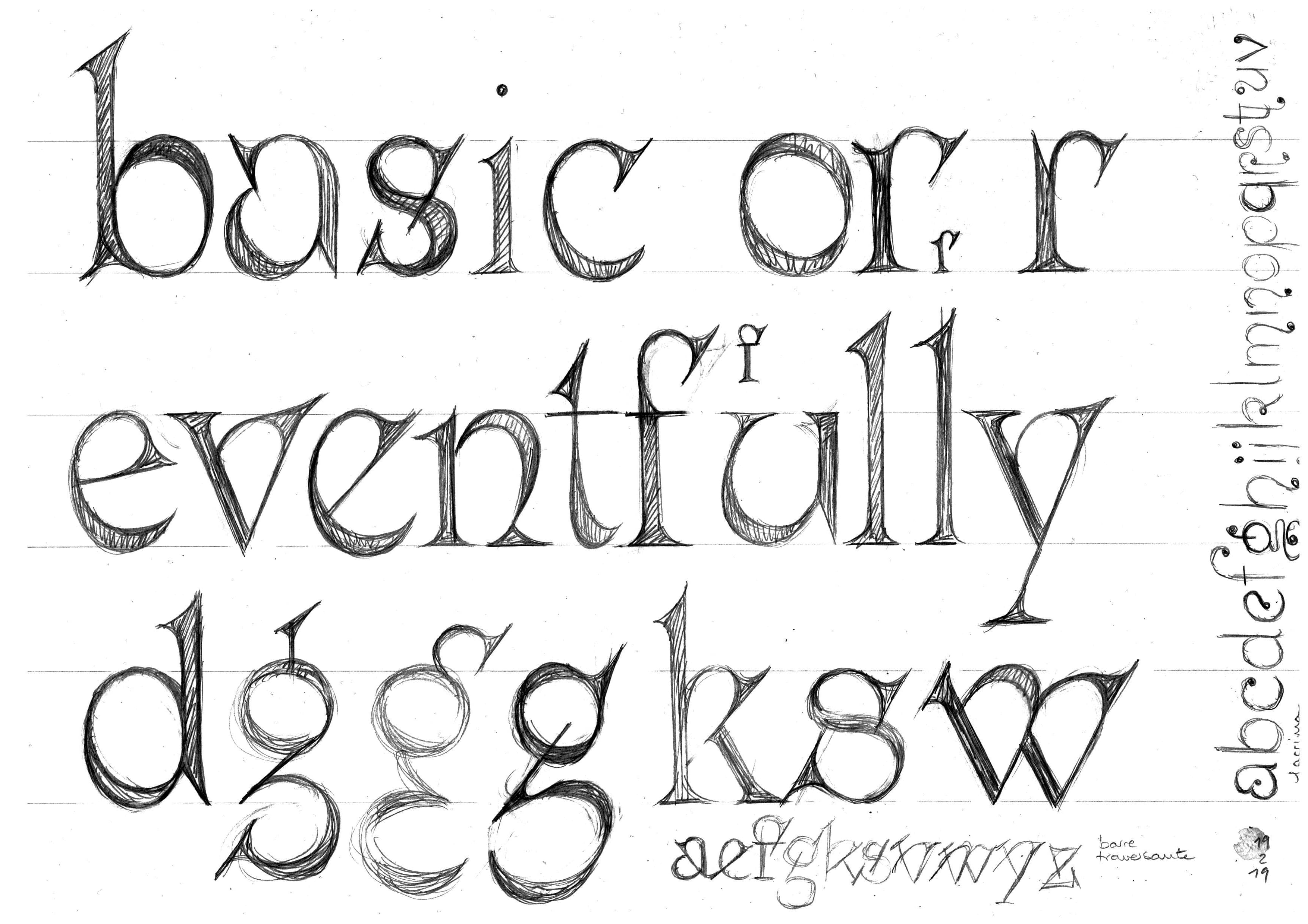
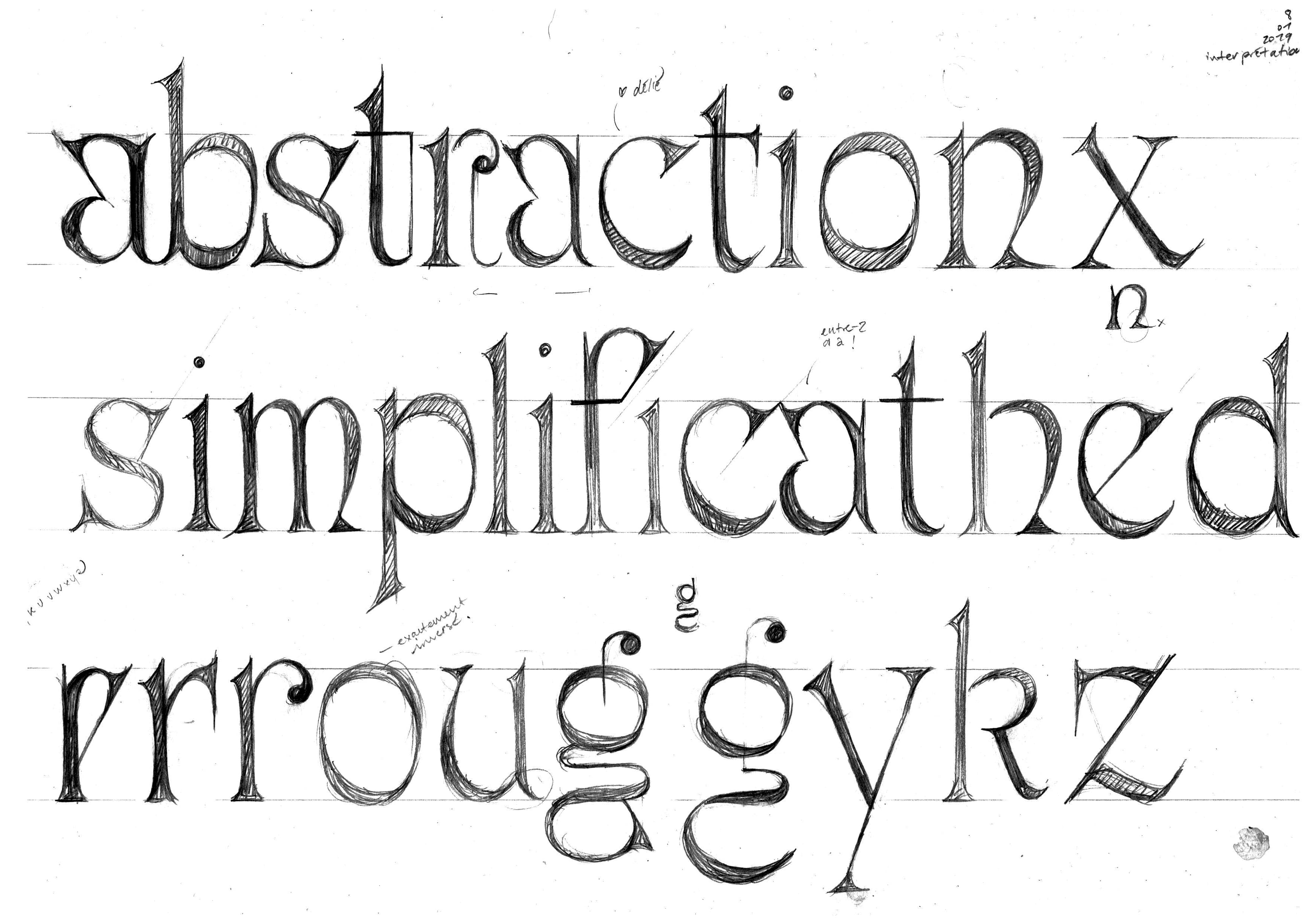

The design caught Lucas & Chantra's eyes, seeing its potential yet recognizing that there was still a long way to go for this quirky sketch. My-Lan wrestled rigorously with the contradictory aspects of the design, and over the years, it changed a lot. Rosalie was both unconventional yet elegant, spiky and round, smooth and sharp. Through this process, the contrast became very delicate, and it’s logic began to stabilize. The bowl forms resolved, and the stems straightened.
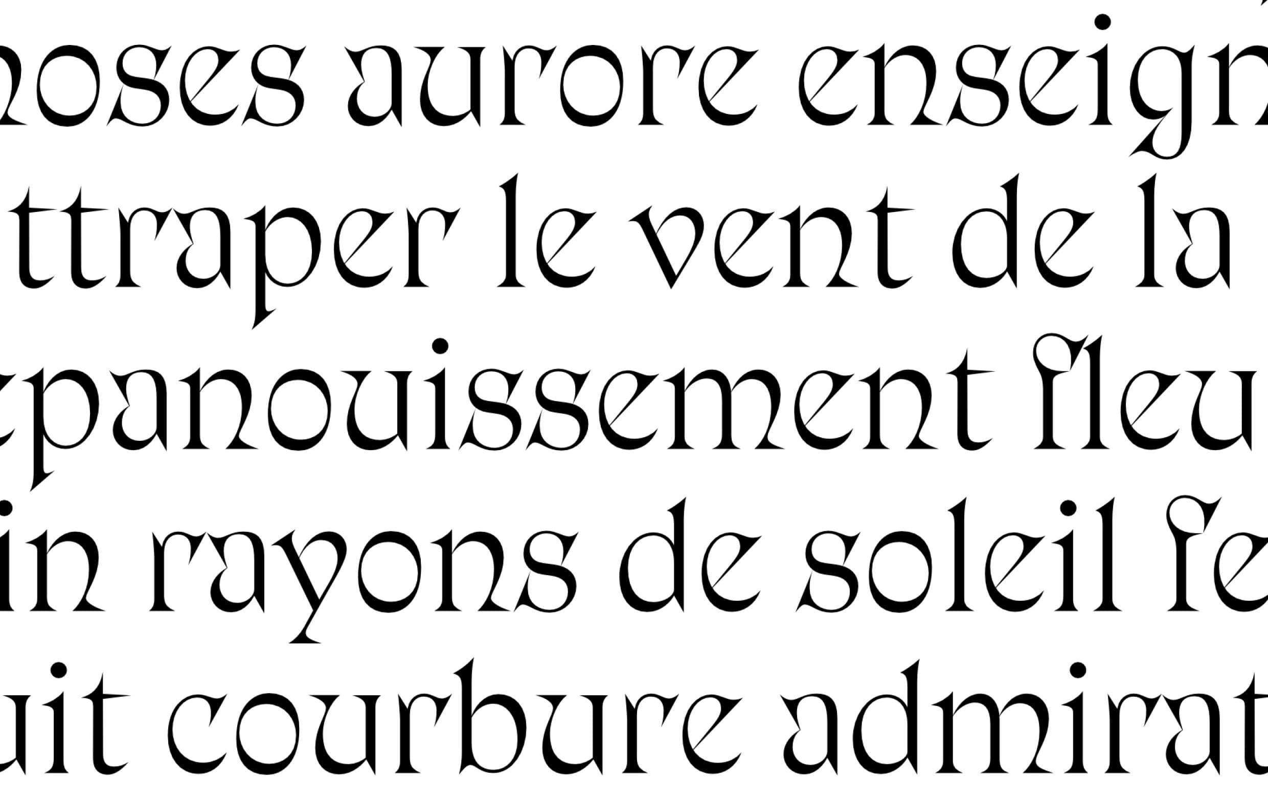
Evolution
Evolution
Some letters found their shape immediately, while others searched for a long time– the /v/w/y simply refused to be pinned down till the bitter end! The angle of the oblique end serif gave the tempo. An important aspect of the design was the novel subtraction of interior strokes in letters like the /a and /k. These forms where taken in and taken out countless times, but were ultimately chosen to be the default forms.
vwy
ak
The drawing of the uppercase introduced this new idea of emphasizing the width proportions of each letter. The vertical letters became very narrow, while the round ones became plump and circular. They all got tracked tighter for an assertive display look. These Art Deco proportions are usually applied to geometric Sans Serif, so the application in a display serif was somewhat novel. This logic was then applied to the lowercase, which is an uncommon feature.
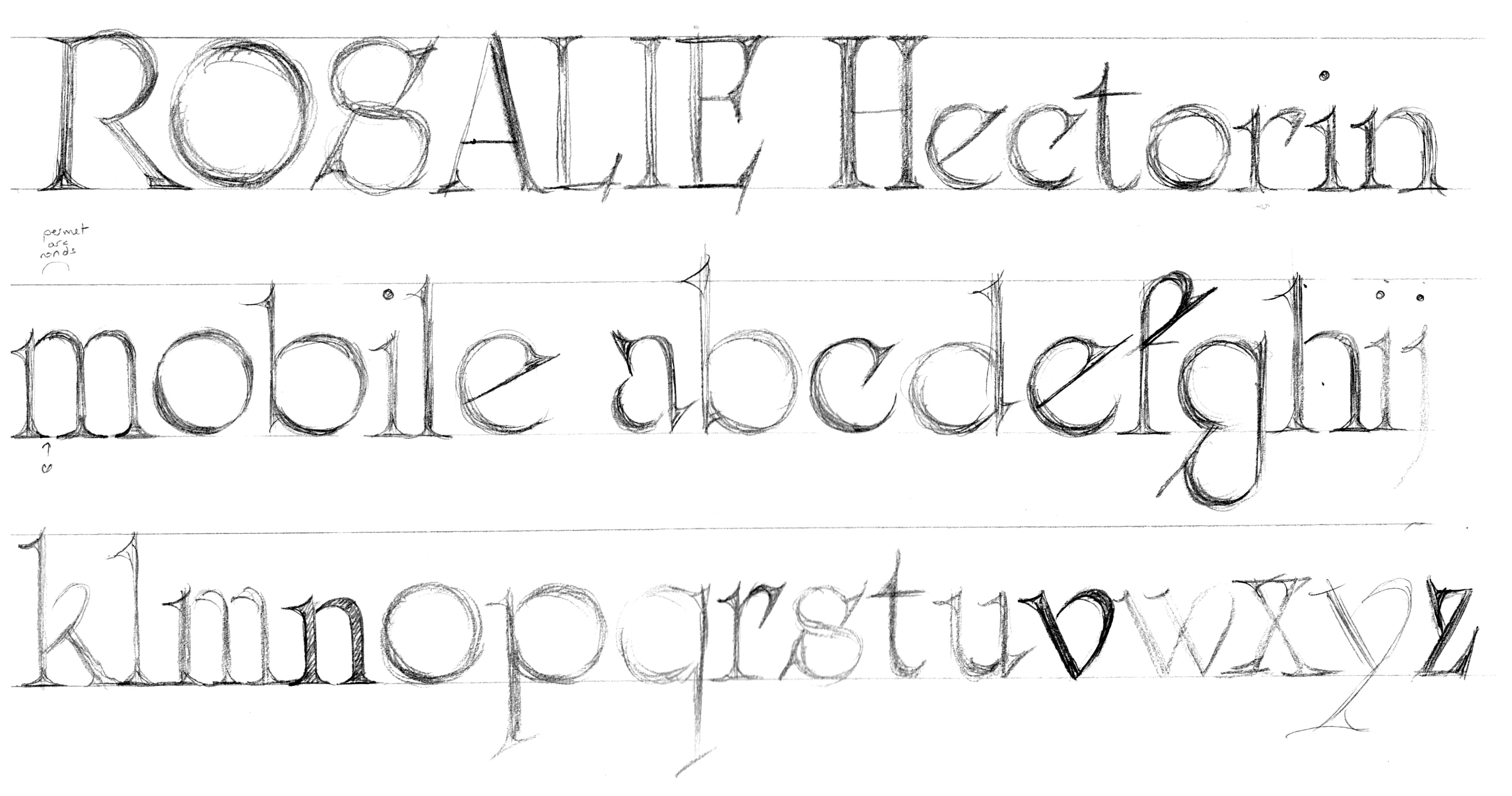
In the last round of edits, drastic changes were made. The oblique ending serif was straightened to a more acceptable angle. Some letters got their final design. The /G and the /Q were transformed. And the emblematic /a and /e letters were replaced (or given alternate shapes), for the greater good of the overall texture. Serifs grew long again, and not just on terminals, to the point where they can merge and melt into each other on occasion.
MAGNÉTIQUE
abcdefgh
ijklmnopqr
stuvwyz
abcdefgh
ijklmnopqr
stuvwyz
Italic
Italic
The idea for a distinct Italic counterpart started early on, yet, as the Roman, it took many iterations before it turned into this classical calligraphic interpretation. Rosalie doesn’t do things halfway, and through much trial and error, the letters eventually embraced their true potential in this style too.

“The italic, which is often my favorite style to draw as it is more expressive and cursive, was going to be quite extreme.” says Thuong. “It is narrow and calligraphic, with a lot of movement and personality.” Rosalie’s italic carries the same weight and contrast as the Roman but with completely different proportions, achieving the classic roman/italic textural contrast.
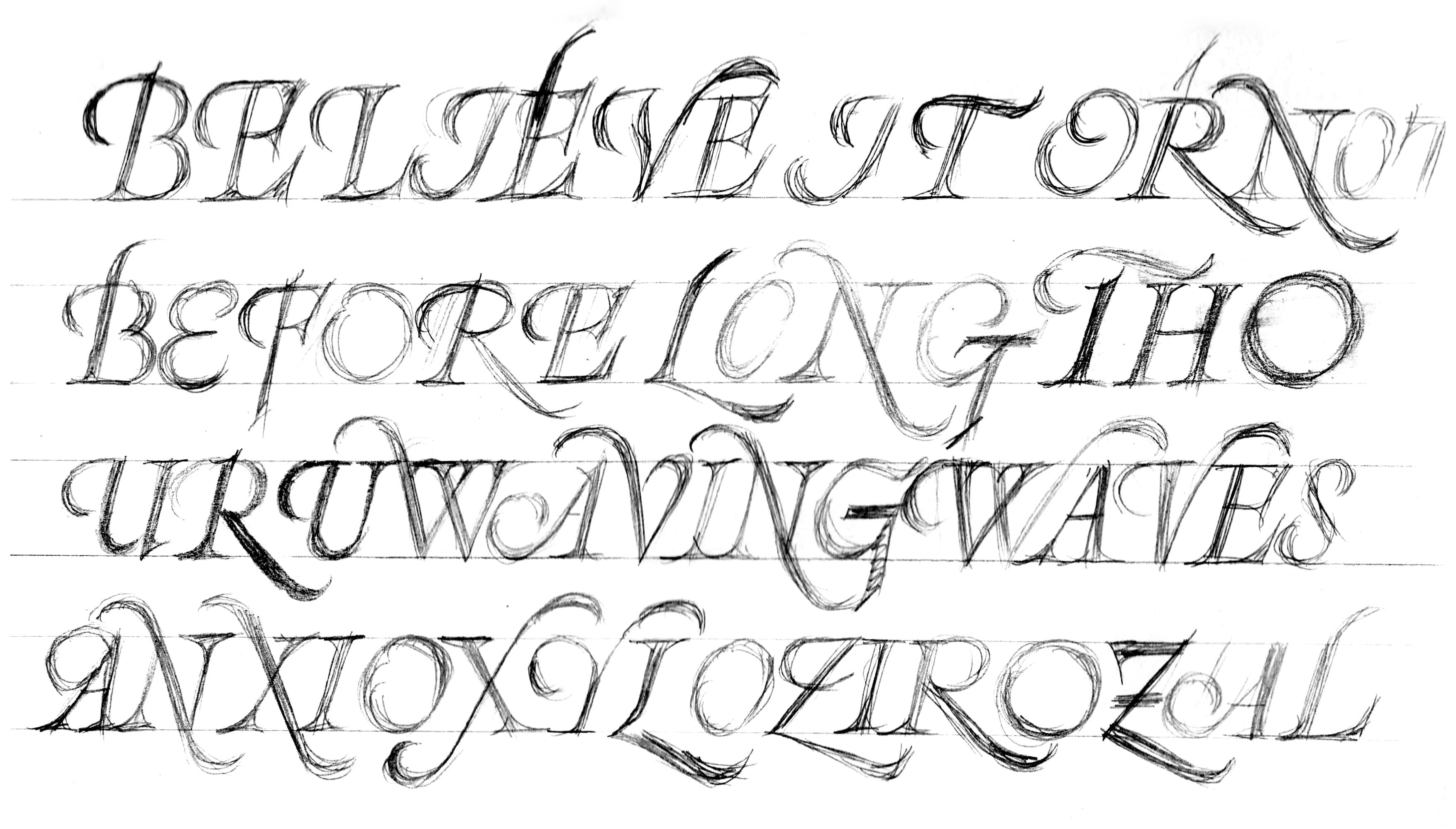
Inspired by italic typefaces of the Renaissance, Thuong imagined a whole set of swashes, some more typographic, some more calligraphic, and others hybrid. All the uppercase have one or two ornated counterpart(s), so do some lowercase.
MARVEL
MARVEL
OmniLatin
OmniLatin
One of the main achievements of the typeface was to build it to the specifications of our new omnilatin character set, a goal and research project dear to Thuong. Many additional letters, diacritics and symbols, as well as the combining marks features were added to support as many languages using the Latin alphabet as possible. These characters were given a lot of care and have a very expressive design. They were even thought to have a set of swashes, like the main characters of the alphabet. This, combined with a comprehensive backend resulted in a very extensive character set of more than 1300 / 1600 characters.
Ææ Ⱥⱥ Ɑɑ Ⓐ@ Ɓɓ Ƈƈ Ȼȼ Đđ Ðð Ɗɗ Ɖɖ DŽDždž Ǝǝ Əə Ɛɛ Ɇɇ Ƒƒ Ɠɠ Ɡɡ Ǥǥ Ħħ Ɦɦ Ɪɪ Ɩɩ Ɨɨ ı ȷ IJij Ɉɉ ĸ Łł Ƚƚ Ɬɬ Ɫɫ LJLjlj ƛ Ƙƙ Ŋŋ Ɲɲ NJNjnj Ơơ Øø Ɔɔ Ɵɵ Œœ Þþ Ƥƥ Ɽɽ Ɍɍ ʀ ẞß Ʃʃ Ŧŧ Ƭƭ Ⱦⱦ Ʉʉ Ưư Ꞹꞹ Ʋʋ Ʊʊ Ʌʌ Ⱳⱳ Ƴƴ ⅄ Ɣɣ Ƶƶ Ʒʒ Ɂʔ ʕ ɂ Ꞌ ꞌ
B́b́ Ɛ́ɛ́ Ǝ́ǝ́ Ɩ́ɩ́ Ɔ́ɔ́ Œ́œ́ Ŕŕ Ʊ́ʊ́ Ʉ́ʉ́ ʕ̓ Ã́ã́ Ẽ́ẽ́ Ɛ̃́ɛ̃́ Ĩ́ĩ́ Ɩ̃́ɩ̃́ Ṍṍ Ɔ̃́ɔ̃́ R̃́r̃́ Ṹṹ Ʋ̃́ʋ̃́ Á̹á̹ Í̹í̹ Ẹ́ẹ́ Ị́ị́ Ọ́ọ́ Ụ́ụ́ B̀b̀ Ɛ̀ɛ̀ Ə̀ə̀ Ɩ̀ɩ̀ M̀m̀ Ǹǹ Ɔ̀ɔ̀ Ʊ̀ʊ̀ Æ̀æ̀ Ɨ̀ɨ̀ Œ̀œ̀ Ã̀ã̀ Ẽ̀ẽ̀ Ɛ̃̀ɛ̃̀ Ĩ̀ĩ̀ Ɩ̃̀ɩ̃̀ Õ̀õ̀ Ɔ̃̀ɔ̃̀ Ũ̀ũ̀ Ẹ̀ẹ̀ Ọọ Ǝ̂ǝ̂ Ɛ̂ɛ̂ Ɔ̂ɔ̂ Ʊ̂ʊ̂ Ẑẑ Æ̂æ̂ Ɨ̂ɨ̂ Ø̂ø̂ Œ̂œ̂ Ḓḓ Ḽḽ Ṋṋ Ṱṱ Ɛ̈ɛ̈ Ɔ̈ɔ̈ Ŋ̈ŋ̈ N̈n̈ Ǝ̌ǝ̌ Ɛ̌ɛ̌ Ɔ̌ɔ̌ Ʊ̌ʊ̌ Ø̌ø̌ Œ̌œ̌ Č̓č̓ Q̓q̓ Q̓ʷ Ã̌ã̌ Ɛ̃̌ɛ̃̌ Ĩ̌ĩ̌ Ɔ̃̌ɔ̃̌ Ũ̌ũ̌ Ɛ̃ɛ̃ Ɔ̃ɔ̃ Ʋ̃ʋ̃ Ɩ̃ɩ̃ A̰a̰ Ḛḛ Ɛ̰ɛ̰ Ḭḭ Ɔ̰ɔ̰ Ṵṵ Ḛ́ḛ́ Ó̰ó̰ Ɔ̰̀ɔ̰̀ À̰à̰ Á̰á̰ Ɛ̰̀ɛ̰̀ Ɛ̰́ɛ̰́ Ḭ́ḭ́ Ḭ̀ḭ̀ Ɔ̰́ɔ̰́ Ṵ̀ṵ̀ Ṵ́ṵ́ Ǝ̄ǝ̄ Ɛ̄ɛ̄ Ɔ̄ɔ̄ M̄m̄ N̄n̄ Ʊ̄ʊ̄ Ǟǟ Ṅṅ Ḍḍ Ḥḥ Ḷḷ Ṛṛ Ṣṣ Ṭṭ Ẓẓ Ị́ị́ Ị̀ị̀ Ị̂ị̂ Ị̃ị̃ Ị̄ị̄ È̤è̤ Ò̤ò̤ Ô̤ô̤ Ṳ̂ṳ̂ A̧a̧ Ḑḑ Ç̌ç̌ Ȩȩ ȩ̀ȩ̀ Ȩ́ȩ́ Ȩ̂ȩ̂ Ȩ̌ȩ̌ Ɛ̧ɛ̧ Ə̧ə̧ I̧i̧ Ɨ̧ɨ̧ ɨ̧̀ɨ̧̀ ɨ̧̂ɨ̧̂ Ɨ̧̌ɨ̧̌ O̧o̧ Ɔ̧ɔ̧ U̧u̧ Ą́ą́ Ą̊ą̊ Ą̀ą̀ Ą̂ą̂ Ą̌ą̌ Ą̈ą̈ ą̈̂ą̈̂ Ą̄ą̄ Ą̄́ą̄́ Ę́ę́ Ę̀ę̀ Ę̂ę̂ Ę̌ę̌ Ę̈ę̈ Ę̈̂ę̈̂ Į́į́ Į̀į̀ Į̂į̂ Į̌į̌ Ǫ́ǫ́ Ǫ̀ǫ̀ Ǫ̂ǫ̂ Ǫ̌ǫ̌ Ų́ų́ Ų̂ų̂ Ų̌ų̌ S̨s̨ Z̨z̨ A̱a̱ Ḏḏ P̱p̱ X̱x̱ Ũ᷆ũ᷆ I᷆i᷆ I᷇i᷇ I᷅i᷅ I᷆i᷆ I̍i̍
Conclusion
Conclusion
Rosalie was dusted off, worked on, and put back in the drawer many times over in the last 5 years. Each time, it was reworked extensively and took new steps (forward or backward). It raised many challenges, questions and difficulties that could become deterring at times, resulting in long pauses in its progression. “It wasn’t an easy and smooth process, but looking back, I have no regrets and believe it was the kind of project that needed a lot of time to evolve to where it is now.” recollects Thuong. “This long time allowed me to take the necessary steps back to have a new look on it and improve the design by making the difficult decisions in the choice of the shapes I should keep, let go of, or transform. ”
“It wasn’t an easy and smooth process, but looking back, I have no regrets and believe it was the kind of project that needed a lot of time to evolve to where it is now.”
“It wasn’t an easy and smooth process, but looking back, I have no regrets and believe it was the kind of project that needed a lot of time to evolve to where it is now.”
Rosalie has been a consistent thread thoughout My-Lan Thuong’s type design career and tracks the evolution of her practice. It started in her artistic adolescence, what she calls her her “I love weird shapes phase”, which eventually led her to refine her design along with discovering a more mature intention: to make the typeface more approachable and useful for designers. “It completely emancipated from its origins to become something that is more in sync with what I like and believe in now. It was not easy, but it was meaningful to me to finally finish it and share it with the world. It’s time for me to move on and for Rosalie find it’s own life outside of me. I hope you’ll enjoy it.”

Featured Fonts