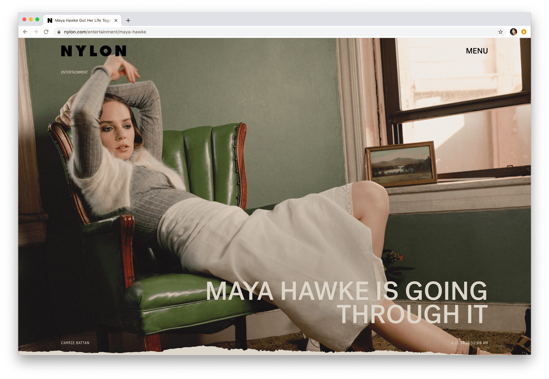
Nylon Magazine & Post Grotesk
NYLON lifestyle magazine covers fashion, art, beauty, music, design, celebrities, and technology. As part of NYLON’s updated digital identity, the online magazine platform and social media graphics use Post Groteskas a primary typeface.
The typeface was designed to balance rationality on one end, with irregularity and peculiarity on the other — a fitting solution for NYLON, which is both an information-packed resource for all things pop culture and fashion, and a brand that is seen as bold and idiosyncratic. Paired with colorful backgrounds, striking imagery, and handwritten details, Post Grotesk harmonizes with the NYLON’s glamor and charm.
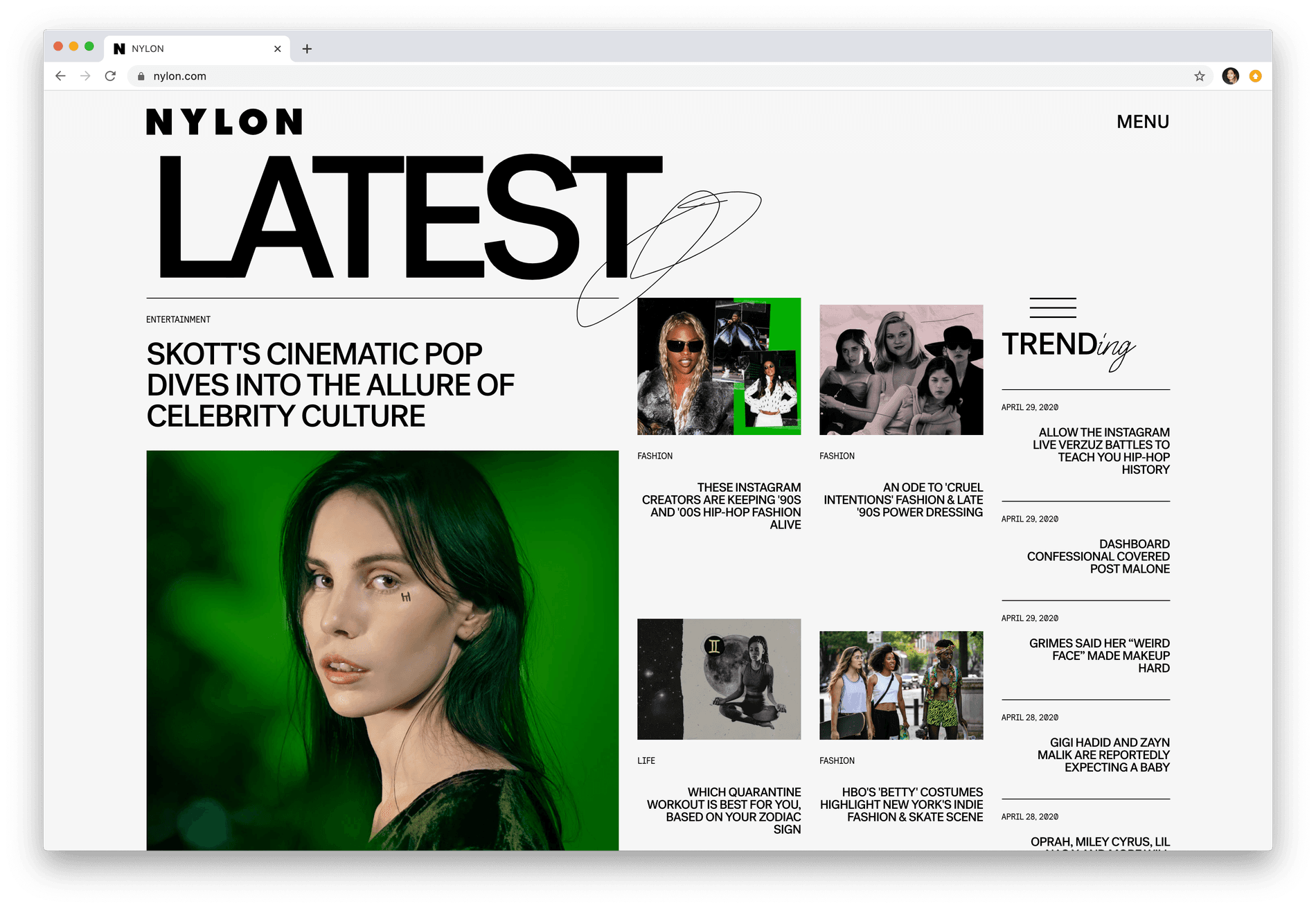
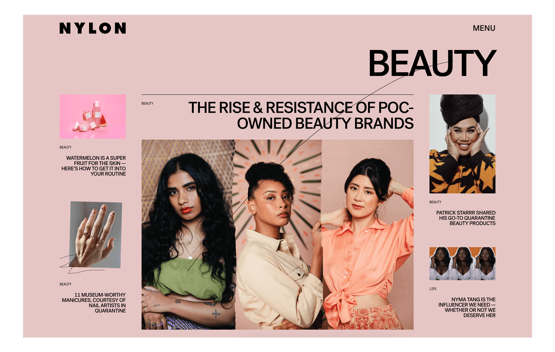
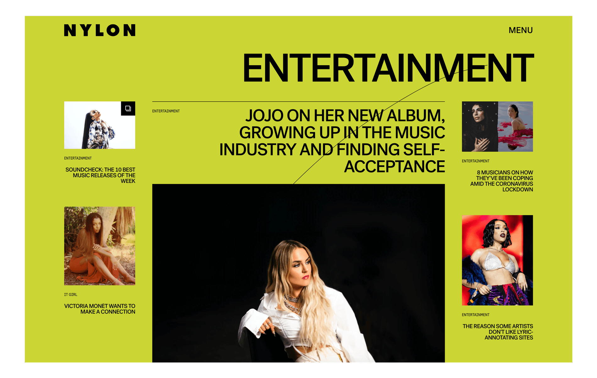
On the website, Post Grotesk is part of a systematic typographic hierarchy. It is mainly set in all-caps with tight tracking for headlines and sections to stand out. At the same time, when used at varying sizes to include multiple stories on a page, Post Grotesk strikes a balance between being typographically impactful, while shaping a clear and navigable experience when jumping from one story to another.
NYLON lifestyle magazine covers fashion, art, beauty, music, design, celebrities, and technology. As part of NYLON’s updated digital identity, the online magazine platform and social media graphics use Post Groteskas a primary typeface.
The typeface was designed to balance rationality on one end, with irregularity and peculiarity on the other — a fitting solution for NYLON, which is both an information-packed resource for all things pop culture and fashion, and a brand that is seen as bold and idiosyncratic. Paired with colorful backgrounds, striking imagery, and handwritten details, Post Grotesk harmonizes with the NYLON’s glamor and charm.
On the website, Post Grotesk is part of a systematic typographic hierarchy. It is mainly set in all-caps with tight tracking for headlines and sections to stand out. At the same time, when used at varying sizes to include multiple stories on a page, Post Grotesk strikes a balance between being typographically impactful, while shaping a clear and navigable experience when jumping from one story to another.
Client: Nylon Magazine
Typeface: Post Grotesk
Show us your latest project using our typefaces by getting in touch or tagging us on social media.
IG: @sharp_type TW: @SharpTypeCo