Loquat Cafe + Respira Black

Loquat is a new bakery and cafe located on a picturesque corner in the Hayes Valley neighborhood of San Francisco. Named after the trees found throughout the city that are beloved for their sweet & tangy golden fruit, it's a joint venture from the team behind The Mill & Four Barrel Coffee and an alum of another local gem, Tartine. Loquat sets itself apart from the myriad other bakeries and cafes in SF with a focus on classic Jewish and Levantine pastries and opened in autumn of 2022.
Loquat is a new bakery and cafe located on a picturesque corner in the Hayes Valley neighborhood of San Francisco. Named after the trees found throughout the city that are beloved for their sweet & tangy golden fruit, it's a joint venture from the team behind The Mill & Four Barrel Coffee and an alum of another local gem, Tartine. Loquat sets itself apart from the myriad other bakeries and cafes in SF with a focus on classic Jewish and Levantine pastries and opened in autumn of 2022.
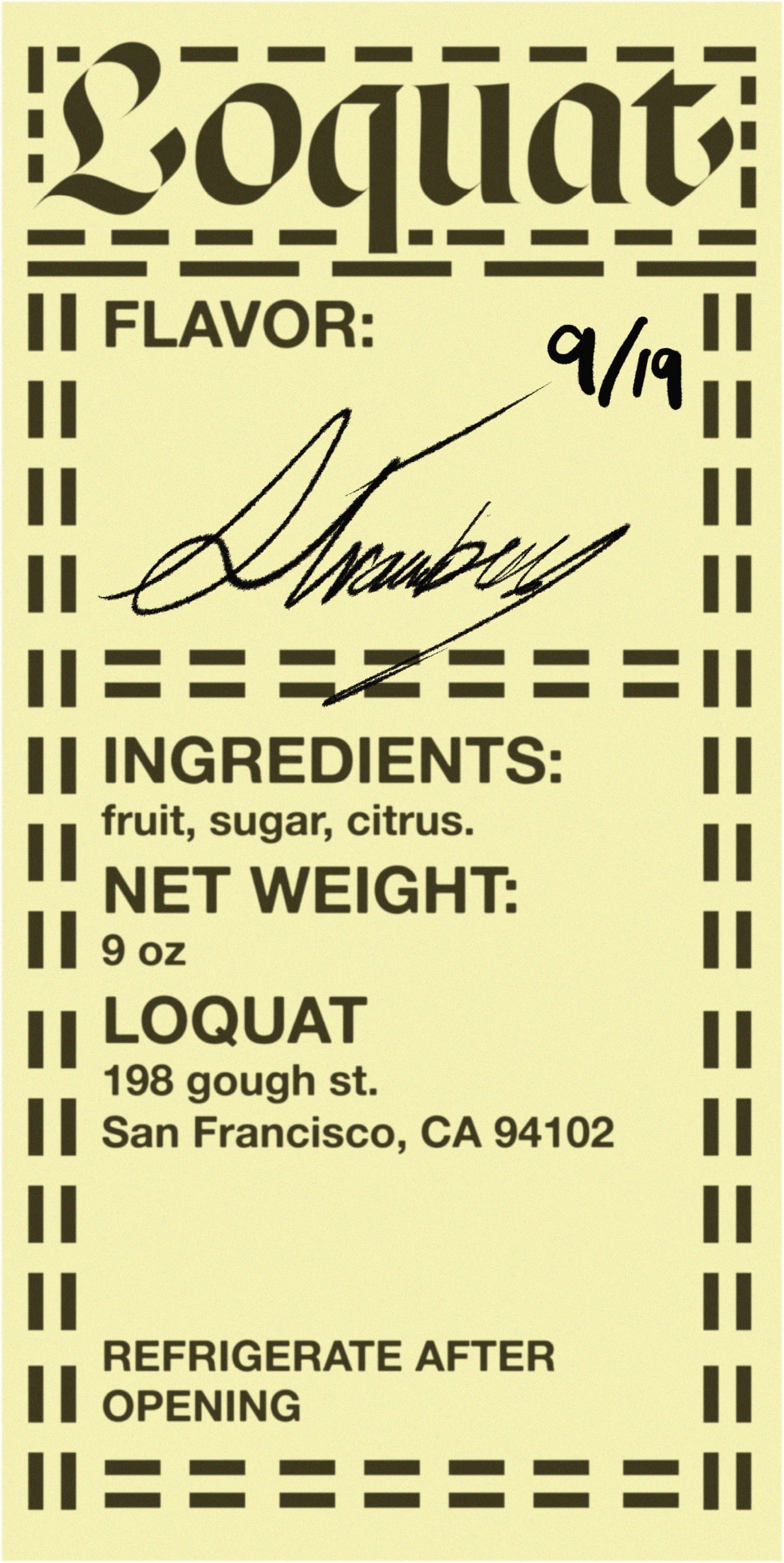
Houseof Gul was hired to design Loquat's brand identity, visual system, and print assets. Forgoing any obvious visual association with its sibling businesses, Loquat is defined by a selection of vibrant and warm earthy tones to reference the color of its pastry selection, and the design studio also makes prominent use of SharpType's contemporary blackletter revival, Respira Black.
The design direction was built from the idea of modernizing classical Illuminated manuscripts and imagining how the ancient coffee houses of Europe and Asia would show up in a modern society. Respira was inspired by a particular style of Spanish blackletter often found in illuminated manuscripts of Andalusia, making it a perfect candidate for Loquat's branding. Used for the main logotype, the blackletter's gothic elements and ornamentation are tastefully balanced for modern applications, imparting a timeless elegance. The bold gold logotype set in one of Loquat's windows is particularly fun.
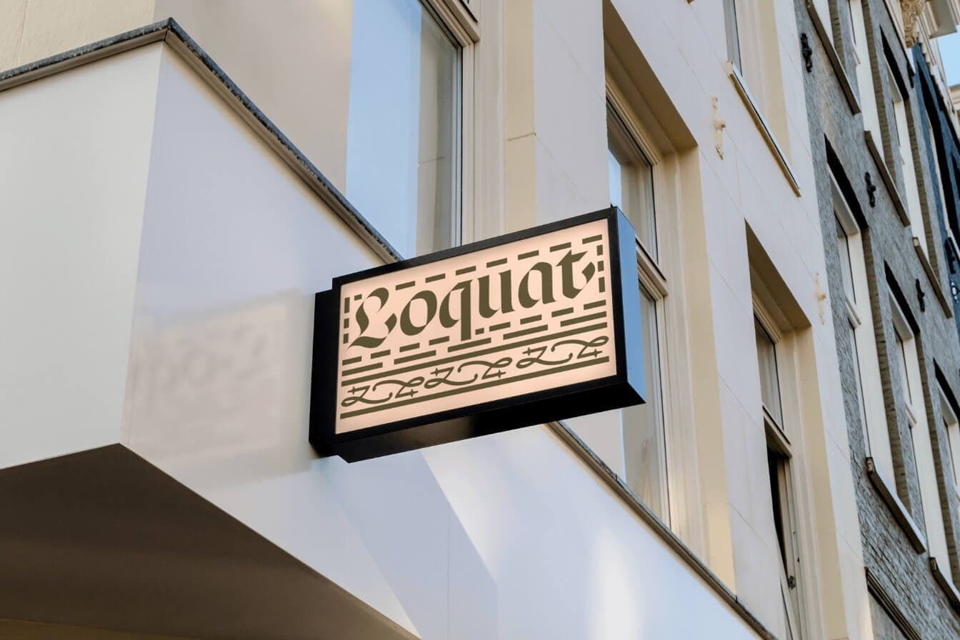
Signage for Loquat logotype set in Respira Black. The design direction references illuminated manuscripts and gothic filigrees; Respira's design is simultaneously bold and minimal, giving the letterforms great readability and a striking graphic quality.
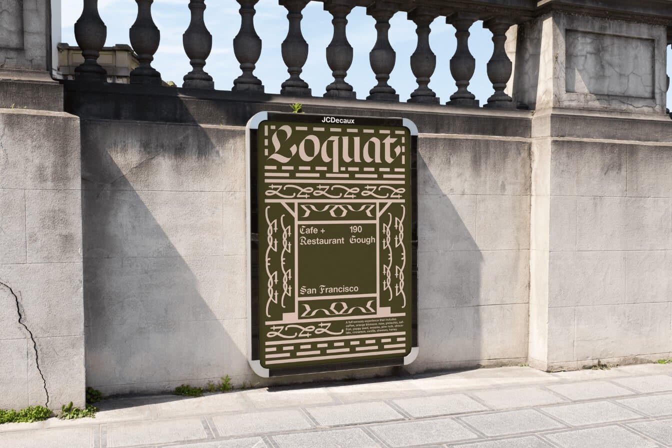
Ad rendering for Loquat. The shape and texture of Respira's letterforms seems to have determined much of the graphic ornamentation and overall design direction. The resulting visual identity is unconventional, memorable, and bold.
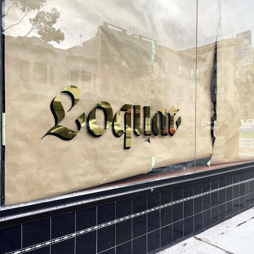
The Loquat logotype set in brilliant reflective gold with black drop shadow. Photo taken shortly before opening week.
Featured Fonts
Featured Fonts