Jean Fourche & Trois Mille (3000)
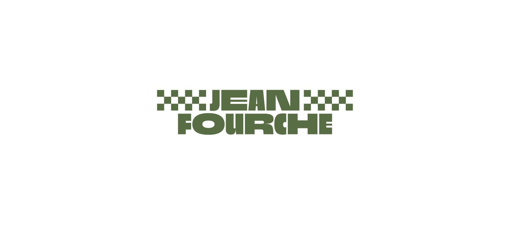
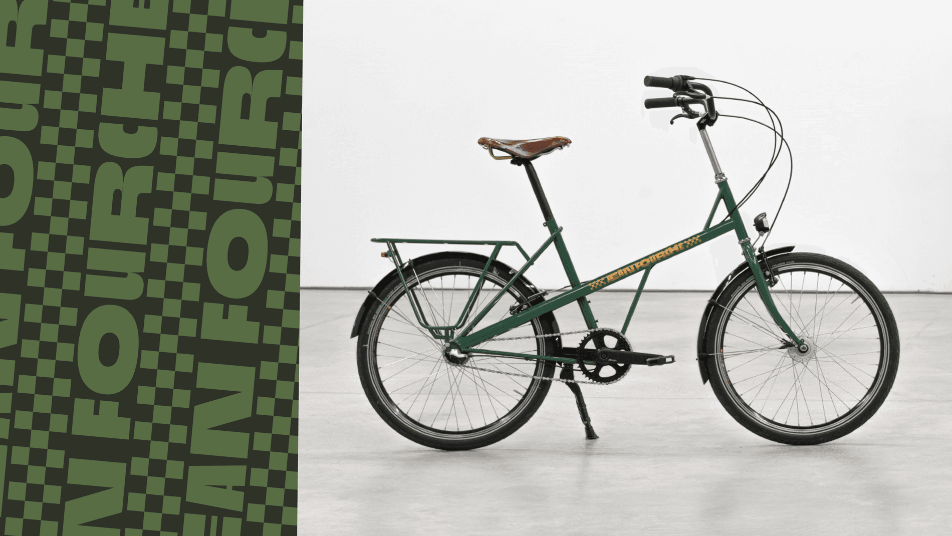
Jean Fourche is a Bordeaux-based company that makes bicycles for everyday city life. The bicycles have been designed to adapt to the needs of almost any cyclist through its ease of use, maintenance, and customization. There is a matter-of-fact simplicity and playfulness that permeates the brand (even the name "Jean Fourche" is a play on "J'enfourche" which means "I ride..."), and this extends to the fonts used for its logo. The brand and identity, led by studio OUAM, uses a range of weights and widths of the Trois Mille (3000) family.
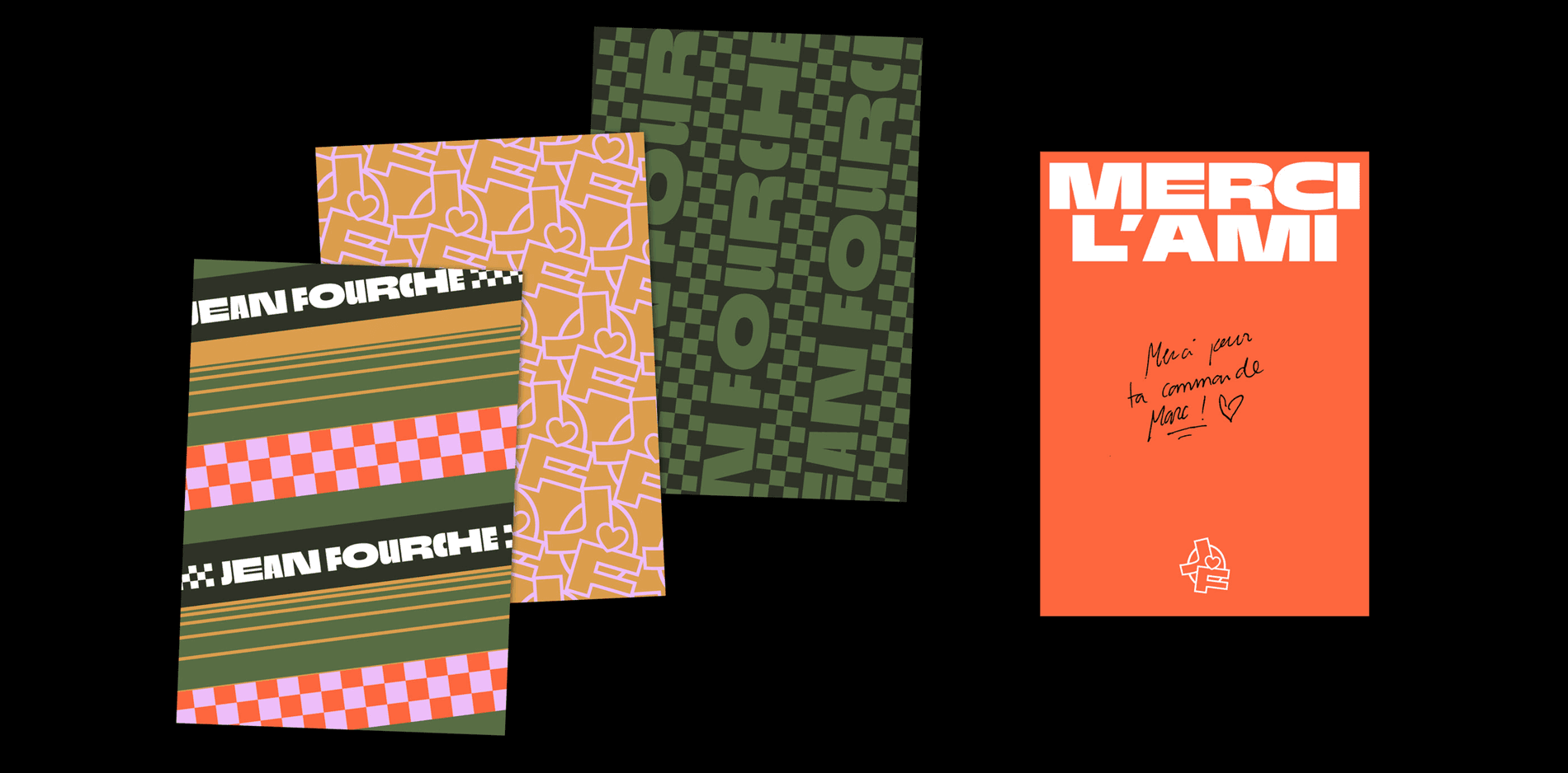
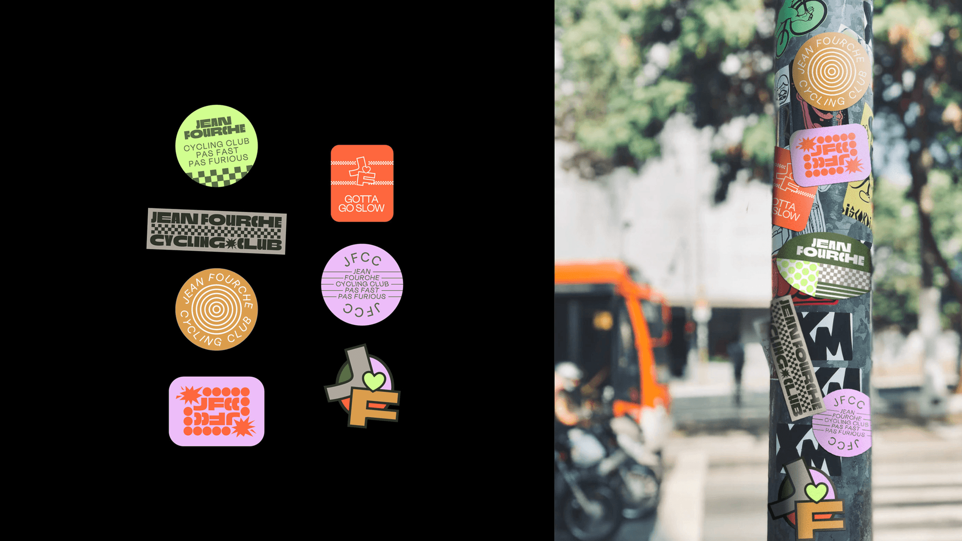
Trois Mille was designed by Sharp Type collaborator Marc Rouault. The typeface is dynamic and expressive, and distinctly, appropriately French. It commands attention but can be applied in a variety of settings. In this case, the main logo pairs tire track patterns with different widths of Trois Mille Extra Bold, giving the type a dynamic sense of movement. The company’s digital media campaign pairs the typeface with contrasting colors, graphic patterns, and cheeky quotes and photography.
OUAM’s Art Director Maxime Pirot shared why they decided to Trois Mille: “Trois Mille is a well-drawn typeface, and it also has a playful feeling, which is exactly what we needed for this brand. Jean Fourche is run by joyful people that don’t take themselves too seriously, but the bikes they produce are carefully crafted with a lot of attention to details. Trois Mille was the perfect match,” said Pirot. “Once the font was chosen, we developed the identity by digging vintage cycling iconography and adding a touch of humor and satire."
Jean Fourche is a Bordeaux-based company that makes bicycles for everyday city life. The bicycles have been designed to adapt to the needs of almost any cyclist through its ease of use, maintenance, and customization. There is a matter-of-fact simplicity and playfulness that permeates the brand (even the name "Jean Fourche" is a play on "J'enfourche" which means "I ride..."), and this extends to the fonts used for its logo. The brand and identity, led by studio OUAM, uses a range of weights and widths of the Trois Mille (3000) family.
Trois Mille was designed by Sharp Type collaborator Marc Rouault. The typeface is dynamic and expressive, and distinctly, appropriately French. It commands attention but can be applied in a variety of settings. In this case, the main logo pairs tire track patterns with different widths of Trois Mille Extra Bold, giving the type a dynamic sense of movement. The company’s digital media campaign pairs the typeface with contrasting colors, graphic patterns, and cheeky quotes and photography.
OUAM’s Art Director Maxime Pirot shared why they decided to Trois Mille: “Trois Mille is a well-drawn typeface, and it also has a playful feeling, which is exactly what we needed for this brand. Jean Fourche is run by joyful people that don’t take themselves too seriously, but the bikes they produce are carefully crafted with a lot of attention to details. Trois Mille was the perfect match,” said Pirot. “Once the font was chosen, we developed the identity by digging vintage cycling iconography and adding a touch of humor and satire."
Client: Jean Fourche
Art Director:studio OUAM
Designers: Alice Bouchardon & Maxime Pirot
Typeface:Trois Mille (3000)
Featured Fonts
Featured Fonts