Hillary Clinton & Sharp Sans
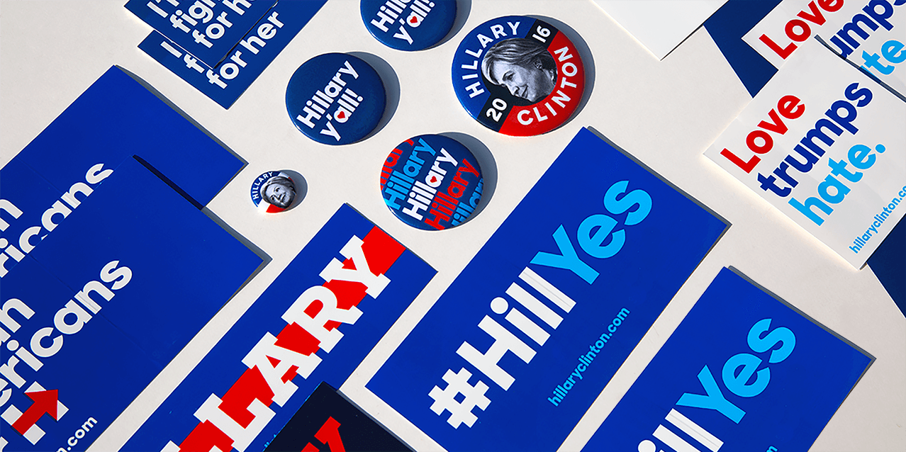
In 2014 we were approached by Michael Bierut and his team at Pentagram to use Sharp Sans Display No.1, for their newest identity project: the Hillary 2016 presidential campaign. We developed a multifaceted superfamily that would function for the campaign’s every need.
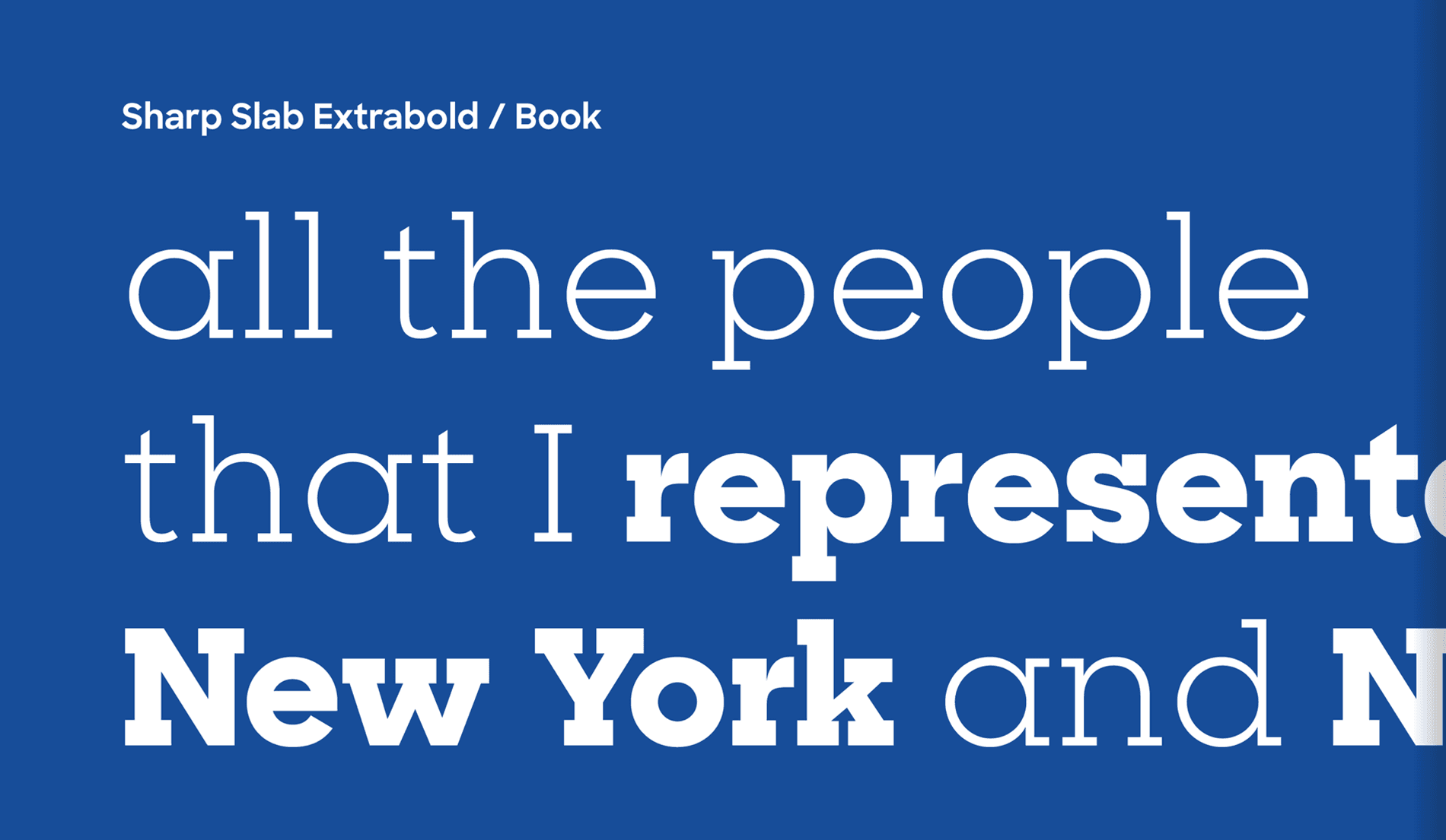
This project was an opportunity to finally complete the Sharp Sans family. The original had achieved a level of prominence, but after seeing it out in the world for a few years, we knew it could be improved. We had drawn a tightly spaced, Lubalinesque geometric sans, and now wanted to draw a version with utility and versatility. Sharp Sans Display’s highly geometric and tightly packed forms give it striking visual appeal but also limit it's utility as an all-purpose font. It functions best when set at large sizes, and while you could manually track it out for smaller type settings, it was designed to be hyper-tight.
Client: Hillary Clinton
Typeface: Sharp Sans Display No. 1
Designer: Pentagram


Origins
One of the greatest sources of inspiration for Sharp Sans Display was the typeface Avant Garde. Avant Garde’s original design only included uppercase, and was used strictly for Avant Garde magazine, instead of mass distribution. The typeface was renowned for it's innovative system of interlocking ligatures, tight-as-humanly-legible spacing, and relentless geometry. These qualities were integral to the conception of Sharp Sans Display.
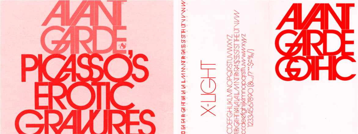
Digital editions of ITC Avant Garde Gothic exist, however, its original creators were insistent against it being used. Tony DiSpigna once said, “The first time Avant Garde was used was one of the few times it was used correctly. It has become the most abused typeface in the world.”
Ed Benguiat stated, “The only place Avant Garde looks good is in the words AVANT GARDE.” In our opinion, the beautiful instances that made the Avant Garde magazine lettering so compelling were never properly and artfully translated into a quality digital typeface.
Sharp Sans Evolution
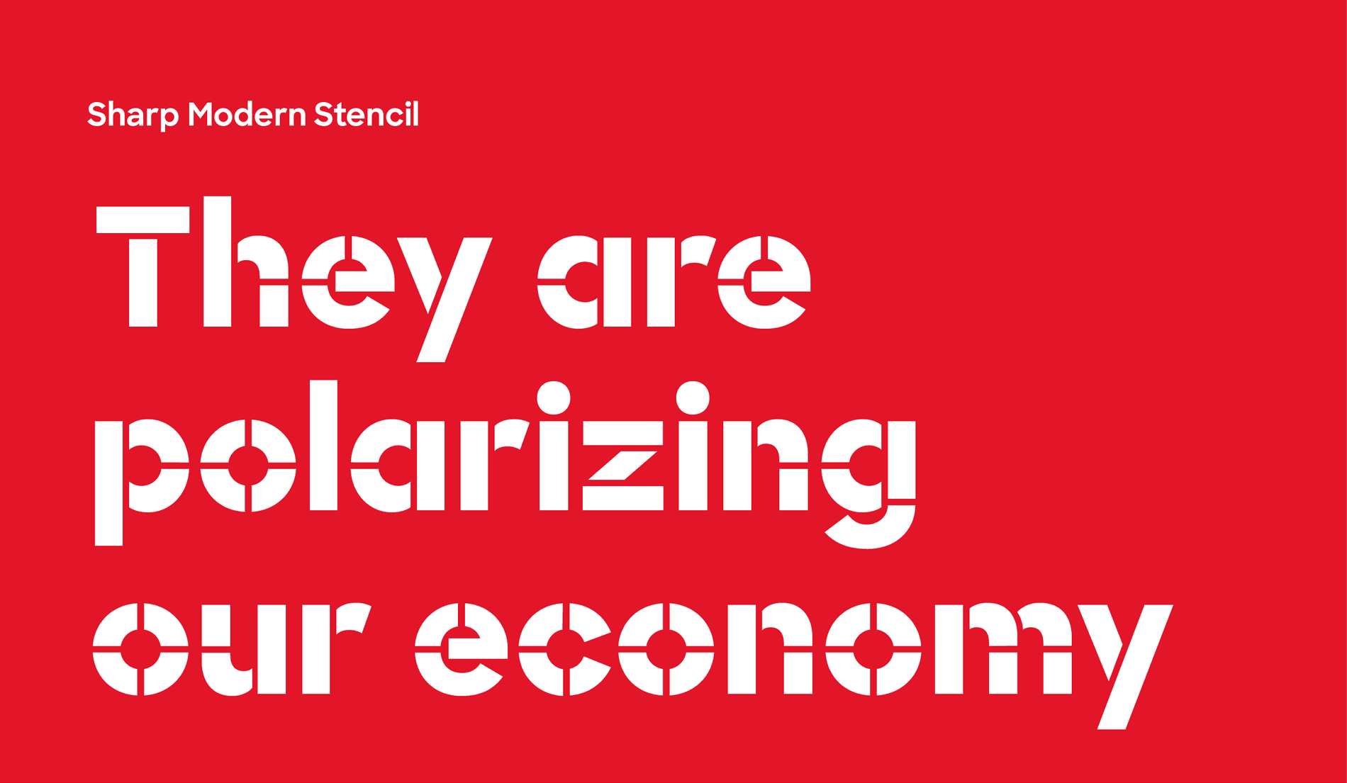
A major presidential campaign relies on a typeface that can be used at scale, for multiple contexts, and be in the hands of many different types of typesetters. When Sharp Sans Display No.1 Extrabold was chosen as the main typeface for the campaign, this required us to think through these implications and design the typeface for optical sizes, which led to the development of Sharp Sans Standard. This ensured that everyone from Michael Bierut to the average campaign volunteer could use the typeface effectively.

The first step was increasing the x-height and letter spacing. We opened up apertures, experimented with new constructions, and made subtle adjustments to weight and stroke emphasis. Some things we loved about the Display style ended up finding new ways to rhyme and groove with Sharp Sans’s lowercase.

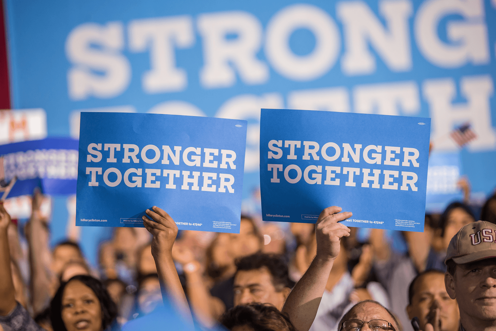
We drew a double story lowercase “a” in this new version of Sharp Sans, due to legibility issues of the single story Futura “a” at small sizes. The double story “a” is the default glyph in the retail version of Sharp Sans. However, for the Hillary Clinton edition titled ‘Sharp Unity’, both Bierut and Jennifer Kinon, the co-founder of OCD who later took over as Design Director of the campaign, insisted on the importance of the original Futura style “a”. While we initially had reservations at first, we came to really the single story ‘a’ for the campaign branding. Futura’s underpinnings were in style, and it shaped a friendly and chic quality that resonated with the Hillary brand. Kinon and her team took the identity to new heights, building up to a momentous occasion at The Democratic National Convention.

In our typefaces, we seek the optimal relationship between letter width and uppercase forms. Taking two extremes of monospaced and proportional letter widths, we found the sweet spot in between to determine the width system for Sharp Sans uppercase. The diagram above illustrates each letter’s relationship in width to the uppercase ‘H’ in Sharp Sans. The extent to which each letterform occupies or exceeds this space is dependent on its unique construction.

A monolinear stroke, and lack of ascenders and descenders make Sharp Sans’s letter width system all the more important. The monolinear strokes produce an even color, so if letter widths and spacing are even slightly off, the inconsistencies would be immediately noticeable. The system is not meant to monospaced, but is designed to have measured rhythm.
Our eyes tend to feel most comfortable with an exaggerated overshoot of the bowls and a reduced width in forms that take up less optical weight than those of the flat stems. This reduction is evident in the forms like the ‘E’, ‘F’, ‘I’, ‘L’, and ‘Z’. Letters like ‘A’ and ‘V’ compensate by taking up more ground with less form. Letters that have more strokes and higher density such as the ‘M’ and ‘W’ can produce more darkness, which require them to substantially break free from the H-width.


Finally, we have implemented other useful updates to the new Sharp Sans. The quotations, apostrophe, ampersand, and numerals were all drawn from scratch and give the typeface a friendly and approachable voice. The italic lowercase was also completely redrawn. We consider the Sharp Sans Display’s lowercase italics as our “window pieces” as they make for visually appealing type specimens, but are too distinct to be as versatile as their roman counterparts. As a result, we opted for a more standard italic design for the new Sharp Sans.
We are grateful to have worked with such an incredible team including Jesse Reed, Jennifer Kinon, and Michal Beruit. This project presented new challenges and was an opportunity to reflect, improve upon, and finally complete the Sharp Sans family.