Process: Garnett
Rr Rr Rr Rr Rr Rr
About Garnett
About Garnett
6 weights, 12 total fonts.
Garnett is the first typeface designed by Connor Davenport. The evolution of it’s design has tracked the development of his craft, beginning as an incredibly ambitious and comprehensive drawing exercise, and culminating in a typeface both rooted in history and imbued with the perfectionism and eccentric personality of its creator. Garnett is a sturdy, contemporary grotesk that glows with the affable quirkiness of 19th-century metal type.
Construction
Construction
Originally conceived as Davenport’s undergraduate thesis project, Garnett started as a superfamily of 4 different typographic classifications—Grotesk, Antique, Modern, and Typewriter—with each style based on the type of its respective classifications’ time period. The accompanying book acted as a documentation of his process, a container for Davenport’s essay: The Banality of Typeface Design, as well as a type specimen for the 42 style family. The essay explores type design’s innate referential nature through the exploration of contemporary interpretations, revivals, and the internet’s role in the proliferation of type design tools.
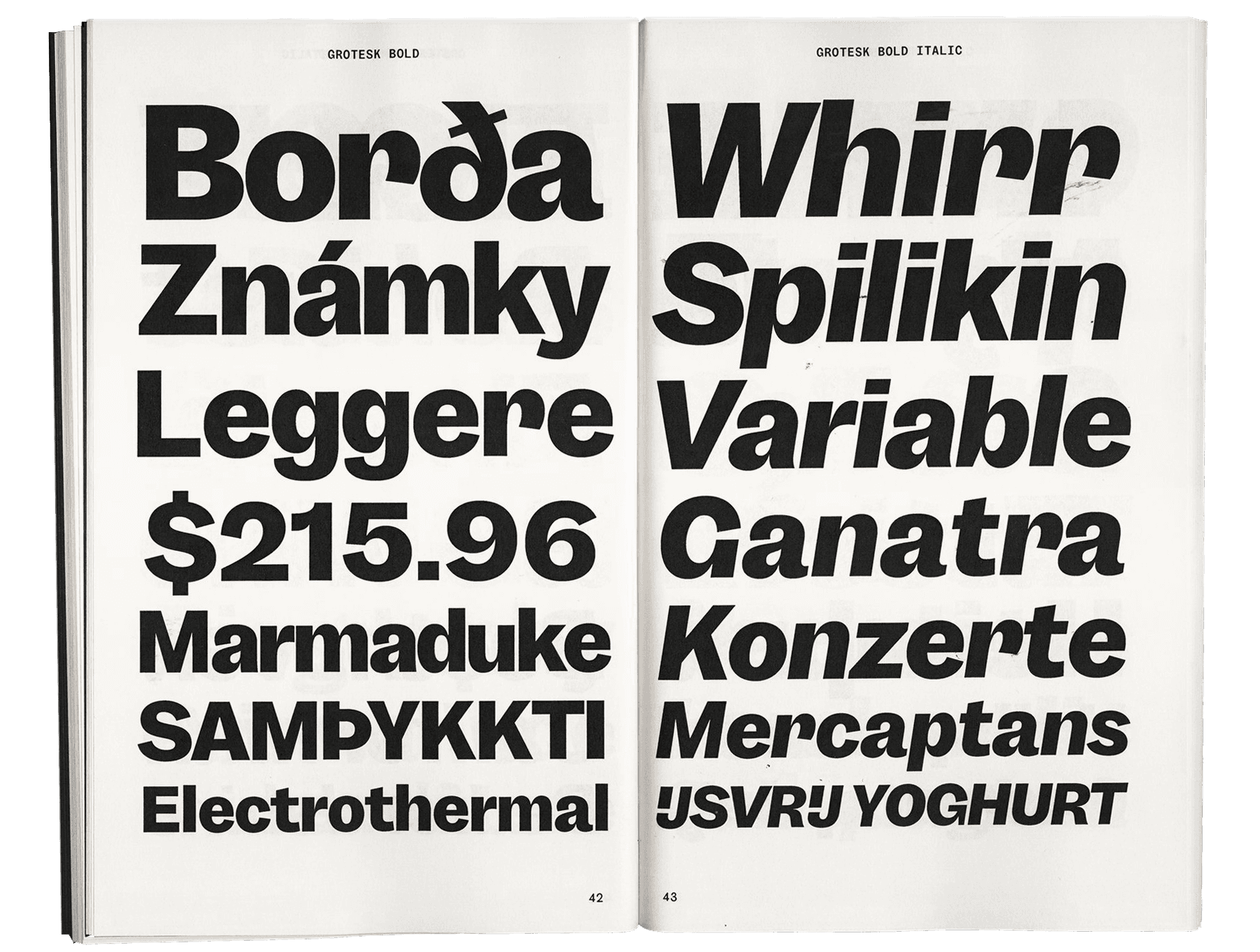
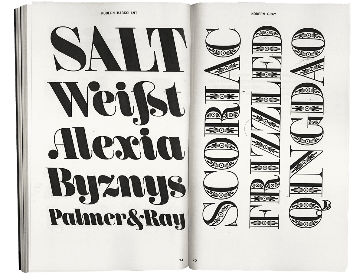
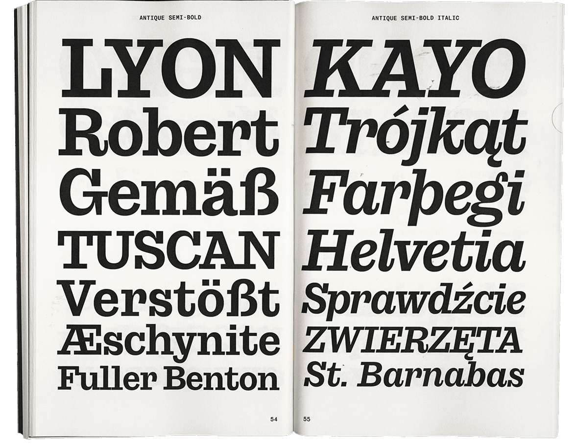
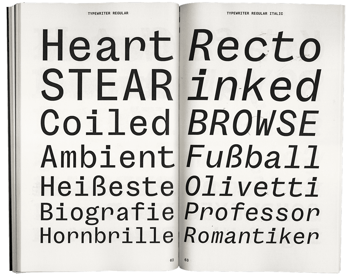
In his book Revival of the Fittest, Philip B. Meggs poses the question: “should a typeface designer slavishly copy the original exemplar, including numerous imperfections and inconsistencies? Or should one draw inspiration from earlier fonts, then exploit the vast potential of digital technology to refine and perfect...?”. Davenport based his initial sketches of Garnett on the work of Stephenson Blake, Caslon, Miller & Richard, and Vincent Figgins. As those initial concepts evolved and took new forms in the subsequent years, Megg’s call to action formed the basis of Davenport’s design praxis.

The source material for Garnett consists mostly of the early grotesques of 19th-century Britain, although the forms are not an interpretation of one specific typeface but an entire genre of these types.
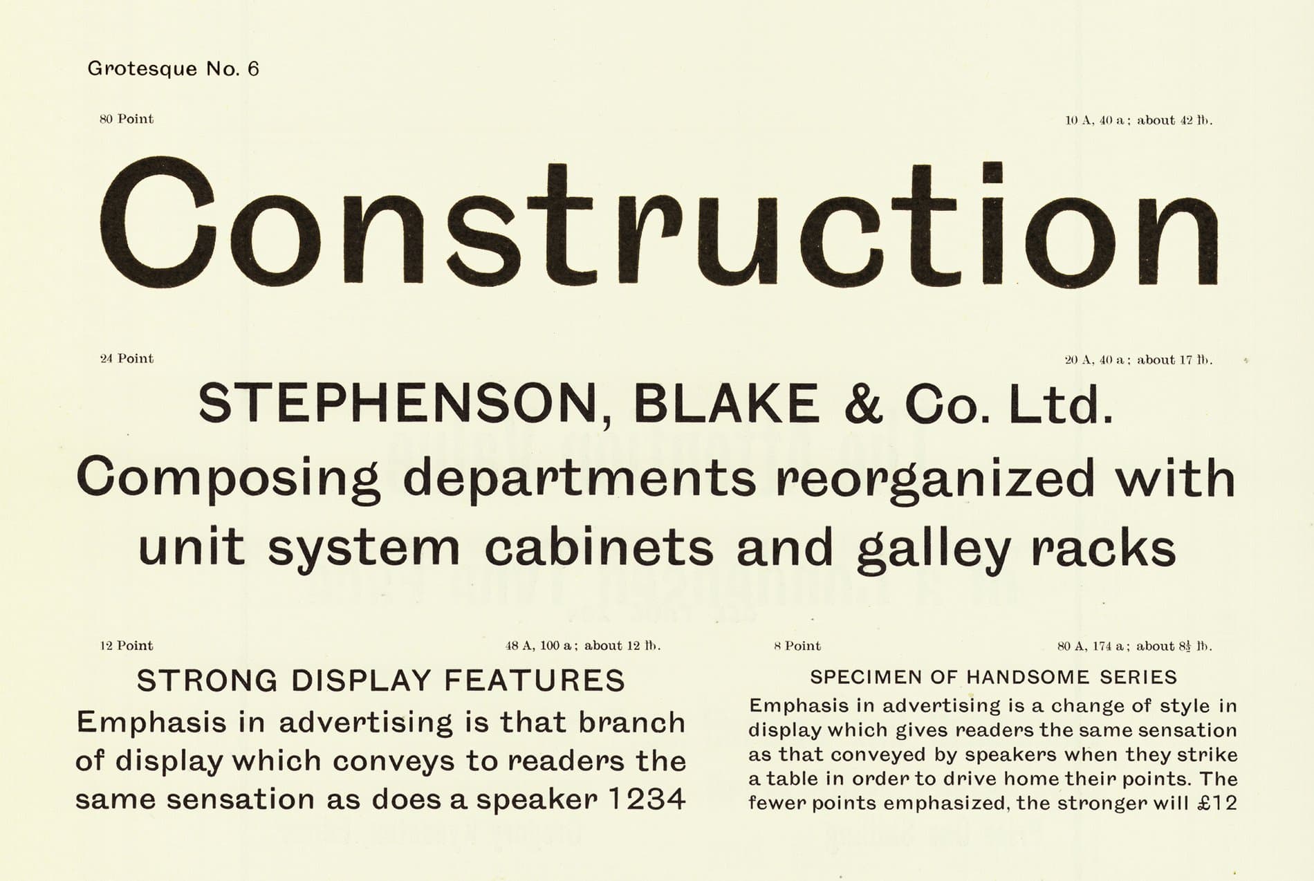
Stephenson Blakes’s Grotesque No.6 (above) greatly informed the underlying flavor of Garnett, inspiring Davenport to capture the quirkiness of it's curves while concurrently maintaining its austerity. As seen throughout the source material, it is evident that the early sans-serif concepts were just that: concepts and ideas that were being tested and changing with the times. Before modernism came along and sterilized everything, the sans-serifs of this time were lively and chimerical.
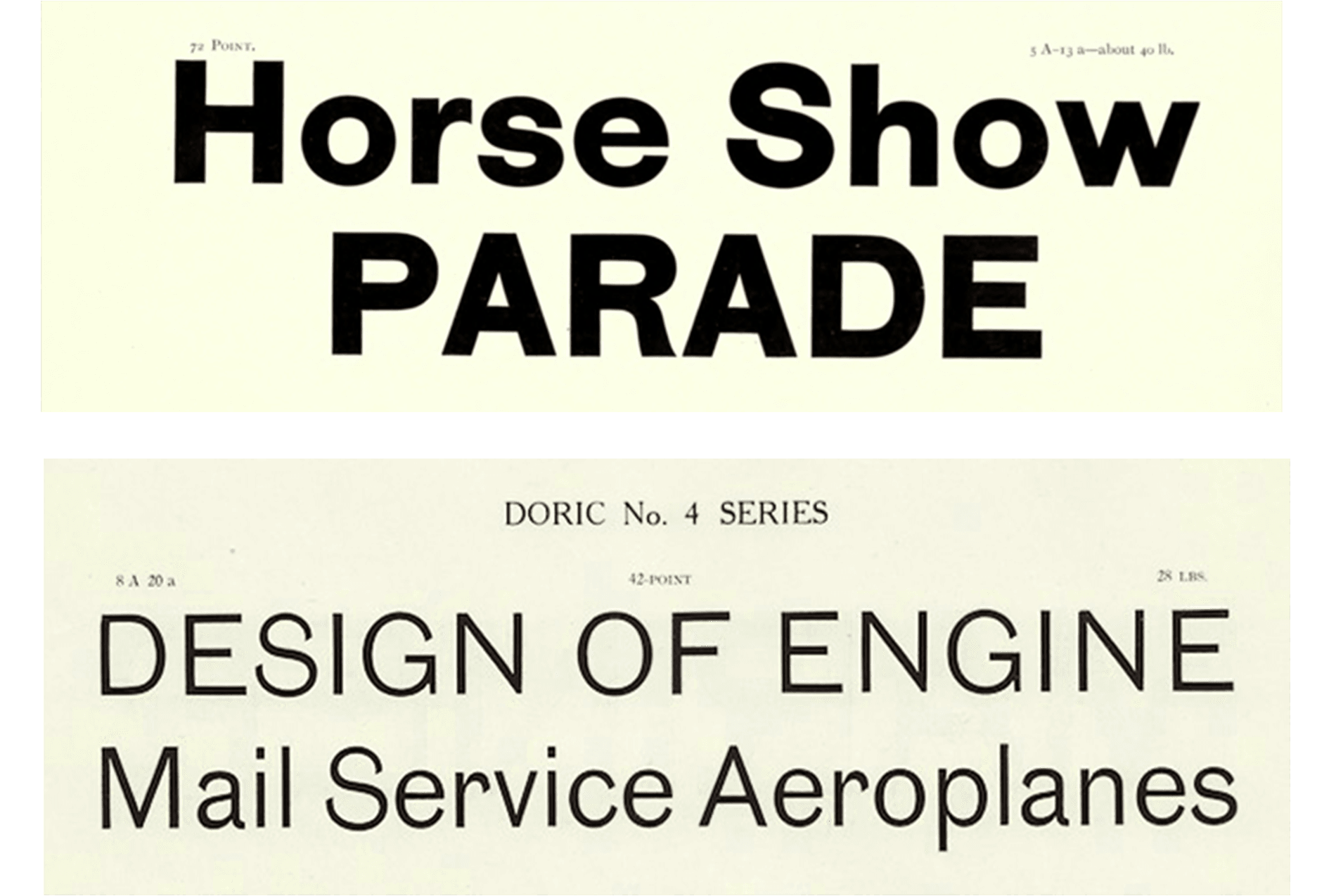
Garnett handles weight in much the same way as Miller & Richard's Grotesque No. 4 (left), with ever-so-slight contrast and thinner than average cross-bars. Caslon's Doric No. 4 (right) was referenced for it's warmth and innate geometry.
Though the sources are predominantly of British origin, there are hints of American Gothics throughout the family—similar to some foundries of the time such as the San Francisco based foundry Palmer and Ray, the “sister foundry” to the Scottish Miller & Richard. This transatlantic relationship resulted in American Gothics with a bit of “British grotesque” flavor. Not only in the artwork but also in the way the design approaches negative space, this is an aesthetic moment in type history that Davenport channels to great effect. Garnett is a utilitarian design that carries the idiosyncrasies of 19th-century sans-serifs with pride and swagger, moving confidently into contemporary spaces and speaking in a voice all its own.
Special thanks to Tal Leming and Dai Foldes.
Featured Fonts
Featured Fonts