Sharp Sans for SkyShowtime
Throughout 2022, Sharp Type worked with SkyShowtime creative director Arjen Nordeman to develop a custom package of Sharp Sans for the new streaming platform. With our regular collaborator Marc Rouault, we designed a prototype Cyrillic extension of our flagship geometric sans-serif to meet the branding and messaging needs of SkyShowtime's European market, which require both Latin and Cyrillic localizations.
SkyShowtime completed its rollout earlier this year, which began in the Nordic countries in late 2022, before continuing with Central Europe -- which includes Albania, Bulgaria, Czechia, Hungary, Kosovo, North Macedonia, Poland, Romania, and Slovakia -- and finished with Spain and Andorra.
SkyShowtime combines the signature logotypes of Sky TV and Showtime, and Sharp Sans acts as both a complementary display face and supporting font to complete the visual identity of the brand. Dubbed Sharp Sans SST, this project required a lot of collaborative back-and-forth with the team at SkyShowtime and their affiliates at NBC/Peacock to ensure that the custom font family works holistically throughout the services branding, messaging, and development code.
The world of streaming has grown increasingly diverse in recent years, not only in terms of content, but in the variety of platforms. As studios continue to merge and acquire one another, new platforms have been created to support and work within the complex matrices of regional markets and licensing. These platforms are often named in a way that reflects the merged studios, and the chimeric nature of the resulting brand names often results in carefully combined pre-existing logotypes to retain familiarity for the audience and brand consistency. In these cases, the final brand identity requires a supporting typeface that can shine in its own right without clashing with any pre-existing proprietary logomarks or type.
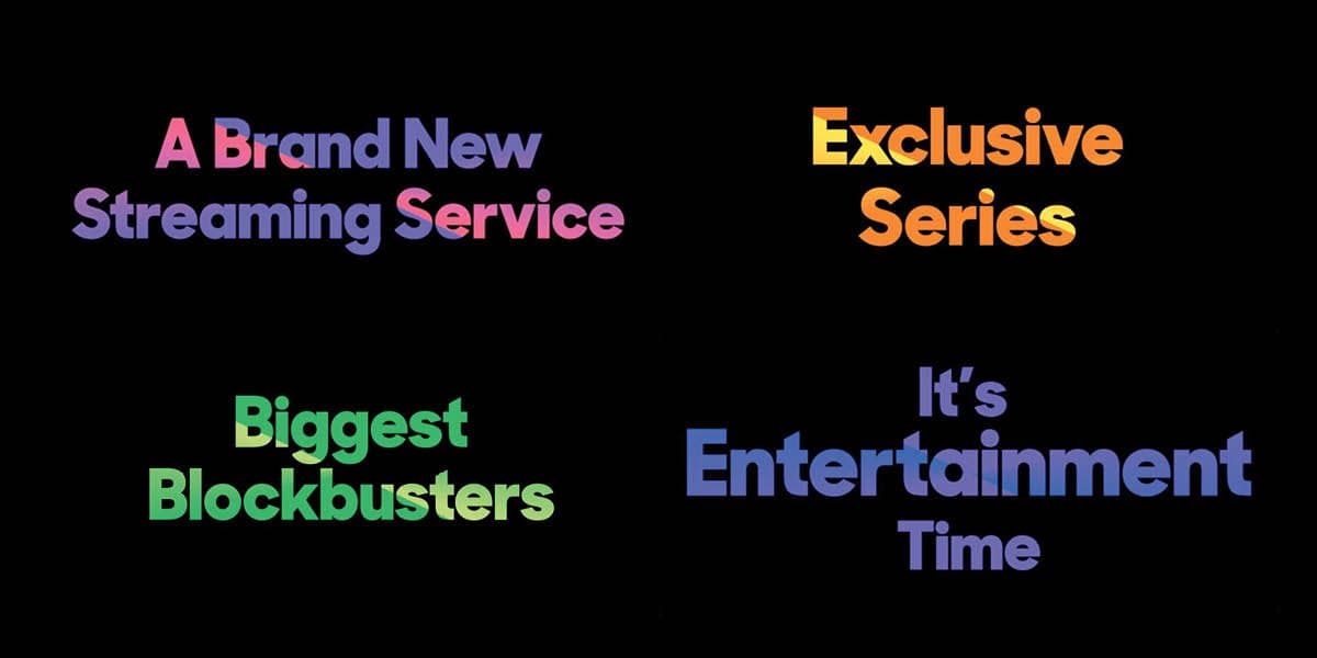
Sharp Sans was designed for ultimate utility, and it looks great in any context. Beneath the simple and strong forms of our workhorse geometric sans-serif is a wealth of fastidious design considerations. Simplicity is often the most difficult quality to achieve, and Sharp Sans’ easy adaptability further reinforces this trait.
For the general public in these regions, Sharp Sans SST will be seen primarily in title and headline uses throughout the user experience. However, we also provided monospaced type for the SkyShowtime team to use on the development backend. Sharp Sans is everywhere in the rollout for SkyShowtime, and it's a comprehensive proof of concept. The typeface’s understated warmth unifies the platform’s diverse content and branding with quiet confidence.