Ettore Sottsass and the Social Factory + Centra No.2
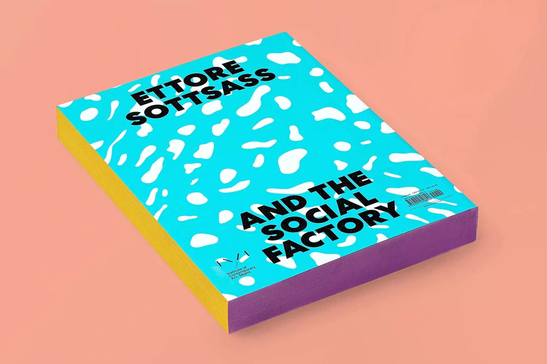
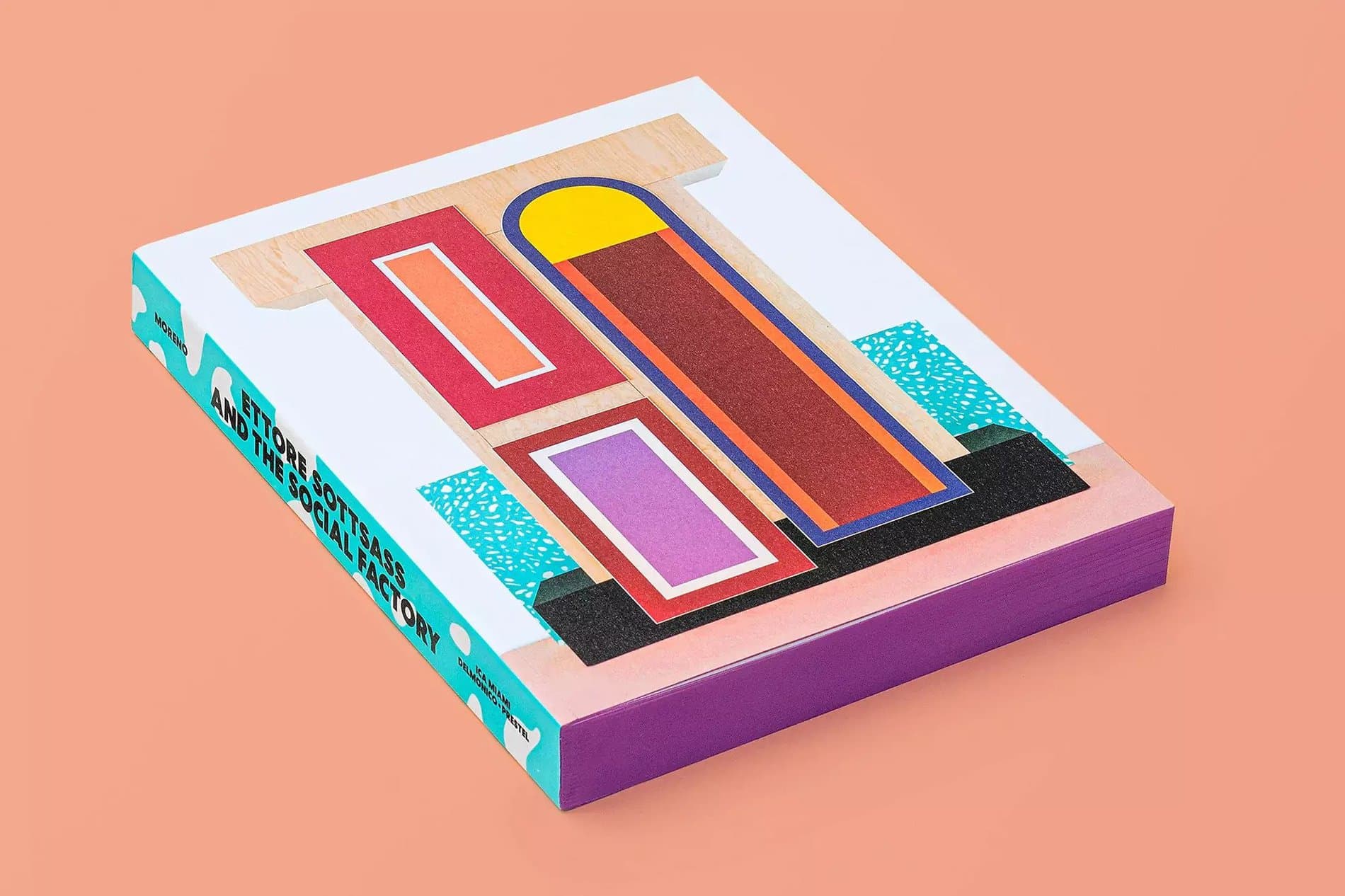
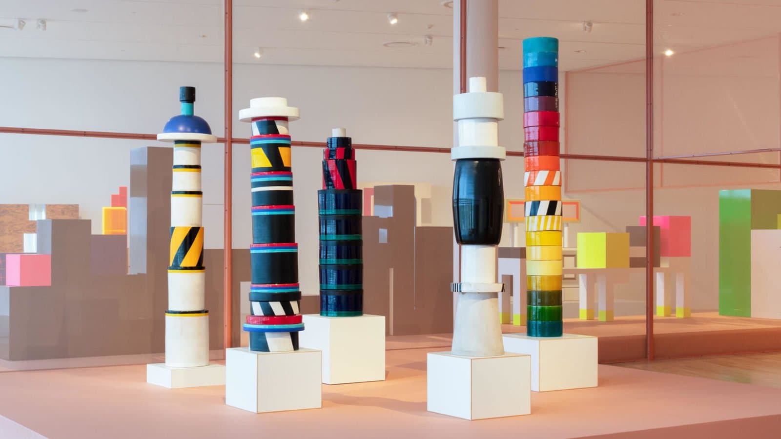
In the summer of 2020, Miami's Institute of Contemporary Art published a monograph titled Ettore Sottsass and the Social Factory to coincide with the exhibition of the same name. The catalogue, designed by Mark Owens, features a wealth of images and archival material, with essays by Sven Lütticken, Jaleh Mansoor, Jacopo Galimberti, Francesca Balena Arista, Elisabetta Trincherini, Maria Cristina Didero, Silvia Franceschini, Evan Calder Williams, Ernesto Oroza, Wava Carpenter, and Gean Moreno. Unsurprisingly, Mark's approach follows the iconoclastic architect's bold use of shape and color, lending the catalogue a similar vibrancy that Sottsass imbued into his own wide body of work, which has been much-imitated and is perennially in vogue.
In the summer of 2020, Miami's Institute of Contemporary Art published a monograph titled Ettore Sottsass and the Social Factory to coincide with the exhibition of the same name. The catalogue, designed by Mark Owens, features a wealth of images and archival material, with essays by Sven Lütticken, Jaleh Mansoor, Jacopo Galimberti, Francesca Balena Arista, Elisabetta Trincherini, Maria Cristina Didero, Silvia Franceschini, Evan Calder Williams, Ernesto Oroza, Wava Carpenter, and Gean Moreno. Unsurprisingly, Mark's approach follows the iconoclastic architect's bold use of shape and color, lending the catalogue a similar vibrancy that Sottsass imbued into his own wide body of work, which has been much-imitated and is perennially in vogue.
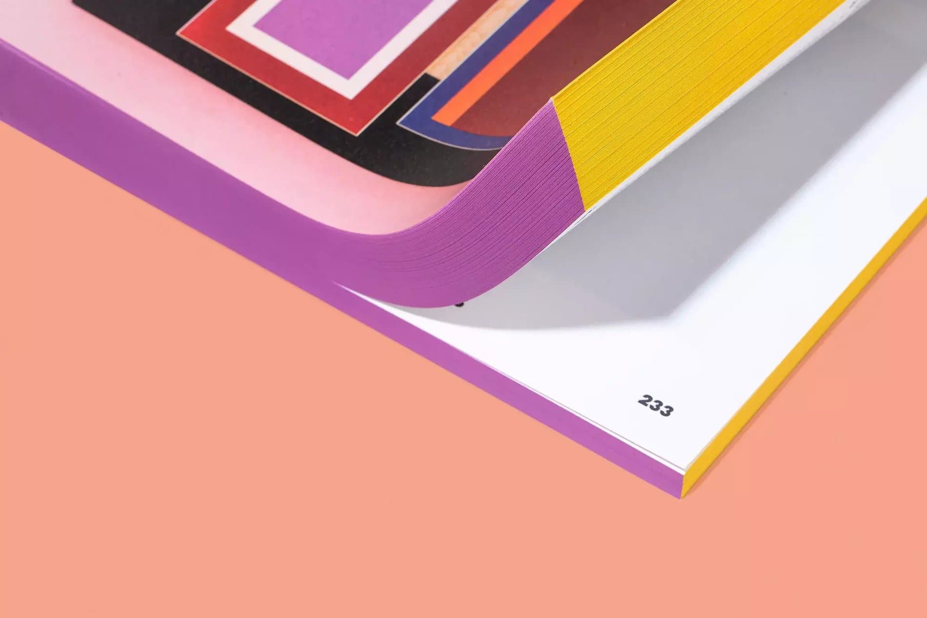
Owens chose Centra No.2 as the primary display font. Published by Sharp Type in 2017, Josh Finklea's take on the Modernist Geometric sans is a class act in refinement and texture, its wide letterforms and diagonally-sheared curvilinear terminals giving the typeface a distinctive but sensibly matter-of-fact rhythm of negative and positive space. Applied to the Sottsass monograph, the font echoes both the Italian artist's influential Memphis-era work, as well as Owen's graphic design. Centra No.2 is featured as a display, of course, and is used as the titling font, but the catalogue also shows how versatile Centra No.2 can be, too, as a supporting player, beautifully numbering all 336 pages of the book.
Featured Fonts
Featured Fonts