Process: DOSS Collection
Inspired by the logotypes of construction and hi-fi audio brands, DOSS is a collection of four display-oriented typefaces that also reference the aesthetics of ‘90s rave culture and ‘80s sci-fi tropes.
Inspired by the logotypes of construction and hi-fi audio brands, DOSS is a collection of four display-oriented typefaces that also reference the aesthetics of ‘90s rave culture and ‘80s sci-fi tropes.
The quartet was designed by Marc Rouault over a period of five years, forming a loose confederacy of fonts that reveals his fascination with vernacular typography—in this case, the aesthetics of electronics and their branding.
Available all together or as individual styles, the DOSS collection includes Exaflop, Acid, Plexus, and Problem. While each has its own unique flavor, the styles within the Doss collection are unified by their exaggerated geometric structures, unexpectedly round counterforms, and unicase character sets. A graphic designer’s type designer, Marc’s output maintains a balance of inventive curiosity and sharp technical prowess. DOSS is no exception, offering a toolbox of riches to the intrepid designer seeking to explore the limits of ultra-display typography.
DOSS Exaflop
DOSS Exaflop
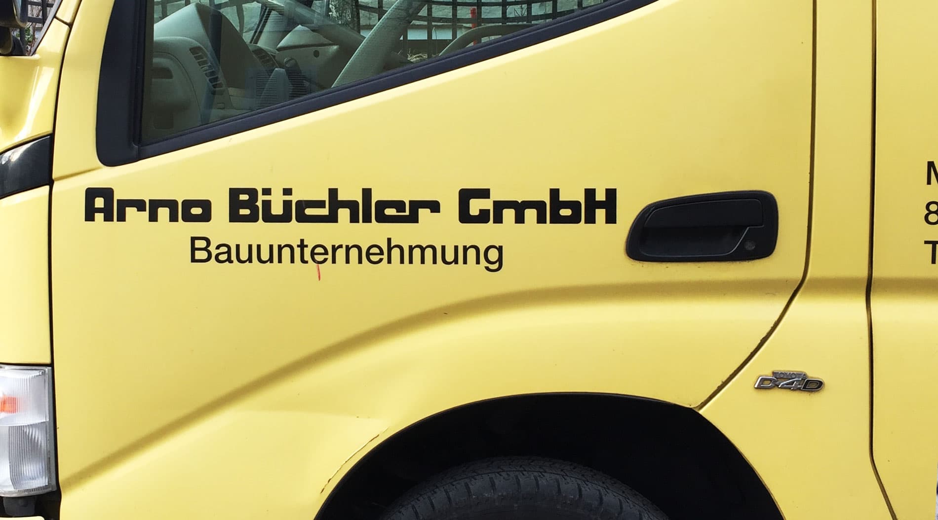
The origin of the DOSS collection, the Exaflop family was inspired by a logo found on the side of a construction company vehicle. With its geometric structure and machine-made outlines, Exaflop defines the loose construction rules behind this bundle of fonts. Arguably the most sci-fi-esque of the collection, Exaflop feels cold and technical on the wide side of the spectrum and playful when it gets narrower. In the DOSS altverse, where time travel is possible, this is James Cameron’s favorite font before he discovers Papyrus.

AAA
RRR
aaa
ooo
Originally called Arnold—in reference to the Terminator, of course—Marc began sketching Exaflop in May of 2019 after sighting a construction company van on the clean streets of Zürich. “I used to cross this van next to my place. The type on it looked familiar and reminded me of some ‘80s letter-transfer type, but I knew it was kinda vernacular, or at least not a ‘real’ typeface.”

Using the construction logotype as a jumping off point, Marc also looked to a trio of fonts as he built out the character set: Max Miedinger’s wide set Horizontal from 1965; sci-fi mainstay Eurostile by Aldo Novarase from 1961; and the more rounded forms of Corporate, published by Alphabet Innovations in 1971, which Marc discovered deep in the design process.


“To start, I reproduced the source letters ‘Arno Büchler’ and then expanded the character set, exploring variants of the existing letters. For example, the /A went from rectangular to triangular.”
“To start, I reproduced the source letters ‘Arno Büchler’ and then expanded the character set, exploring variants of the existing letters. For example, the /A went from rectangular to triangular.”
Exaflop’s construction principles were initially based upon CNC-driven geometry—a subtractive process that imposed design constraints—but Marc found creative freedom there, taking on the CNC style as a challenge rather than a limitation. “The other main technical challenge was definitely the x-height/weight ratio.” Combined with the CNC-rounded inner corners, this made it difficult to keep certain counters. To ensure that the weight balance would work, Marc simply chose to remove the counters in the /a and /e letterforms.
ABCDEFGHI
JKLMNOPQ
RSTUVWXYZ
ABCDEFGHI
JKLMNOPQ
RSTUVWXYZ
abcdefgh
ijklmnopqr
stuvwyz
abcdefgh
ijklmnopqr
stuvwyz
DOSS Acid
DOSS Acid
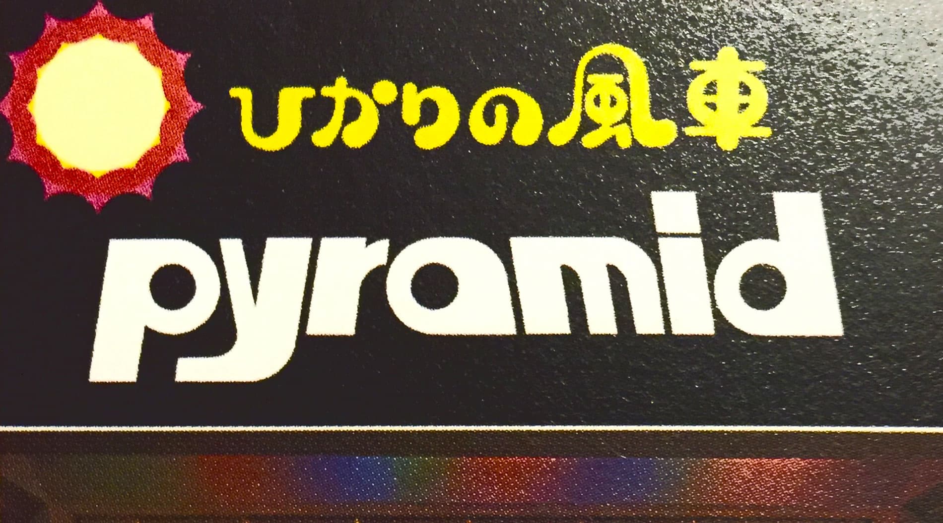
Acid began as the interpretation and extension of a Japanese acoustic material company logo called Pyramid, likely dating from the 1980s. Incredibly geometric, the font references the playfulness of toy brands as much as the rationality of tech logotypes. The font features a Unicase set, and a treasure chest of alternative shapes that will provide hours of play. Acid will feel appropriate on toys for all ages, channeling your inner child, whether you’re designing a logotype for wood blocks or drum machines.
In March of 2020, just days before lockdown, Marc was visiting New York City and came across a reference book compiling Japanese HiFi brands and commercial material. It would be another year before he began sketching the first draft of Acid, and another three years before it would be complete. Initially titled Pyramid after the brand that inspired it, Marc started out by studying and riffing off the source material. “I basically started to redraw the Pyramid letters, staying close to the original, and gradually made adaptations so it becomes more of a functional typeface—still a display, but maybe a bit more rational.”
“So far, I almost designed display typefaces only, but this one is maybe the most geometric. The DOSS family has something very basic but strong across all the styles—these perfectly round counters. Acid is maybe the darkest of them, and has the most compact design. Acid and Problem both have contrast, which sets them apart within the display/geometric/techno world of DOSS.”
“So far, I almost designed display typefaces only, but this one is maybe the most geometric. The DOSS family has something very basic but strong across all the styles—these perfectly round counters. Acid is maybe the darkest of them, and has the most compact design. Acid and Problem both have contrast, which sets them apart within the display/geometric/techno world of DOSS.”
ABCDZ
VWXY
Acid could be described as digital woodblocks in the shape of letters. The basis of the entire character set is composed of squares, circles and triangles. From there, round counters and inner-corners were paired with sharp outer-corners to complete the design logic.
“Really, this is a geometric sans-serif but simply more radical than what we are used to seeing in this category, and with contrast.” The main challenge was to stick to this radical geometry and figure out a satisfying construction method for the diagonals.
DESPITE ITS NAME,
the Production of the Album was completely Analog.
The font’s unicase is particularly notable. “I think the blocky design makes any character a good container for color or pictures.” Acid, like all the other DOSS styles, is ideal for exploring all kinds of graphic treatment like spacing, in & out, and outlining.
ABCDEFGHIJKLM
NOPQRSTUVWXYZ
“Outside of type history, I think of the retro-futurist aesthetic, rave flyers, and computer brands. Acid also has this weird combination of shapes that make me think of the Memphis movement, actually.”

DOSS Plexus
DOSS Plexus
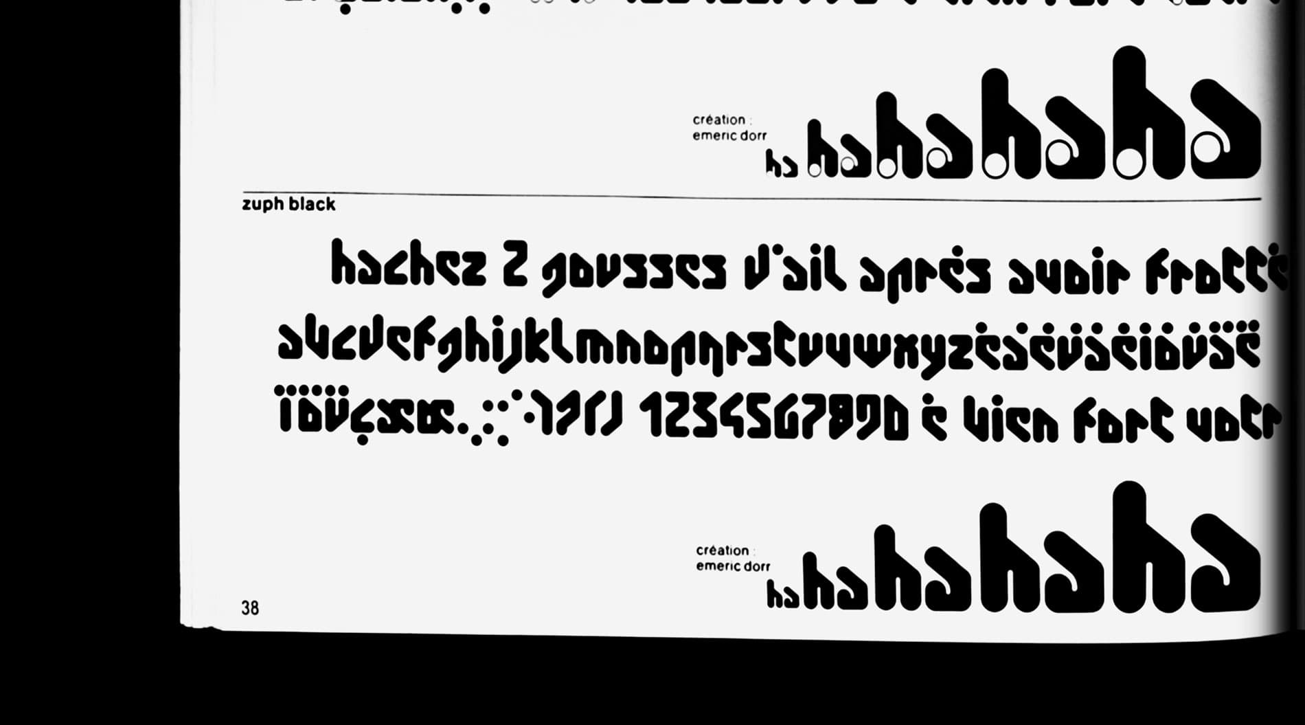
With its radical, indelible design, Plexus pushes the design philosophy of DOSS to the very limits of legibility and into the world of pure shape and texture. The font’s origin point is an obscure phototypesetting typeface from the Hollenstein collection by Emeric Dorr. Marc retrofitted and revamped the source material’s design logic, and in the process, he inverted cliches of futuristic typography of the ‘70s and ‘80s for an altogether esoteric energy, like a fictional writing system that could have been invented by a sci-fi author.
In the 1970s, Emeric Dorr published a phototype called Zuph through Studio Hollenstein. Beyond this font, not much is known about this designer, unfortunately. What we do know is that in 2022, with the concept of DOSS established, Marc rediscovered Dorr’s singular phototype while poring over a deep folder of type design reference material he had compiled over the years. Zuph’s iconoclastic design seemed a kindred spirit with the rest of the family, and Plexus was born.
Hachez 2 gousses d’ail.
“I am a big fan of all the work that has been produced at Hollenstein,” says Marc. “Zuph is one of the most extreme designs they have, which is saying a lot, since everything is quite crazy there. I started with the original Hollenstein catalogue sample, which is a crucial part of the recipe.” As he worked on the design, he took some freedom from Zuph's strict logic of angles: “I started to draw it close to the original, and gradually started to take some freedom with the 45° constraint that didn't seem necessary to me,” says Marc, who also added capitals to the character set. “It is one of the most radical designs I’ve worked with.”
LINEAR
LINEAR
Like the rest of the DOSS family, Plexus’ strong construction rules presented a creative challenge for Marc as he delved deeper into its design. The original phototype reference is primarily constructed of vertical and diagonal strokes, all rounded, without any sharp edges. “I included more horizontals to update the construction of narrow characters like /L /T and /1.”
DOSS Problem
DOSS Problem
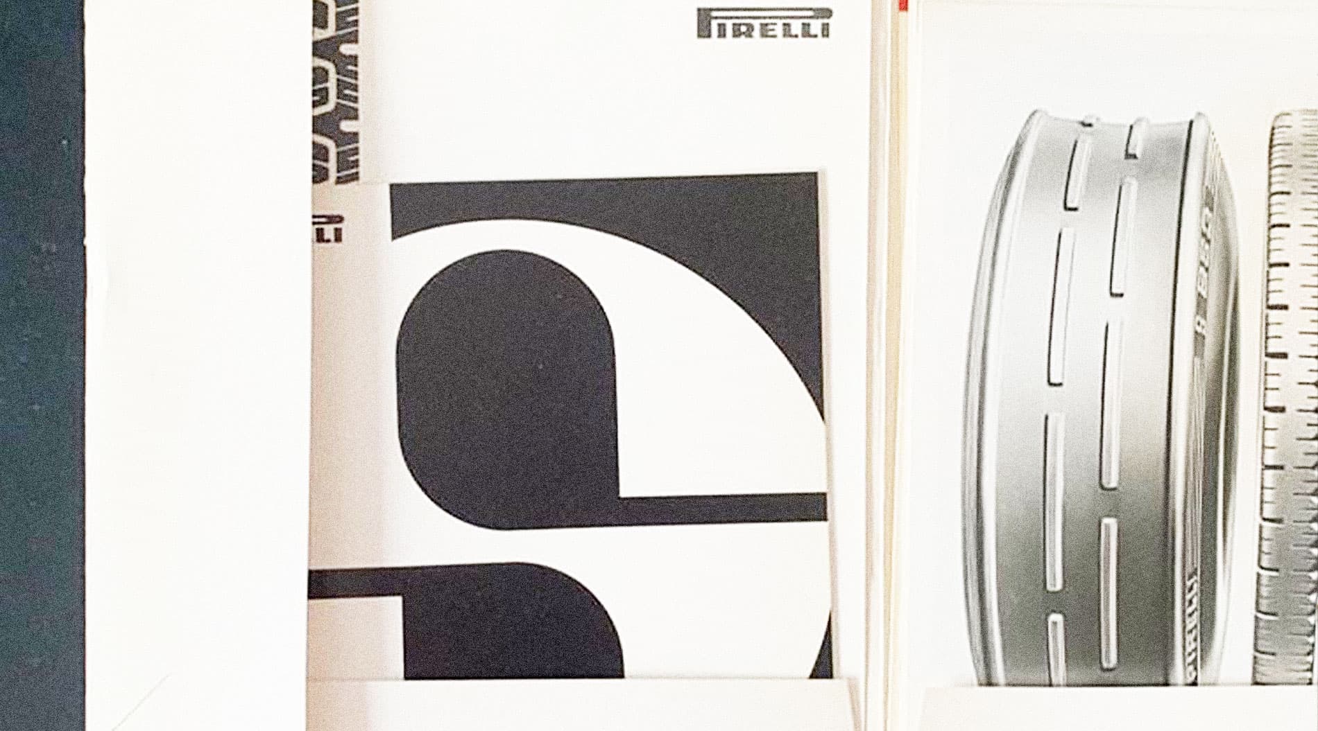
Problem is a geometric celebration of the sadly uncelebrated high contrast sans serif subgenre. The initial inspiration came from a Pirelli leaflet, which Marc came across while conducting research for another type project. Problem, with its siblings Problem Solved, Problem Micro, and Problem Child, takes contrast to unexpected extremes, and its playful naming convention belies the practical design journey undertaken by Marc over the course of two years. We challenge you to make this your Problem. We’re forecasting that it could be the solution for fashion magazine fonts for the next century.
aaaa
The high contrast sans is an uncommon style, but there are two iconic reference points: A.M. Cassandre’s controversial Peignot from 1937, arguably the first of this subgenre, and Otl Aicher’s zeitgeisty Rotis Semi, which was published at the cusp of the ‘90s. Simultaneously liminal yet distinctive, this style has arguably never been out of fashion because it never actually gained the mass appeal like many other genres of type. Nevertheless, you’ll find that a number of successful brands took this audacious direction, from printers to video games to highlighters.
Marc began drawing Problem in March of 2020. Its genesis was a very special /S found in an old Pirelli leaflet published sometime in the ‘60s or ‘70s. “I started with that first, and after I had all the capitals and lowercase drawn, I started to simplify some characters so they get less weird.” As with the rest of the DOSS family, the constraints of geometry, here in relation to contrast, was the main design challenge. As the design progressed, Marc referenced a few other logotypes for inspiration, including longtime favorites Stabilo Boss, Canon, and Nintendo.


As with the other DOSS styles, Marc started applying Problem to graphic design projects in order to understand how it worked—and didn’t work—typographically. In this case, flexing the font resulted in the serendipitous creation of a new weight. “Because of its high contrast, the outline effect was not working in design programs, so I decided to make a specific version for outline use, with absolutely no contrast.” This became Problem Solved.


Essentially, this created a new master on a contrast axis, and the results were surprising: “You can interpolate between Problem and Problem Solved,” says Marc. “But even more interestingly, I realized you could extrapolate—to reduce contrast. I called the result Problem Micro since the lower contrast made it usable at smaller point sizes.” Marc then randomly tried rounding the corners, and “the result became quite a funny and cute result.” The perfectly round counters aligned the Problem subfamily with the rest of DOSS. “This result also reminded me of the magnet letters we find on fridges all over the world, so I decided to give it a name related to kids and childhood—Problem Child.”
Roland
Roland
Roland
Roland
In the 1960s, drum machines were most often used to accompany home organs. They did not allow users to program rhythms, but instead offered preset patterns such as bossa nova. The Roland TR-808 Rhythm Composer, commonly known as the 808, is a drum machine manufactured by Roland Corporation between 1980 and 1983. It was one of the first drum machines to allow users to program rhythms.
The chief engineer, Makoto Muroi, credited the 808 voice circuit design to "Mr. Nakamura" and the software to "Mr. Matsuoka". The 808 imitates acoustic percussion: the bass drum, snare, toms, conga, rimshot, claves, handclap, maraca, cowbell, cymbal and hi-hat (open and closed). Rather than playing samples, it generates sounds using analog synthesis; the TR in TR-808 stands for "transistor rhythm". The sounds do not resemble real percussion. The engineers conceived a "drum synthesizer" with which users could program drum sequences and edit parameters such as tuning, decay and level. Though they aimed to emulate real percussion, the prohibitive cost of memory
With its next machine, the TR-808, Roland aimed to develop a drum machine for the professional market, expecting that it would mainly be used to create demos. The engineers conceived a "drum synthesizer" with which users could program drum sequences and edit parameters such as tuning, decay and level. Though they aimed to emulate real percussion, the prohibitive cost of memory drove them to design sound-generating hardware instead of using samples (prerecorded sounds). Kakehashi deliberately purchased faulty transistors to create the 808's distinctive sizzling sound.
Featured Fonts