Discovery & Sharp Sans
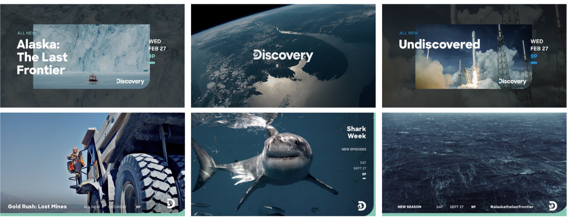
Few American cable channels have the widespread familiarity and welcoming appeal of Discovery. From its debut in the late 80s, it has established a unique presence in media as a safe space for educationally-inclined viewers of any age. For those of us who grew up with strict television rules, Discovery was likely your one allowance for weekday TV watching, and even if Shark Week's phenomenal cultural ubiquity has given way to a cherished collective memory, the memory remains. Like many established media institutions, Discovery has regularly rebranded itself over the past three decades, incrementally facelifting and sometimes drastically overhauling its branding system. Most recently, in 2019, Los Angeles-based studio Roger was hired to design Discovery's global rebrand.
Few American cable channels have the widespread familiarity and welcoming appeal of Discovery. From its debut in the late 80s, it has established a unique presence in media as a safe space for educationally-inclined viewers of any age. For those of us who grew up with strict television rules, Discovery was likely your one allowance for weekday TV watching, and even if Shark Week's phenomenal cultural ubiquity has given way to a cherished collective memory, the memory remains. Like many established media institutions, Discovery has regularly rebranded itself over the past three decades, incrementally facelifting and sometimes drastically overhauling its branding system. Most recently, in 2019, Los Angeles-based studio Roger was hired to design Discovery's global rebrand.
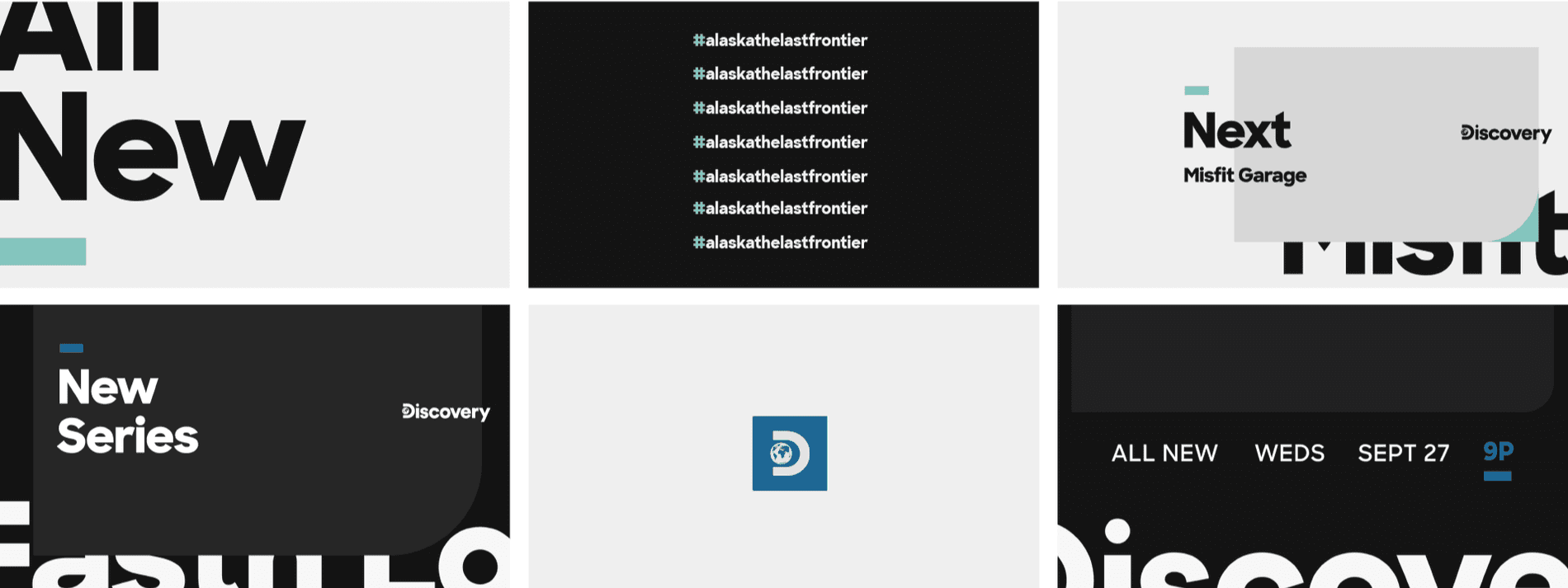
The goal was to reference the established visual identity that the company has gradually evolved since 1987, while pushing the branding into a global context, and into the future. To this end, Sharp Sans was chosen as the main font used throughout the branding system. Whether used as a prominent display text or more modestly as a supporting caption, Sharp Sans' scalability has been utilized beautifully. The typeface's characteristics--boldness, cleanliness, neutrality, and balance--were ideally suited to communicate across Discovery's expanding platforms as the company stays current within our digital world.
Featured Fonts
Featured Fonts