Dagens Næringsliv & Sharp Grotesk
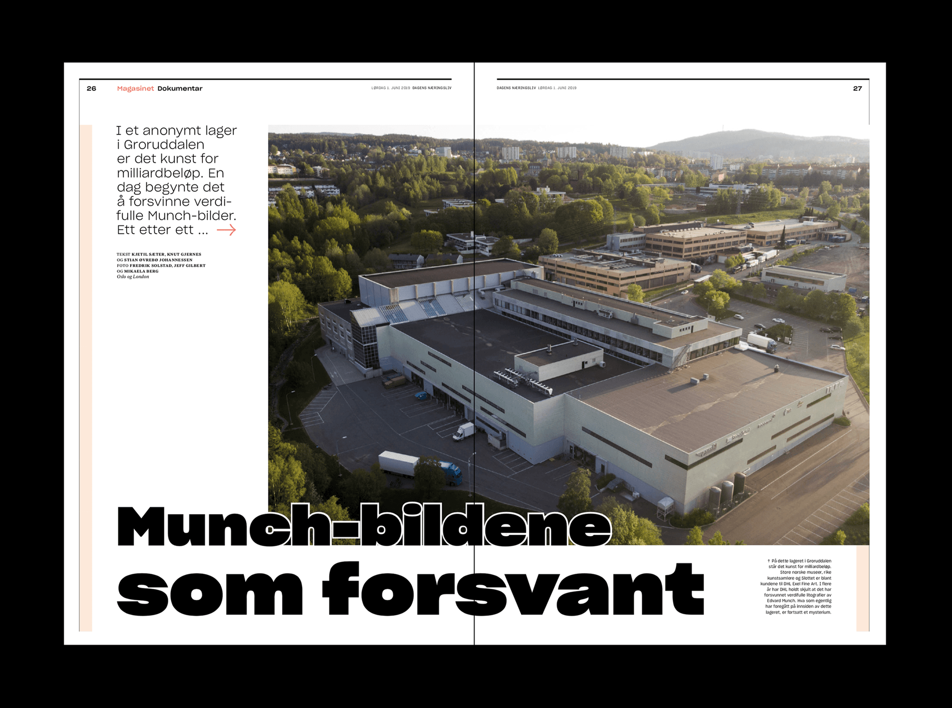
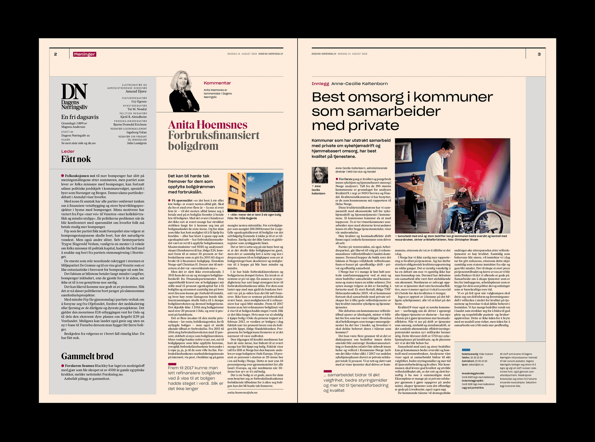
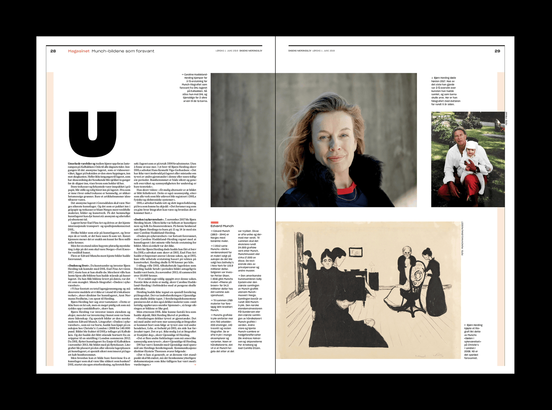
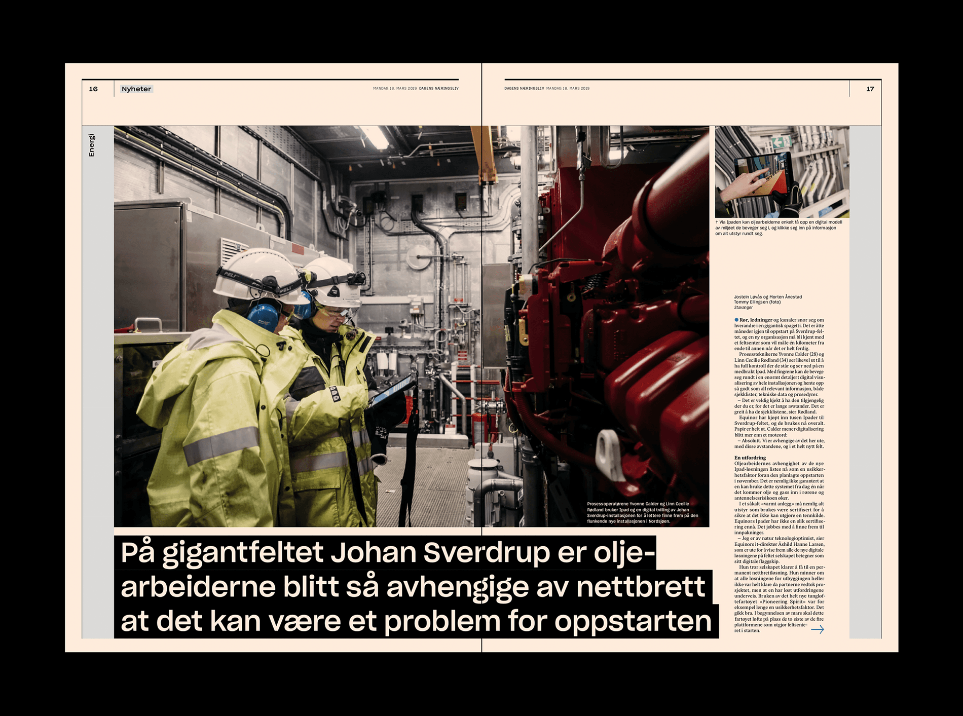
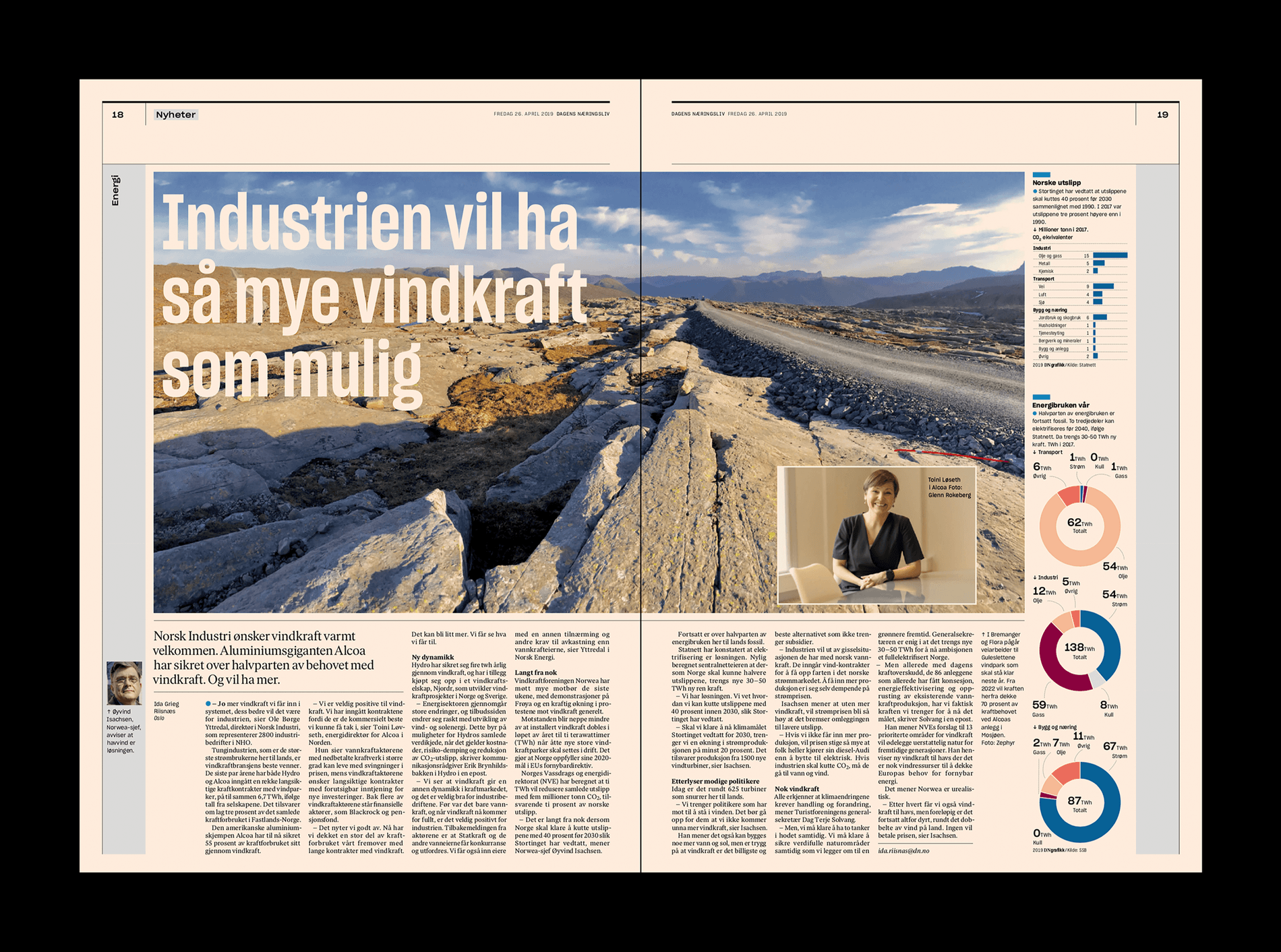
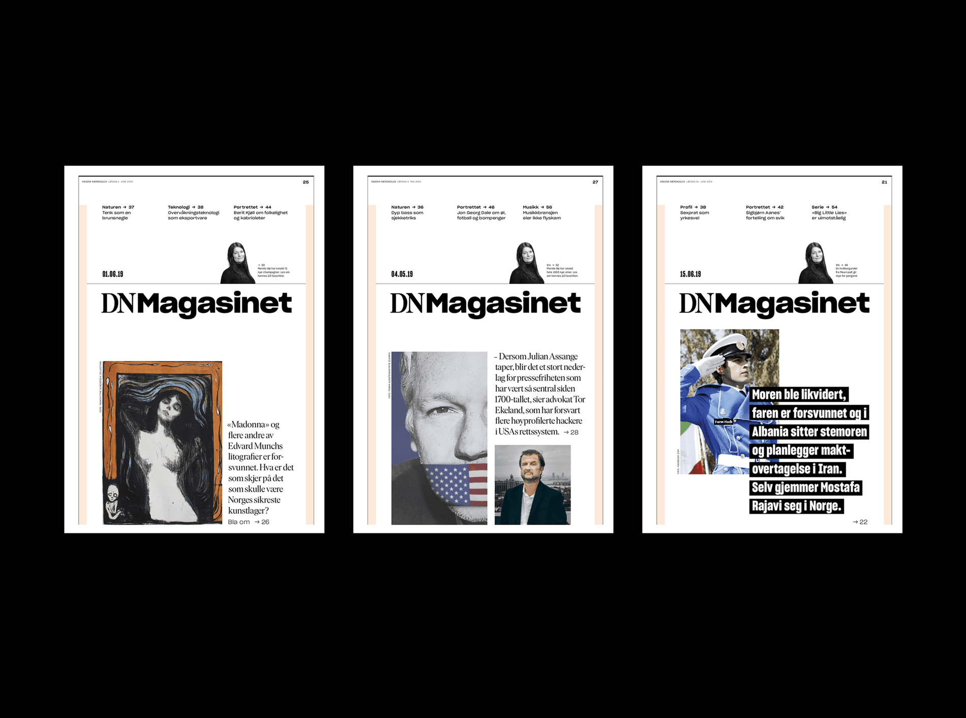
Dagens Næringsliv, commonly called DN, is Norway's largest financial newspaper and uses Sharp Grotesk as their primary typeface in print. We worked with art director Anne Brun and designer Jørgen Brynhildsvoll to develop a customized Sharp Grotesk to use in their rebrand of the over one-hundred-year-old news provider. We added Tabular Numbers, and per their request, created an optical size for body copy by widening the apertures of the lowercase 'e' and 'a' as well as the G' 'C' 'S' 'c' and 's'.
Dagens Næringsliv, commonly called DN, is Norway's largest financial newspaper and uses Sharp Grotesk as their primary typeface in print. We worked with art director Anne Brun and designer Jørgen Brynhildsvoll to develop a customized Sharp Grotesk to use in their rebrand of the over one-hundred-year-old news provider. We added Tabular Numbers, and per their request, created an optical size for body copy by widening the apertures of the lowercase 'e' and 'a' as well as the G' 'C' 'S' 'c' and 's'.
Client: Dagens Næringsliv
Designers: Anne Brun and Jørgen Brynhildsvoll
Typeface: Sharp Grotesk
