The Rare Cursive Typeface That Actually Recreates the Feel of Handwritten Script
AIGA EYE ON DESIGN
AIGA EYE ON DESIGN
The Rare Cursive Typeface That Actually Recreates the Feel of Handwritten Script
The Rare Cursive Typeface That Actually Recreates the Feel of Handwritten Script
19th century handwriting comes to life in My-Lan Thuong’s digital reimagining of copperplate calligraphy
Writer: Angela Riechers
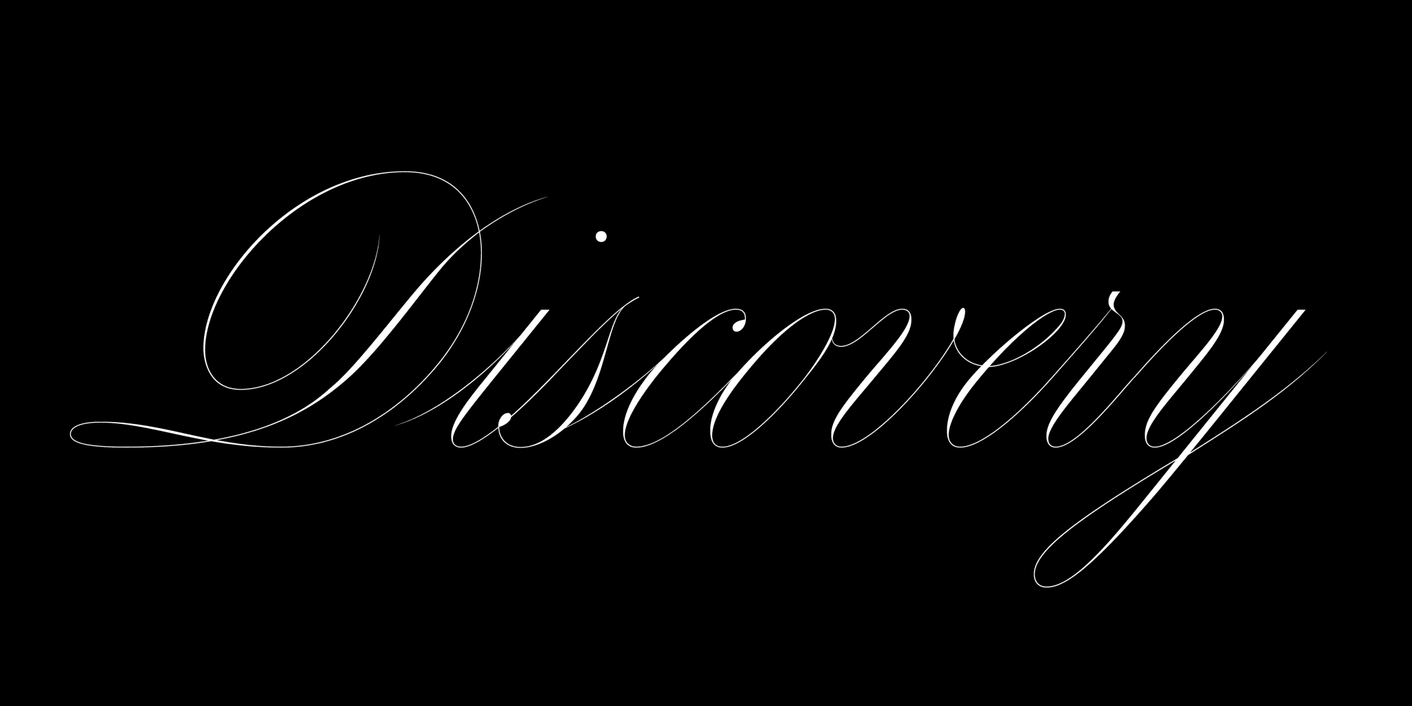
Name: Carta Nueva
Designer: My-Lan Thuong
Foundry: Sharp Type
Release Date: November 2020
Back Story: Type history 101: once upon a time, beautiful cursive handwriting was a fact of life. In the 19th and early 20th century, the grade-school taught Spencerian script (and its simplified cousin, the Palmer method) ensured that the ephemera of daily existence—a handwritten receipt from your plumber, or a cop’s entry on a crime blotter—were rendered in exquisite penmanship. Beautiful handwriting is now largely a forgotten art, and digital typefaces that attempt to recreate the feel of handwritten scripts often fall flat, lacking the grace and delicacy of their forbears.
Fortunately, all is not lost. Shortly after My-Lan Thuong joined Sharp Type, cofounders Lucas Sharp and Chantra Malee asked her to create a typeface based on the engraved lettering in a small antique booklet they’d found in Madrid. The name of the person who created that extraordinary copperplate calligraphy is lost to time, as the book bore just the place and date of publication (Barcelona, 1851). Despite their best efforts at research, the designers couldn’t find any other information about the printer, editor, or designer. “What Lucas and Chantra didn’t know then is that they were handing me my dream project,” says Thuong. “I had always wanted to design a cursive typeface, and I particularly love this style of calligraphy.”
Why is it called Carta Nueva
Why is it called Carta Nueva
One of the only words found on the mysterious booklet was “Carta,” faintly visible on the spine. “In Spanish, Carta means missive or map,” Thuong says. “We decided to add Nueva to it, following the typographic tradition of adding Neue or Next to a name, but this time in Spanish to match its origins.”
What are its distinguishing characteristics?
What are its distinguishing characteristics?
Carta Nueva’s digital letterforms preserve the essence of its calligraphic origins—firm downward strokes establish a consistent rhythm, then become as light as air on upward strokes tapering to fine points. The hairlines almost disappear upon contact with the stems, requiring them to be drawn at 4096 units per em scale to capture every intricacy. Uppercase ornamental characters flaunt lively winding loops and arabesques.
As with any typeface conversant with history, there comes a point where the designer takes over to write her own finale. The source booklet contained only the standard alphabet, so Thuong envisioned what the remaining glyph set would look like, including punctuation, symbols, mathematical signs, and special characters. “Carta includes a complete character set and extended Latin support, so you can write a single name in Vietnamese, a headline in Polish, a poem in German or a long passionate love letter in Icelandic,” she says.


What should I use it for?
What should I use it for?
Carta Nueva is a display font that comes in five optical sizes to suit a range of potential uses. Its extremely delicate hairlines invite typesetting at a dramatic scale to show off all the details and intricacies. Its handwritten origins also make it a candidate for more intimate writings (love letters/texts/emails?) while its formality adds a flourish to announcements as well.
What other typefaces do you like to pair it with?
What other typefaces do you like to pair it with?
Copperplate and DH Bank Gothic both offer a square solidity that contrasts nicely with the looping airiness of Carta Nueva. It also looks great with a typewriter-style face such as Pitch.
Featured Fonts
Featured Fonts