Williams College
Introducing the Williams College Custom Typefaces: Eph Serif, Light, Italic, Regular, Italic & Bold Italic Eph Slab Light, Regular & Bold. Eph Gothic: Light, Regular & Bold Eph Octic: Light, Regular & Bold.
In 2020, we developed a custom type system with Jesse Reed at order.design for a large-scale identity rebrand for Williams College. The goal was to establish a long-term system that can evolve with the institution while mirroring its immersive academic community. To that end, we developed the Eph Family—a typeface system of four interactive but distinct styles.
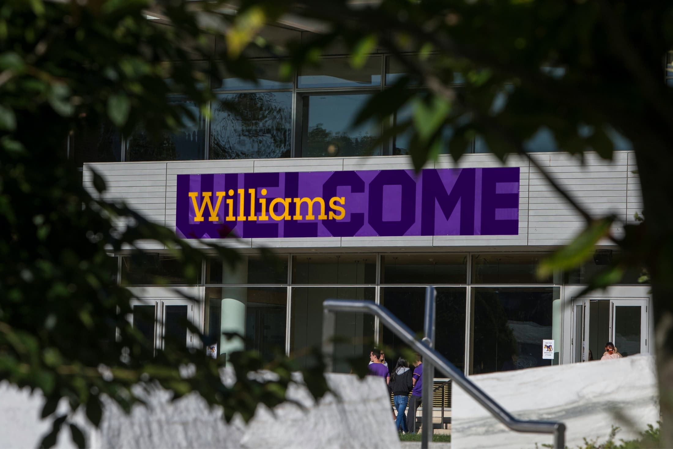
Founded in 1793, Williams College stands as one of the nation’s leading liberal arts colleges year after year. It's home to a vibrant community of undergraduate students, graduate students, and esteemed faculty members who continue to contribute to creative production, intellectual discovery, and academic scholarship. With this in mind, we created a custom suite of typefaces that represent the College’s multi-faceted, vibrant, and dynamic voice.
Eph Slab
Eph Slab
Eph Serif
Eph Serif
As the College’s official wordmark, the Slab is bold and straightforward, designed to emphasize individuality.
Eph Serif speaks to a classic, sophisticated voice fit for an academic institution, and is updated for a modern era with details like larger proportions and spacious counters.
Eph Gothic
Eph Gothic
Eph Octic
Eph Octic
Eph Gothic references copperplate typeface design, featuring crisp, tapered wedge-shaped serifs, that gives letterforms subtle and stylish flair.
Eph Octic takes cues from stone carvings found on building exteriors throughout campus. Made up of angular strokes, Octic’s geometric design amplifies Williams’ fighting spirit, and their athletics teams—the Ephs.
A common structure
The Ephs family includes four distinct typefaces: Eph Slab, Eph Serif, Eph Gothic, and Eph Octic. These have been designed to interact with each other to create an expressive harmony of voices. At the same time, while they share a core skeleton, they can stand on their own—highlighting the individuality and range of character found on campus. We used Sharp Sans as a jumping off point, referencing its large x-height, compact proportions, and spacing. Each typeface includes 3 weights: Book, Semibold, and Bold, for a total of 12 fonts.
Capturing the spirit of the Ephs
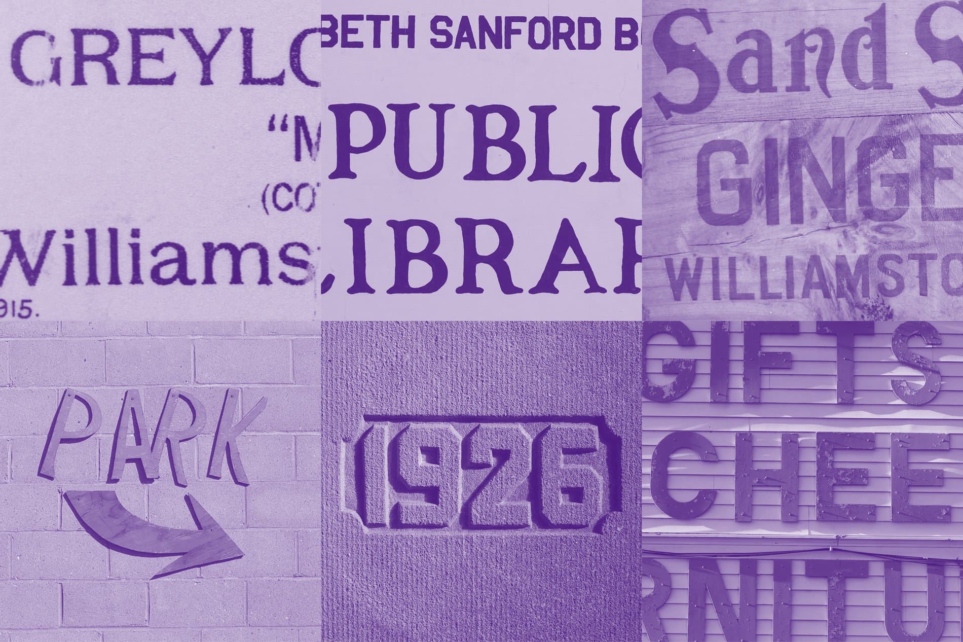
During the research phase at Williams’ library archive, Reed and his team saw that the college’s communication materials historically featured an eclectic variety of typefaces. The concept of «typographic diversity» became a clear driving point for the new identity. From detailed lettering on 20th century Ephs basketball tickets and The Williams Recordnewspapers, to painted and carved contemporary signage downtown, these anecdotes are all referenced and woven into our custom-designed font family.

Ephelia The Purple Cow
In addition to the Ephs typeface family, we had a lot of fun designing additional visual components for Williams’ official mascot: Ephelia, the purple cow. Lucas Sharp drew the Ephelia insignia by referencing issues of The Purple Cow, a 20th century humor magazine published at Williams. My-Lan Thuong drew a second insignia that captures Ephelia’s tough, fighting spirit, used by Williams’ athletic teams.