The Malee Scholarship
Our Mission
Our Mission
When we welcome and advocate for diverse voices, perspectives, and experiences in any industry, including our own world of type, we witness a discourse and creative output that is undeniably more interesting and vibrant. It expands our vision of what is possible and pushes the needle forward — reminding us to look beyond standard molds where ideas emerge. However, it is no surprise that there is not a level playing field for everyone, including women of color. The talent exists, but there needs to be better and more sustainable structures in place to engage and support these voices.
In 2019, Sharp Type Co-Founder Chantra Malee, with support from the Sharp Type team, launched The Malee Scholarship, an annual grant and mentorship program awarded to one young woman of color in type design. In our first year, we have already encountered new and refreshing ways of seeing, imagining, and designing letterforms that we all love. This is just the beginning, and we are inspired to see what else will emerge in the years to come.
This case study details how we brought this ambitious and collaborative project to life. We joined forces with incredible talent from across the globe to create custom typefaces Malee Serif and Malee Sans, the logotype system, and a dynamic website with an ongoing showcase that includes amazing typefaces designed by women.

The Logotype
The Malee Scholarship is a new initiative and the first of its kind. In light of this, we wanted the logotype to feel scholarly, mature, and fresh at the same time. We were grateful to collaborate with TienMin Liao, a graphic designer, lettering artist, and type designer from Taiwan based in NYC. We had been fans of her custom letterform work and felt that she was a perfect fit to draw a custom logotype. We started off by providing reference images from The Gallo Roman Museum from our recent trip to Lyon, France, which is considered one of the best stone carving museums in the world.

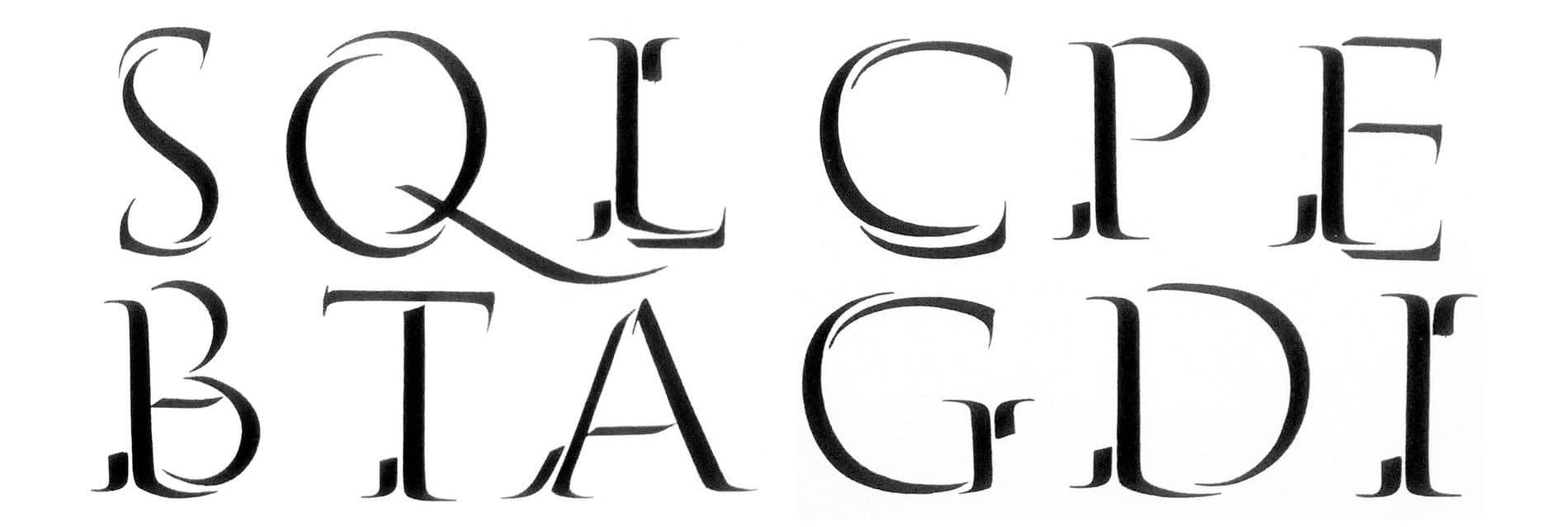
In TienMin’s initial designs, she explored a variety of serif treatments, ultimately deciding on a contrast style inspired by flat brush calligraphy. As an all uppercase logotype, there was an opportunity to play with capital ligatures, a distinct nod to Roman capital inscriptions. To pair, she also explored a variety of serif treatments: sharp and crisp, blunt and wedge-shaped, and a version in between.


One of the greatest challenges was harmonizing this academic and contemporary feeling in the letterforms. The choice to go with all capitals without ligatures underlines a more mature tone. The brush style references Edward Catich’s stroke ductus from The Origin of the Serif, capturing the movement and pressure of the pen to illuminate details such as soft and wispy serifs, slight kinks in counters, and imperfectly straight horizontal bars. The final logo set is sophisticated and captures the elegant brushed effect of serif letters, and is adapted for a range of mediums from website headers to social media thumbnails.

Custom Typefaces: Malee Serif & Malee Sans
TienMin’s logotype served as the foundation for custom typefaces Malee Serif and Malee Sans. My-Lan Thuong, type designer at Sharp Type, created a full character set to use for the website and branding assets. My-Lan looked at brushed lettering work by Father Edward Catich as inspiration. The uppercase serif finds a balance between a whimsical, calligraphic brush stroke and a steady, typographic rhythm. The lowercase was imagined in an equally classic style, evolving the brush endings in the logotype to be adapted for a more classic typographic text treatment.


We originally planned to only design Malee Serif, but as we were developing the website we recognized the need for typographic contrast. Our web designers longingly wished for a complimentary sans, to which we replied, “We can do that!”. Malee Sans was then designed using the skeleton of the Serif. The concept was to have a sans as delicate as the serif’s hairline. When they are used side by side, the darker serif becomes the bold companion to the sans.
The Website Identity
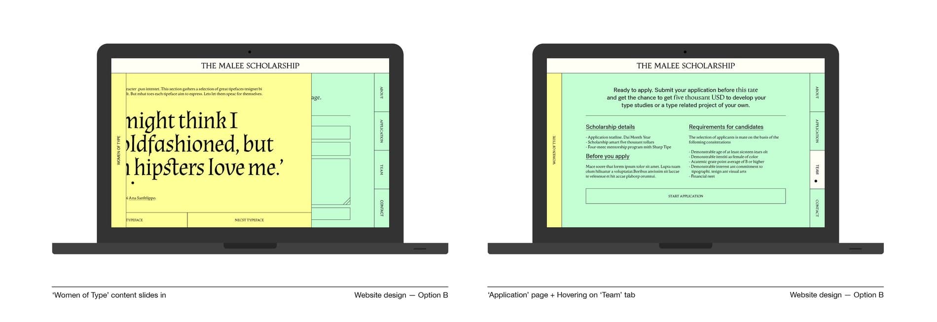
For website design and brand materials, we worked with Sara Landeira & Ekhiñe Domínguez from What The Studio. Design studio Default Value developed the website and brought all of these ideas to life. Working with the theme of education, in the initial rounds Sara and Ekhiñe presented incredibly thorough ideas. The website is inspired by a symbol of student life: classic paper folders, like the ones we used as students to neatly organize different subjects, classes, and notes. This folder system influenced the pastel color palette and the use of tabs in the user interface.

We especially loved how the website evolved to be both an informative platform about the scholarship, as well as a space for us to spread knowledge and inspiration about women in type. Sara and Ekhiñe said that the informational side underlines the need to have more women in the type industry, while the inspirational side empowers and motivates potential applicants by showing other women’s achievements, and how it is possible to be a part of the type industry.
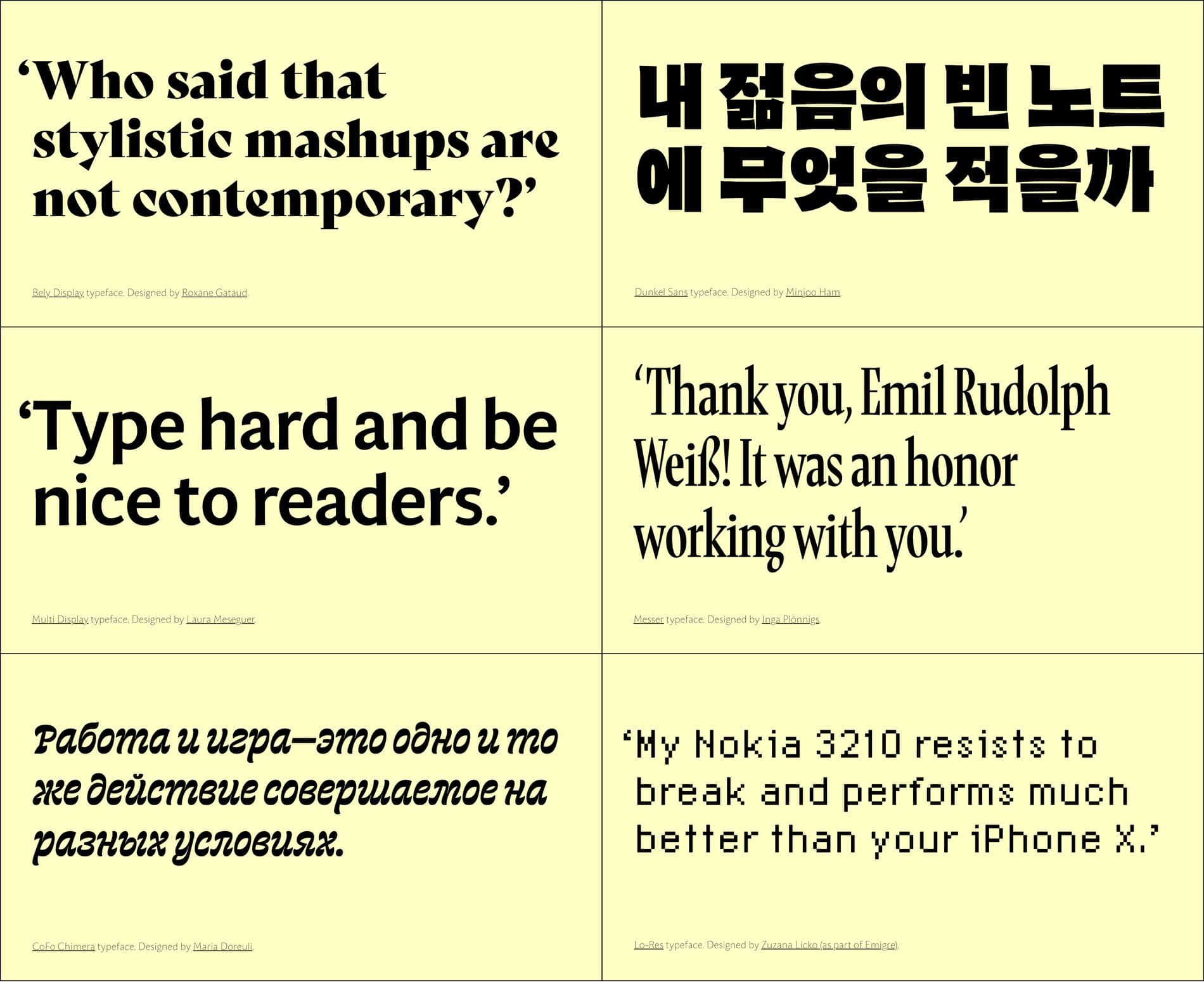
This is where the ‘Women of Type’ section came to life as a way to showcase typefaces designed by women, and present them through quotes as if the typefaces could 'speak' about themselves. We reached out to some of our favorite designers in hopes that we could include their typeface, and we got an amazing response. The beauty of this section is that it will continue to grow with many other fonts by women, including the work of our future applicants.
Each typeface has its own character (pun intended!) This section gathers a selection of great typefaces designes by women from all over the world. But what does each typeface aim to express? Let's let them speak for themselves!

We’re incredibly proud of this collaborative project to bring forth a new initiative to make the type design industry more accessible and equitable. One core belief we have is paying it forward. We hope that future recipients of The Malee Scholarship will remember our support and our confidence in them, and we encourage them to pass it on to a community or cause they are passionate about when they are in the position to do so.
If you’re interested in learning more about the Malee Scholarship, visit here.