Twilio
Twilio Sans is a bespoke superfamily derived from the Humanist sans genre, designed by Lucas Sharp and the Sharp Type team for the San Francisco-based communications platform pioneer. In 2020, Twilio’s creative team approached us to create a comprehensive type system that would encapsulate the company’s wide-ranging needs–”from the coding terminal to the airport terminal”–and serve as the basis for a refreshed logotype and brand identity. After two years, we delivered Twilio Sans, a typeface three weights across almost fifty styles that is uniformly approachable and adaptable while remaining distinctly true to its origins. It’s a warm welcome into the world of Twilio.
A Brand New Font
A Brand New Font
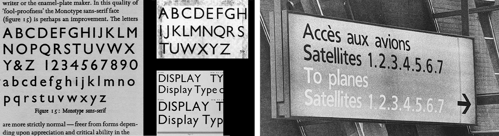
- The core creative team at Twilio approached us to design a typeface from scratch. We began brainstorming during the height of the Pandemic, and while we drew from a variety of sources, we eventually modeled Twilio Sans upon the classics of the Humanist sans serif. Until that point, while we had fondly observed this style of type for many years, this was an opportunity for us to fully explore this genre for the first time.
- We considered Optima and the wonderful aesthetic moment it has come to represent, but we then looked to the sturdiness of Edward Johnston’s eponymous typeface from 1916, which harkens back to the elegance of Roman inscriptional lettering. We also took inspiration from the charming idiosyncrasies of Roger Excoffon’s Antique Olive from the early 1960s. Finally, we looked at two of Sharp Type’s own releases, Beatrice and Trois Mille, which pull from different genres altogether, but their digital provenance and stylistic quirks proved to be important for Twilio Sans’ development.
Twilio Sans is broadly defined by tall x-heights, tight spacing, pinched intersections, and vertically-sheared terminals. It has a classical system of skeletal proportions and letter widths, and in the place of the serifs, we decided on vertical shears at the curvilinear terminals. With this model as a starting point, we eventually integrated slight contrast and grotesk proportions to find the ideal middle ground for the final design.

Twilio Sans Display
Twilio Sans Display
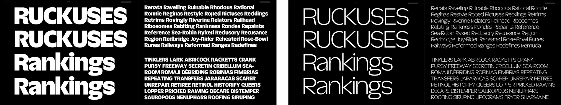
We began the design of Twilio Sans counterintuitively with the Display. Using the aforementioned Humanist Sans classics as our foundation, we began the task of creating a typeface that would be a natural but significant evolution of Twilio's established identity. Twilio Sans Display needed to be distinctive on its own while remaining relatable to the eventual Text and Mono styles.

Lucas started with the capital S form of the darkest master, which exaggerates the downward slope of its top terminal and vice versa with the bottom terminal. From this starting point, the rest of the Display was drawn to serve two purposes simultaneously as both text and graphic, wherein the font would not only be legible as a combination of letterforms, but understood as being Twilio by the specific curves, pinches, and shears that make this typeface unique.

Twilio Sans Display
Twilio Sans Text
Twilio Sans Text
Once the initial Display weights and italics were complete, we worked backwards to the Text style. Based upon the bright and bold Display, we imagined Twilio Sans Text to be its quieter companion. The Display and Text have entirely different textures, contrasts, letter width systems, and apertures while adhering to the same foundation.

With Text, we reduced the extreme pinches, opened up the tight spaces, and reduced the x-heights. We optimized Text for long-form reading on screens, and extra care was taken to ensure that it would be readable at even the smallest scales. In the end, we arrived at a family of text fonts that is spiritually consistent with the display but optimized for a different function.
Twilio Sans Text
A Mono for Coding
A Mono for Coding

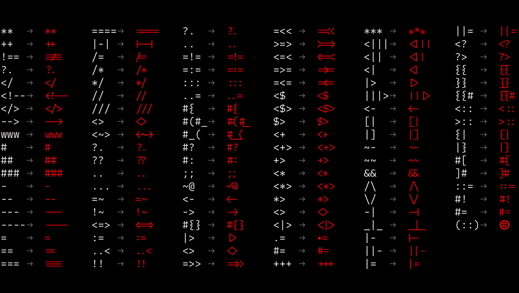
Finally, we began drawing the mono. The monospace and text share the same DNA: the contrast, shapes, and styles of the letters are practically identical. The main design considerations were purely functional to better support the future adoption of Twilio Mono amongst coders and developers. To this end, we referenced well-established weight ranges used in coding typefaces, and the color and texture of Fira Code and Plex Monospace were two guiding sources.
Twilio Sans Mono
There is a robust and extensive set of specific coding ligatures referencing Fira Code; these ligatures have been warmly accepted by developers, which we acknowledge in our final design.
A Logotype Refreshed
A Logotype Refreshed
- The Twilio Sans superfamily was all but finished by the summer of 2022, and the final part of the project was to refine the Twilio logo itself. Huw Williams, a regular Sharp Type collaborator who spearheaded the design of Twilio Mono, took on the task of refreshing the current design. We presented a few different options before arriving at the final artwork.

- Originally set in Gotham, we took the old logotype and set it in a custom version of Twilio Sans by extrapolating a heavier weight of the Display Black. The overall x-height was decreased, and the contrast of the /o and /w were significantly changed.
- We had many conversations with the creative team at Twilio about the final /t glyph. It’s the most prominent letterform in the logo, so we designed a few different options before choosing the rounded /t with an angled shear.
Optimization for Screens
Optimization for Screens
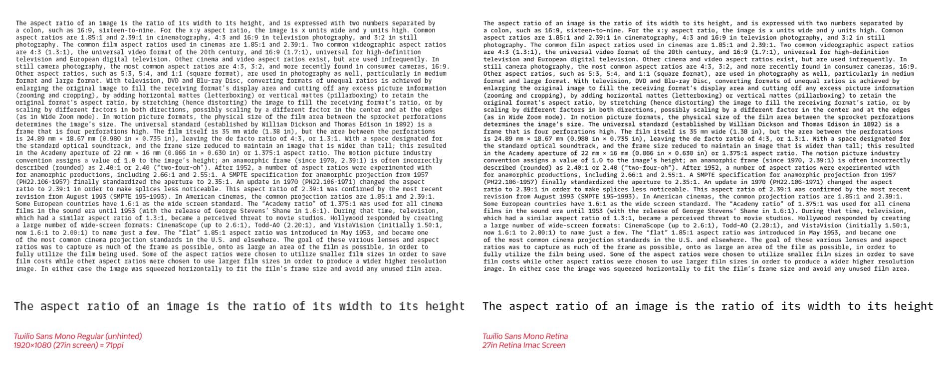
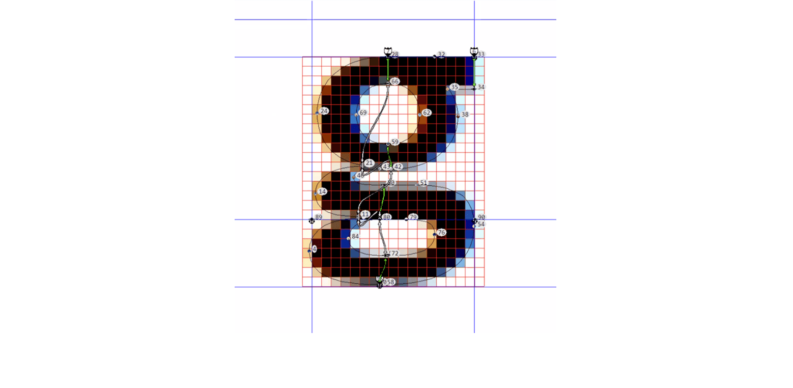
As a text face, Twilio Sans is large and distinctive, but it’s not optimized for modern coding environments, so we scaled down the proportions of the x-height and adjusted the overall design for uniformity: the narrower letters were expanded to help with overall spacing and texture, while the wider letters were significantly reduced for the same reasons; punctuation, fractions, and symbols have been scaled-up since their significance is greater within a coding context. With the italics, we expanded on the distinctive cursive style of the text with more elaborate forms for the /f /v /x /z. Finally, our designers even created a custom retina weight, which is slightly heavier than the regular, for optimal viewing on Apple Retina screens, when compared to a low resolution environment.

Hinting is a part of the font production process that is often taken for granted. For the purpose of text display on lower resolution screens, hinting designates how pixels are placed on a grid to more clearly render a font, depending on the point size. Digital fonts are drawn with “perfect” Bezier curves, typically at very high resolution, so when set at small sizes, these curves require a bit of help to “move” to the correct location. “It’s not easy, but it’s not complicated,” says Noe Blanco, our go-to hinting expert.
While programs like VTT make hinting a more automated process, the scale of this project made hinting Twilio Sans a unique challenge. Additionally, the level of detail in the different styles, particularly the Display, meant that there were instances where Noe had to rethink her approach and strategically place “deltas”—size-specific bits of hinting code to move particular points—to ensure that significant details were not lost.
Encapsulating Twilio’s Past, Present, & Future
Encapsulating Twilio’s Past, Present, & Future
Twilio Sans represents one of our most comprehensive client projects to date. Twilio is a communications platform that is highly diversified in its applications, and our type system will be used throughout every facet of the company. Beyond the technical merits, we had to make sure that the typeface accurately and beautifully encapsulates and articulates Twilio’s past, present, and future. It was a labor-intensive but fun challenge to concept and holistically design an entire superfamily from scratch to anchor Twilio’s core identity–it’s a unique case where a typeface becomes a fundamental part of a company’s DNA.


Twilio Sans Superfamily Credits:
• Type Design: Lucas Sharp, with Huw Williams, Connor Davenport and My-Lan Thuong
• Font Engineering: Connor Davenport
• Hinting: Noe Blanco