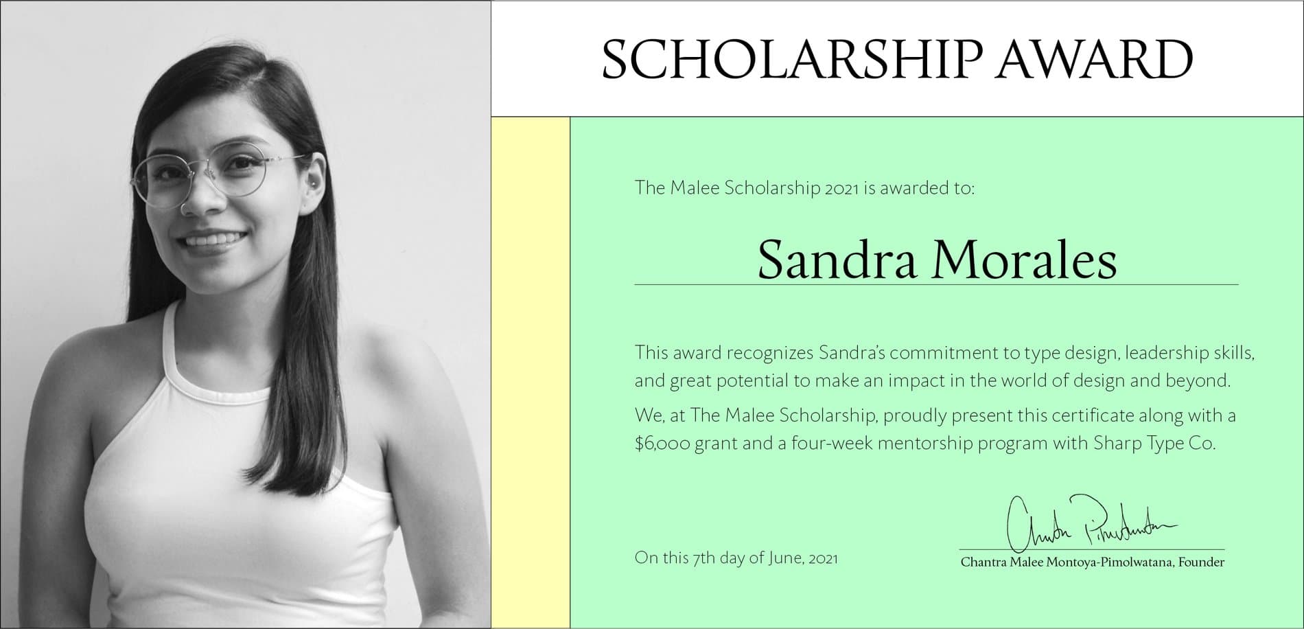
Announcing The Malee Scholarship 2021 Recipient
We are thrilled to announce the 2021 recipient of The Malee Scholarship. Get to know Sandra Morales, her design work, and her aspirations in this interview.
We are thrilled to announce the 2021 recipient of The Malee Scholarship. Get to know Sandra Morales, her design work, and her aspirations in this interview.
Sandra Morales is a graphic designer and type designer from Mexico. She describes her home country as rich in history and visual culture, with vibrant letterforms that flood the streets everywhere she looks. At the same time, the country experiences lethal violence against women. The rage and urgency to speak out against this issue accompanied her introduction into graphic design — revealing to her how images have the power to enhance the impact of messaging in social justice issues.
Feminism is a core part of Sandra’s identity and practice, having revolutionized her way of thinking and relating to the women around her. She aims to make visible the work of Latin American women in typography, and contribute to the process of depatriarchalizing and decentralizing design. As she shared with us, “I would like my work to be built through the historical moment we are living, to defend the message of protest for our rights, to be a call to action, and to provoke a visual echo.” She is also part of Times New Woman, a community of women interested in letterforms, who regardless of age, professional experience or level of knowledge aim to help and support other women in the industry.
All of us from the Malee team were incredibly impressed not only with Sandra’s passion for type design but her passion for social justice and women's rights, which she actively interweaves into her design practice. It’s an honor to award the scholarship and mentorship to her.
When did you first get interested in letterforms?
In college, I studied graphic design and took calligraphy and lettering classes. I fell in love with letters, tools, textures and the multiple possibilities of experimenting with them to enhance the messages I wanted to convey in my designs. I understand typefaces as a visual representation of somebody's voice, so I want to learn how to design and express my own voice through letters.
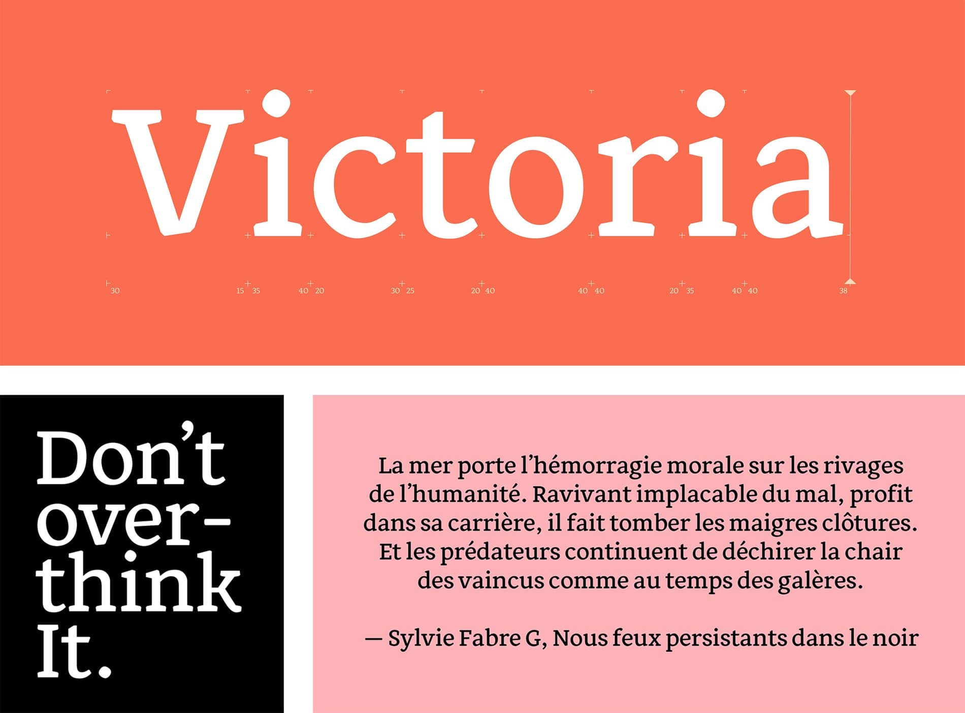
I also looked for other spaces where I could learn about type design. In 2020, I was fortunate to be paired with Oscar Guerrero through the Alphabettes Mentorship Program and have him as a mentor in my first type design project. That summer I designed Victoria, a contemporary humanist typeface for editorial use in print and on screen. It was a great space to explore and experiment.
“I understand typefaces as a visual representation of somebody’s voice, so I want to learn how to design and express my own voice through letters.”
How does your background and upbringing shape who you are?
I come from a place rich in history, culture, and traditions, a place where color and textures are part of everyday life. Throughout Mexico, one can find wonderful and diverse ecosystems, delicious food and festivities that combine both pre-Hispanic and colonial cultures. I feel very fortunate to have this heritage and am constantly looking for ways to reinterpret the beauty I find.
I was born and raised in Puebla, a city in the central highlands of Mexico, a very colorful place and a great source of inspiration for letterforms, my favorites are the streets with billboards with “sonideros” (murals with music events advertisements), the old hotels signs and the business signs with a particular blackletter.
We are moved by your initiative to speak out against violence towards women in Mexico. Can you tell us more about your projects that discuss this issue?
Not everything in Mexico is beautiful — the violence against women and girls is lethal. There are 11 femicides per day and a 97% impunity rate, so justice feels almost unattainable. In 2014, there was a femicide of a girl in my city, and that moved everything inside me. At the time, I was out of the country and the way the media communicated this murder generated a lot of fear for the women in my life.
The rage and the need to protest against this situation led me to explore different means to say this message: Nos quiero vivas, libres y sin miedo. For the last 4 years I have been working on a personal project about femicides in Mexico, which includes a fanzine, a magazine, and a website prototype. I believe that women are transforming fear into courage, bravery, and love for other women.
“The rage and the need to protest against this situation led me to explore different means to say this message: Nos quiero vivas, libres y sin miedo.”
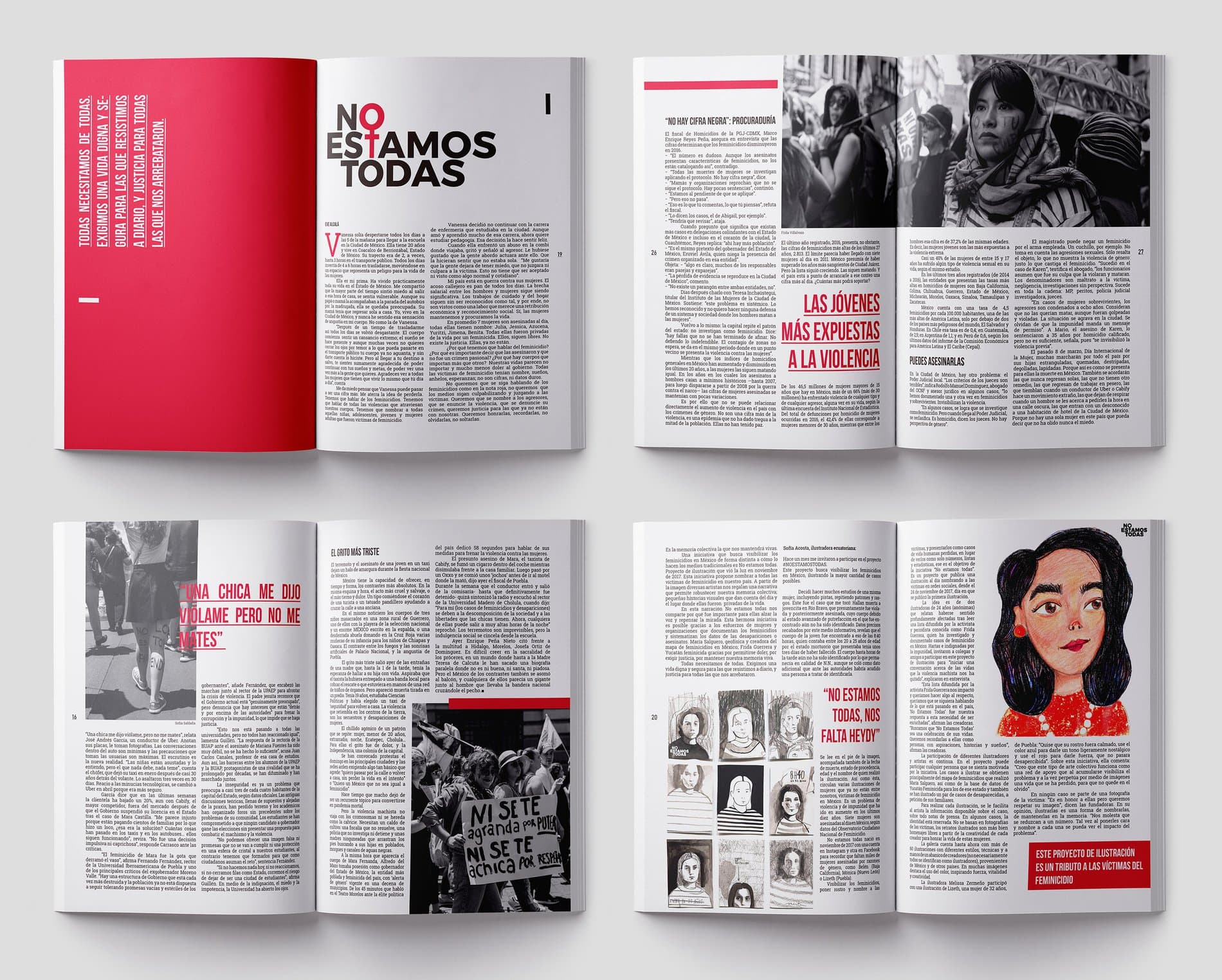
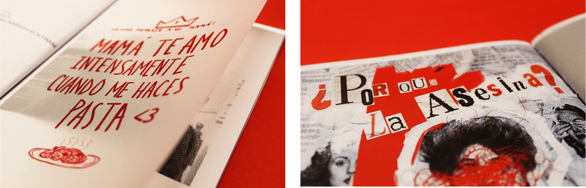
The fanzine is a collaboration between Isis Campos, Daniela Barrera, Andrea Arciniega and myself titled: Ella no está aquí (She is not here). It aims to create a media counterinsurgency: to remember the women victims of femicide for who they were and not for the way they were killed, since most media in Mexico do not publish with a gender perspective, and the treatment of information lacks empathy. Changing the narrative seemed vital to us. For the design, I compiled texts denouncing femicides in Mexico and the project of No estamos todas, and designed a magazine with specific elements of reports.
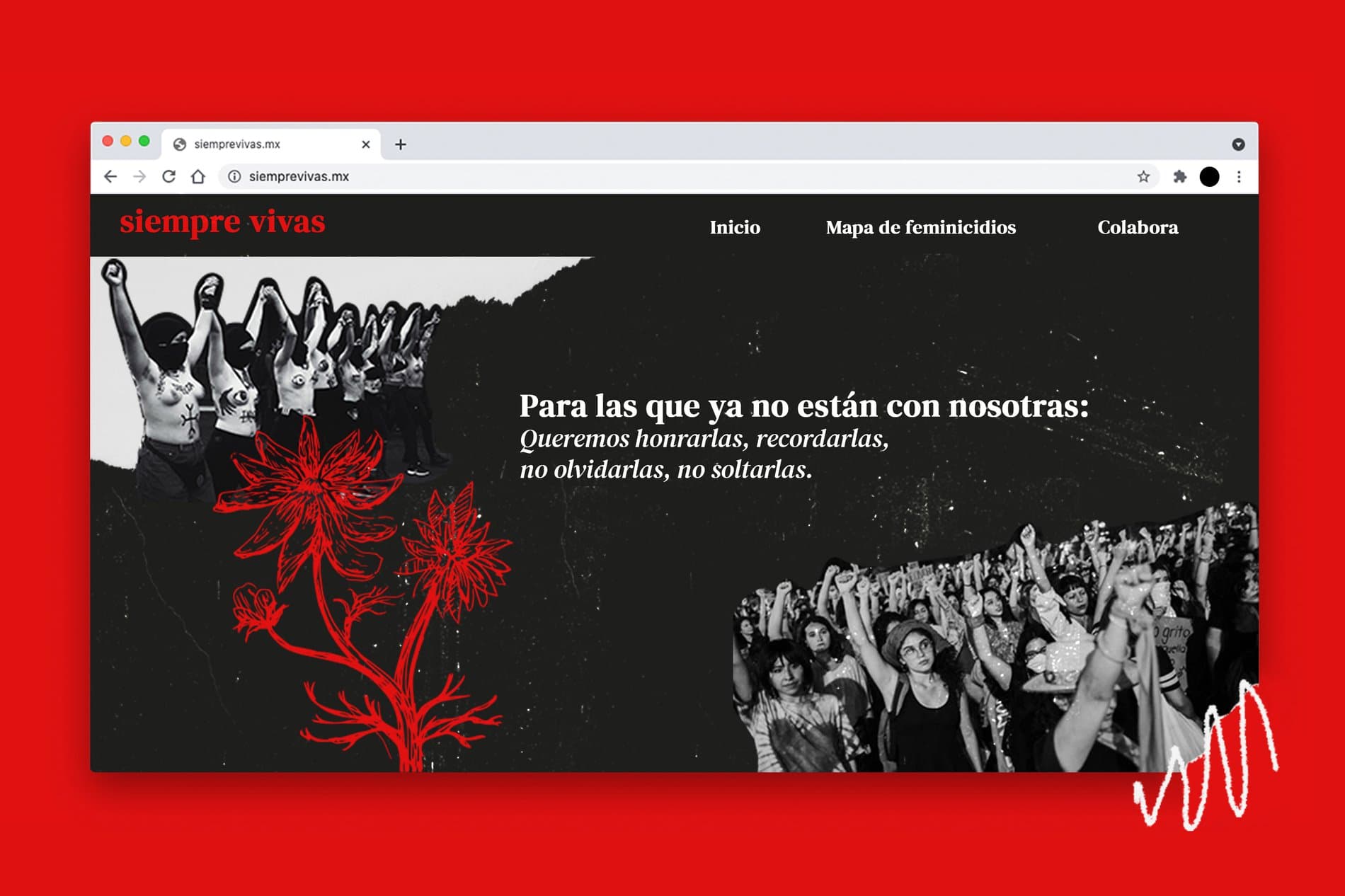
Every day the numbers increase, which makes us normalize violence and think only in statistics. Going beyond the data can be a tool to prevent the reproduction of violence and transform reality. This led to siemprevivas.mx, which is a proposal for a website as a digital memorial for victims of femicide in Mexico to house the voices and testimonies of family and friends. The name, siempre viva, comes from an endemic flower, and I consider it a symbol of resistance to male violence in my country. It is the collective memory that will keep us alive.
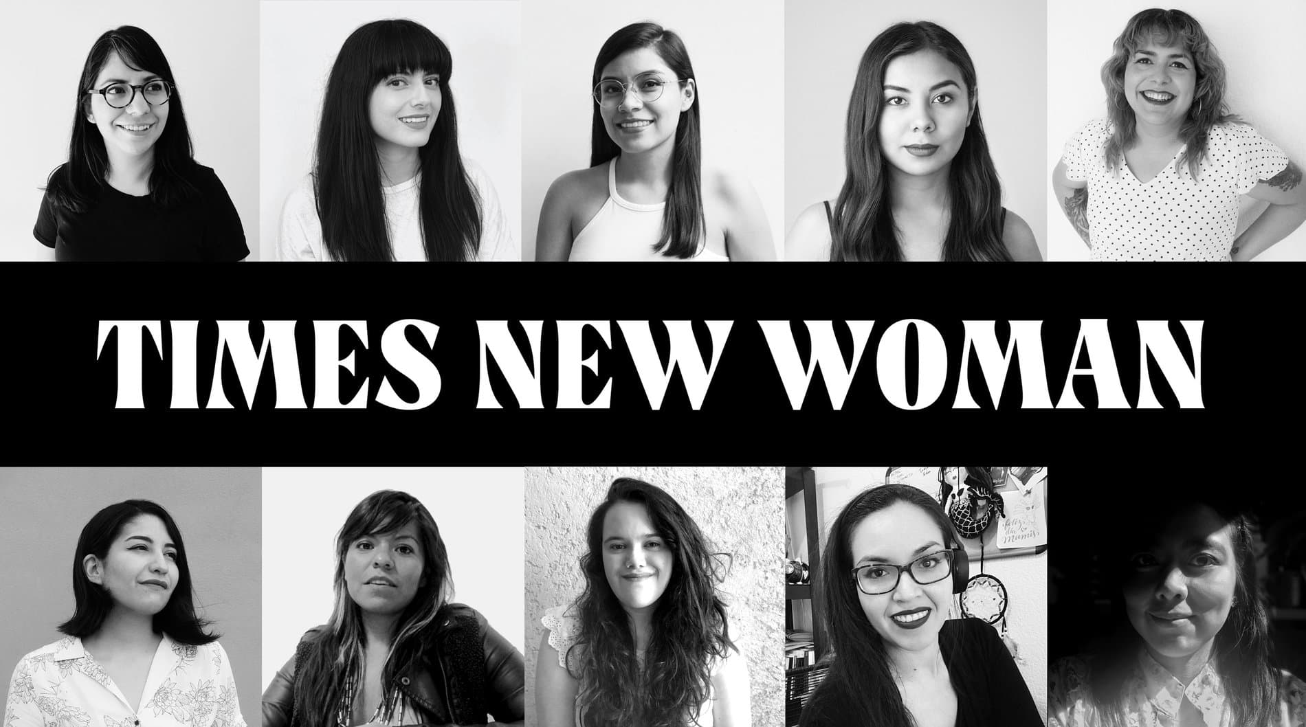
For those who may not know, can you share more about Times New Woman? What have you learned during your time with them?
Times New Woman is a community of women interested in letterforms, who regardless of age, professional experience or level of knowledge aim to help and support each other women in the industry. The women behind this initiative are Rebeca Anaya, Aspacia Kusulas, Frida Medrano, Romina Hernandez, Karla Pasten, Monica Munguia, Tamara Segura, Nitzchia Diaz, Karla Mateos, myself, and all those who want to participate because we seek to build a horizontal community with any woman who wants to be part of it (is a transinclusive and non-binary people space).
When we met and shared our professional experiences, we agreed that there wasn't space, at least in Mexico, where we could share and learn together — not only about type design but about the struggles that are often dismissed or not talked about enough, including mental and physical health, and how women can often get overlooked in this field. Times New Woman started as a fun WhatsApp group with other letter-lover women who sharing tips, feedback, accomplishments and failures and has now grown into a Latin American sisterhood. We have a Slack group where members can find a safe space to talk about their experiences, receive support and learn together, through comments about projects, portfolios or solve any doubts about typography and life, as well as resources in Spanish about different areas of interest around letterforms. On Instagram we share the experience of women who have studied in type design programs around the world so that we can encourage other women to pursue their paths in type. We simply want to be there for each other in our journeys.
Times New Woman has become a source of professional and personal inspiration. I learned so much from listening to other members’ experiences, getting advice, having others to talk to about type, but most importantly having a community I can turn to. We have formed such a beautiful support network that I am grateful to be able to call them friends: together we are stronger.
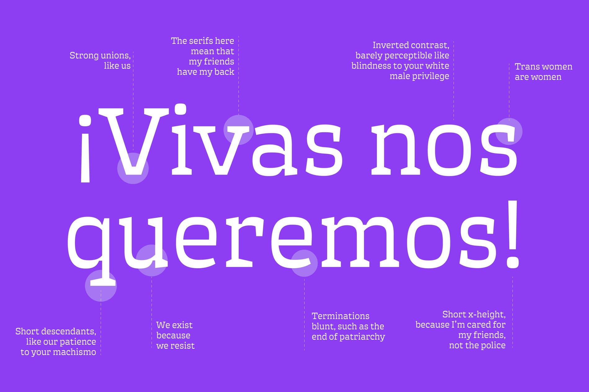
Tell us more about Ácrata, the typeface you developed in collaboration with a small team of other women type designers.
In 2020, I developed a collaborative typeface with Romina Hernandez, Tamara Segura, Aspacia Kusulas, and Karla Mateos. Over the course of 4 weeks, we designed an open source display typeface to resist patriarchy and low-resolution screens.
In the Typatriarchy, what we consider "neutral" responds to male stereotypes, "functional and legible'' define normality and dominate the typographic market. In opposition to this, decorative or experimental morphologies are considered feminine (literally these labels exist in several retail font sites). We wanted to find out what a typeface would look when it breaks these standards and be the container of protest messages. The result of this questioning is Ácrata, a disruptive project made by women who question the gender conventions and forms around typography and what they communicate.
What do you hope to add to the type industry?
Being in a historically a male-dominated industry, the contribution and membership of women in the typographic field have been limited. Even with efforts to increase representation, we have a long way to go to become a truly inclusive and equitable industry. I know I can contribute to the process of decentralization and depatriarchize of type design. Having more female role models can encourage others to start their way in typography. I believe that when a woman achieves something, it encourages other women too.

“People, time, and communication needs have been transforming the letterforms. I do not consider that there is a unique style, but they are as varied as the people are.”
What are some examples of typography unique to Mexico and your hometown?
What first comes to mind is sign painting: for businesses, transportation, billboards or posters... I imagine all the words we find in the street are narratives and stories of those who inhabit the city. People, time, and communication needs have been transforming the letterforms. I do not consider that there is a unique style, but they are as varied as the people are.
We have the historical precedent of the first printing press in Latin America, but a lot of things were imported from Europe. Over time they had to solve problems specific to our context, such as linguistic diversity. From there, I think it is a mixture of everything. I also think of all the applications that have been made for different areas such as architecture, blacksmithing or engraving, even in cemeteries you can find very inspiring letters. In my hometown, a very nice example is the talavera, a hand-done ceramic decorated with metallic colors and used as architectural decoration, home signage, tableware, and more.
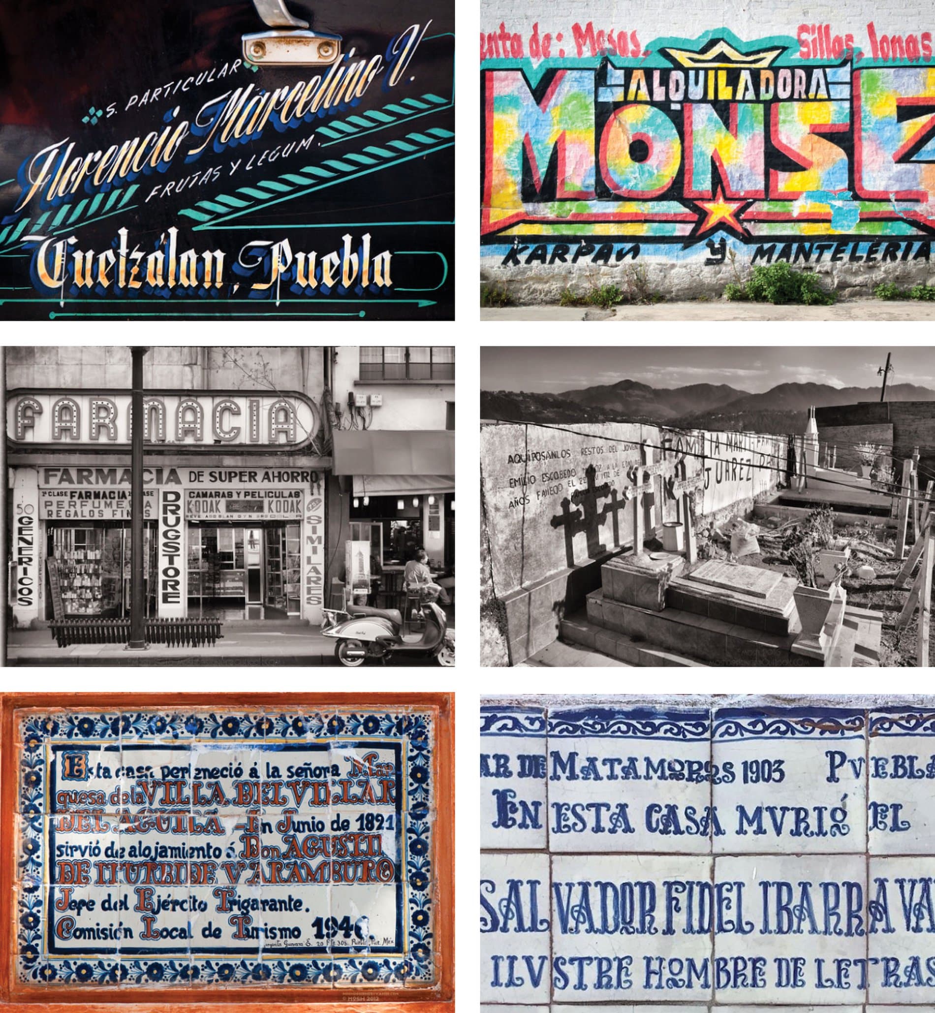
Photos: Óscar Osorio "Mosh"
What’s next for you?
I am very excited to share that I have been accepted into the Master's program in Type Design at the Universidad de Buenos Aires in Argentina! I am sure a journey full of new experiences and learning is in the near future.