Introducing Ceraph
"It started with a song," says EmmaPiercy, a Korean-British designer based in Amsterdam whose debut typeface, Ceraph, will be released through Sharp Type. "The lyrics resonated with my circumstances at the time, and starting the typeface became a way for me to try and break out of a feeling of frustration."
"It started with a song," says EmmaPiercy, a Korean-British designer based in Amsterdam whose debut typeface, Ceraph, will be released through Sharp Type. "The lyrics resonated with my circumstances at the time, and starting the typeface became a way for me to try and break out of a feeling of frustration."
Piercy began Ceraph in 2018 as an experiment, a sketched word featuring whiplash forms and flared serifs. "It slowly evolved into a more ambitious and refined project. I wanted the typeface to embody grace and strength, and this aim was the north star throughout its development. This is my first serious undertaking of typeface design, and it took a year on-and-off to settle on the concept."
When it came to naming the work in progress, she found inspiration in the highest heavenly bodies as well as the foundational form of the typeface itself. "The name 'Ceraph' is a hybrid of 'seraph' and 'serif': Seraph refers to the ethereal quality of the initial inspiration, and the latter is a nod to the characteristic flared serifs."
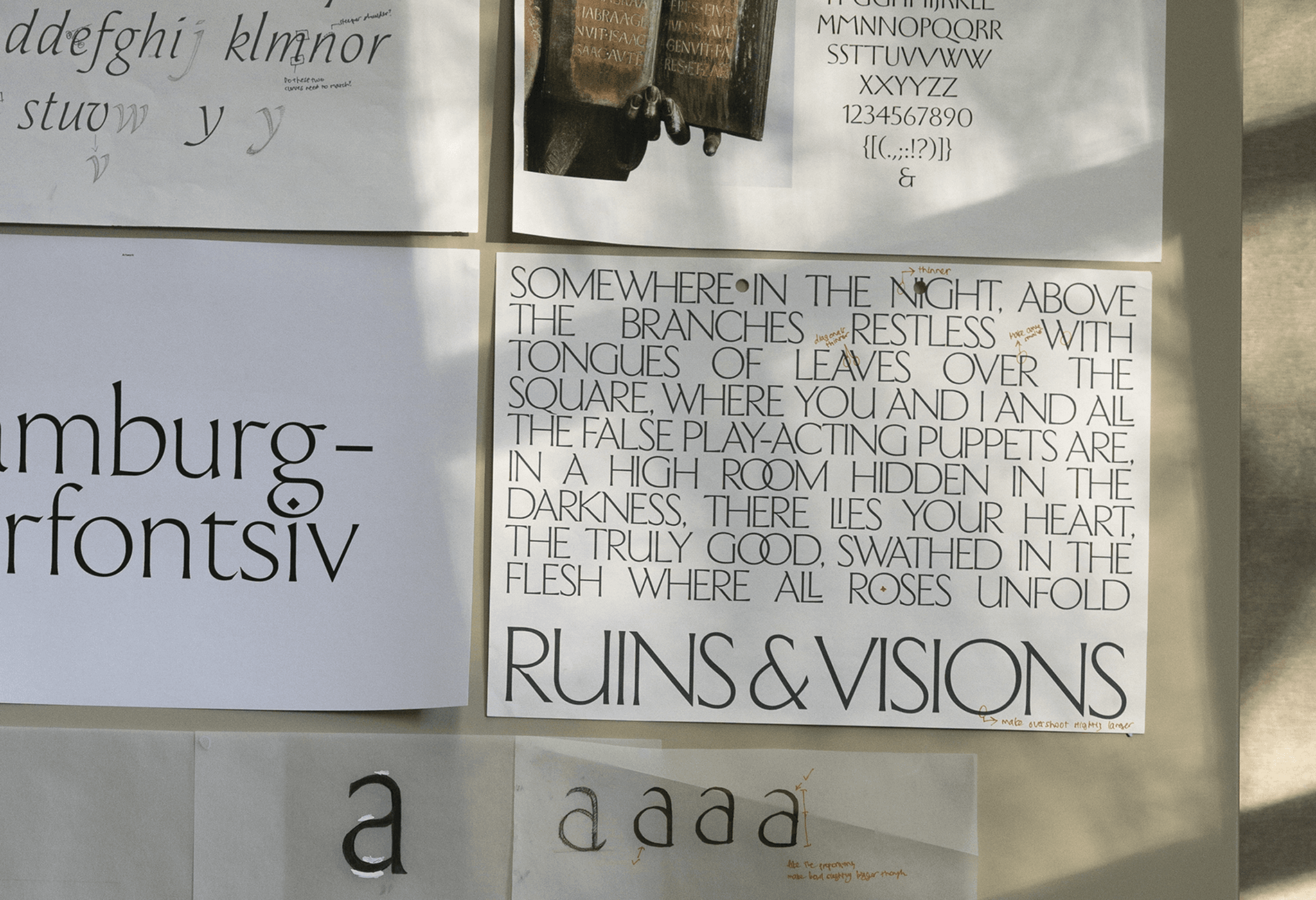
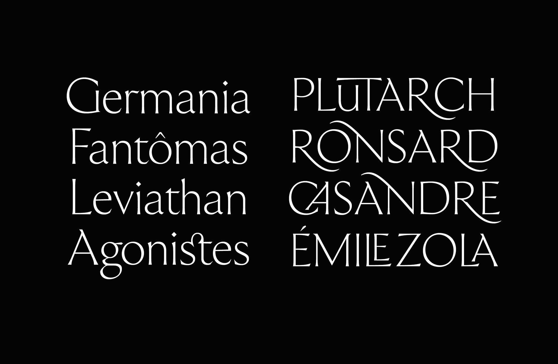
"Ceraph’s flared stroke endings give them an engraved quality. The uppercase proportions and construction reference Roman capitals, while the lowercase has more of a calligraphic approach. This is a flared serif typeface, but it doesn’t follow any particular historical model." Even so, Piercy is forthcoming about her influences: "The work of Hermann Zapf, Giovan Francesco Cresci, and Jakob Erbar were significant. Typeface-wise, Canela was a specific reference point, too. Over time, my influences also became more humanistic, so my interest and practice in calligraphy further moulded this project. However, I’d say the communities of women in type design that I later found had the biggest impact. I hope the final result is a synthesis of contemporary styles and historical scripts that feels simultaneously old and new."
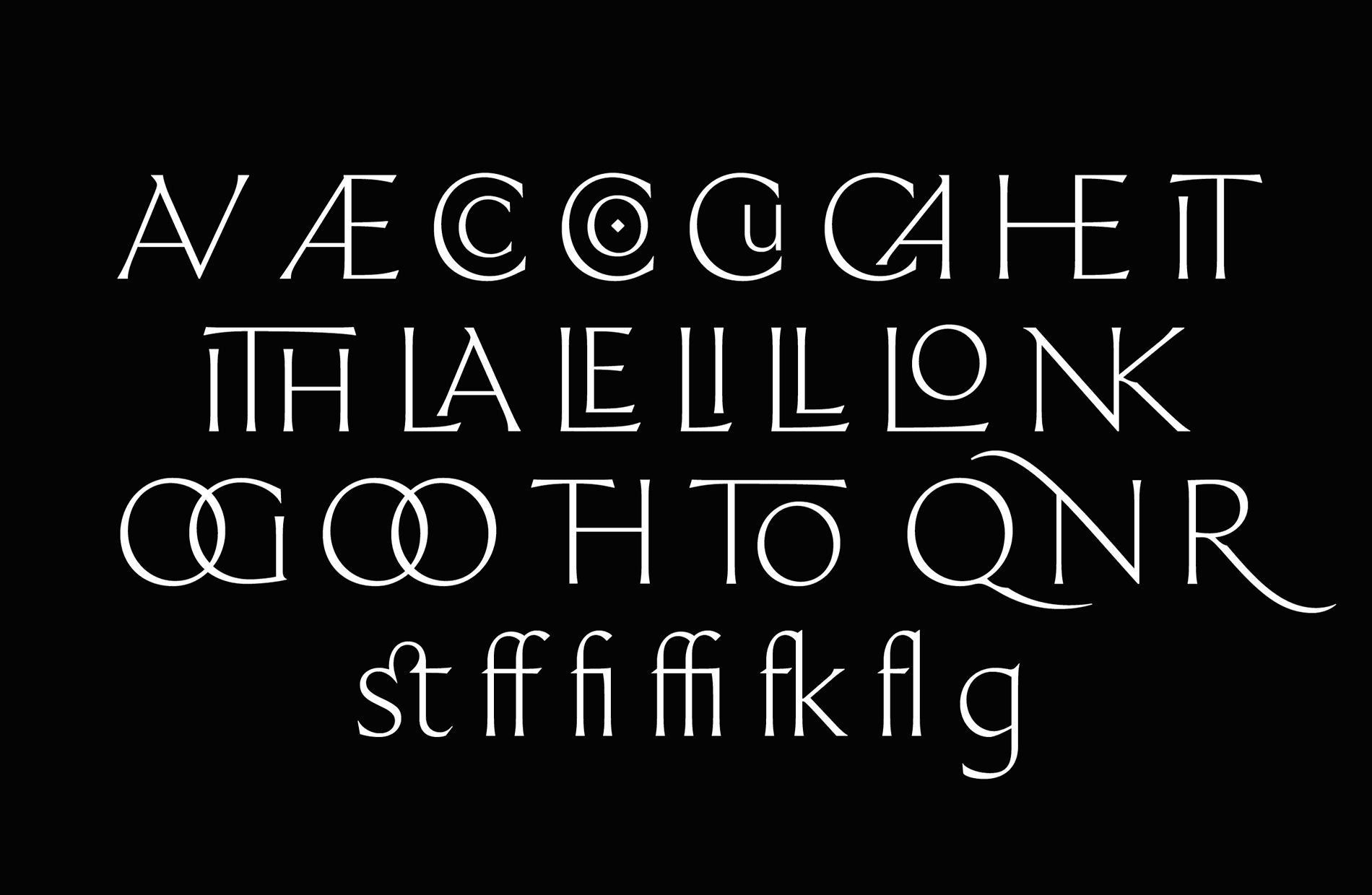
Ceraph's suite of contextual alternates gives designers beautiful display options
We're always curious to know how a type designer envisions their work being used by others in the real world. For Piercy, "The design process actually kindled an interest in poetry, so it would be rewarding to see that come full circle, perhaps used for titles or short text. I like being surprised with applications, but I’d be most excited to see it used by people and initiatives in the arts–whether that be music, fashion, literature, film, exhibitions."
"Working on Ceraph has led to a lot of growth: in drawing, with calligraphy, diving into the historical context of scripts and type, meeting people who’ve inspired me for a long time. It’s honestly been pretty life-changing. It saw me through darker to brighter times."
Ceraph X Ghostly
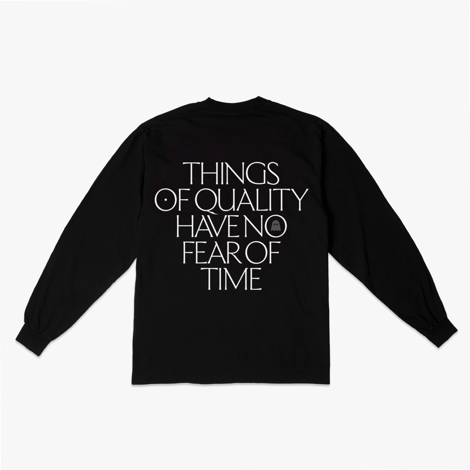
While the full family of Ceraph is still under construction, the display version is already getting attention: most recently, Piercy collaborated with Brooklyn-based Ghostly, an independent electronic music label that has uniquely transcended its label roots to encompass a deeper holistic approach to music, design, and culture. The joint project marks the third run of one of Ghostly's most popular shirts, which is a paean to patience. Twoversions will be released.
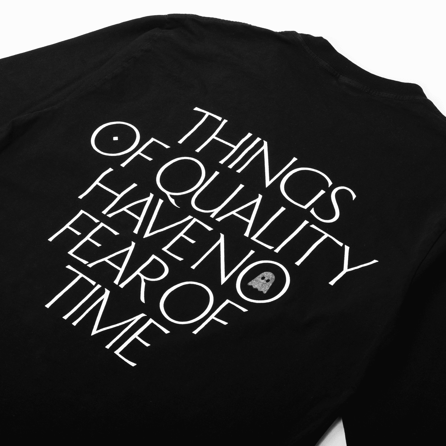
Emma Piercy's collaborative shirt with Ghostly, which is a riff on an enduringly popular found type specimen that has never been attributed; the original artist remains an unknown legend
"We discovered Emma's work on Instagram and knew we needed to get in touch," says Sam Valenti IV, founder of Ghostly. "We asked her to take a crack at one of our favorite found designs, following in the shoes of Randy Hunt’s Remastered version, and she did not disappoint."
"I was thrilled as I've been a big fan of the label for a while," says Piercy. "We played around with a few twists on aphorisms set in the typeface, which suited the enduring quality of the stone-carved lettering Ceraph takes after. They suggested a remix of an earlier tee featuring some found type with the mantra 'Things of quality have no fear of time'. I loved the thought of coming across a sincere reminder like that while at the supermarket or walking down the street. It's an honour to be a part of passing on the message."
Interested parties may inquire about licensing Ceraph directly through Sharp Type until the official retail release. Please email info@sharptype.co
Featured Fonts
Featured Fonts